*황암동굴에서 펼쳐진 세 가지 공간 이야기 [ Atelier Moo ] Three Spatial Designs in the Huangyan Grottoes
"건축은 인간과 자연 사이의 가장 아름다운 대화다." 알바 알토(Alvar Aalto)

 |
 |
 |
황암동굴에서 펼쳐진 세 가지 공간 이야기 Atelier Moo-Three Spatial Designs in the Huangyan Grottoes
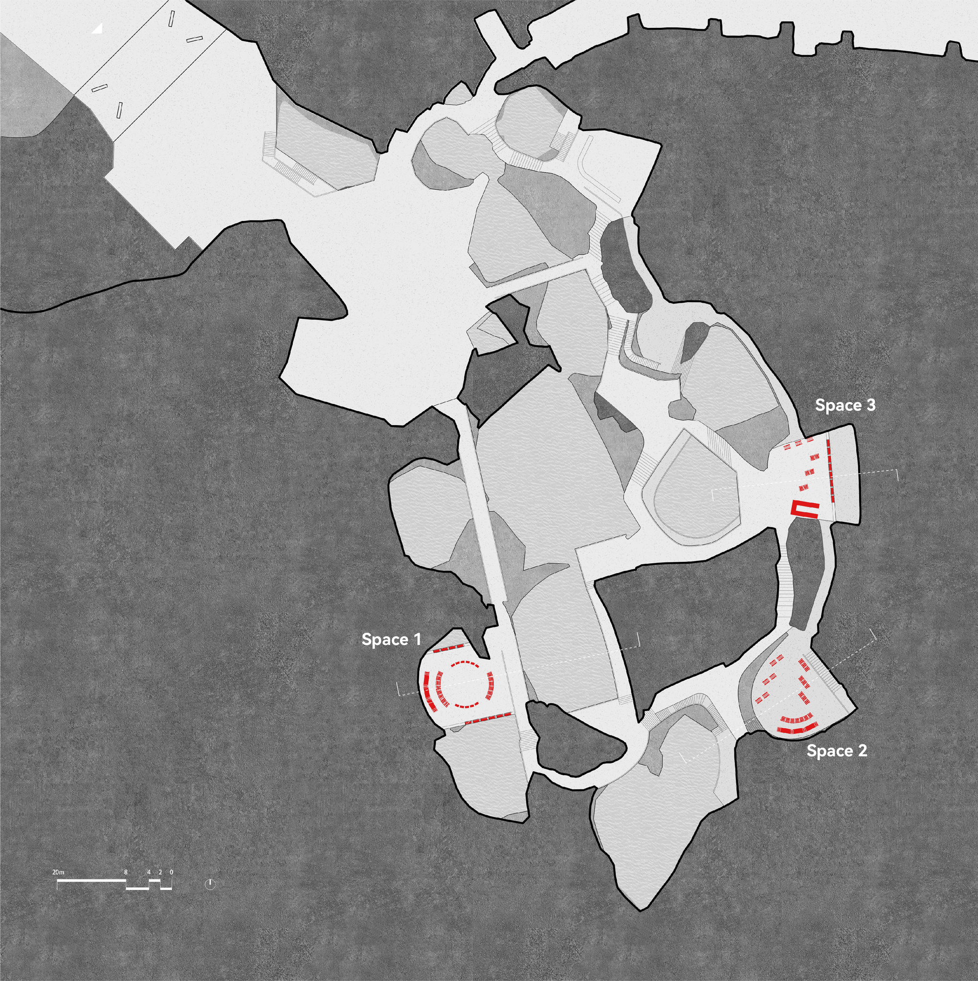
This is a set of spatial designs within the Huangyan Grottoes scenic area in Taizhou, Zhejiang. The renovation work was completed by architect Xu Tiantian's team. Our design task was to transform three areas into a cafe, a multifunctional design store, and a pop up shop for an indie brand. Due to schedule pressures, no disruptive adjustments could be made to the completed infrastructure on site, such as paving and utility lines. One strategy is to use modular assembled furniture units as the main means of spatial organization. All the furniture is not fixed to the ground or stone walls, to reduce the damage to the original environment, also to minimize the on-site work, and make the construction easier and faster. Another strategy is to use as few units as possible to create three different spatial experiences by different combinations of the furniture units.
저장성(浙江省) 타이저우(台州)의 황암동굴 경관구역 내에 위치한 이 프로젝트는 건축가 쉬 티엔티엔(徐甜甜) 팀이 섬세하게 개입하여 탄생했다. 세 개의 독특한 공간을 각각 카페, 다기능 디자인 스토어, 인디 브랜드 팝업 숍으로 탈바꿈시킨 이 작업에서 가장 눈에 띄는 점은 기존 환경을 존중하고 최소한의 개입을 추구하는 철학이다.
디자인 전략: 유연함과 가역성의 미학
일정상의 제약으로 현장의 기존 기반 시설을 수정할 수 없었던 디자인팀은 독창적인 접근법을 취했다. 디자인팀이 선택한 핵심 전략은 모듈식 조립 가구를 공간 구성의 주요 수단으로 활용하는 것이었다. 원래 환경에 대한 손상을 최소화하고, 현장 작업을 간소화하며, 시공 과정을 용이하게 하기 위해 모든 가구는 바닥이나 석벽에 고정하지 않았다.
또 하나의 중요한 전략은 최소한의 가구 유닛으로 최대한의 다양성을 추구하는 것이었다. 가구 유닛들을 다양하게 조합하여 세 개의 완전히 다른 공간 경험을 창출해냈다.
재료 선택에도 확고한 철학이 담겨 있다. 동굴의 거친 질감과 대비를 이루기 위해 은백색의 매끄럽고 추상적인 질감을 가진 양극산화 알루미늄 단일 소재를 선택했다. 가구 유형 역시 450mm, 900mm, 1800mm의 세 가지 높이로 단순화하여 각각 의자, 테이블, 선반으로 활용했다.
공간별 스토리: 세 개의 서로 다른 경험
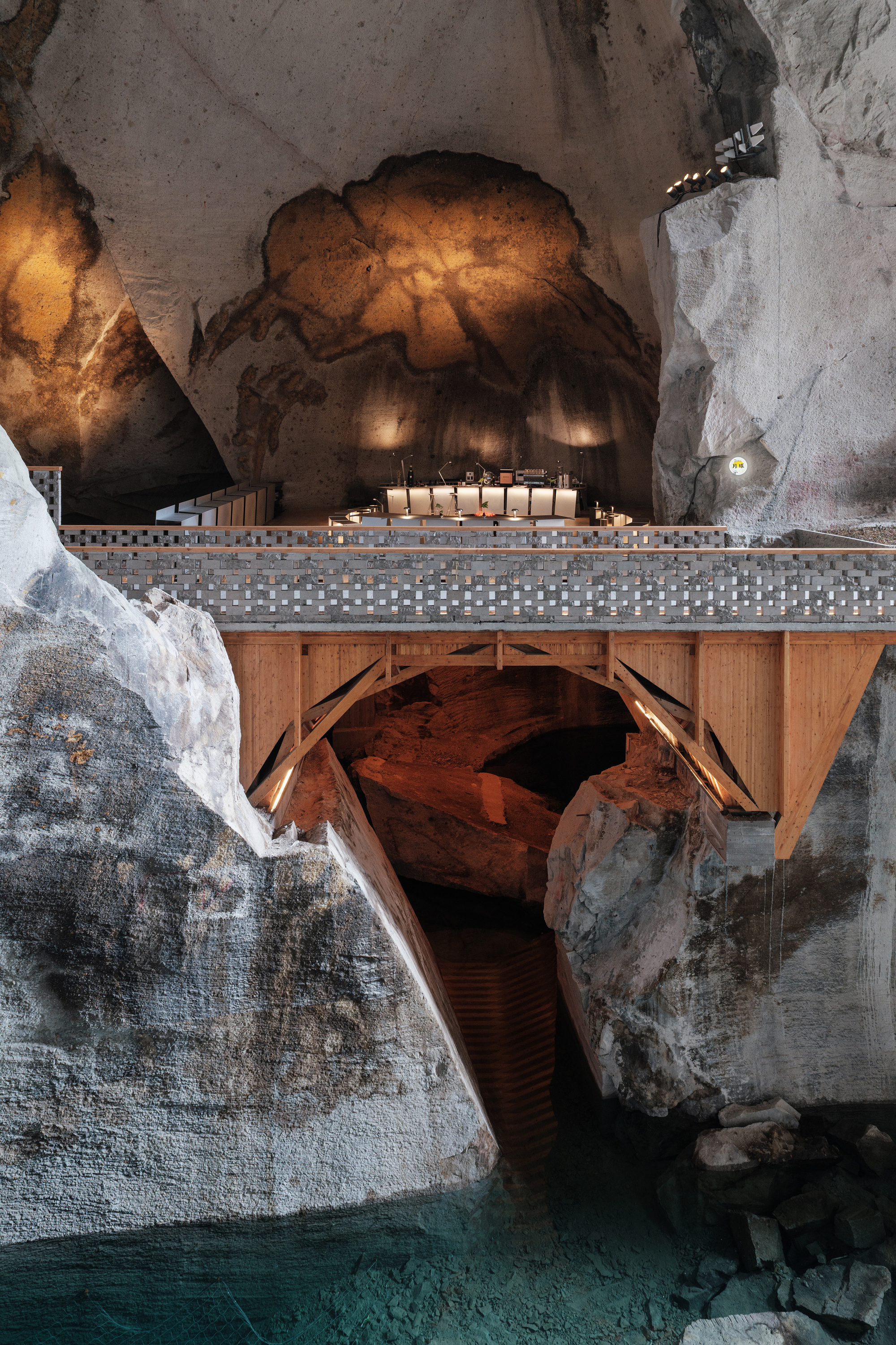
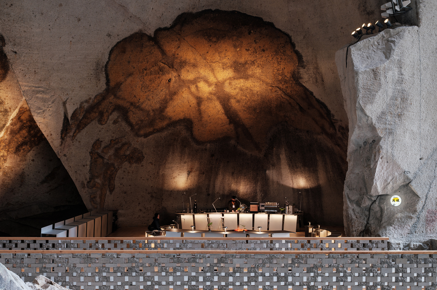
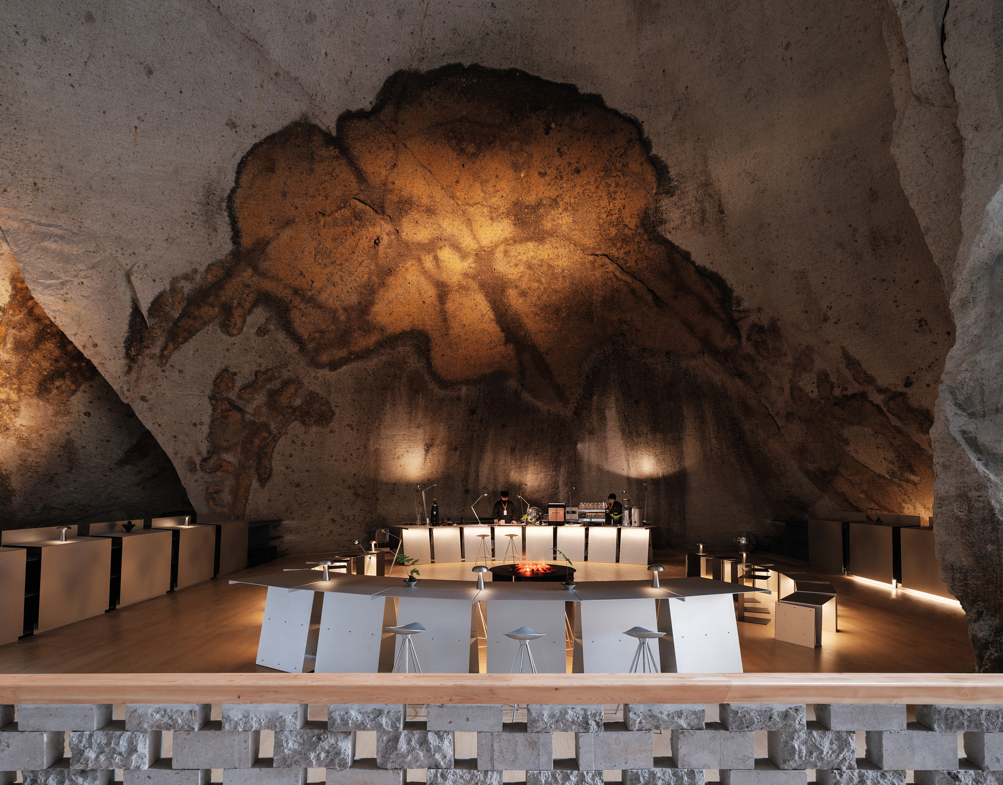
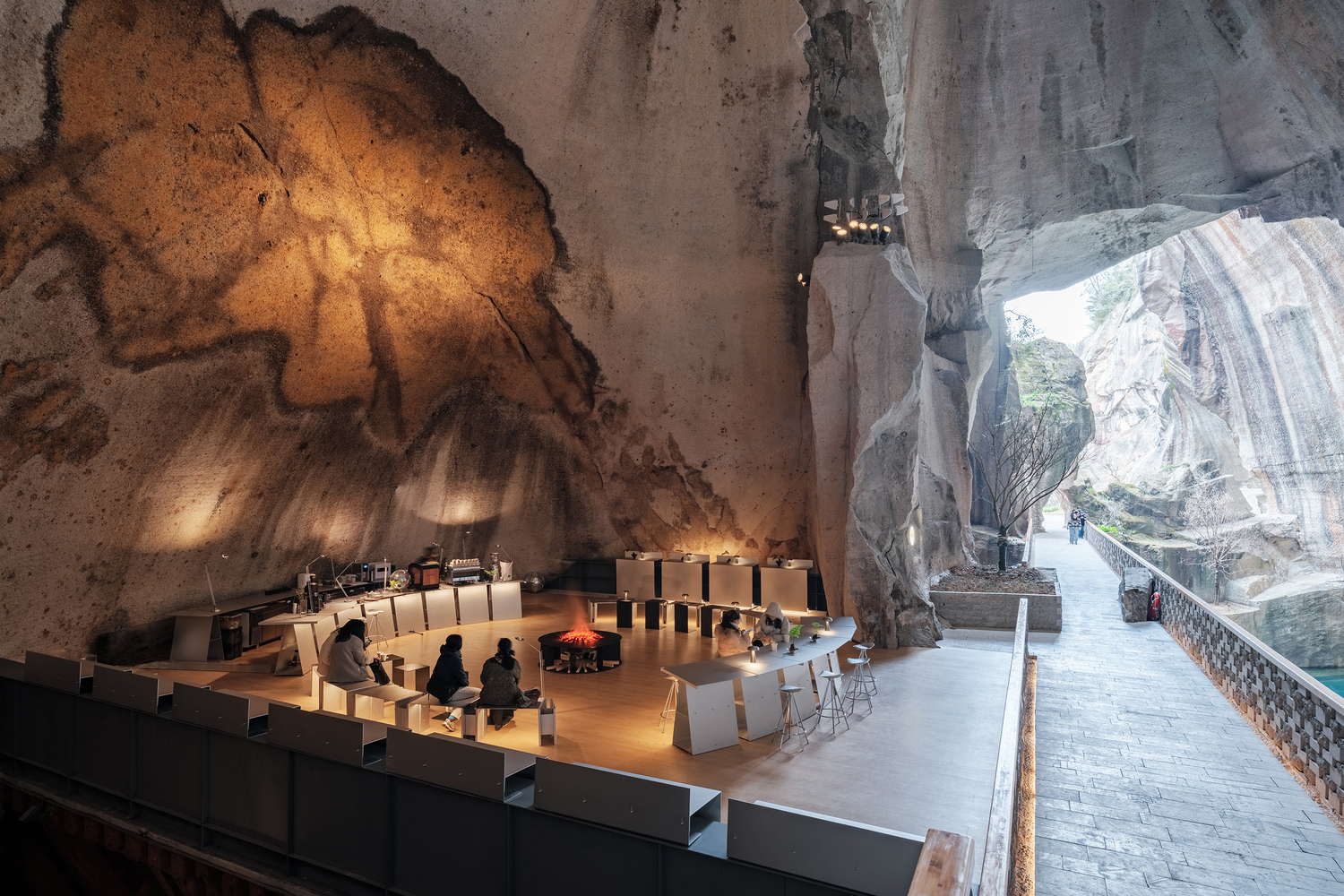
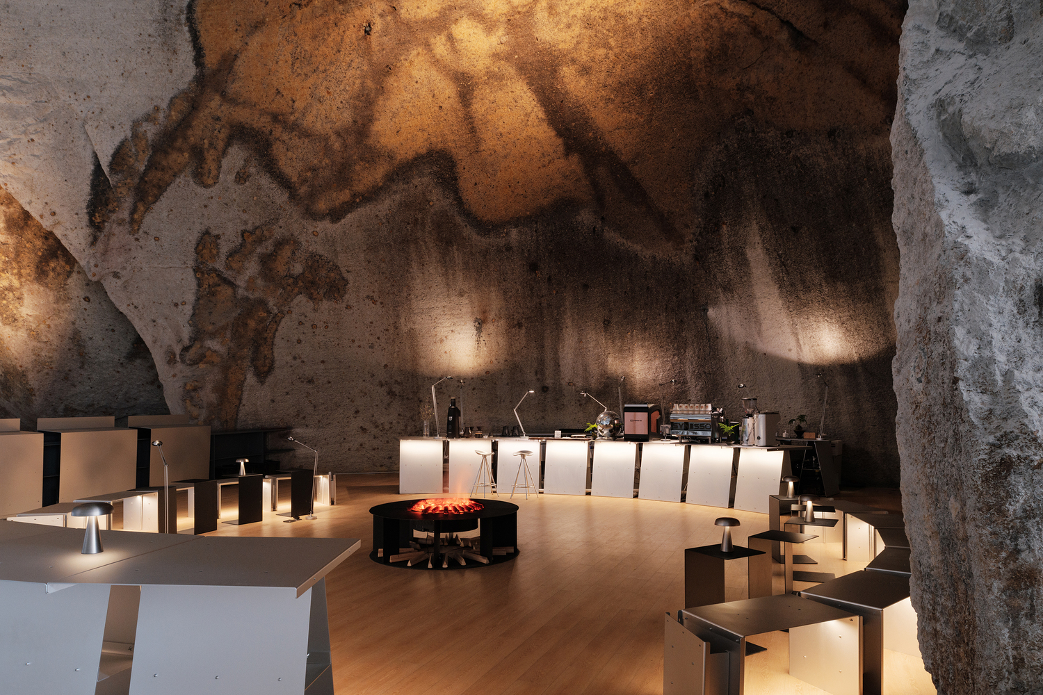
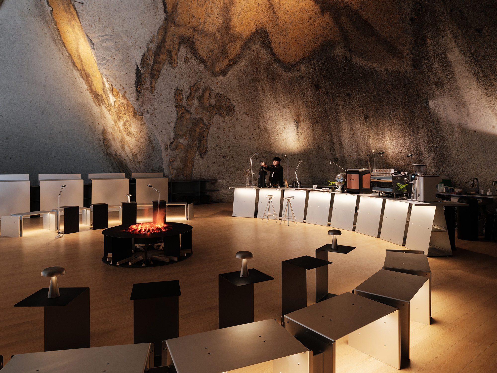
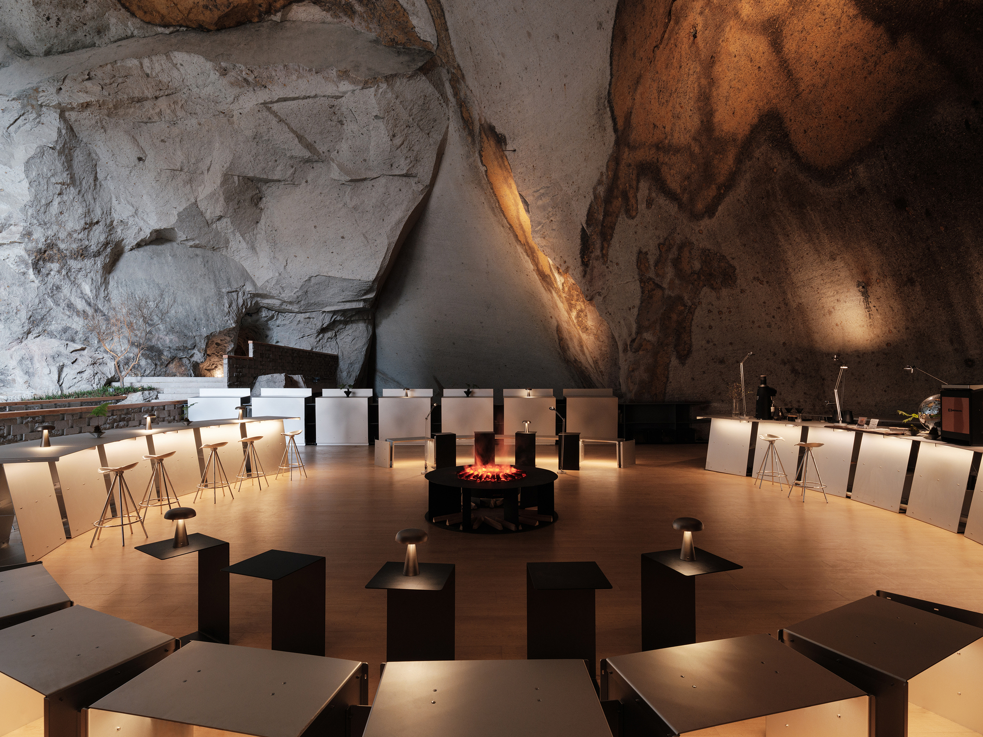
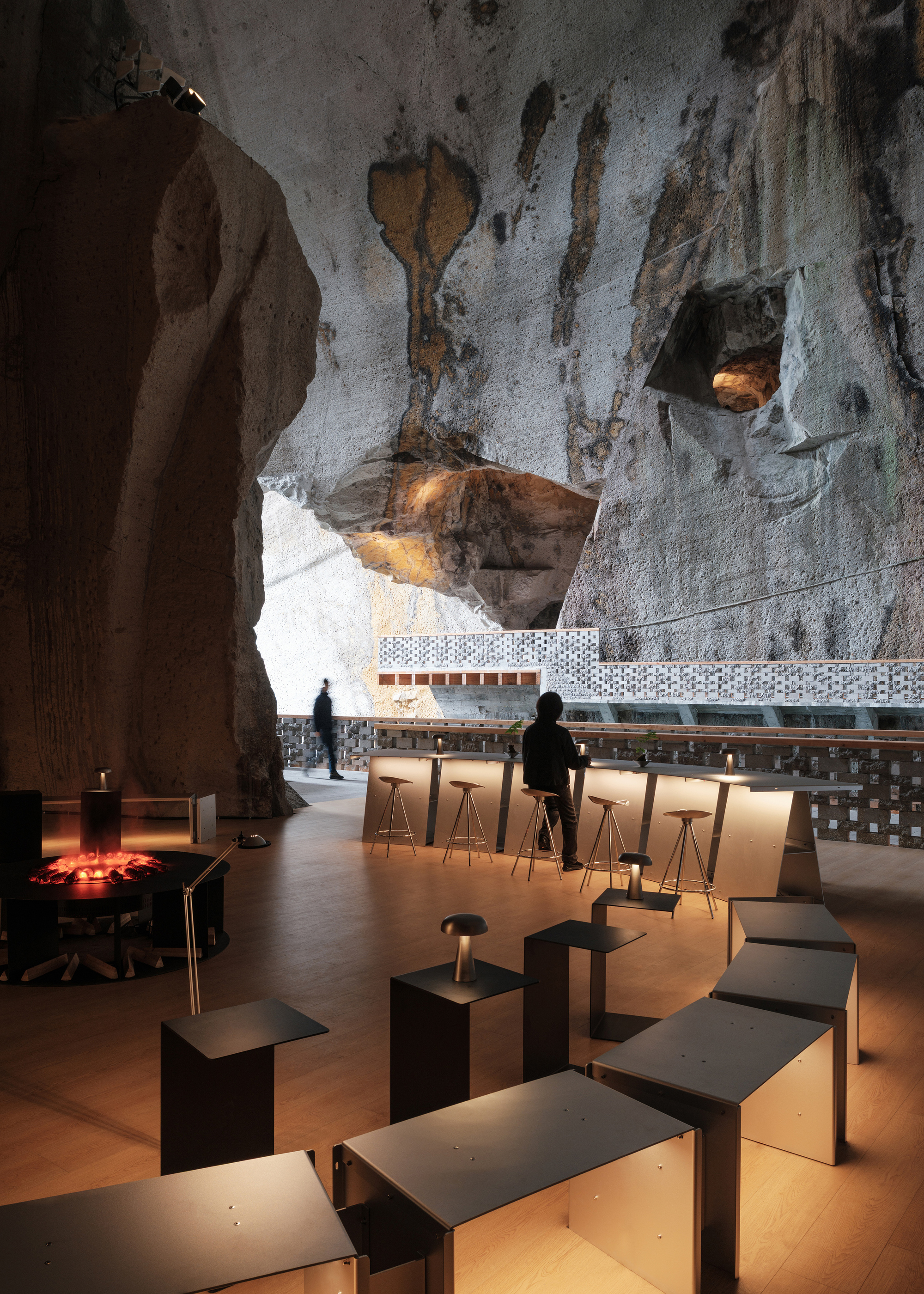
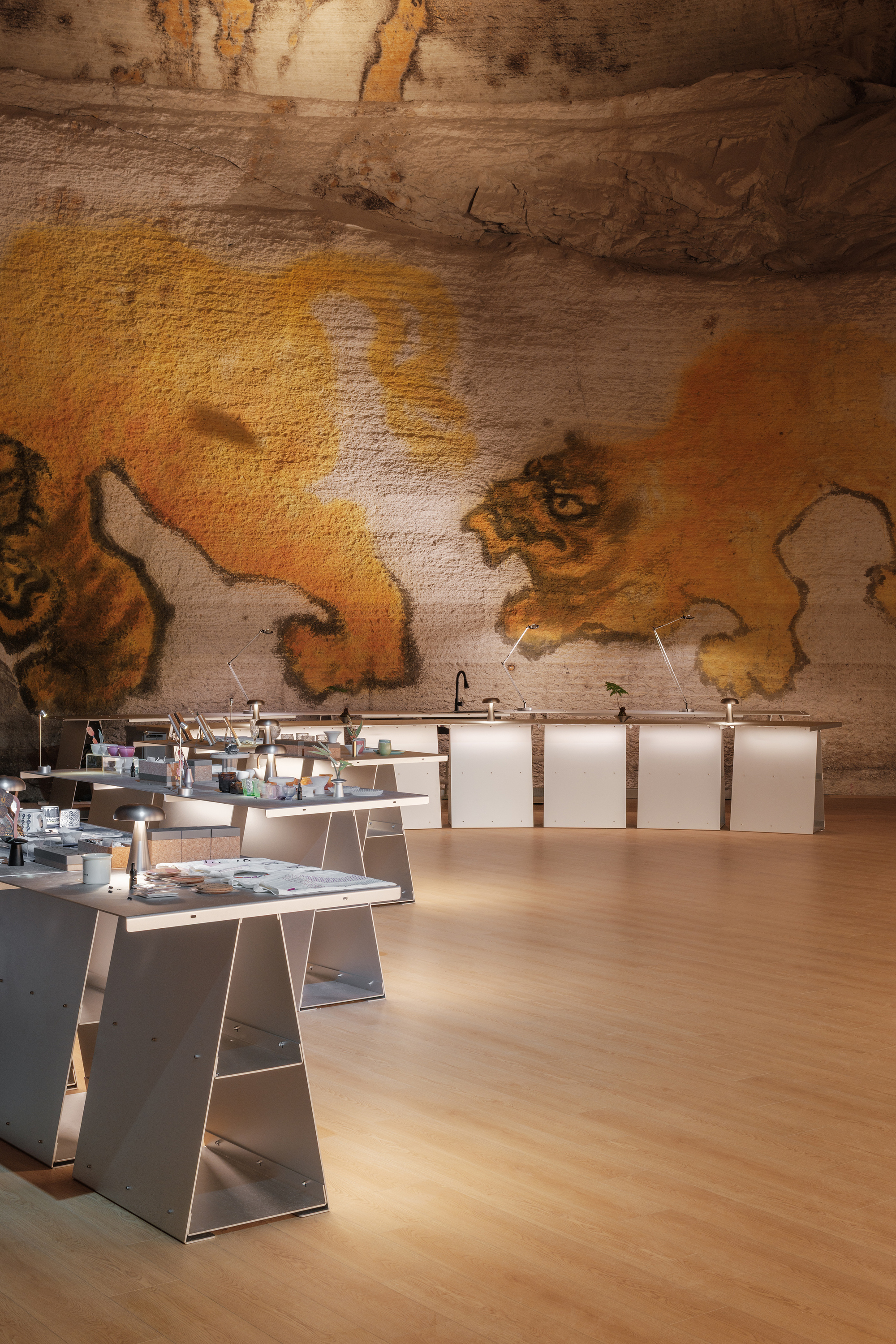
첫 번째 공간: 명상의 원형 카페
첫 번째 공간은 입구 인근에 위치하며, 석벽에 형성된 거의 원형에 가까운 자연 '벽화'가 가장 인상적인 특징이다. 이 벽화는 조명을 받으면 미묘한 입체감을 만들어내며, 마치 돔처럼 공간을 장악하고 은은한 종교적 분위기와 함께 강한 중심성을 부여한다.
이 공간은 방문객들이 고요히 머물며 벽화를 감상하고, 석교와 깊은 연못, 그리고 맞은편 경관을 바라보며, 석벽의 틈새로 다양한 방향으로 펼쳐진 동굴 네트워크를 상상할 수 있는 명상적 카페로 탄생했다.
디자인팀은 테이블과 의자로 원형 공간을 구성하여 이 강력한 공간적 특성에 대응했다. 석벽 근처에 바를 설치하고, 원의 양쪽 날개에는 방문객들이 편안하게 앉을 수 있는 연속된 곡선형 벤치를 배치했다. 입구 쪽에는 서서 또는 기대어 사용할 수 있는 높은 테이블을 두어 언제든 자유롭게 이동할 수 있게 했고, 이는 낮은 벽 너머 지나가는 사람들과 자연스러운 관계를 형성한다.
입구의 돌출된 석벽은 공간 구성의 완벽한 대칭을 깨뜨리는 요소로 활용됐다. 모듈의 각도와 수량을 조정하여 편안한 입구 폭을 확보했고, 이러한 섬세한 처리로 인공 구조물이 자연 환경과 더욱 유기적으로 어우러질 수 있게 됐다.
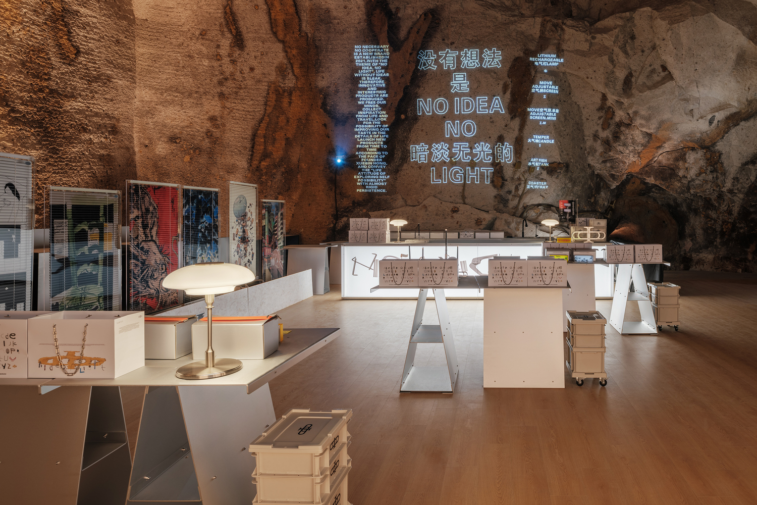
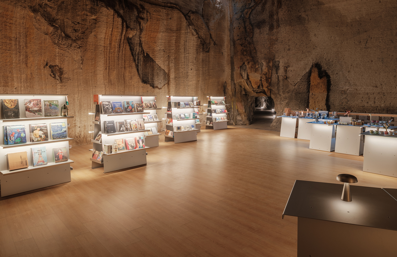
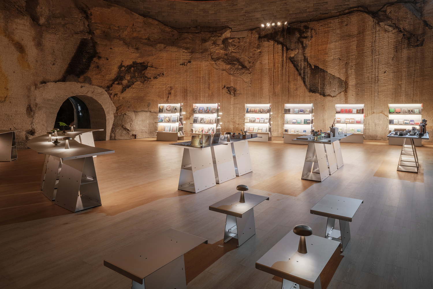
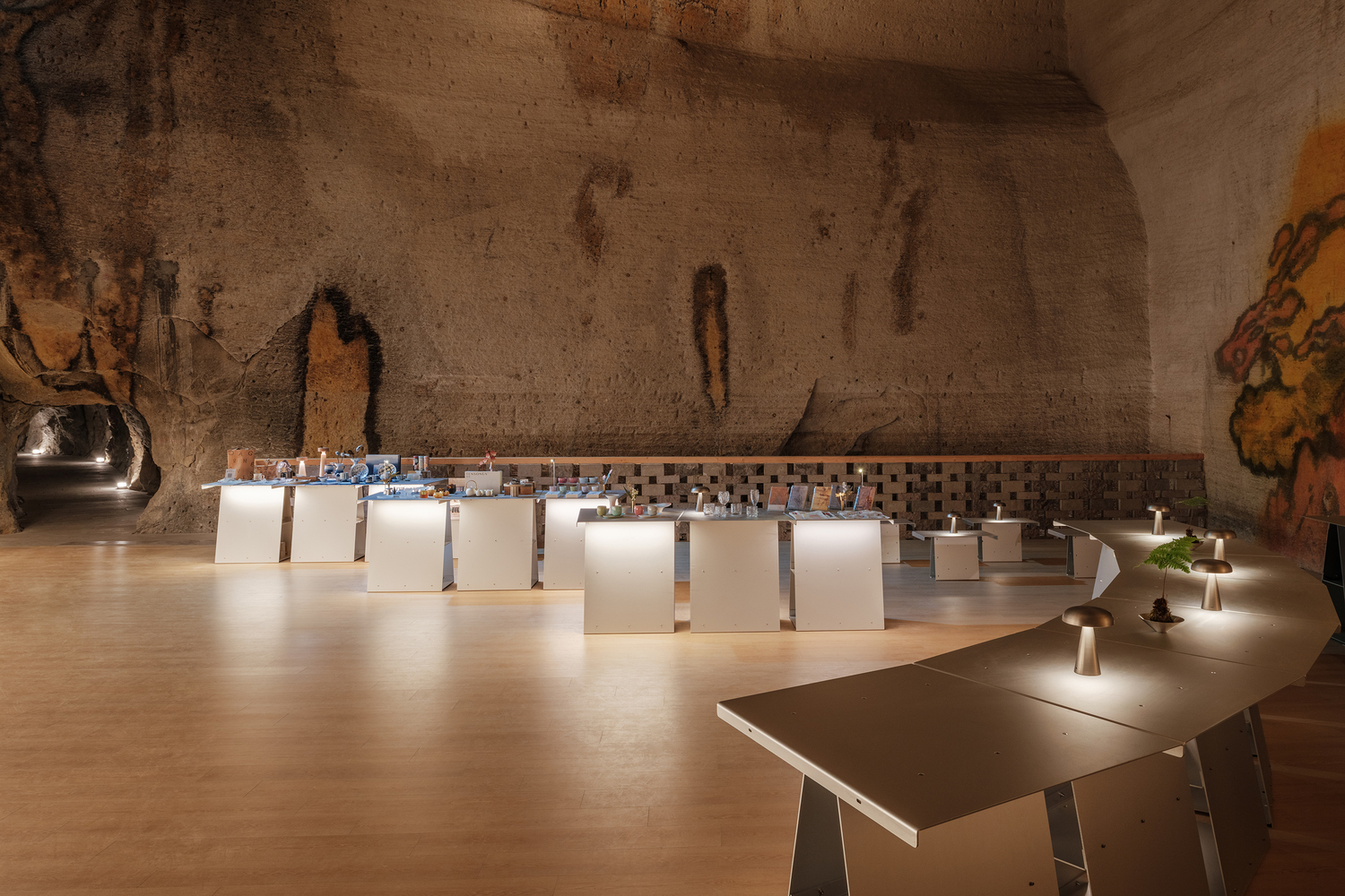
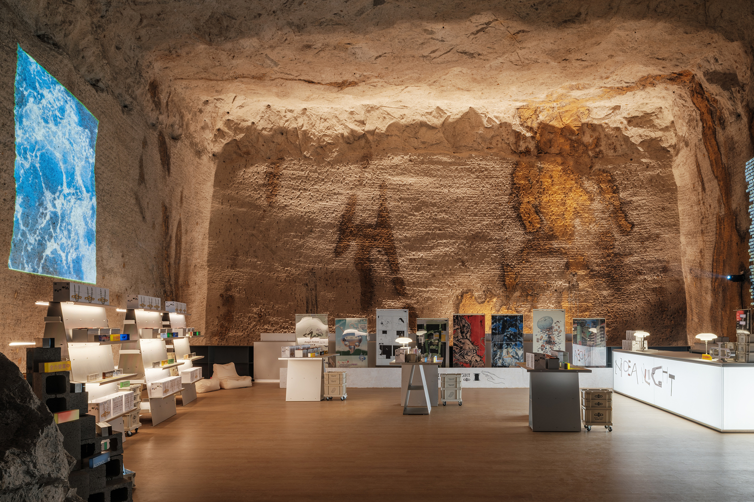
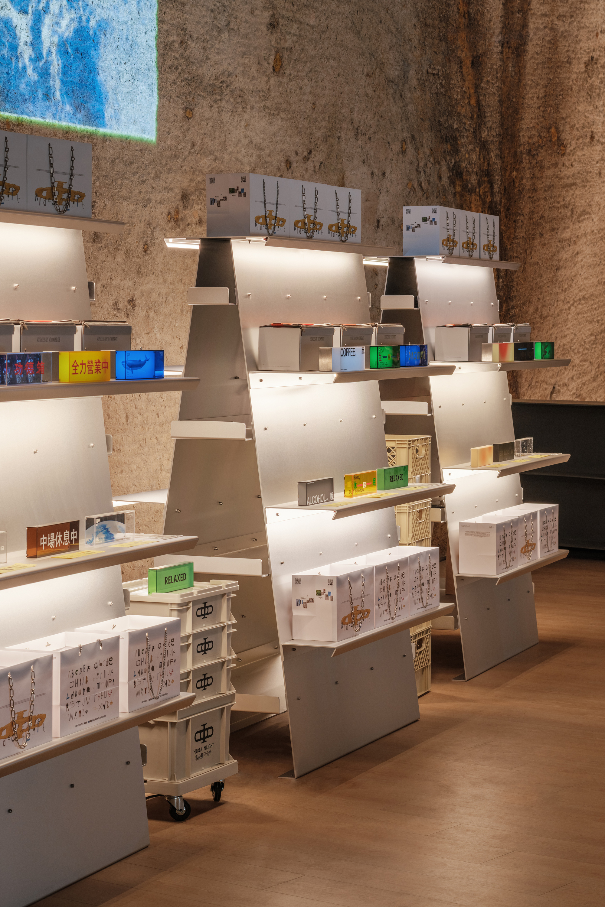
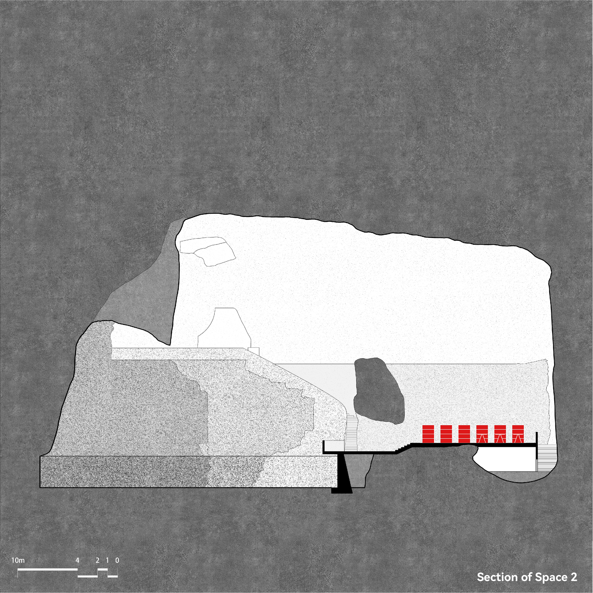
두 번째 공간: 유동적 다기능 갤러리
두 번째 공간은 뚜렷한 시각적 초점 없이 통로로서의 성격을 가지고 있어 전체적으로 느슨한 분위기를 띤다. 디자인팀은 한쪽 벽면을 따라 서가를 배열하고, 반대편에는 리셉션 카운터와 바를 설치했다.
이 공간은 통로로서의 기능을 유지하면서도, 중앙의 열린 공간을 테이블과 의자의 다양한 배치를 통해 전시회, 워크숍, 또는 영화 상영회 등 여러 용도로 활용할 수 있도록 설계했다.
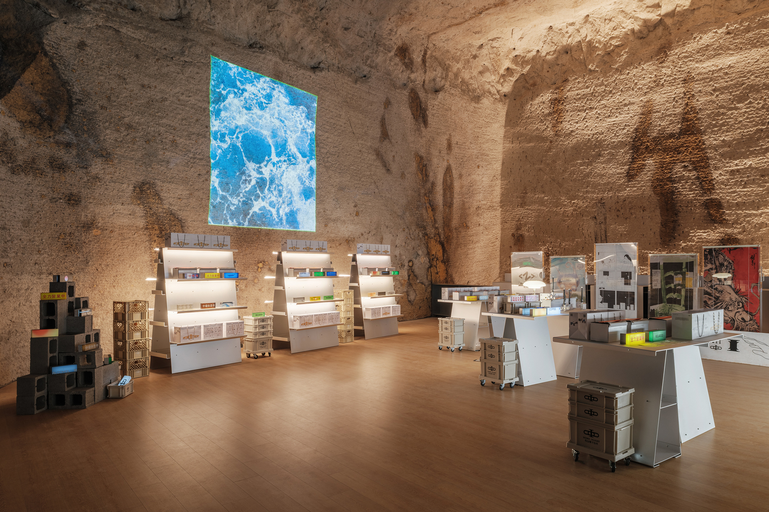
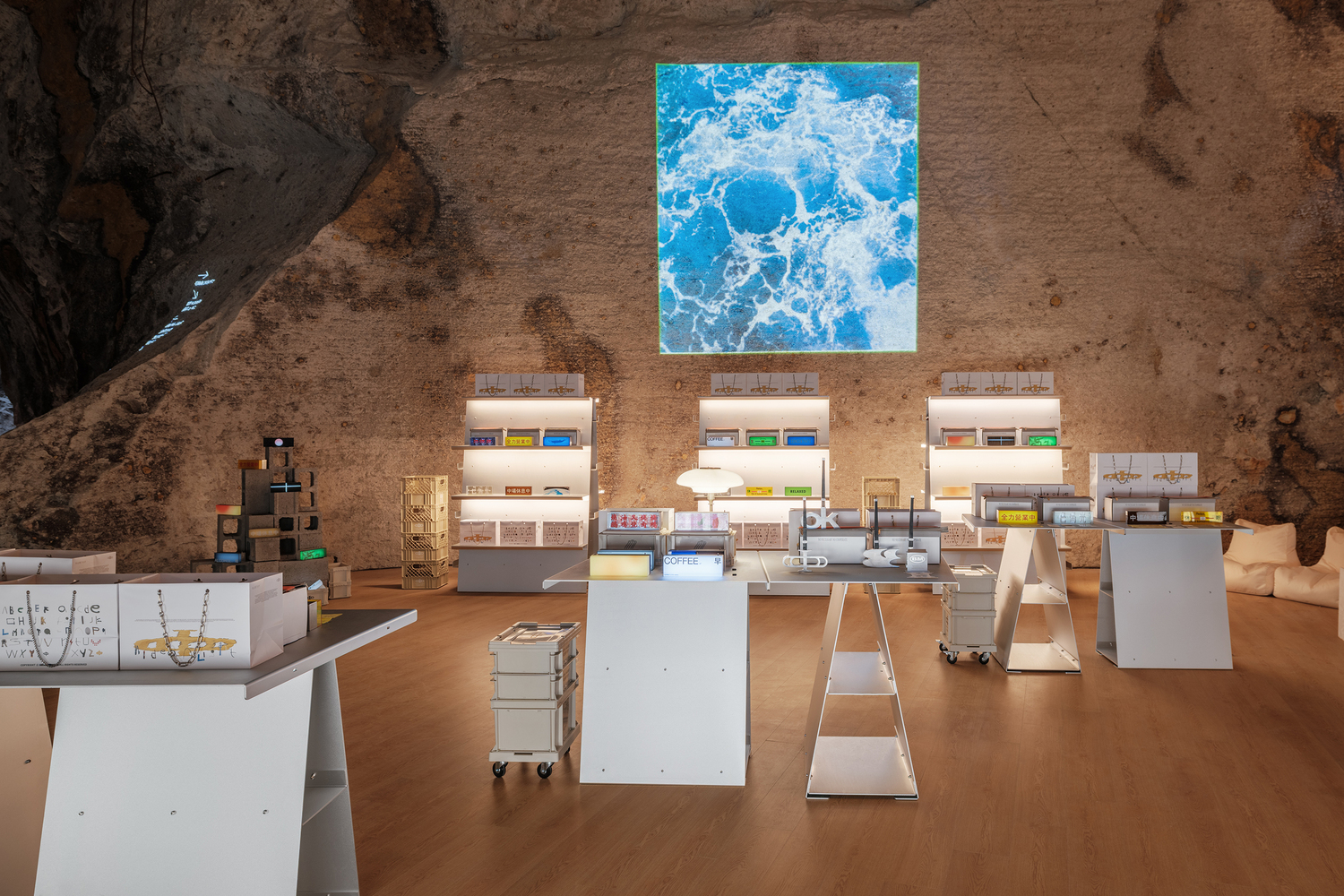
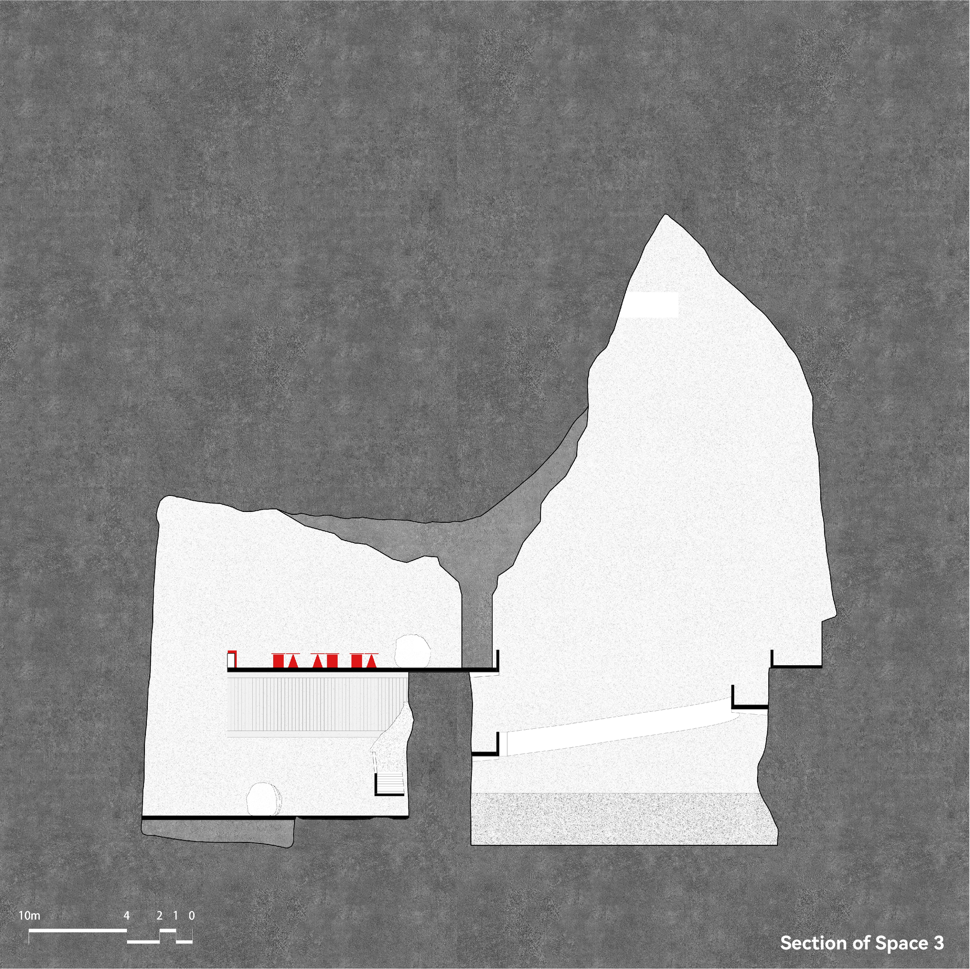
세 번째 공간: 역동적 팝업 플랫폼
세 번째 공간은 사다리꼴 플랫폼 형태를 띤다. 석벽이 플랫폼과 분리되어 아래 공간과 높고 좁은 아트리움을 형성하며, 이 부분이 자연스럽게 공간의 전면부가 된다.
이 전면부를 중심으로 공간을 구성했으며, 인디 브랜드 팝업 숍의 자유로운 분위기와 균형을 이루도록 설계했다. 이 관광지의 상업 형태는 변화할 수 있기 때문에, 디자인팀은 가구 유닛의 형태와 배치를 조정하여 다양한 공간 조건에 적응할 수 있는 유연성을 제공하고자 했다.
디테일에 담긴 철학
현장에서의 조립과 해체 용이성을 고려한 설계 역시 주목할 만하다. 모든 수직 구성 요소는 자립형으로, 수직 요소의 안정성이 확보된 후에 수평 구성 요소를 설치한다. 모든 연결부는 볼트로 고정하여 한 사람만으로도 작업이 가능하다.
조명 디자인에서도 섬세함이 돋보인다. 수평 구성 요소 아래 굽어진 모서리에 조명 스트립을 숨겨 기울어진 수직 표면에 빛이 반사되어 부드러운 발광면을 만들어낸다.
자연과 인공의 조화로운 공존
이 프로젝트는 기존 환경을 존중하고 최소한으로 개입하여 자연과 인공물이 어떻게 조화롭게 공존할 수 있는지를 보여주는 훌륭한 사례다. 쉬 티엔티엔 팀은 모듈식 가구 시스템이라는 단순한 아이디어를 통해 동굴의 거친 자연미와 현대적 디자인 요소의 깔끔한 대비를 성공적으로 만들어냈다.
자연스러운 변화에 열려 있는 이 가변적 공간들은 단순히 기능적인 요구를 충족시키는 것을 넘어, 방문객들에게 황암동굴의 독특한 지질학적 특성을 새로운 관점에서 경험할 수 있는 기회를 제공한다. 공간마다 다른 분위기와 경험을 선사하면서도 일관된 디자인 언어를 유지하는 이 프로젝트는 자연과 건축의 대화가 얼마나 풍요로울 수 있는지를 보여주는 시적인 예시다.
Write by Claude & 5osa


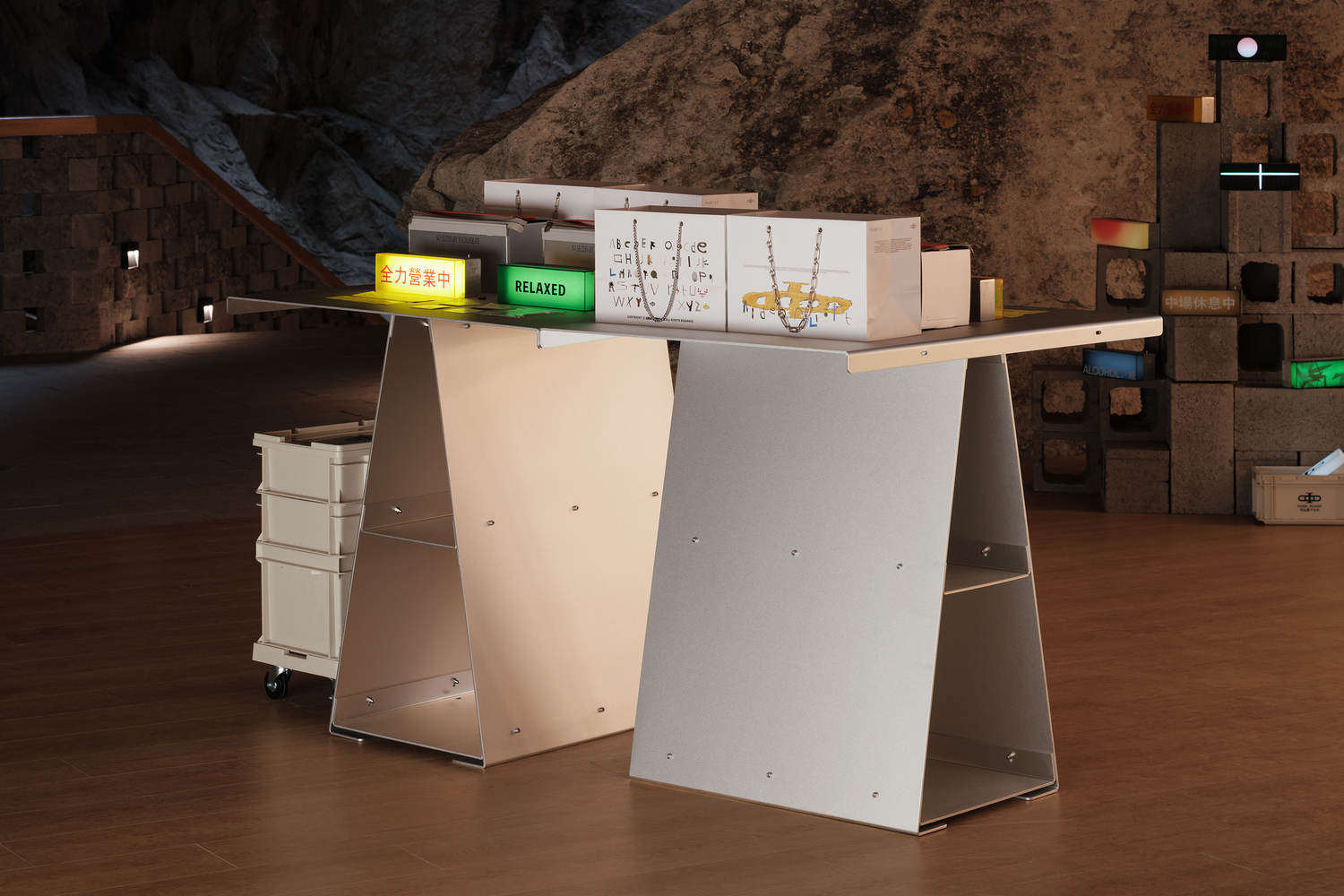
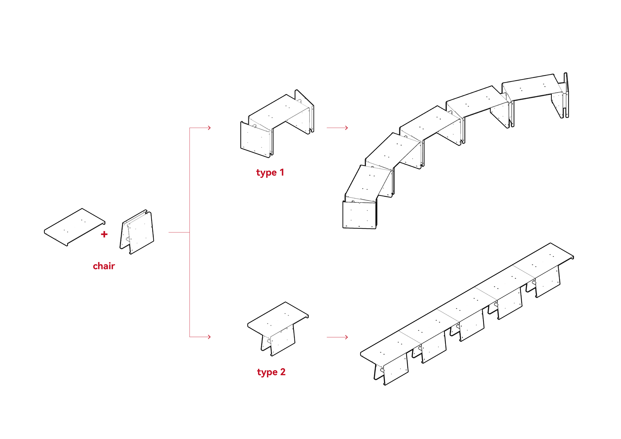
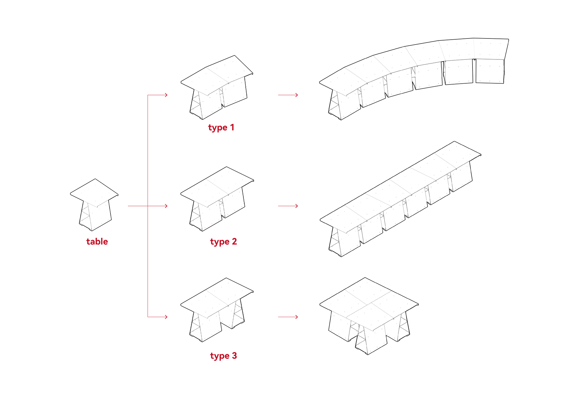

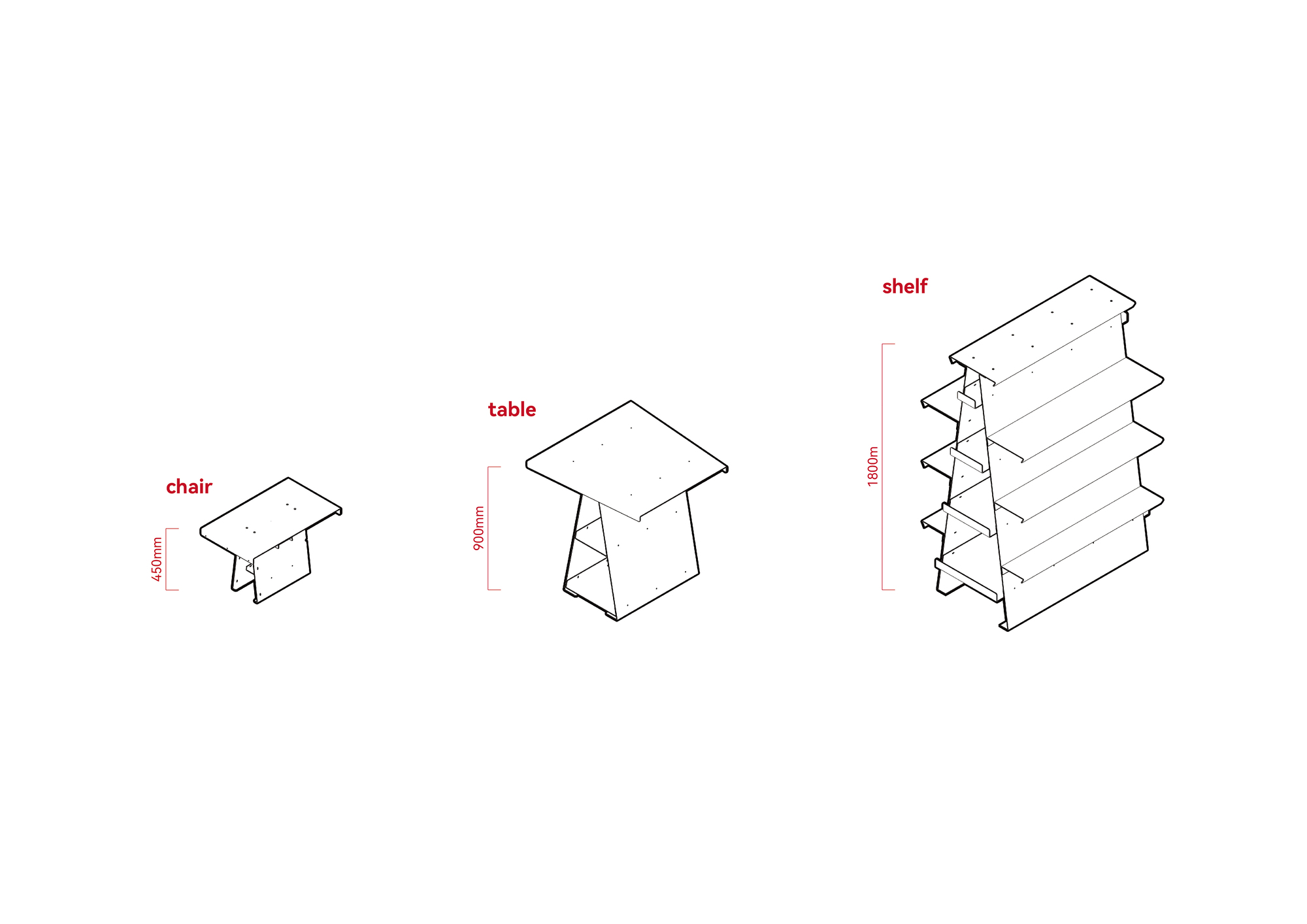
First, we decided to use only one material, from the perspective of contrasting with the grottoes and durability, we chose anodized aluminum, which has a silver white color, and smooth, abstract texture, contrasting with the rough texture of the stone walls. Also, we limited the variety of furniture unit types to a minimum. Three heights of 450mm, 900mm, and 1800mm were set, corresponding to three types of furniture: chair, table, and shelf.
The chair legs and surfaces can be combined in different ways to create two states of use: a linear bench and a curved bench. The tabletops are trapezoidal, with the shorter edges facing one side to create a curved bar, while combining longer and shorter edges forms a linear bar. Tabletops and legs can be combined both parallel and perpendicularly, and can be adjusted as needed when the leg space is used as storage space.
Considering the convenience of on-site assembling and disassembling, all vertical components are self supporting, and the installation of the horizontal components is carried out after ensuring the stability of the vertical components during the construction process. All connection points are secured with bolts, and basically, one person can operate. Lighting strips are hidden in the bending edges under the horizontal components, and the inclined vertical surfaces receive the light, forming a softly luminous surface with diffuse reflection.
The first space is located near the entrance, featuring a nearly round natural "mural" formed by mineral deposits on the stone wall. Under lighting, the mural produces a subtle three dimensional effect, dominating the space like a dome and creating a strong centrality with some subtle religious sentiment. This space is set as a cafe. We wanted it to be a quiet space for contemplation, where people can stay to have close-up views of the mural, vistas of the stone bridge, deep pond, and the opposite side, and visualize a network of caves spreading out in various directions through the openings in the stone walls.
We defined a circular space with tables and chairs, using powerful geometric forms to counteract the strong spatial characteristics. We set the bar near the stone wall; curved continuous low benches are set on two wings of the circle for people to sit comfortably; and on the entrance side, a high table that can be used by standing or leaning, is easy to get up from at any time, forming a relaxing relationship with the pedestrians on the other side of the low wall. A protruding stone wall at the entrance becomes an opportunity to break the absolute axial symmetry of the composition, and by adjusting the angle and the number of modules, we create a comfortable entrance width. This weakening treatment seems to allow this installation space to integrate more naturally into the environment.
The second space does not have a strong visual focus and has a property of passage, so the overall feeling is relatively loose. We filled one side with an array of bookshelves, while on the opposite side, we set up a reception counter and a bar. The property of the space as a passageway is retained, while the open area enclosed in the middle can be used flexibly as an exhibition, workshop, or movie-watching space through different layouts of tables and chairs.
The third space is a trapezoidal platform. The stone wall is disconnected from the platform, creating a high, narrow atrium with the lower space, which naturally becomes the front of the space. The layout of the space is based on this front facade, balanced with the free atmosphere of a pop up shop for an indie brand. The business formats of this scenic area are supposed to be changed. We hope our design can provide strong flexibility, adapting to unknown spatial conditions by adjusting the forms and the layout of the units.
from archdaily