*그리드 커피 [ B.L.U.E. Architecture Studio ] Grid Coffee

 |
 |
 |
B.L.U.E. Architecture Studio-Grid Coffee
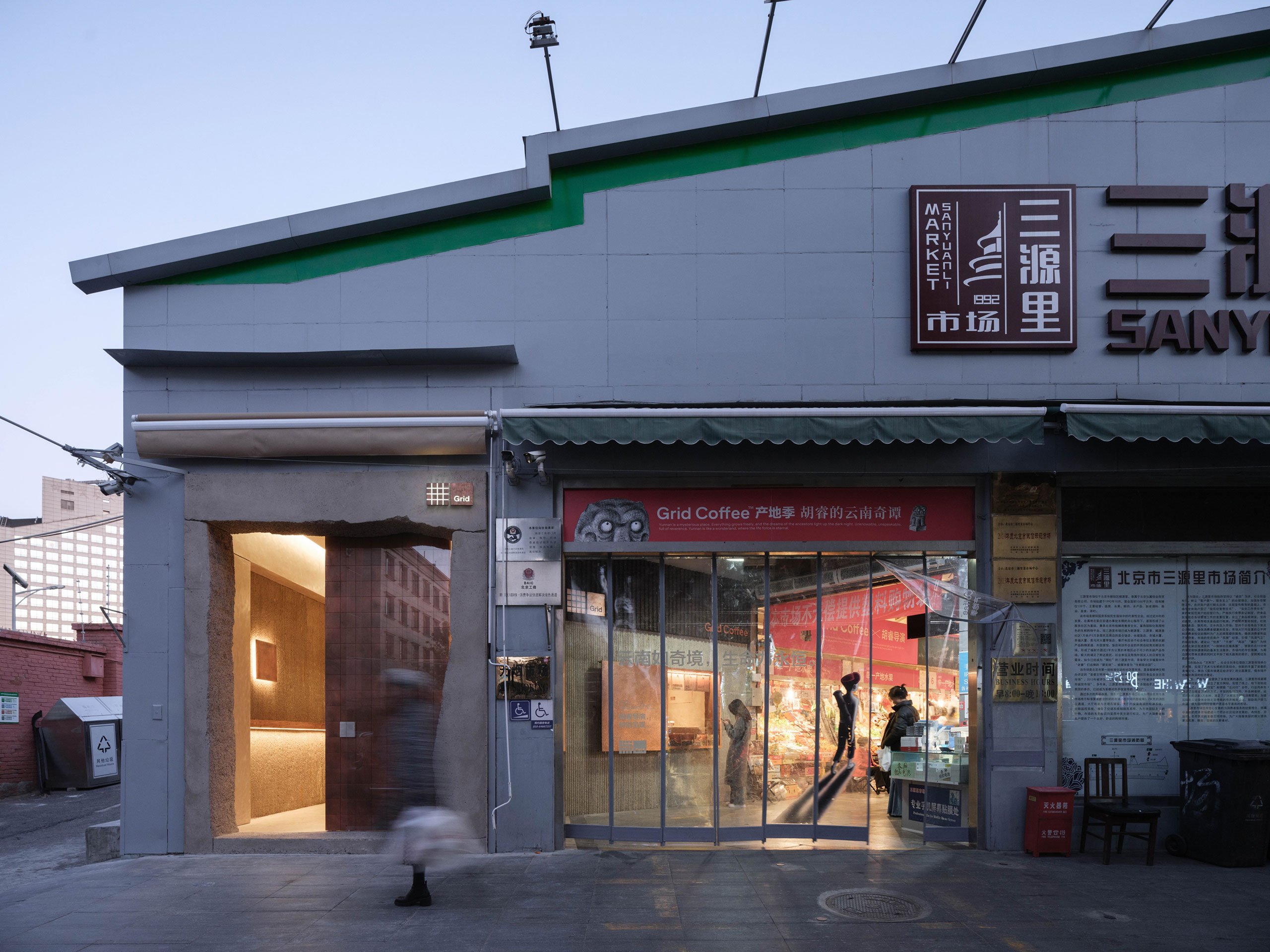
베이징의 스페셜티 커피 체인점 그리드 커피의 의뢰를 받아 최신 전초기지를 설계한 베이징의 일본 사무소 B.L.U.E. 건축 스튜디오는 대사관 지구와 호텔이 늘어선 량마강변에 인접해 있어 30년 넘게 현지인과 외국인에게 서비스를 제공해 온 인기 시장인 산원리 푸드 마켓의 일부인 25평의 좁은 공간과 까다로운 환경을 극복해야 했죠. 극도로 미니멀한 공간이지만, 시장의 다양한 노점과 신선한 농산물을 반영하는 풍부한 질감과 수공예 디테일 덕분에 다채롭고 혼란스러운 주변 환경과 조화롭게 어우러져 있습니다. 단순함과 기능성이라는 원칙에 따라 콘크리트, 구리, 목재의 원소 팔레트를 사용하여 소박한 건물을 최대한 활용하여 지역 커뮤니티를 보완하고 활성화하는 데 성공한 진정으로 독특한 환경을 만들었습니다. 건축 팀은 좁은 거리의 파사드에 맞서야 하는 상황에서 사람들의 시선을 사로잡을 수 있는 방법을 고안해냈습니다. 조각 같은 콘크리트 포털이 전체 높이의 구리 슬라이딩 도어가 지배하는 대형 유리 입구를 둘러싸고 있습니다. 브랜드 이름에서 영감을 받은 독특한 격자 패턴을 만들기 위해 수작업으로 조립한 175개의 산화 구리 사각형 패치워크로 구성된 이 문은 견고하고 추상적인 형태의 콘크리트 포털과 시각적으로 눈에 띄는 대조를 이룹니다. translate by DeepL


Commissioned by Beijing speciality coffee chain Grid Coffee to design its latest outpost, Beijing based Japanese practice B.L.U.E. Architecture Studio had to contend with a compact 25-square-metre footprint and a demanding setting – the coffee shop is part of SanYuanLi Food Market, a popular market that has been serving locals and expats for over 30 years due to its proximity to the embassy district and the hotel-lined banks of the Liangma River. Their answer is a starkly minimalist venue that is nevertheless harmoniously integrated into its colourful, chaotic surroundings thanks to its rich tapestry of textures and handcrafted details that reflect the market’s diverse array of stalls and range of fresh produce. Guided by the principles of simplicity and functionality, the team have made the most of the modest property using an elemental palette of concrete, copper and wood to craft a truly unique environment that succeeds in both complementing and revitalizing the local community.
Having to contend with a narrow street façade, the architectural team came up with an eye catching gesture to draw people in. A sculptural concrete portal frames a large glass opening dominated by a full-height copper sliding door. Comprising a patchwork of 175 oxidized copper squares, manually assembled to create a unique grid pattern inspired by the brand’s name, the door creates a visually striking contrast in relation to the rugged, abstractly-shape concrete portal.
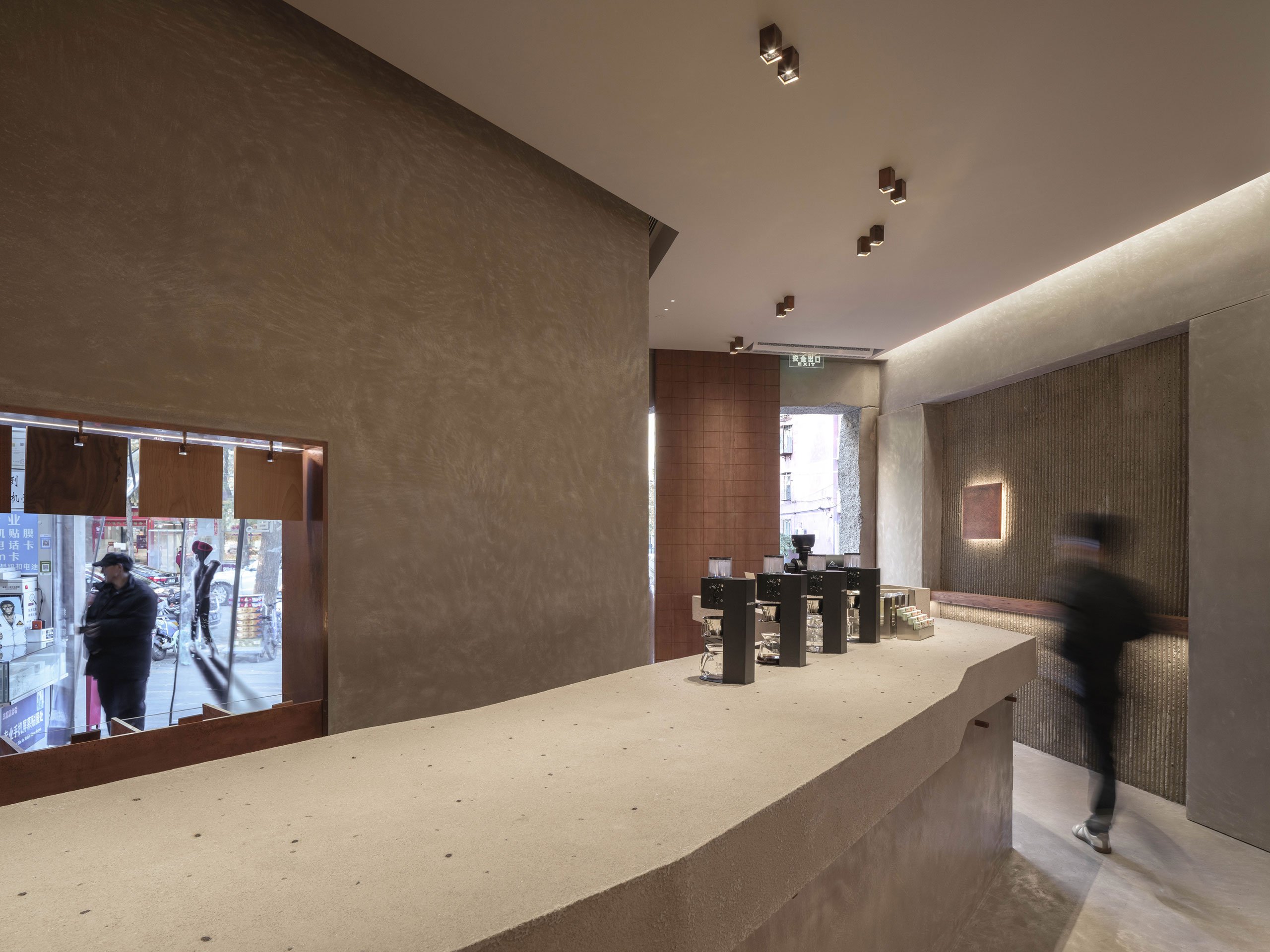
Upon entering, visitors are greeted by a monolithic counter extending from the front to the back, dividing the space into customer and staff areas. Slighting angled, it also separates the ordering and serving zones. Cast-in situ from a cement and coffee bean aggregate, its uniquely spotted finish is a nod to the brand’s commitment to single-origin coffee. The counter’s sculptural sensibility extends to the entire space which is predominantly enveloped in polished concrete surfaces. Hand-cast, striated concrete wall sections add contrast while elm wood wall elements that function as coffee cup stands and backrests add warmth.
Forming part of one of the market’s entrance vestibules (its location is by the market’s north entrance), the coffee shop’s internal façade is also rendered in striated concrete against which a hand hammered copper plate stands out. The copper plate slides open to reveal a retail window that allows customers entering or exiting the market to purchase coffee beans connecting the subdued, minimalist venue with the vibrant, chaotic market, both visually and conceptually, functioning in essence just like another market stall. A custom-made display system advertising the available coffee varieties for sale consists of several square boards made from different woods, each representing a different coffee variety, which can be interchangeably hung above the sales counter. The low-tech displays can also be found inside the coffee shop aptly forming a grid, underlining the dual qualities of simplicity and uniqueness that underpin the design concept:
from yatzer