*프리즘 인 오구 호텔 [ Hiroyuki Ito Architects ] PRISM Inn Ogu Hotel

Hiroyuki Ito Architects-PRISM Inn Ogu Hotel
프리즘 인 오구 / 장기 체류를 위한 호텔 - 도심에서 가까운 곳에 위치하여 공항에서 쉽게 접근할 수 있습니다. 전통적으로 도쿄에서는 4~5명이 함께 숙박할 수 있는 호텔 객실이 상대적으로 부족하고, 있더라도 가격이 비싼 경우가 많습니다. 이 호텔의 목표는 대규모 가족 및 단체 여행객, 특히 아시아에서 온 해외 여행객의 숙박 편의를 도모하는 것이었습니다. 따라서 많은 인원이 함께 투숙할 때나 소규모 그룹으로 투숙할 때 각 투숙객이 똑같이 편안함을 느낄 수 있도록 섬세한 균형을 맞춰 설계해야 했습니다.
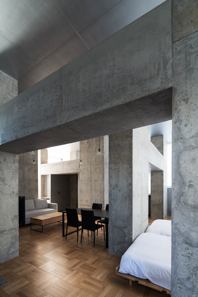
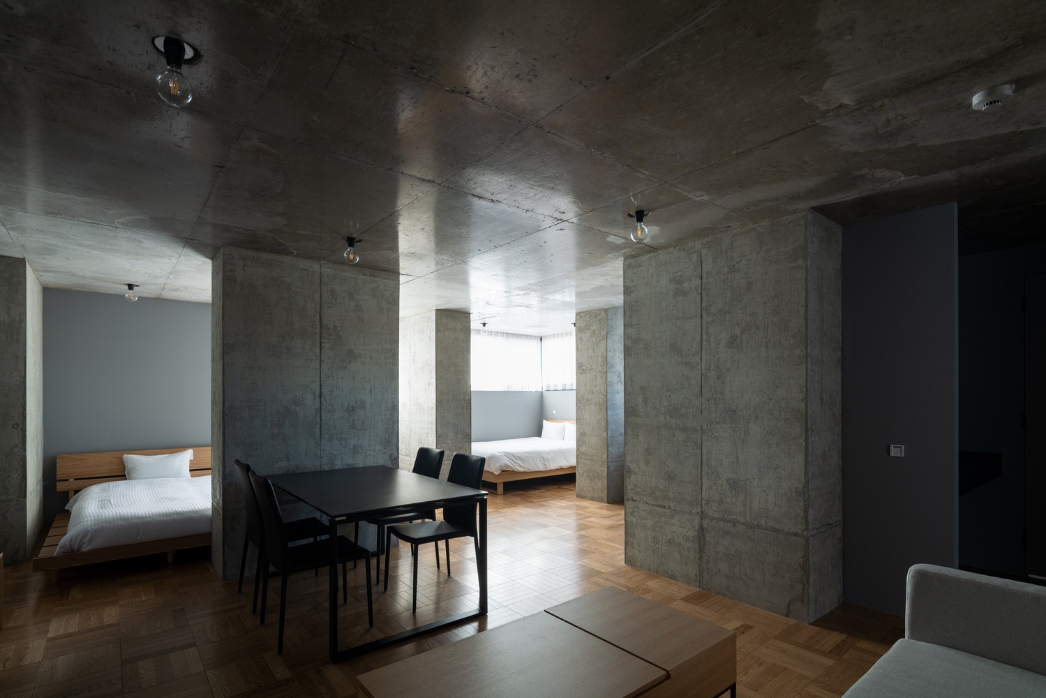
타워의 높이 때문에 처음에는 기둥과 보 시스템이 부담스러울 정도로 클 것으로 예상되었지만, 구조 프레임으로 공간을 분할함으로써 파티션이나 커튼을 사용할 때보다 침대 사이의 적절한 거리를 더 효과적으로 확보할 수 있었습니다. 수직 빔의 교차점에 기둥을 배치하지 않고 엇갈린 기둥 배열을 통해 유동적이고 역동적인 공간을 만들었습니다. 건물의 각 모서리에 기둥을 배치하는 표준 그리드 레이아웃 대신 이 방식을 선택했는데, 이는 공간감을 제한할 뿐만 아니라 침대 치수를 고려할 때 기둥 사이의 가용 거리가 너무 짧아질 수 있었기 때문입니다. translate by Deepl


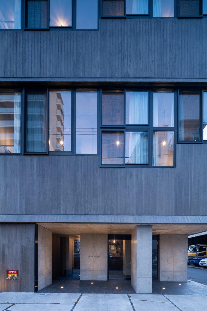

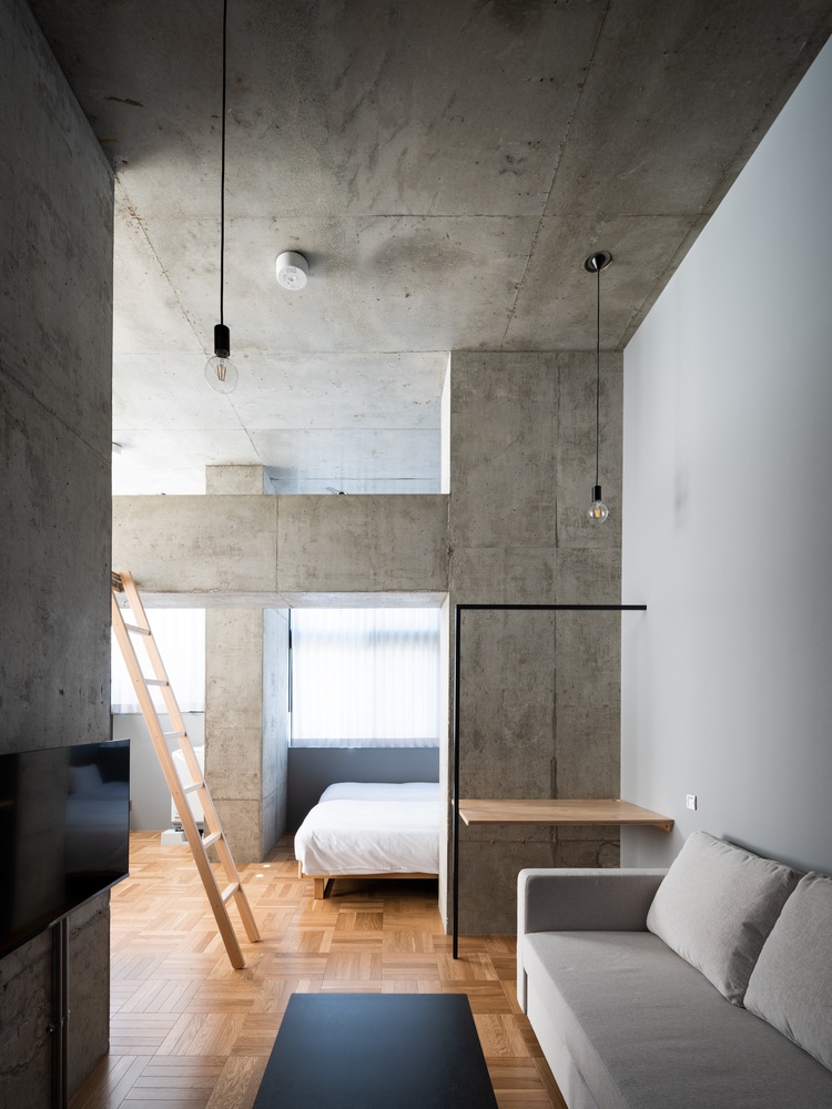

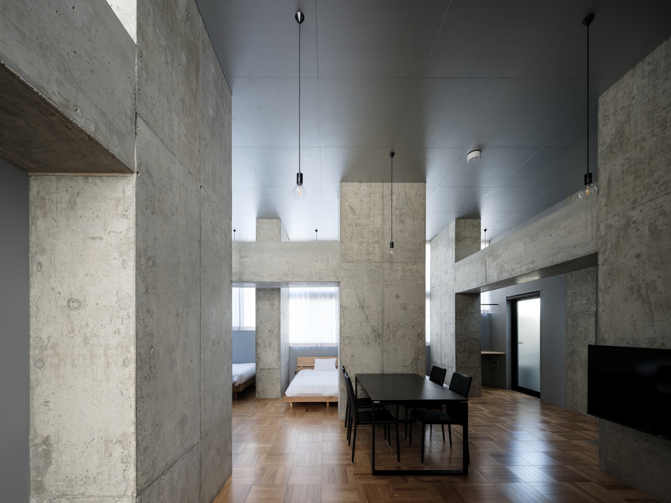
PRISM Inn Ogu / A hotel for long term stays - The project is located on a site close to the city center and is easily accessible from the airport. Traditionally, hotel rooms that can accommodate a group of four or five people together are relatively scarce in Tokyo and, if available, are often restrictively expensive. Here, the aim was to facilitate the accommodation of larger families and groups, particularly overseas visitors from Asia. The resulting design needed to be finely balanced so that each guest could feel equally comfortable when staying together as part of a large group of people or when staying in a smaller group.
Owing to the tower’s height, it was initially expected that the column-and beam system would be overbearingly large; however, by segmenting the space with the structural frame, a suitable distance between beds was more effectively achieved than could have otherwise been using partitions or curtains. A fluid and dynamic space was created through a staggered column arrangement, withholding the placement of columns at the intersection of perpendicular beams. This was chosen over a standard grid layout with columns at each corner of the building, as not only would this have restricted a sense of spaciousness, but based on the dimensioning of beds, it would have meant the available distance between columns was too small.
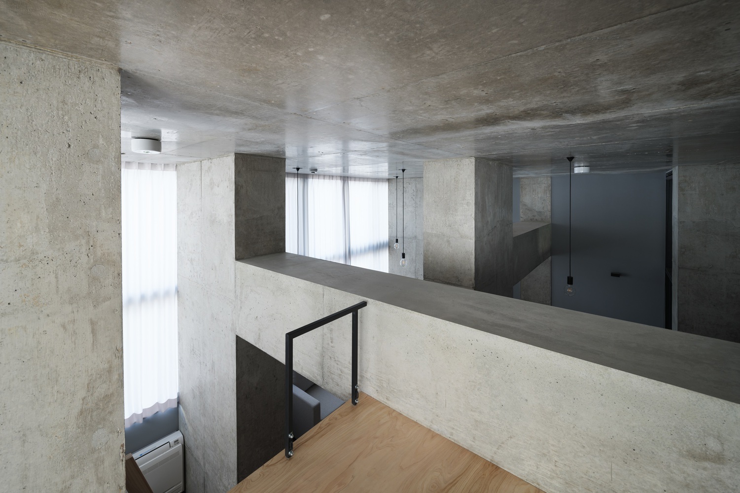
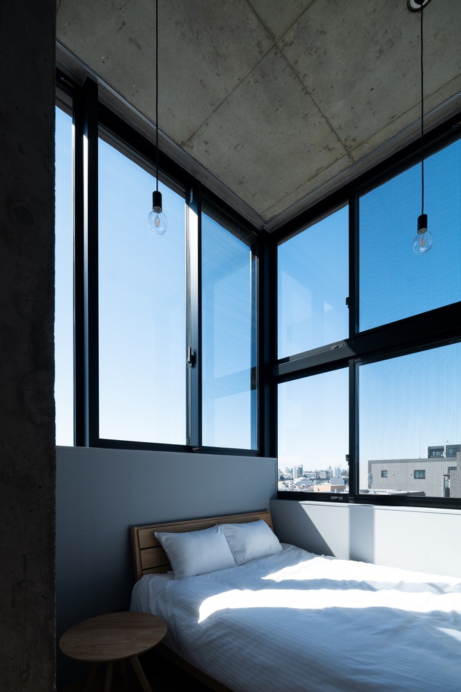
The intermediate reinforced concrete beams that support the loft floor were arranged as windmill sails, and in reversing the direction of these between the upper and lower floors, the rigidity of the entire building was improved. The varying height of the windows on the façade has been carefully composed, mediated by both the internal furniture arrangement and external conditions. This continuous strip of glazing permits light in from three directions to produce as many comfortable internal spaces as possible.
Intermediate horizontal beams have been used to divide vertical columns into two, creating new negative spaces both above and below. In doing so, these intermediate beams can also be seen to fuse two columns into one large-scale structural object. Throughout, the structure corresponds to the scale of the body and presents places for people to inhabit by use as spatial dividers, doorways, nooks for beds, or even as seating. Yet, the structure as a larger whole still simultaneously transcends the human scale and continues to retain its autonomy as a constructive element.
from archdaily