Architects: Monolab architects (Rotterdam)
Location: Rotterdam, the Netherlands
Client: Tijs van Ruiten & Paula Colenbrander
Engineers construction: K-constructies (Rotterdam), Ove Arup (London)
Engineers specifications/costs: Ingenieursbureau Multical (Rotterdam)
Advisor installations: Schwagermann (‘s-Gravenzande)
Contractor: Bouwbedrijf Hofman (Maasdijk)
Construction Roof tent: Stre@m (Rotterdam)
Design year: 2001
Construction year: 2003
Budget: 238.000 euro incl. tax
Constructed Area: 156 sqm, 537 cbm
Photographs: Monolab
The poetics of metaphor in architecture is what comes to mind when one investigates this house in a row. Monolab discarded the formalism of traditional dutch houses that derive their setup from social logic: a façade hiding and garding the bourgeois interior as a shrine , while lace curtains allow to monitor the street in low profile. The Body House draws more from a Roman layout - organised around the emptiness of the atrium - and the premodern houses that lack context but intensify their introverted way of looking into the interior by hallowing the centre of the house, around a defining domestic element (stairs, terrace, fireplace, …) that symbolises the most important function of the house.
The Body House is a topological puzzle of architecturalized domestic elements in a metaphorical juxtaposition. Something you can find in Dutch supermodernism, like in Rem Koolhaas’ Kunsthal in Rotterdam, for whom Jan Willem van Kuilenburg has worked after graduating.
The clients preferred spatial quality over square meters, focused around the dining area and the 25-year-old Bulthaup kitchen as the heart of the house. Hovering between the outer walls, Monolab framed this heart and wired it to give it a structural, spatial and social context.
They let it grow into a body and gave it a skin to function as an organism, hosting the other symbionts, the residents. This body was deformed to arise the different spatial qualities around it.
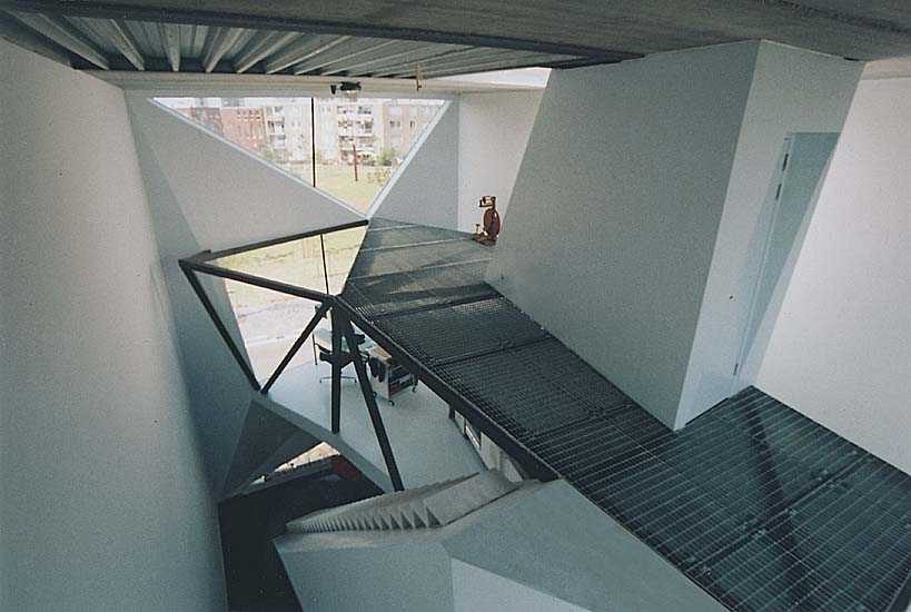
While blobs are amorph - no boundaries - this Body was facetted in triangles to accomodate various edges and frames that point and focuse on the space around it.
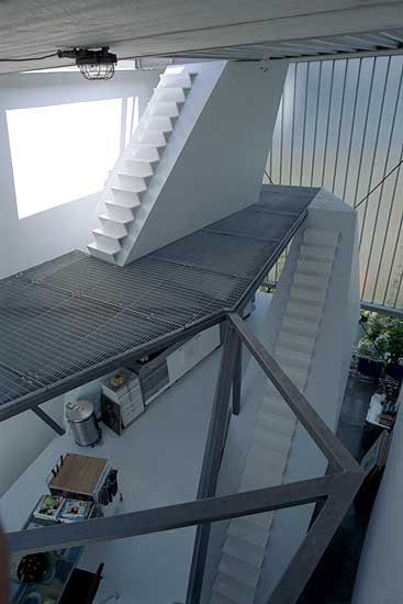
To preserve emptiness in the living space, it absorbs all other functions: bathroom, restroom, wardrobe, installations, stairs and trajectories for cables, plumbing and canals for heating and ventilation.
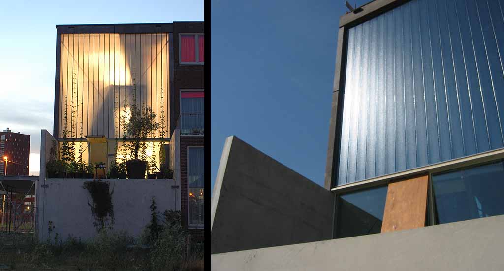
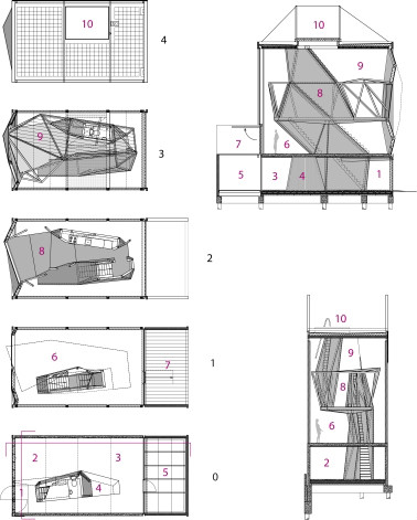
The urban multiplex affirms the order of the classical canon: a tripartite scheme*. The building is characterized by three principal divisions: a concrete base consisting the entrance and bedroom with patio; a light cap at the top of the building that accomodates a roof terrace with nylon tent and a shaft with the Body that connects cap and base.
*tripartite scheme: see Greek temples; also highly visible in the work of Louis H.Sullivan, father of the modern skyscraper
The constant dichotomy that can be found in the house - simple but complex, refined but robust, rigid but faceted - also applies for this scheme: the roof terrace is free, light, flexible and thin; the concrete plinth acts introvert, dark and heavy.
Four wooden parts connect the house to the outer world: the pivoting entry door, the patio door in the bedroom, the window for the terrace above this patio and the sliding plate that gives access to the roof terrace.
The front façade was pushed and pulled by the body so framing the landscape in three different views: the park, the river and the skyline of Rotterdam.
The vertical circulation is emphasized as an architectural promenade from ground floor to roof terrace, reinforced by the Body that even swallowed a stair, becoming hidden as an organ of the Body.
Using these raw basic materials - concrete, steel and wood - in combination with the ingenious skin of the Body - epoxy on fiberglass on multiplex - its visual appearance radiates spatial poetry produced by technology.
The base was made in cast concrete with prefab concrete panels for the patio. The prefab Body - square steel tubes with variable thickness- was transported in parts, put together on site and positioned by crane between the outer walls within a steel cage of portals. The Body stabilizes the entire steel construction on the plinth, while a part of the concrete is being carried by the foot of the body. The head floor of the Body is made in 8mm steel plates with floor heating in copper pipes. The roof terrace has two steel portals, supported by steel cables. It permits a lot of combinations of tensile clothing.
It was possible to construct the house for a low budget because of detailed 3d design, good preparation and fast building: it took only 5 months to have a wind- and airtight building.
One can find multiple overlaps in architectural linguistics with Le Corbusier’s Villa Savoye (1931), Koolhaas’ Villa Bordeaux (1998) and even with Palladio’s villas (16th century): the dramatic exterior motifs, the use of economic materials and the internal harmony and balance. Like Villa Savoye and Villa Bordeaux, the stacking creates three different atmospheres, linked to the routine of sleeping/living/relaxing.
Monolab likes simple and crystal clear concepts. As life patterns have become increasingly dynamic - living/working/leisure are blended - the infrastructure around it needs flexibility. Design can thereby be generated and powered by density (bringing together functions in concentrated layouts), fusion (cooperation and/or merging op previously separated functions) and parallellism (the accessibility to several functions at the same moment in the same place). Those are Monolab’s design instruments.
from archdaily
Location: Rotterdam, the Netherlands
Client: Tijs van Ruiten & Paula Colenbrander
Engineers construction: K-constructies (Rotterdam), Ove Arup (London)
Engineers specifications/costs: Ingenieursbureau Multical (Rotterdam)
Advisor installations: Schwagermann (‘s-Gravenzande)
Contractor: Bouwbedrijf Hofman (Maasdijk)
Construction Roof tent: Stre@m (Rotterdam)
Design year: 2001
Construction year: 2003
Budget: 238.000 euro incl. tax
Constructed Area: 156 sqm, 537 cbm
Photographs: Monolab
The poetics of metaphor in architecture is what comes to mind when one investigates this house in a row. Monolab discarded the formalism of traditional dutch houses that derive their setup from social logic: a façade hiding and garding the bourgeois interior as a shrine , while lace curtains allow to monitor the street in low profile. The Body House draws more from a Roman layout - organised around the emptiness of the atrium - and the premodern houses that lack context but intensify their introverted way of looking into the interior by hallowing the centre of the house, around a defining domestic element (stairs, terrace, fireplace, …) that symbolises the most important function of the house.
The Body House is a topological puzzle of architecturalized domestic elements in a metaphorical juxtaposition. Something you can find in Dutch supermodernism, like in Rem Koolhaas’ Kunsthal in Rotterdam, for whom Jan Willem van Kuilenburg has worked after graduating.
The clients preferred spatial quality over square meters, focused around the dining area and the 25-year-old Bulthaup kitchen as the heart of the house. Hovering between the outer walls, Monolab framed this heart and wired it to give it a structural, spatial and social context.
They let it grow into a body and gave it a skin to function as an organism, hosting the other symbionts, the residents. This body was deformed to arise the different spatial qualities around it.
While blobs are amorph - no boundaries - this Body was facetted in triangles to accomodate various edges and frames that point and focuse on the space around it.
To preserve emptiness in the living space, it absorbs all other functions: bathroom, restroom, wardrobe, installations, stairs and trajectories for cables, plumbing and canals for heating and ventilation.
The urban multiplex affirms the order of the classical canon: a tripartite scheme*. The building is characterized by three principal divisions: a concrete base consisting the entrance and bedroom with patio; a light cap at the top of the building that accomodates a roof terrace with nylon tent and a shaft with the Body that connects cap and base.
*tripartite scheme: see Greek temples; also highly visible in the work of Louis H.Sullivan, father of the modern skyscraper
The constant dichotomy that can be found in the house - simple but complex, refined but robust, rigid but faceted - also applies for this scheme: the roof terrace is free, light, flexible and thin; the concrete plinth acts introvert, dark and heavy.
Four wooden parts connect the house to the outer world: the pivoting entry door, the patio door in the bedroom, the window for the terrace above this patio and the sliding plate that gives access to the roof terrace.
The front façade was pushed and pulled by the body so framing the landscape in three different views: the park, the river and the skyline of Rotterdam.
The vertical circulation is emphasized as an architectural promenade from ground floor to roof terrace, reinforced by the Body that even swallowed a stair, becoming hidden as an organ of the Body.
Using these raw basic materials - concrete, steel and wood - in combination with the ingenious skin of the Body - epoxy on fiberglass on multiplex - its visual appearance radiates spatial poetry produced by technology.
The base was made in cast concrete with prefab concrete panels for the patio. The prefab Body - square steel tubes with variable thickness- was transported in parts, put together on site and positioned by crane between the outer walls within a steel cage of portals. The Body stabilizes the entire steel construction on the plinth, while a part of the concrete is being carried by the foot of the body. The head floor of the Body is made in 8mm steel plates with floor heating in copper pipes. The roof terrace has two steel portals, supported by steel cables. It permits a lot of combinations of tensile clothing.
It was possible to construct the house for a low budget because of detailed 3d design, good preparation and fast building: it took only 5 months to have a wind- and airtight building.
One can find multiple overlaps in architectural linguistics with Le Corbusier’s Villa Savoye (1931), Koolhaas’ Villa Bordeaux (1998) and even with Palladio’s villas (16th century): the dramatic exterior motifs, the use of economic materials and the internal harmony and balance. Like Villa Savoye and Villa Bordeaux, the stacking creates three different atmospheres, linked to the routine of sleeping/living/relaxing.
Monolab likes simple and crystal clear concepts. As life patterns have become increasingly dynamic - living/working/leisure are blended - the infrastructure around it needs flexibility. Design can thereby be generated and powered by density (bringing together functions in concentrated layouts), fusion (cooperation and/or merging op previously separated functions) and parallellism (the accessibility to several functions at the same moment in the same place). Those are Monolab’s design instruments.
from archdaily
'REF. > Architecture' 카테고리의 다른 글
[ Sauerbruch Hutton ] Brandhorst Museum (0) | 2009.02.18 |
---|---|
[ Nora Graw ] Animated Atmosphere (0) | 2009.02.17 |
[ Woodhead ] Pinnacles Interpretive Centre (0) | 2009.02.16 |
[ Wespi de Meuron ] Wood house in Caviano (0) | 2009.02.16 |
[ f451 Arquitectura ] Temporary Extension for the University Pompeu Fabra (0) | 2009.02.15 |