Architects: King Roselli Architetti
Client: Pontificial Lateran University
Location: Rome, Italy
Collaborators: Giandomenico Florio, Ulich Grosse, Christina Hoffmann, Arianna Nobile, Enrica Testi, Katia Scarioni, Toyohiko Yamaguchi
Project chief: Andrea Ricci
Building cost: 7m Euros
Interior Cost: 1m Euros
Materials: Concrete
Project Start: 2004
Project Complete: 2006
Photographers: Santi Caleca (SC), José King (JK), King Roselli Architetti (KR)
On commissioning the project for the new library extension to the Pontificial Lateran University the chancellor Mons. Rino Fisichella was quite clear in his main objective: to bring the activity of reading and the consultation of books as the central occupation of the university.
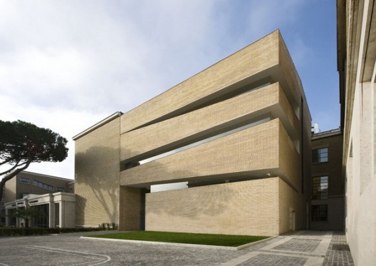
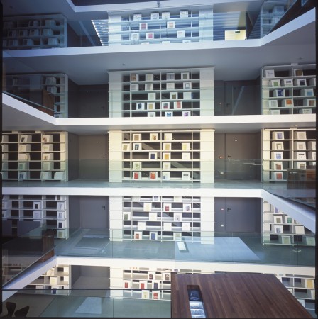
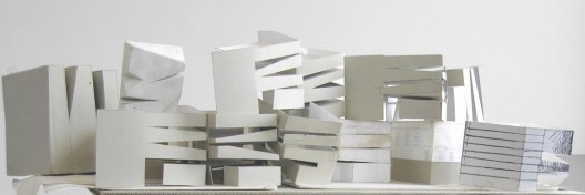
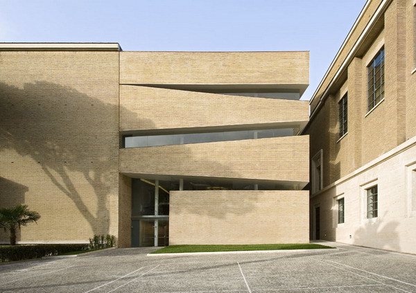
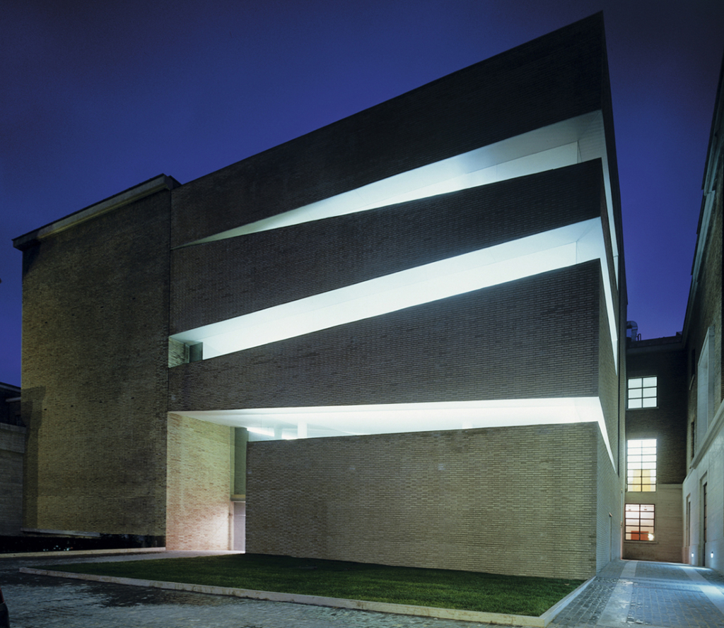
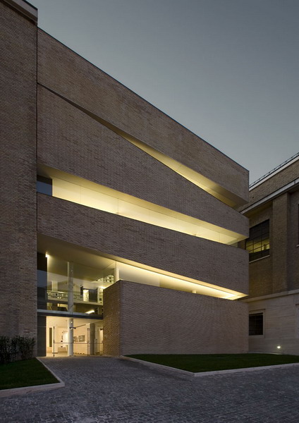
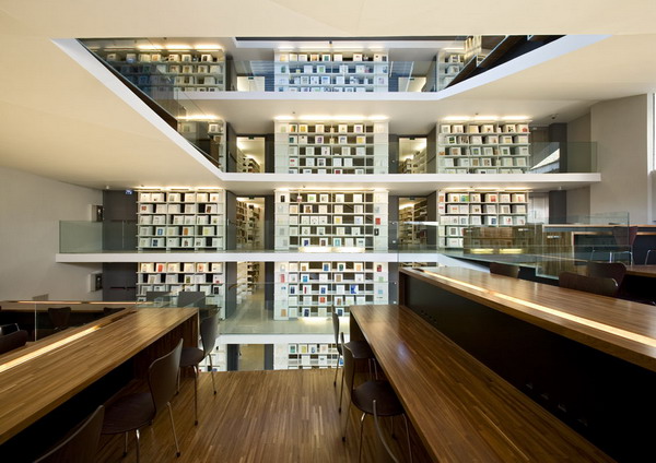
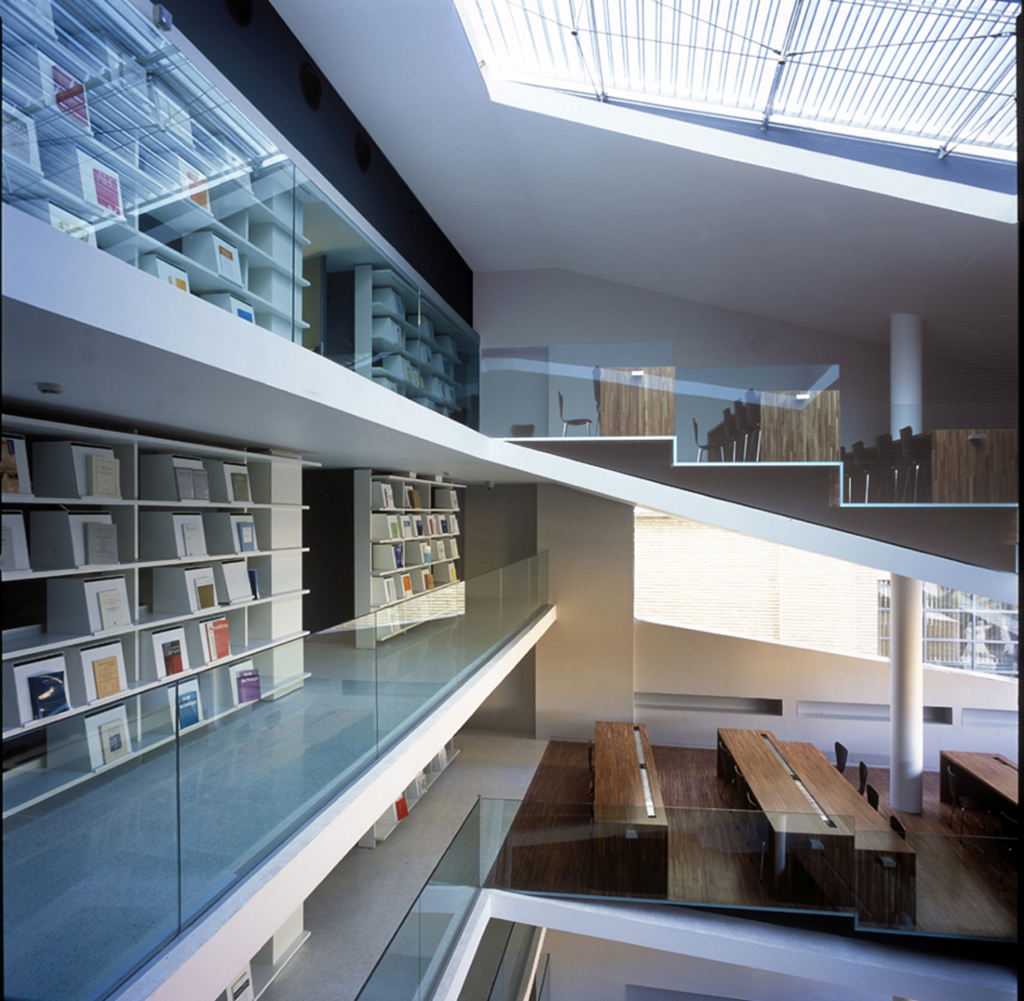
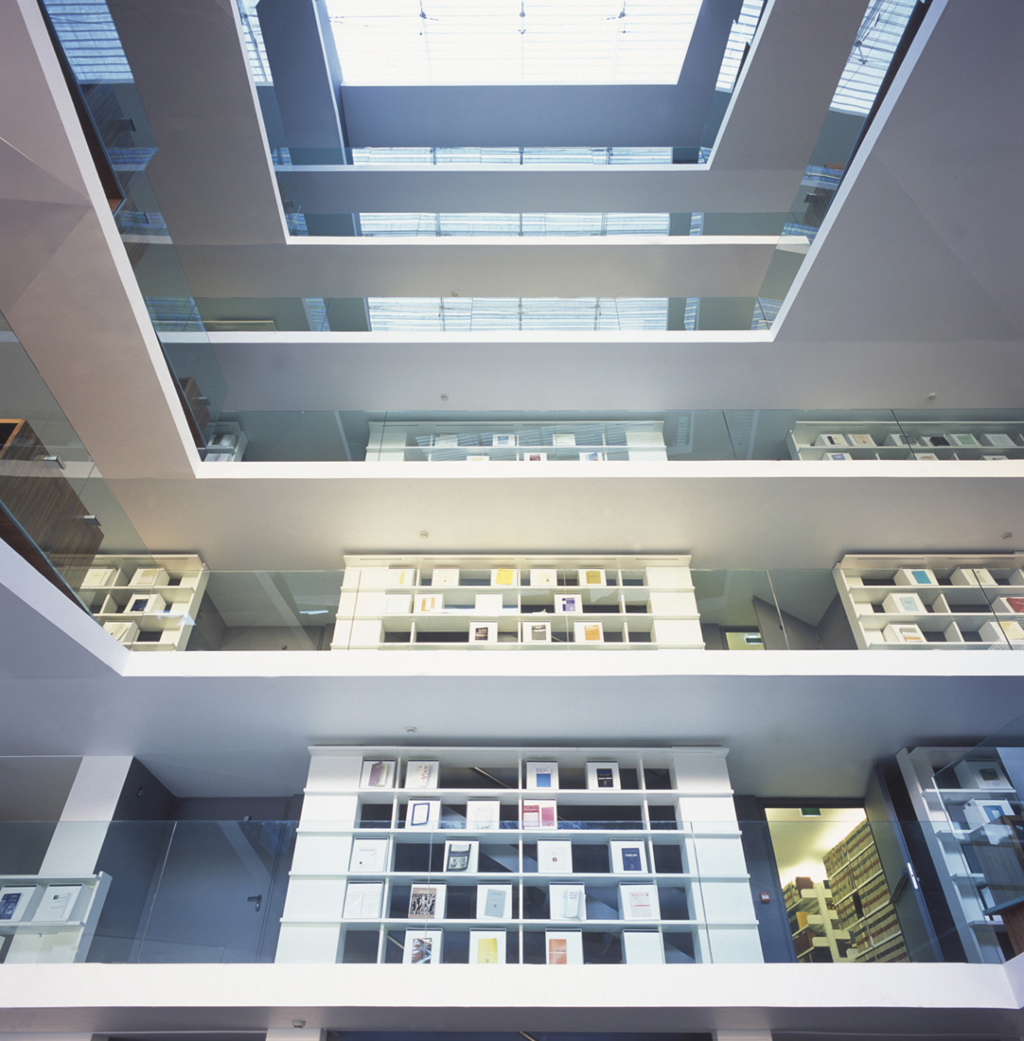
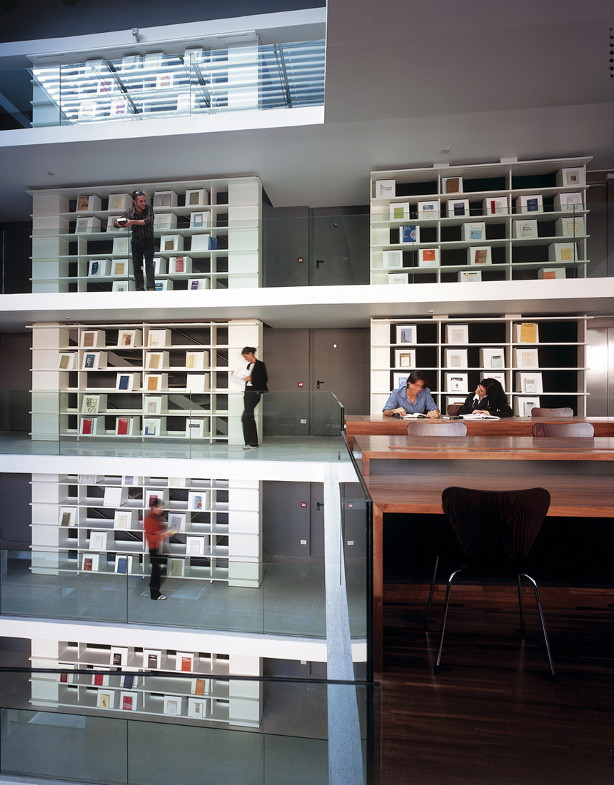
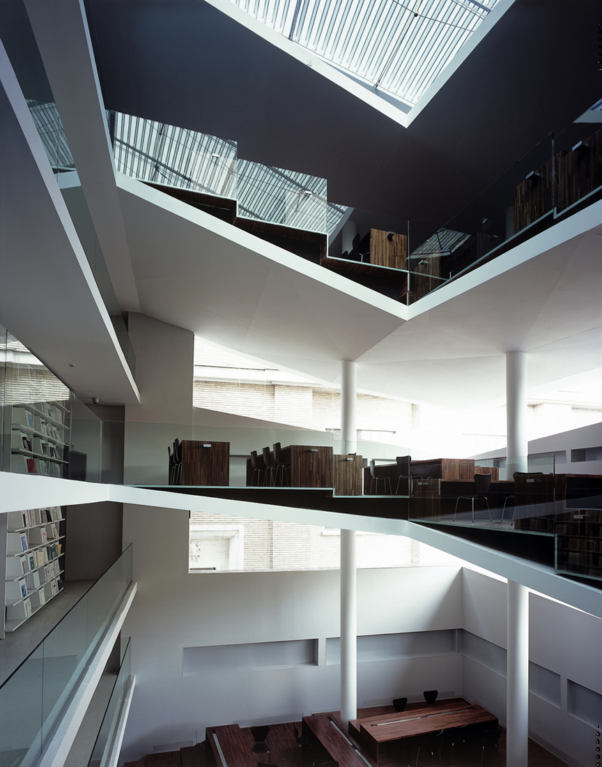
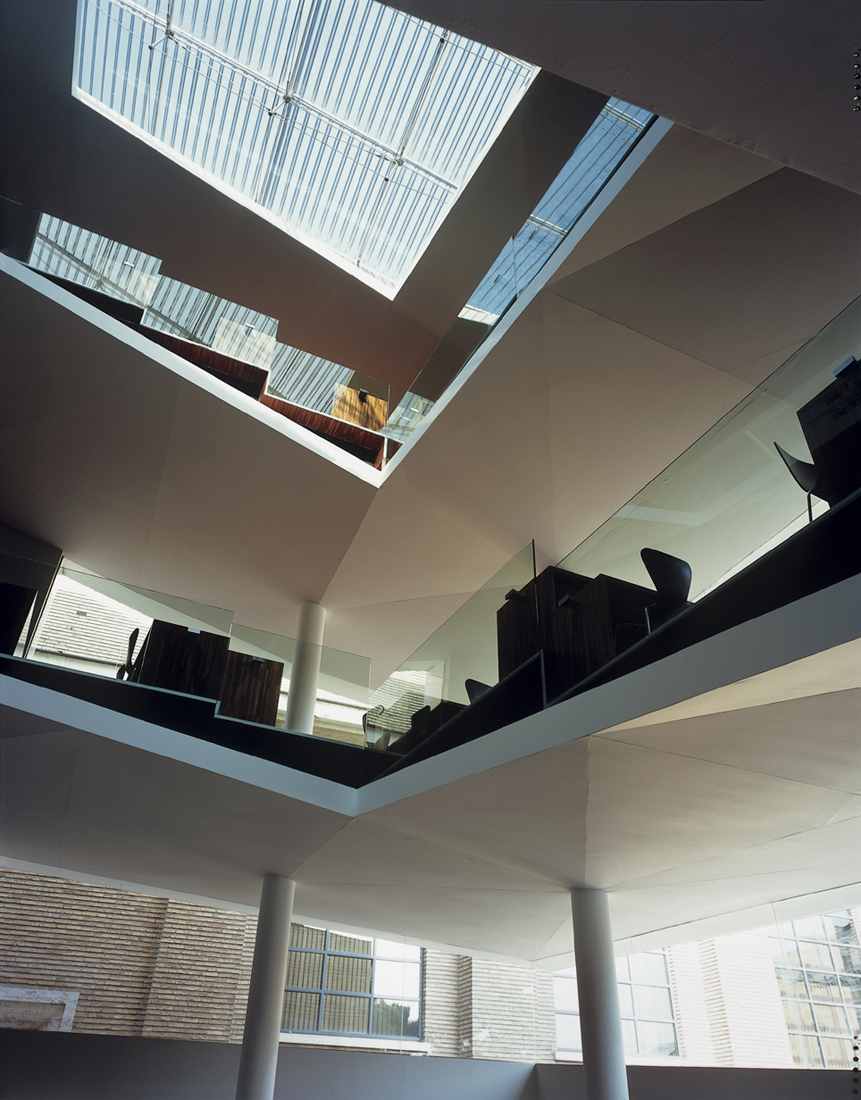
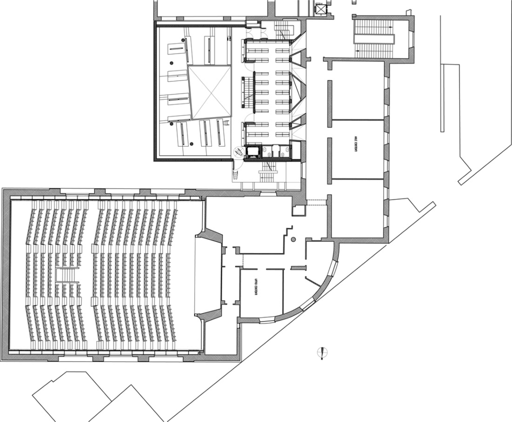
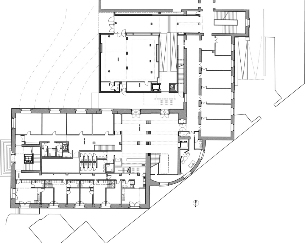
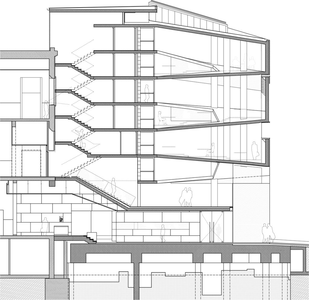
The new reading rooms and book stacks for free consultation are enclosed in in the new extension placed closer to the heart of the university with access from the main spine of the first floor corridor. The reading rooms are now concentrated in a single volume with access to 70,000 volumes and 750 publications housed in the six floors of book stacks in a fire-protected tower. Externally, the new building is placed next to a central block of lecture rooms of the “E” shaped plan. Although it is carefully aligned with the existing volume and clad in the same brick, the new block nevertheless assertively declares its modernity in the play of suspended volumes in light and shade.
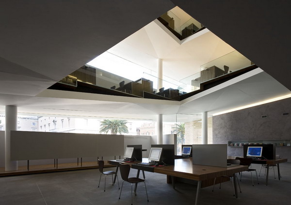
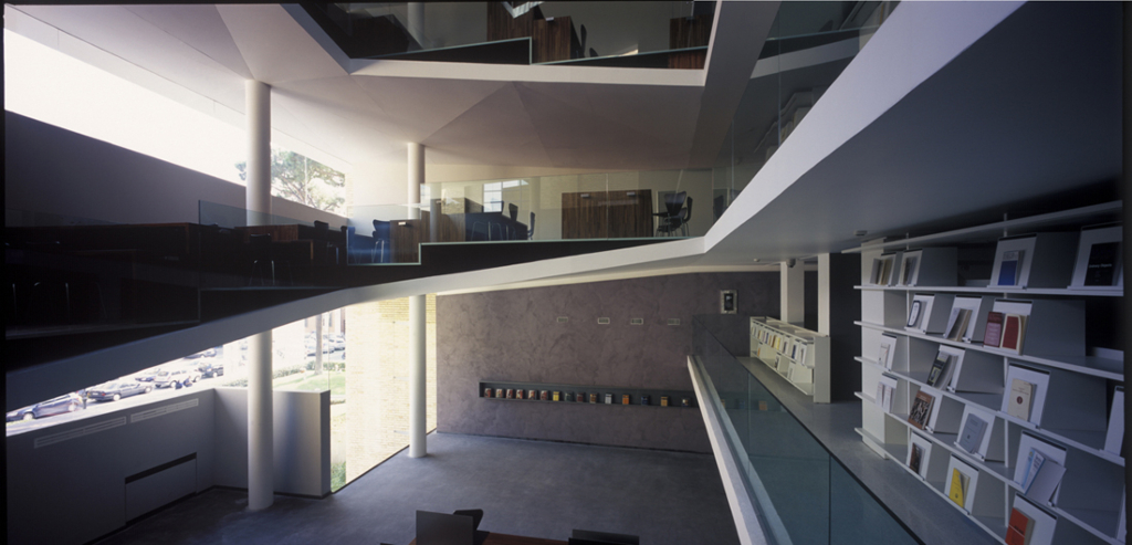
The library’s presence can be perceived from the university; through a series of viewing cones created by joining the window reveals (that once gave on to the exterior) to apertures closed with fire glass in the book stacks. It is entered from the first floor corridor of the main building down a flight of basalt stairs under the first level of the book stacks into a spacious foyer. This is where the locker room, computer indexes-laid on an articulated table, card index, professors reading room and librarians posting are set.
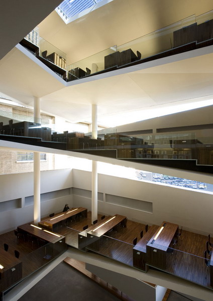
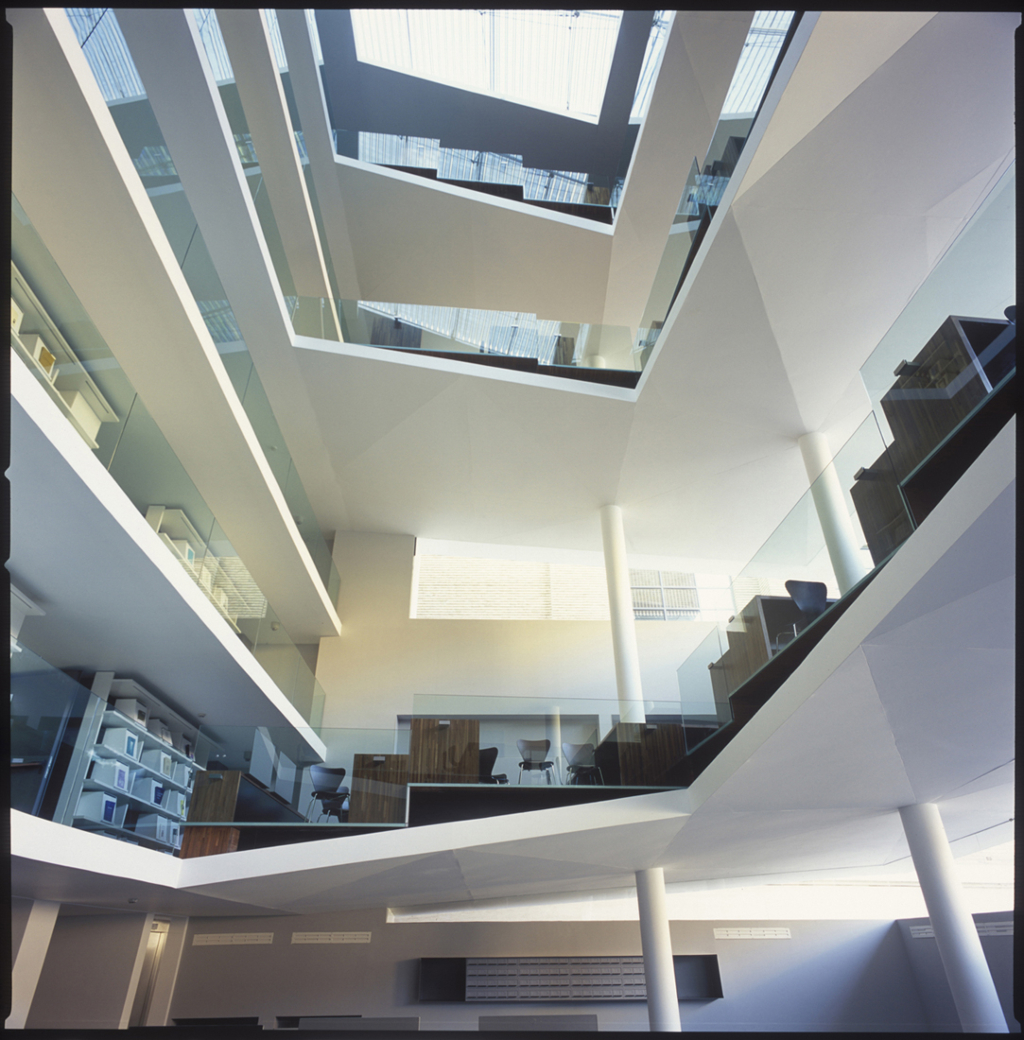
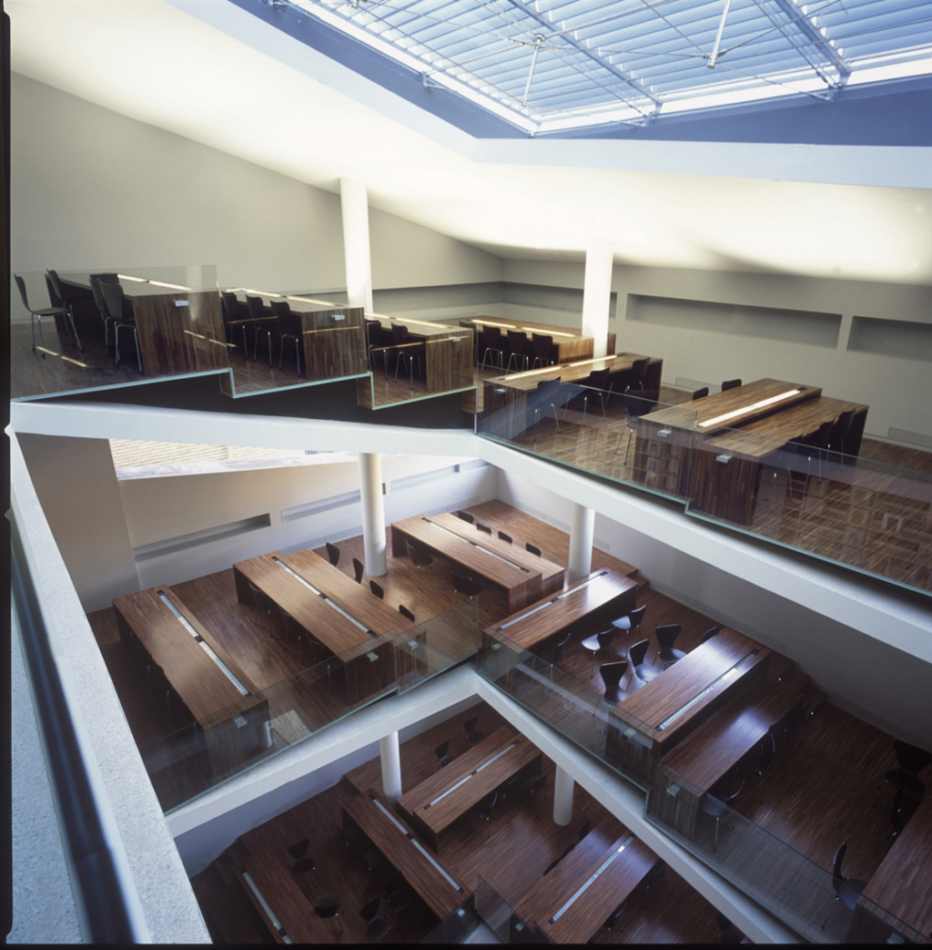
The library is arranged so that for every two floors of book stacks one sloping ramp, “U” shaped in plan, connects them. The book stacks are as low as possible to avoid the use of ladders to reach the highest shelves and, given the thin floor slab, are made look like a set of bookshelves themselves. They are connected vertically by a staircase set between the containing wall and an interior façade of bookshelves facing the reading ramps dedicated to publications, to form in effect a book tower. The slope of the ramps is determined by joining the regularly spaced floors of the book stacks to the irregular cuts in the façade which creates the reality (not simply the effect) of volumes floating in light.
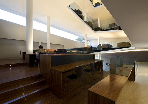
These ramps are the reading rooms- they are levelled with mahogany platforms that accommodate the reading tables at the level changes. These are also made of mahogany block-wood and house the up-lights for ambient lighting.
Auditorium
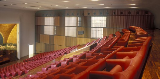
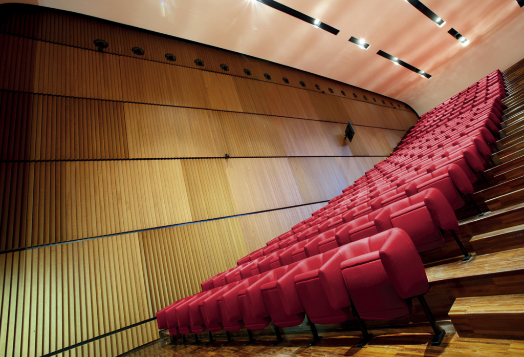
The main assembly hall was restored to conform to modern safety and comfort standards as well as to incorporate the normal technical specification of a modern conference hall- projection facilities, sound diffusion and acoustic control.
The stepped floor was redesigned to provide safety aisles. A new false ceiling and the panelling to the side walls incorporating the black-out system for the existing windows and new seating complete the new design. The curved ceiling expresses an almost elastic quality especially in the treatment of the proscenium architrave defined as a frame pushing the surface into a double curvature. Either side of the stage the entrance doors are completely flush with the plane curving down from the ceiling. The side walls have been clad firstly with a layer of sound absorption panels and then a series of vertical wooden planks set at varying angles to produce a kinetic wave effect. In correspondence with the windows the planks rotate about the vertical axis to regulate the natural light.
Considerable care was taken in the design of the seats. The idea was to achieve a rounded form derived from a moulded upholstery filling. In this case the module is made up a single arm/backrest with the join between modules in the middle of the backrest. When it came to final production Poltrona Frau decided to adopt a more traditional technique, especially for the upholstery filling- and presented a superbly crafted leather armchair, multiplied by 560.
'REF. > Architecture' 카테고리의 다른 글
| [ Roger Bundschuh and Cosima von Bonin ] L40 (0) | 2008.09.18 |
|---|---|
| [Kristin Jarmund Architects] The Norwegian Embassy in Nepal (0) | 2008.09.18 |
| [ Zaha Hadid ]Symbiotic Villa (0) | 2008.09.17 |
| [ Jose María Sáez & David Barragán ] Pentimento House (0) | 2008.09.16 |
| [ Zellnerplus ] LTSC Project (0) | 2008.09.15 |
