Architect: Königsberger Vannucchi - Jorge Königsberger and Gianfranco Vannucchi
Location: Sao Paulo, Brazil
Collaborators: Sandra Dellarole, Huang Kuo Che, Liliane Caparelli, Carla Estrella, Luiz Boscardin and Luiz Paulo Eigenheer
Project Year: 2005-2006
Construction Year: 2007-2008
Site Area: 3,800 sqm
Constructed Area: 25,930 sqm
Photographs: Leonardo Finotti
This project in São Paulo, Brazil, demanded the design of two office towers in a terrain of relatively difficult occupation, because of its narrow and elongated shape. Its location, however, is extremely privileged, situated in the confluence of some of the city’s most important avenues, Paulista Ave., Vergueiro Ave., and Vinte e Três de Maio Ave. The opportunity to the design a new building in such a place also represented a great potential for the creation of a new landmark of great visibility in the city’s skyline.
Thus, two major guidelines were present at the development of the Top Towers project. The first was a group of typical demands from the real estate market, which included the thorough use of the terrain’s building potential, the optimization of the private areas and the adoption of the best possible relation between private and common areas. The second consisted in the architect’s concern of imbuing the project with great formal richness and impressive plasticity that could achieve the goal of creating a new urban reference.
These two relatively conflicting guidelines also needed to be matched through the use of simple and economic constructive techniques, commonly employed by the average building companies in Brazil. This took to the effort of exploring new and innovative applications for common-use, traditional building methods. What was in search was a simple technical solution that wouldn’t force simplicity in the resulting formal effect and that, quite the contrary, could become an architectonical representation of the rich diversity of the surrounding urban tissue.
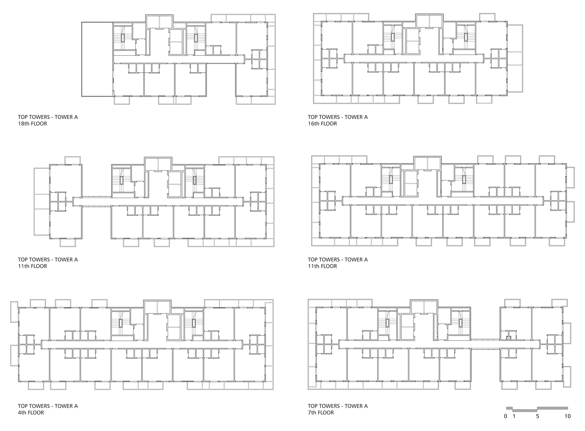
The two towers are composed by compact office rooms that could be united to each other by the owners in various different ways, thus producing almost infinite possibilities of area and shape for the final commercial units. From this concern with the flexibility of the plans came the proposal of adopting multiple setbacks as the towers grew in height, so that there would be different floor models available; these setbacks would be mirrored in opposite directions in each tower, establishing a relation of formal tension between both.
Small terraces were incorporated to each office unit that comprise two different functions. The first of technical character, the installation of individual HVAC units; the second as a space destined for the contemplation of the breathtaking view proportioned by the site. Although open terraces in commercial units are a somewhat atypical proposal, the solution is perfectly coherent, considering the beautiful panoramic view that reaches up to the city’s downtown in one direction and the green fields of the Ibirapuera park in another, also including almost the whole extension of the famous Paulista Ave.
The terraces were distributed along a game of displacements between the floors, creating a composition that at first might seem random, but, seen from a distance, reinforce the sensation of tension between both towers, such as fragments of an explosion spreading in opposite directions.
Structurally, these terraces work as small extensions in balance of the wide concrete slab that supports each floor. This solution allowed the composition of this game of displacements without any need of dislodging the modulation of beams or pillars that form the building’s skeleton. The final result has the appearance of great complexity, but is actually developed on design and structural principles of strict and rigorous simplicity.
The formal complexity is also incremented by a series of empty concavities in various points of the towers, as though some of the units were casually removed. This allowed the contact between the common hall in each floor and the exterior of the building, bringing light and air to this often neglected space.
The towers were positioned along the extension of the terrain, but with a slight disarray between both that makes the whole project have totally different aspects depending on the point from where it’s seen. From the south, they detach themselves as two independent volumes; from the north, they are fused together, becoming a lone monolithic ziggurat.
The materials were selected giving priority to the building economy and efficiency. Finishing materials of simple use, easy maintenance and high durability were privileged, whereas more expensive materials that wouldn’t have great impact on the final aesthetical result were abandoned. This option resides on the acknowledgement that good architecture expresses itself through beauty and harmony of forms, not through the use of seemingly sophisticated materials that add nothing to the quality of the design, only to its final cost. In this way, the project strove to achieve an architecture that could be recognized as generous to the city, without being too costly for the client.
Conceptually, the Top Towers aim to reference, albeit in a contemporary and renovated way, the playful modulated façades of so many of São Paulo’s buildings from the 40’s, 50’s and 60’s that still stand in the city’s downtown. Its impacting language of light and shadows is also related to today’s world contemporary production, one in which Architecture is again an expressive protagonist in the city’s built environment.
Location: Sao Paulo, Brazil
Collaborators: Sandra Dellarole, Huang Kuo Che, Liliane Caparelli, Carla Estrella, Luiz Boscardin and Luiz Paulo Eigenheer
Project Year: 2005-2006
Construction Year: 2007-2008
Site Area: 3,800 sqm
Constructed Area: 25,930 sqm
Photographs: Leonardo Finotti
This project in São Paulo, Brazil, demanded the design of two office towers in a terrain of relatively difficult occupation, because of its narrow and elongated shape. Its location, however, is extremely privileged, situated in the confluence of some of the city’s most important avenues, Paulista Ave., Vergueiro Ave., and Vinte e Três de Maio Ave. The opportunity to the design a new building in such a place also represented a great potential for the creation of a new landmark of great visibility in the city’s skyline.
Thus, two major guidelines were present at the development of the Top Towers project. The first was a group of typical demands from the real estate market, which included the thorough use of the terrain’s building potential, the optimization of the private areas and the adoption of the best possible relation between private and common areas. The second consisted in the architect’s concern of imbuing the project with great formal richness and impressive plasticity that could achieve the goal of creating a new urban reference.
These two relatively conflicting guidelines also needed to be matched through the use of simple and economic constructive techniques, commonly employed by the average building companies in Brazil. This took to the effort of exploring new and innovative applications for common-use, traditional building methods. What was in search was a simple technical solution that wouldn’t force simplicity in the resulting formal effect and that, quite the contrary, could become an architectonical representation of the rich diversity of the surrounding urban tissue.
The two towers are composed by compact office rooms that could be united to each other by the owners in various different ways, thus producing almost infinite possibilities of area and shape for the final commercial units. From this concern with the flexibility of the plans came the proposal of adopting multiple setbacks as the towers grew in height, so that there would be different floor models available; these setbacks would be mirrored in opposite directions in each tower, establishing a relation of formal tension between both.
Small terraces were incorporated to each office unit that comprise two different functions. The first of technical character, the installation of individual HVAC units; the second as a space destined for the contemplation of the breathtaking view proportioned by the site. Although open terraces in commercial units are a somewhat atypical proposal, the solution is perfectly coherent, considering the beautiful panoramic view that reaches up to the city’s downtown in one direction and the green fields of the Ibirapuera park in another, also including almost the whole extension of the famous Paulista Ave.
The terraces were distributed along a game of displacements between the floors, creating a composition that at first might seem random, but, seen from a distance, reinforce the sensation of tension between both towers, such as fragments of an explosion spreading in opposite directions.
Structurally, these terraces work as small extensions in balance of the wide concrete slab that supports each floor. This solution allowed the composition of this game of displacements without any need of dislodging the modulation of beams or pillars that form the building’s skeleton. The final result has the appearance of great complexity, but is actually developed on design and structural principles of strict and rigorous simplicity.
The formal complexity is also incremented by a series of empty concavities in various points of the towers, as though some of the units were casually removed. This allowed the contact between the common hall in each floor and the exterior of the building, bringing light and air to this often neglected space.
The towers were positioned along the extension of the terrain, but with a slight disarray between both that makes the whole project have totally different aspects depending on the point from where it’s seen. From the south, they detach themselves as two independent volumes; from the north, they are fused together, becoming a lone monolithic ziggurat.
The materials were selected giving priority to the building economy and efficiency. Finishing materials of simple use, easy maintenance and high durability were privileged, whereas more expensive materials that wouldn’t have great impact on the final aesthetical result were abandoned. This option resides on the acknowledgement that good architecture expresses itself through beauty and harmony of forms, not through the use of seemingly sophisticated materials that add nothing to the quality of the design, only to its final cost. In this way, the project strove to achieve an architecture that could be recognized as generous to the city, without being too costly for the client.
Conceptually, the Top Towers aim to reference, albeit in a contemporary and renovated way, the playful modulated façades of so many of São Paulo’s buildings from the 40’s, 50’s and 60’s that still stand in the city’s downtown. Its impacting language of light and shadows is also related to today’s world contemporary production, one in which Architecture is again an expressive protagonist in the city’s built environment.
'REF. > Architecture' 카테고리의 다른 글
[ Enric Miralles ] Scottish Parliament, Edimburgo (0) | 2008.11.18 |
---|---|
[ KWK PROMES ] OUTrial House (0) | 2008.11.17 |
[Architects Collective] Origami (0) | 2008.11.17 |
[ Dorte Mandrup ] Skanderborggade Day Care Centre (0) | 2008.11.15 |
[ Wingardh ] K:fem department store (0) | 2008.11.14 |