Architects: Atelier Phileas (member of PLAN01)
Location: Malakoff, France
Client: RATP/SEDP
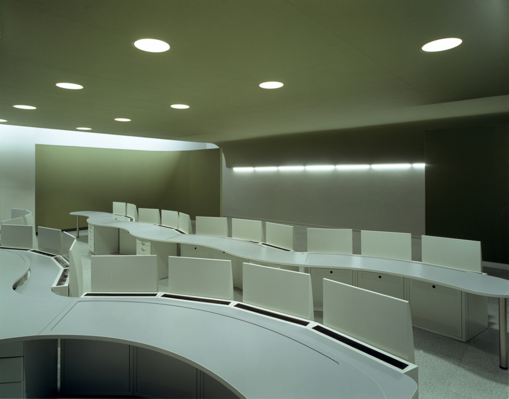
Program: Head quarter room, technical spaces, Offices, meeting rooms, Renovation of the subway station Etienne Dolet, Urban lanscape
Consultant: CETBA
Constructed Area: 1,600 sqm
Budget: 4.5M Euro + tax (US $5.67M + tax)
Project year: 2006
Photographer: Stéphane Chalmeau, Frédéric Delangle
THE SITE:
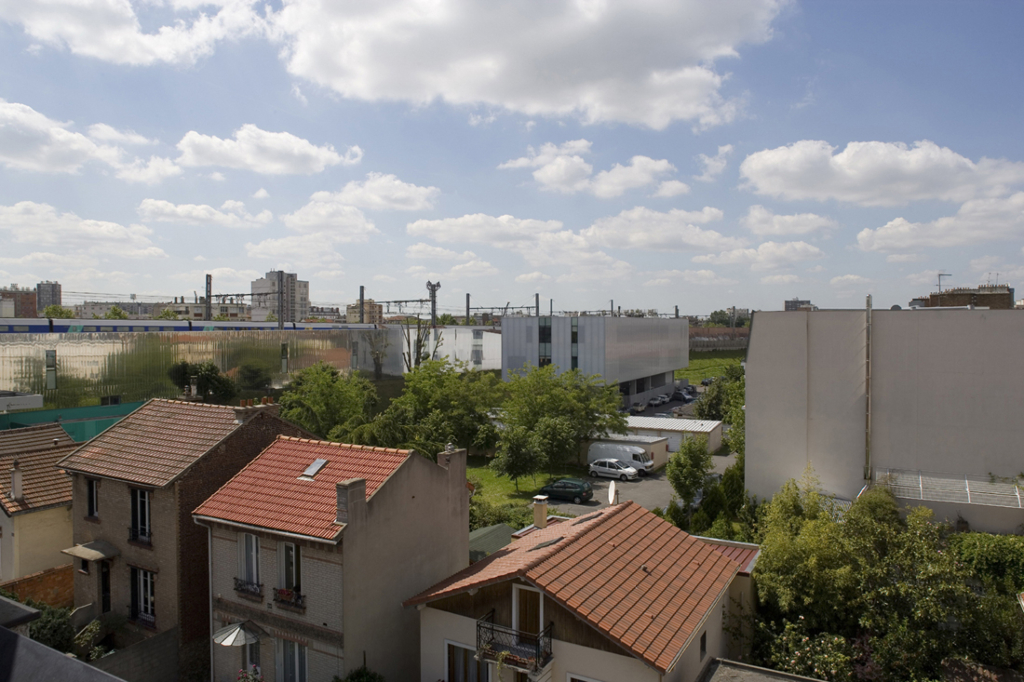
Located close to Paris, the city of Malakoff is a characteristic suburb urban fabric. Separated by the south beltway of the capital, this city, historically proletarian slowly evolved to a high-end neighbourhood for privileged and white collar, willing to escape from the capital ambient stress. This near location allows them to stay in close contact with the city-centre because served by many metropolitan trains.
The geographic context led the Parisian Public transport authority (Regie Parisienne des Transports Parisiens) to implant the control and administrative centre of the metro line 13.
The site is characterized by several remarkable points:
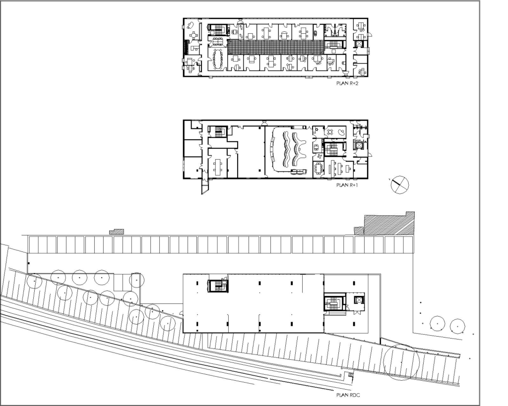
The subway station Etienne Dolet, borders the West side of the building
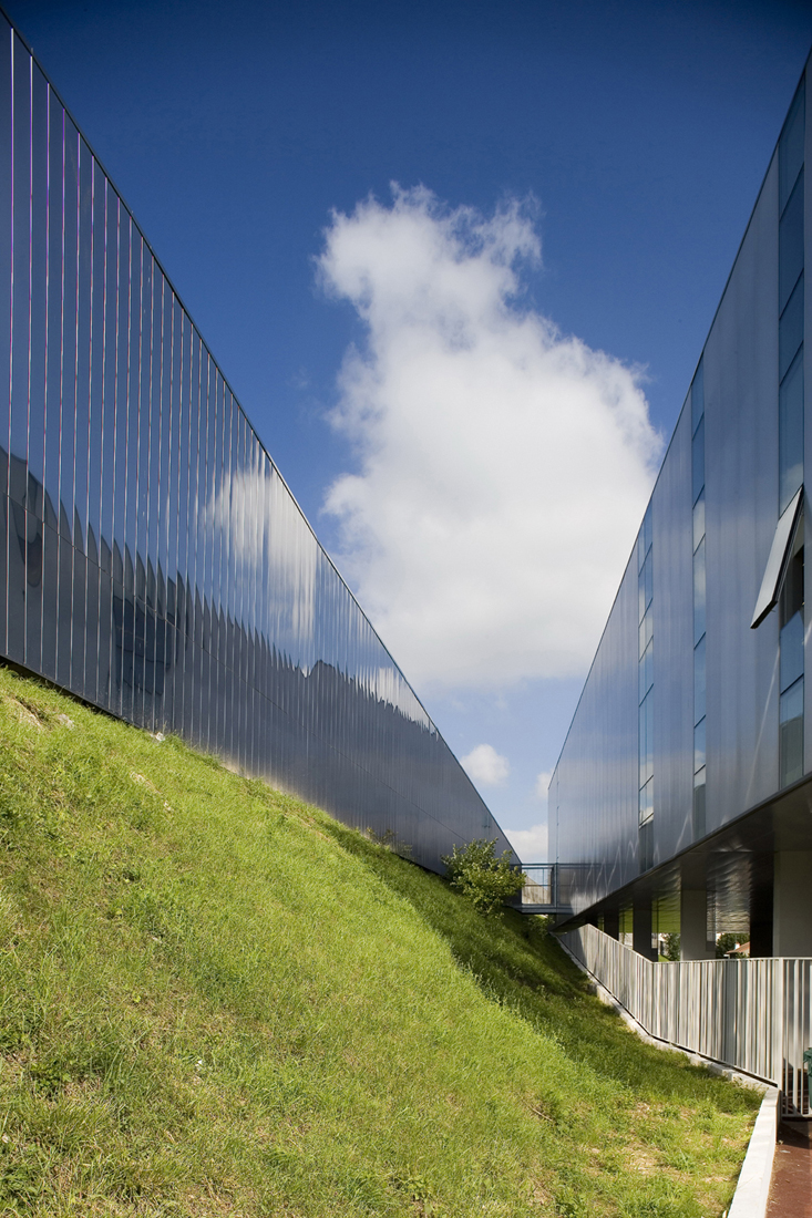
creating a green frontage stretching on all the depth of the site.
The built front develops on 180 metres a cladding of low-grade aspect which gives a poor image of the site.
The construction is set in a large parcel mixed with various landowners that generate divers building alignment.
One of the sides of the building is bordered by a large greenway that stretches around the city. It is one of the cities primary tools tacking part in its urban politic.
THE CONCEPT :
And so it is in architecture, just as it is in mathematics, Less x Less = More.
Numerous negative constraints are added up in this project, the sum
of it, turned out being rewarding by giving high creative potential to
the project.
The building is graved in the geometry of the parcel and opens up next to the embankment;
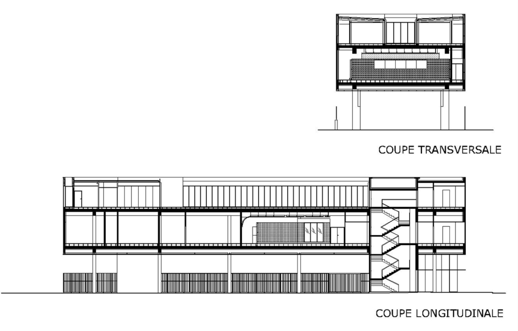
As it was impossible to have an open view on the primary frontage,
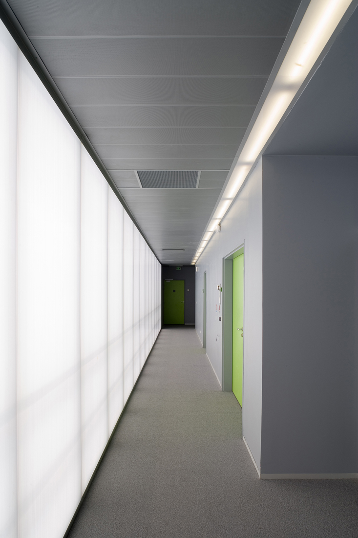
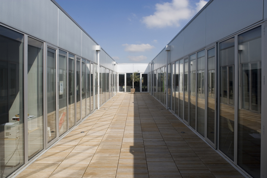
this led us to use some translucent panels and to set the circulations
in the outer side of the building.
These circulations became the essential expression of the project, for
urban regulations to acoustic problems, bringing an ecstatic answer.
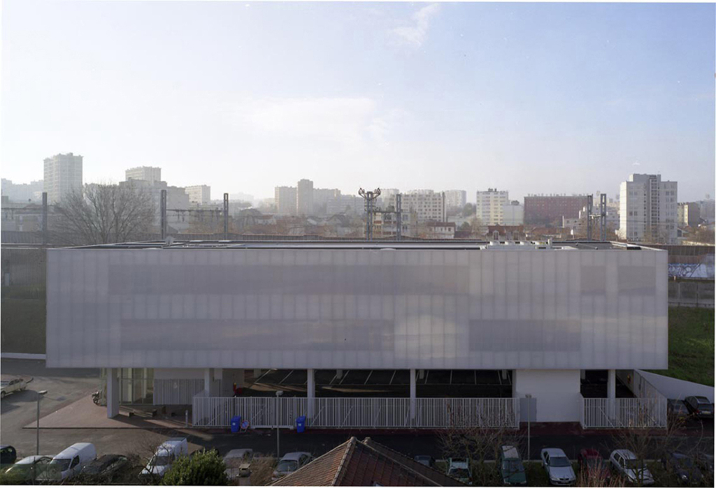
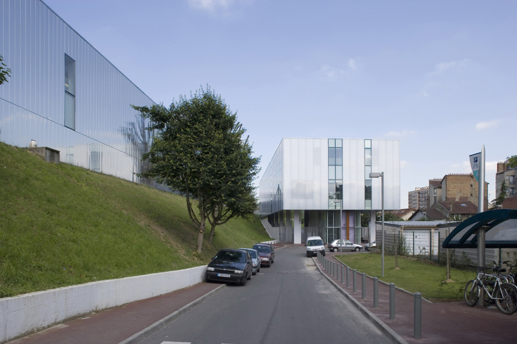
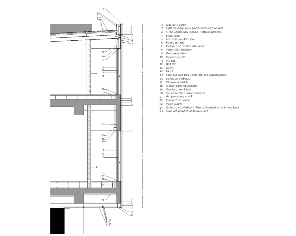
The search of translucence led us to choose polycarbonate as the main material of the front of the building.
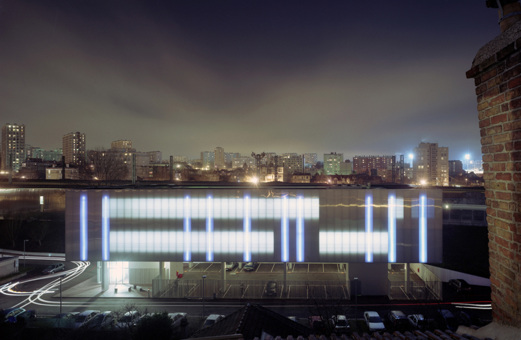
The study of its characteristics led us to choose the ecstatic of the project towards the variation of the light. The architectural object thus becomes a precise play between transparency and reflection, opacity and light.
The project has no colours or materials; it fit’s in with the context matching with the colours of time. It never seems the same, depending where you are located, depending on the intensity of the light, its colour changes.
The Building becomes a dynamic object putting forward its technological aspect. The simple volume becomes enigmatic with its curious vibrations of the front.
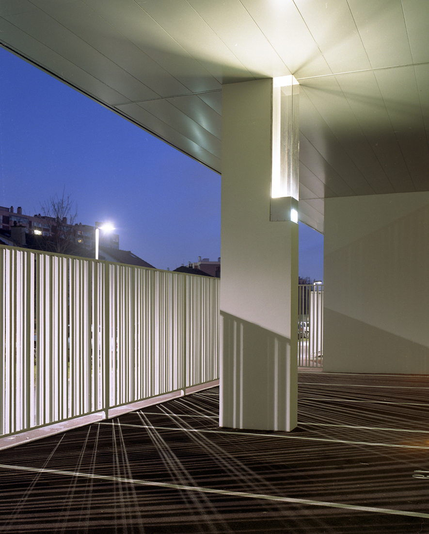
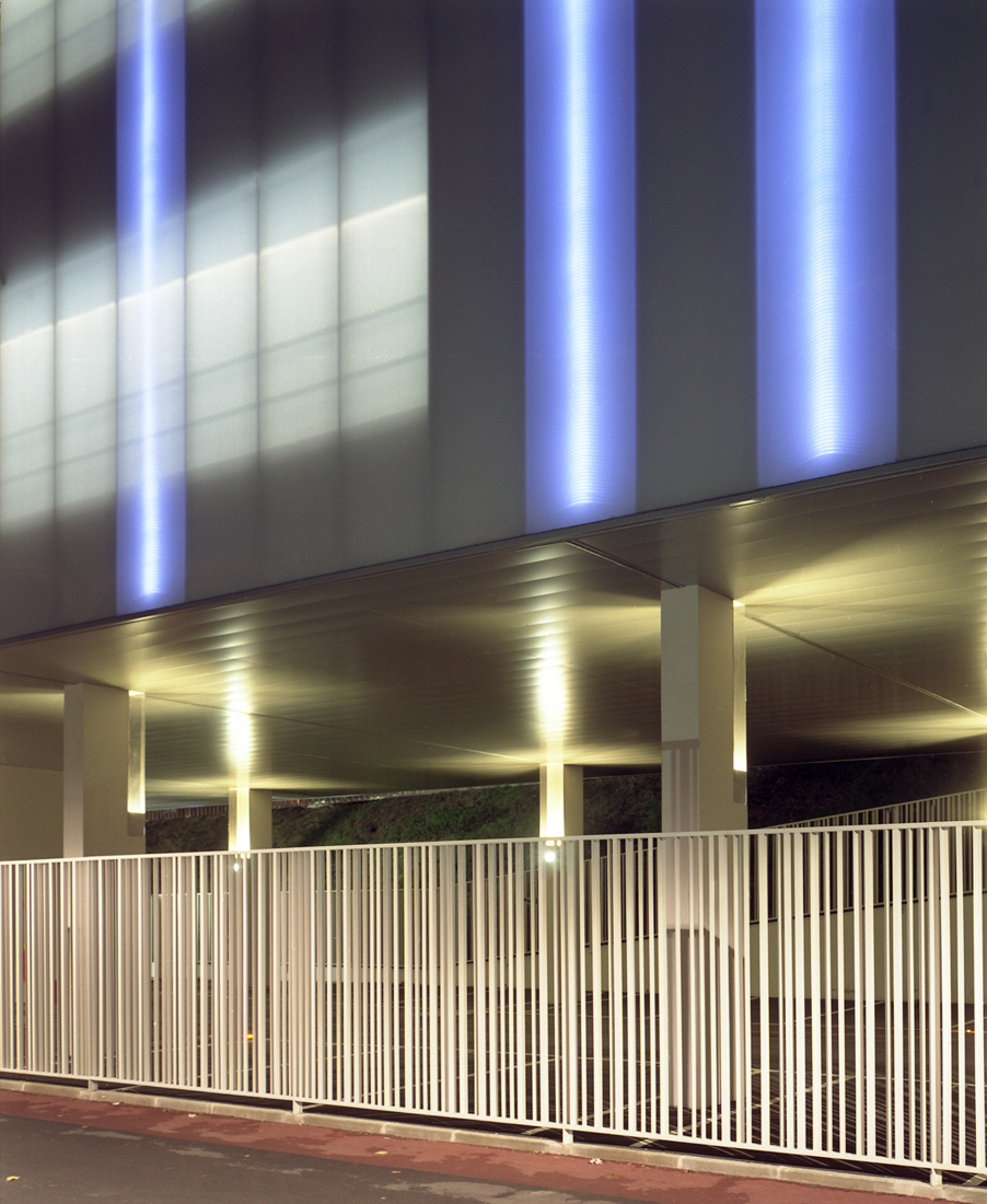
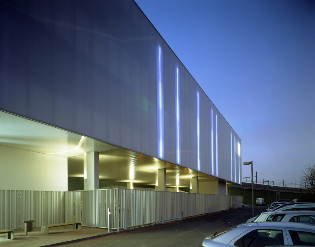
This approach was followed in the same way, in the same sense, through out different elements of the building. The metallic fence of the private park is decomposed just like a bar code, decomposing natural day light during the day, and artificial light at night. The execution details have been thought to obtain a smooth aspect to the building. This aspect removes all the drop shadows to the profit of homogeneous luminous plans.
The integration of vertical electroluminescent diodes completes the work on the light and transforms the building into a night event.
Finally, the treatment of the subway station unifies the whole of the site.
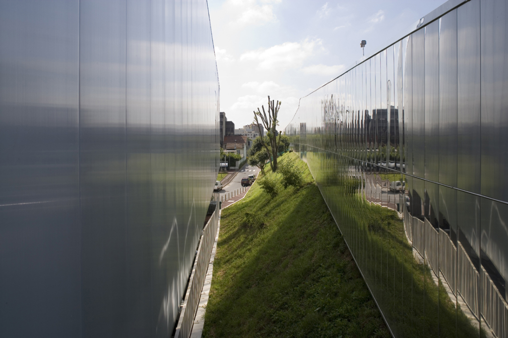
A metal stainless mirror boarding equips the subway station all over its length and prolongs the vegetable slope by a spectacular reflection with the scale of the greenway.
The boarding of the front is not a wall stopping the landscape, but becomes the landscape.
While being prolonged, this metal skin creates link between the quay and the building.
'REF. > Architecture' 카테고리의 다른 글
| [ sereroArchitects ] Canopy (0) | 2010.02.20 |
|---|---|
| [ Peter Zumthor ] Kolumba Museum (0) | 2010.02.19 |
| [ MVRDV ] The Water Cube (0) | 2010.02.19 |
| [ AK2 ] RELAXX sport and leisure center (0) | 2010.02.18 |
| [ Pott Architects ] House L, Glienicke - Berlin, (0) | 2010.02.17 |
