Architects: KPMB Architects
Location: Toronto, Canada
Client: Gardiner Museum
Project Team: Bruce Kuwabara (design principal), Shirley Blumberg (partner-in-charge), Paulo Rocha (design/project architect); Shane O’Neill, Javier Uribe, Kevin Bridgman, Tyler Sharpe, Ramon Janer, Steven Casey, Bill Colaco (project team)
Structural Enginnering: Halsall Associates Ltd.
Mechanical and Electrical Engineering: Crossey Engineering Ltd.
Contractor: Urbacon
Budget: US $7,23M
Photographs: Eduard Hueber & Tom Arban
The Gardiner Museum is one of the world’s pre-eminent institutions devoted to ceramic art, and the only museum of its kind in Canada. It is also one of the major projects in Toronto’s cultural renaissance. The Gardiner renewal, together with the Royal Ontario Museum across the street and the Royal Conservatory of Music around the corner on Bloor Street West, will form a new cultural precinct for the city.
Framed between the neoclassical Lillian Massey building to the north and the Queen Anne-style Margaret Addison Hall to the south, the renewal creates a bolder, more welcoming urban presence for the Gardiner. Inside, the interior is completely transformed to prioritize the display of the museum’s collections and to create a memorable, inviting visitor experience.
The addition of approximately 14,000 s.f., creates a new contemporary gallery to host international exhibits of large-scale contemporary works, provides much-needed storage for the expanding permanent collection, and incorporates new studio and curatorial facilities to support the Gardiner’s popular community-outreach programs and its research activities. The design also greatly enhances the museum’s revenue-generating potential with a larger, more accessible retail shop, a rentable multi-purpose event space, and a destination restaurant run by Jamie Kennedy.
DESIGN SOLUTION: FROM THE INSIDE OUT
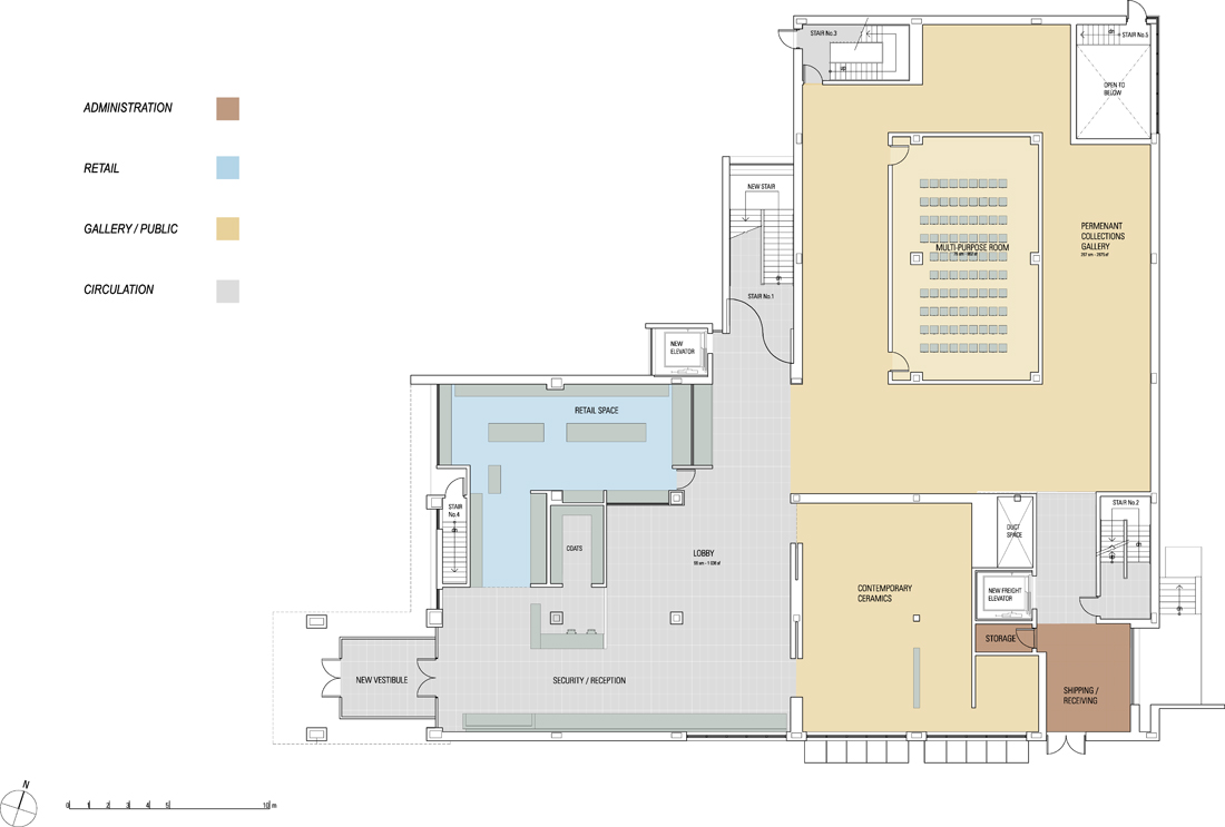
In 2000, Bruce Kuwabara was invited by the Gardiner to design the exhibition Miro: Playing with Fire. This exhibit also provided Kuwabara with an intimate understanding of the inner workings of the institution. When KPMB was selected as the architects for the renewal in 2001, Kuwabara’s first design move was to remove the main stair in the entrance hall. This opened up the ground floor to offer a more generous reception, an expanded museum shop and a new contemporary ceramics gallery. Vertical circulation between floors was shifted to the west with a new addition containing a public stair and passenger elevator. After this key shift, the team of Kuwabara, Blumberg and Rocha then developed an overall design strategy to respond to the Gardiner’s needs and vision for growth.
A BOLDER, WELCOMING IMAGE FOR THE GARDINER
The renewal builds on top of the original structure, designed by Keith Wagland in 1984, to anticipate vertical expansion. The third floor expansion and extension of the original footprint to the street negotiates a bolder image for the Gardiner, while carefully maintaining the intimate scale for which the original building was admired.
The original pink granite exterior is replaced with polished buff limestone to give the Gardiner a more contemporary image. The limestone seamlessly weaves existing and expanded spaces together. Screens of limestone louvers control solar exposure into the upper floors of the west and south facades. The front of the museum is completely re-landscaped with a series of terraced platforms that provide a gradual ascent into the forecourt of the building.
A MEMORABLE VISITOR EXPERIENCE
A cubic volume marks the entrance to the building. During the day, the cube’s broad expanse of floor-to-ceiling glazing creates a reflective surface which mirrors the ROM across the street, and at night acts as a window into the museum’s activities. The generously scaled entrance hall encourages visitors to linger.
The retail store, which was previously only accessible after paying admission, is now visible and inviting from the street.
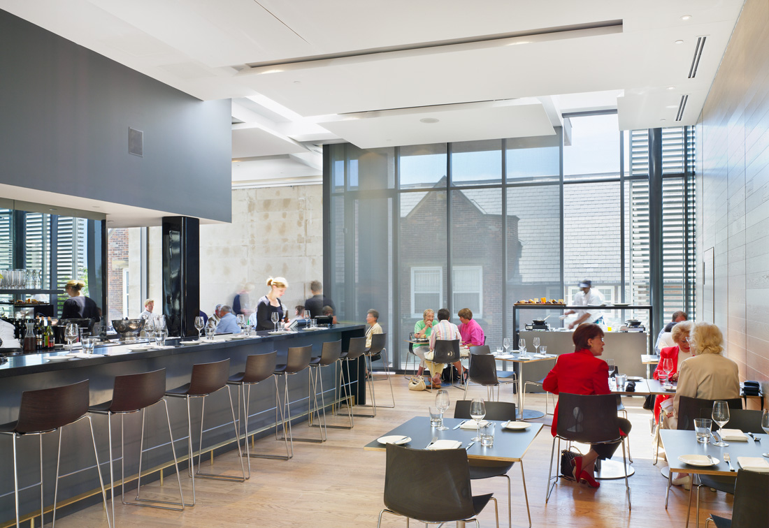
The existing plan of the museum is completely re-configured, and encourages the journey through the galleries to unfold in an ascending order, from the ground to the new third floor. Visitors ideally complete their gallery tour in the new third floor exhibition space. This column-free area with a clerestorey ceiling creates a monumental space for large-scale contemporary and traveling exhibits. The third floor is also where the Jamie Kennedy restaurant, the new multi-purpose event hall, and outdoor terrace are located.
Additional space was also created by sinking the floor of the former underground parking garage by one metre to provide studios and curatorial spaces for the Gardiner’s popular outreach programs and research initiatives.
THE MUSEUM AS A VESSEL FOR THE COLLECTION
The design emphasizes a subtle interplay between transparency and lightness, opacity and weight, to resonate the paradoxical qualities of ceramics. The existing galleries were completely transformed to create a series of highly refined volumes, each scaled relative to the content. A consistent language of materials, custom-designed casework, and precise detailing provide a quiet backdrop against which to showcase the collections and special exhibitions.
A UNIQUE SENSE OF THE GARDINER IN THE CITY
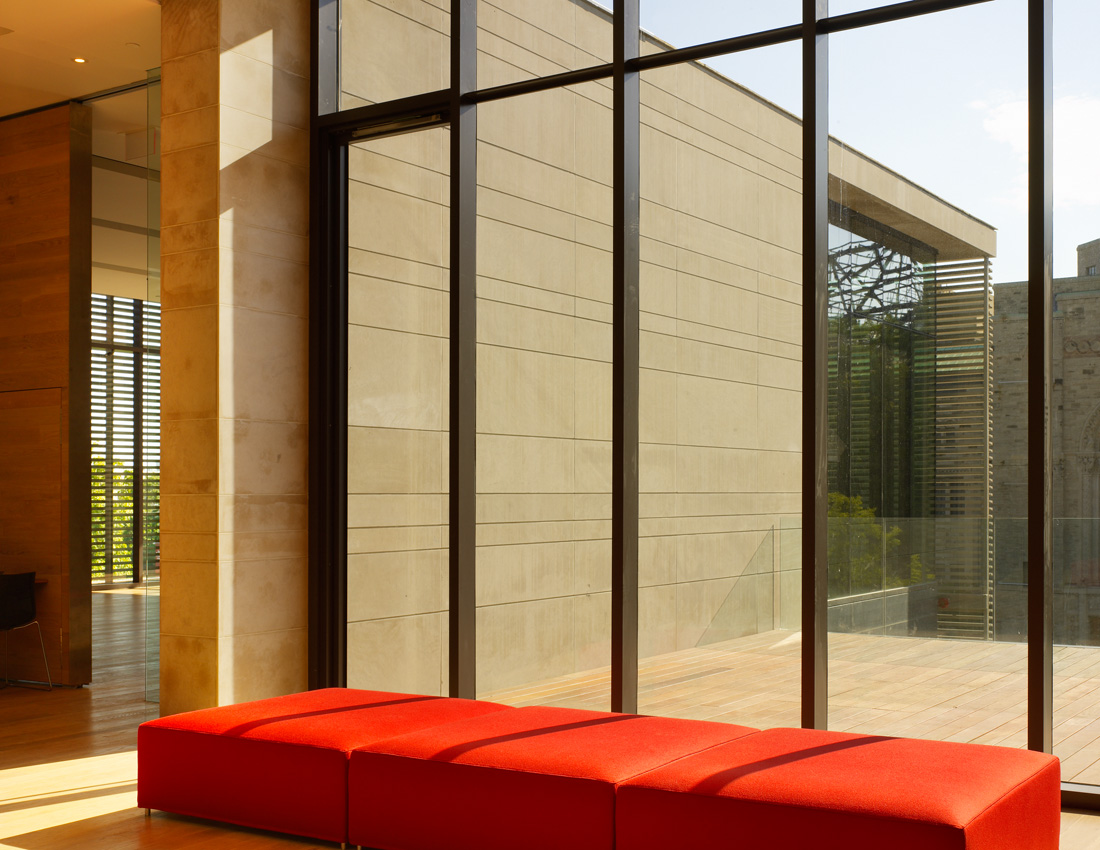
The renewal enhances the Gardiner’s place in the city. Windows are positioned to provide visual breaks in the public spaces of the museum, and to draw attention to the surrounding context at different scales, from closeup views of the historic facades and pediments of the adjacent Lillian Massey and Margaret Addison buildings to framed sequences of the ROM’s heritage building and new Crystal expansion across the street. On the third floor, the multi-purpose space and terrace create elegant new ‘look out points’ that open on expansive vistas of Queen’s Park, the University of Toronto, and the downtown skyline.
Location: Toronto, Canada
Client: Gardiner Museum
Project Team: Bruce Kuwabara (design principal), Shirley Blumberg (partner-in-charge), Paulo Rocha (design/project architect); Shane O’Neill, Javier Uribe, Kevin Bridgman, Tyler Sharpe, Ramon Janer, Steven Casey, Bill Colaco (project team)
Structural Enginnering: Halsall Associates Ltd.
Mechanical and Electrical Engineering: Crossey Engineering Ltd.
Contractor: Urbacon
Budget: US $7,23M
Photographs: Eduard Hueber & Tom Arban
The Gardiner Museum is one of the world’s pre-eminent institutions devoted to ceramic art, and the only museum of its kind in Canada. It is also one of the major projects in Toronto’s cultural renaissance. The Gardiner renewal, together with the Royal Ontario Museum across the street and the Royal Conservatory of Music around the corner on Bloor Street West, will form a new cultural precinct for the city.
Framed between the neoclassical Lillian Massey building to the north and the Queen Anne-style Margaret Addison Hall to the south, the renewal creates a bolder, more welcoming urban presence for the Gardiner. Inside, the interior is completely transformed to prioritize the display of the museum’s collections and to create a memorable, inviting visitor experience.
The addition of approximately 14,000 s.f., creates a new contemporary gallery to host international exhibits of large-scale contemporary works, provides much-needed storage for the expanding permanent collection, and incorporates new studio and curatorial facilities to support the Gardiner’s popular community-outreach programs and its research activities. The design also greatly enhances the museum’s revenue-generating potential with a larger, more accessible retail shop, a rentable multi-purpose event space, and a destination restaurant run by Jamie Kennedy.
DESIGN SOLUTION: FROM THE INSIDE OUT
In 2000, Bruce Kuwabara was invited by the Gardiner to design the exhibition Miro: Playing with Fire. This exhibit also provided Kuwabara with an intimate understanding of the inner workings of the institution. When KPMB was selected as the architects for the renewal in 2001, Kuwabara’s first design move was to remove the main stair in the entrance hall. This opened up the ground floor to offer a more generous reception, an expanded museum shop and a new contemporary ceramics gallery. Vertical circulation between floors was shifted to the west with a new addition containing a public stair and passenger elevator. After this key shift, the team of Kuwabara, Blumberg and Rocha then developed an overall design strategy to respond to the Gardiner’s needs and vision for growth.
A BOLDER, WELCOMING IMAGE FOR THE GARDINER
The renewal builds on top of the original structure, designed by Keith Wagland in 1984, to anticipate vertical expansion. The third floor expansion and extension of the original footprint to the street negotiates a bolder image for the Gardiner, while carefully maintaining the intimate scale for which the original building was admired.
The original pink granite exterior is replaced with polished buff limestone to give the Gardiner a more contemporary image. The limestone seamlessly weaves existing and expanded spaces together. Screens of limestone louvers control solar exposure into the upper floors of the west and south facades. The front of the museum is completely re-landscaped with a series of terraced platforms that provide a gradual ascent into the forecourt of the building.
A MEMORABLE VISITOR EXPERIENCE
A cubic volume marks the entrance to the building. During the day, the cube’s broad expanse of floor-to-ceiling glazing creates a reflective surface which mirrors the ROM across the street, and at night acts as a window into the museum’s activities. The generously scaled entrance hall encourages visitors to linger.
The retail store, which was previously only accessible after paying admission, is now visible and inviting from the street.
The existing plan of the museum is completely re-configured, and encourages the journey through the galleries to unfold in an ascending order, from the ground to the new third floor. Visitors ideally complete their gallery tour in the new third floor exhibition space. This column-free area with a clerestorey ceiling creates a monumental space for large-scale contemporary and traveling exhibits. The third floor is also where the Jamie Kennedy restaurant, the new multi-purpose event hall, and outdoor terrace are located.
Additional space was also created by sinking the floor of the former underground parking garage by one metre to provide studios and curatorial spaces for the Gardiner’s popular outreach programs and research initiatives.
THE MUSEUM AS A VESSEL FOR THE COLLECTION
The design emphasizes a subtle interplay between transparency and lightness, opacity and weight, to resonate the paradoxical qualities of ceramics. The existing galleries were completely transformed to create a series of highly refined volumes, each scaled relative to the content. A consistent language of materials, custom-designed casework, and precise detailing provide a quiet backdrop against which to showcase the collections and special exhibitions.
A UNIQUE SENSE OF THE GARDINER IN THE CITY
The renewal enhances the Gardiner’s place in the city. Windows are positioned to provide visual breaks in the public spaces of the museum, and to draw attention to the surrounding context at different scales, from closeup views of the historic facades and pediments of the adjacent Lillian Massey and Margaret Addison buildings to framed sequences of the ROM’s heritage building and new Crystal expansion across the street. On the third floor, the multi-purpose space and terrace create elegant new ‘look out points’ that open on expansive vistas of Queen’s Park, the University of Toronto, and the downtown skyline.
'REF. > Architecture' 카테고리의 다른 글
[ Pott Architects ] House L, Glienicke - Berlin, (0) | 2010.02.17 |
---|---|
[ Dorte Mandrup ] Skansen Residences (0) | 2010.02.17 |
[ A-cero Architects ] House in Santander (0) | 2010.02.17 |
[Takuro Yamamoto] F-White (0) | 2010.02.16 |
[ XPIRAL ] House among Pines (0) | 2010.02.16 |