
주름진 공간;
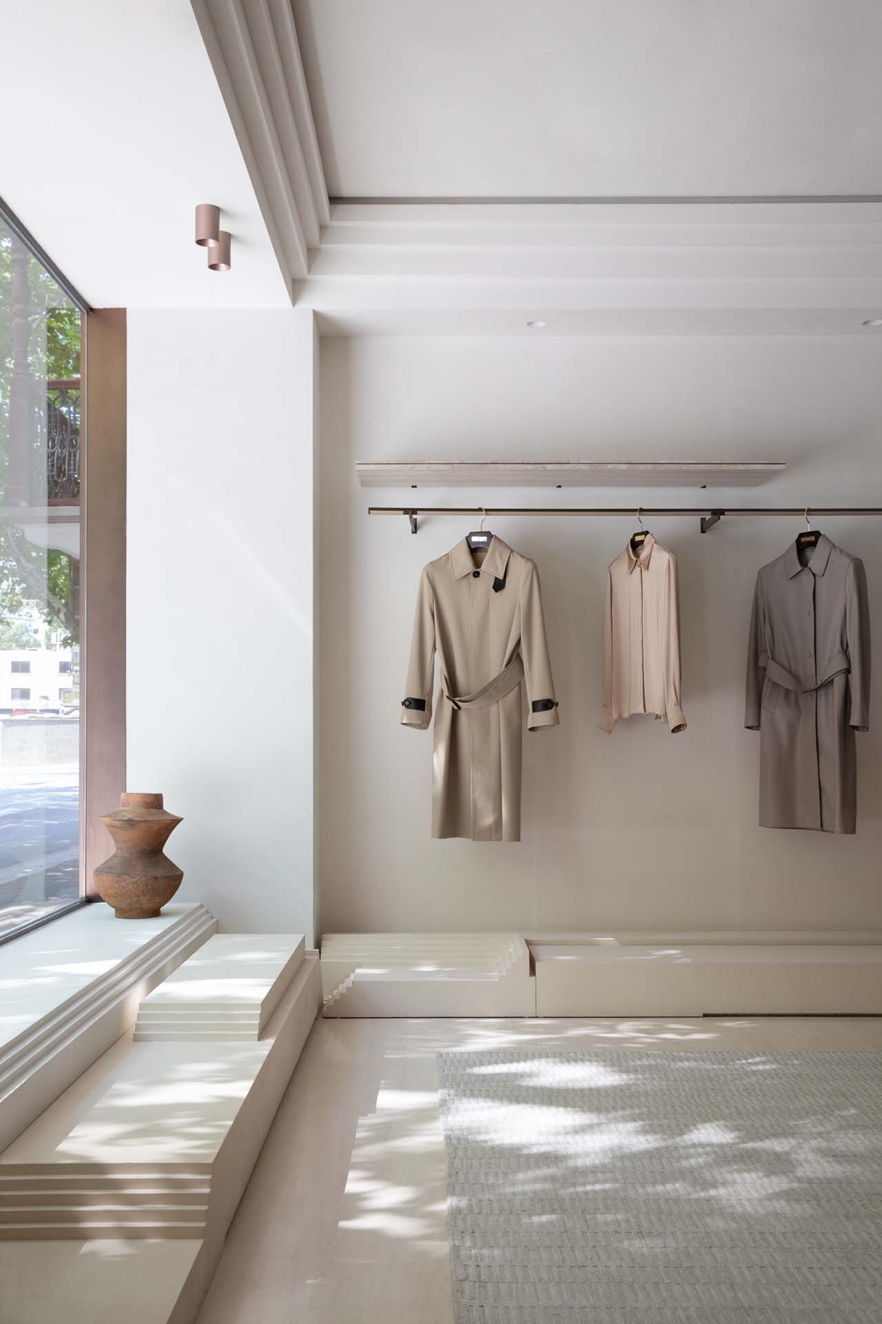
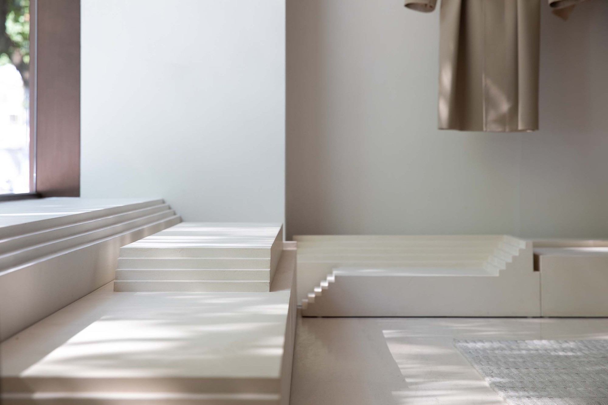
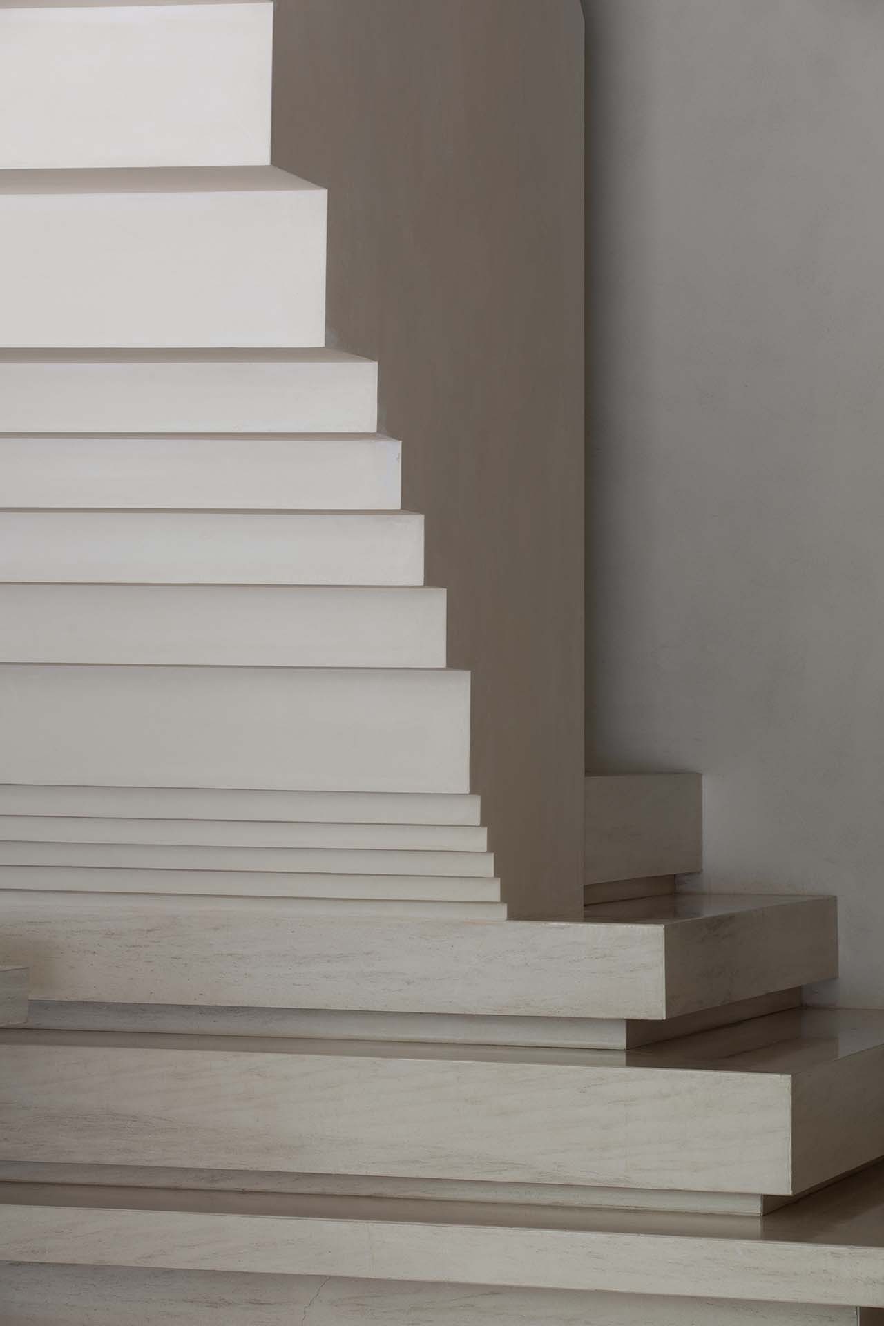
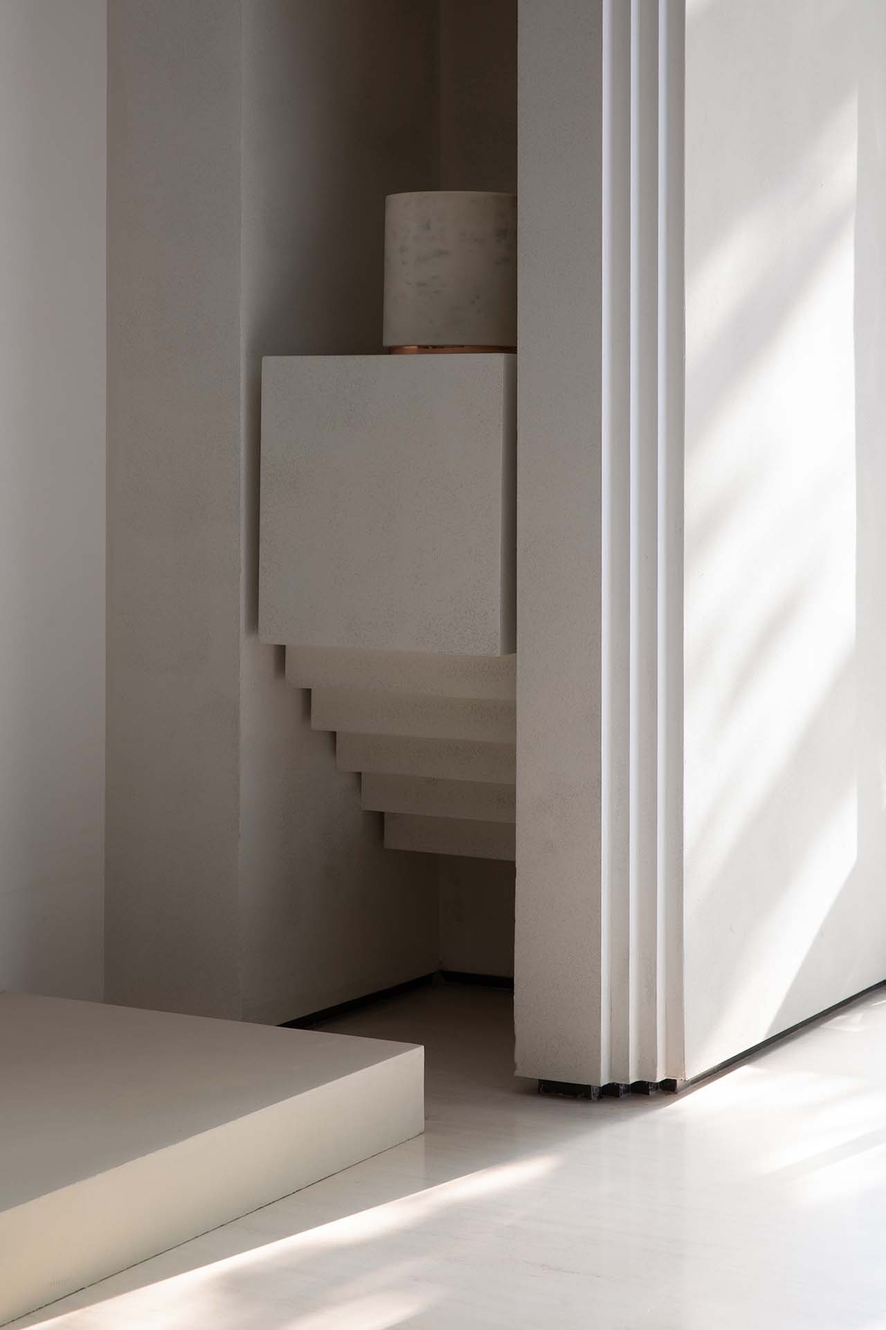
미니멀한 백색공간에 수많은 주름을 새깁니다. 계단의 형상을 띄기도 하고, 어긋나 보이는 단차처럼 보이기도 합니다. 벽면에 수직으로 접혀진 부분은 옷의 주름과 닮아 있기도 합니다. 살아 움직이는 건축물을 옷으로 비유한 것처럼, 공간; 건축도 옷처럼 유동적이고 동적이라는 표현을 보여줍니다. 반복적인 패턴이 은율을 만들어 내기도 하고, 오브제로 읽혀지기도 합니다.
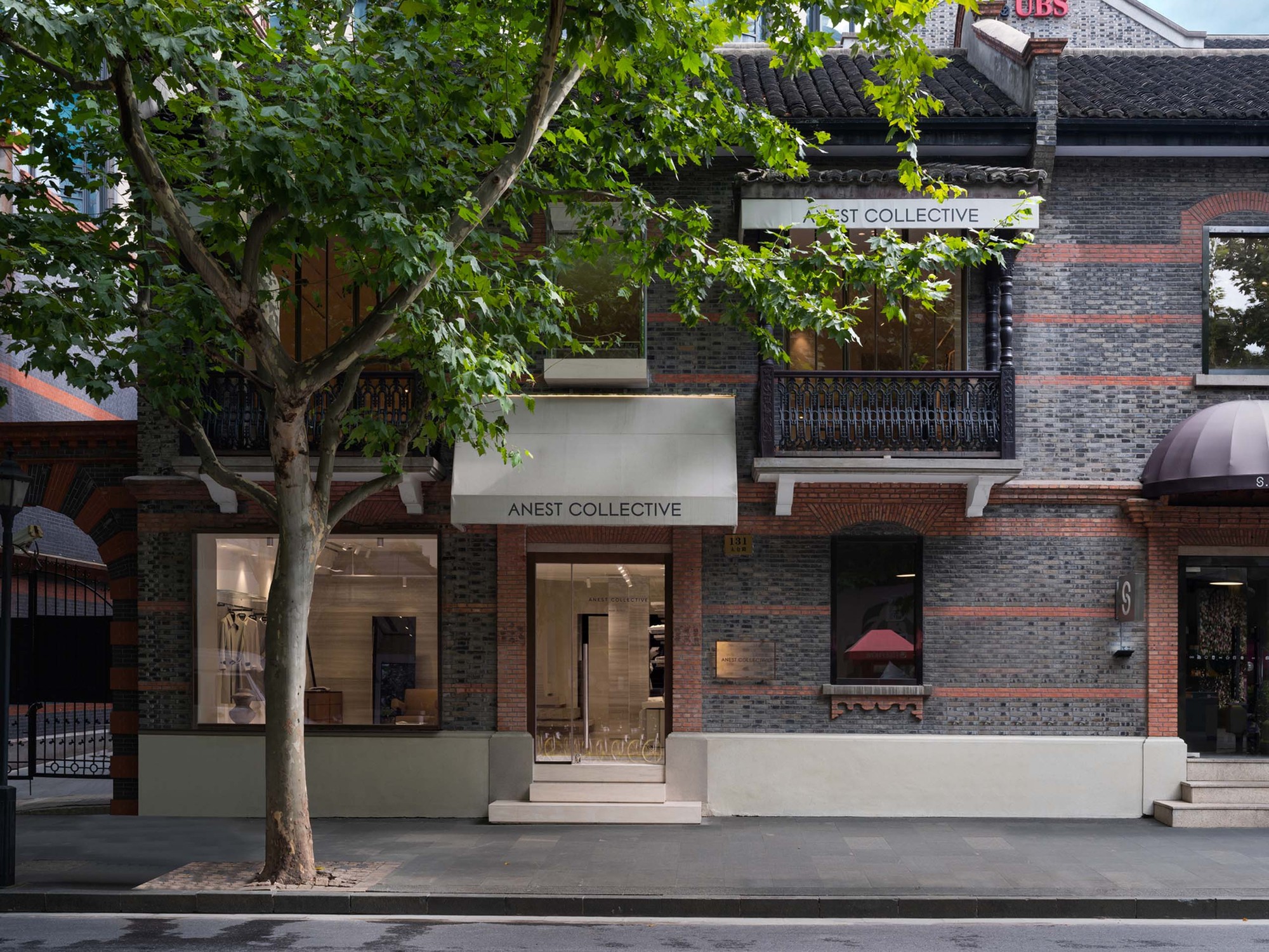
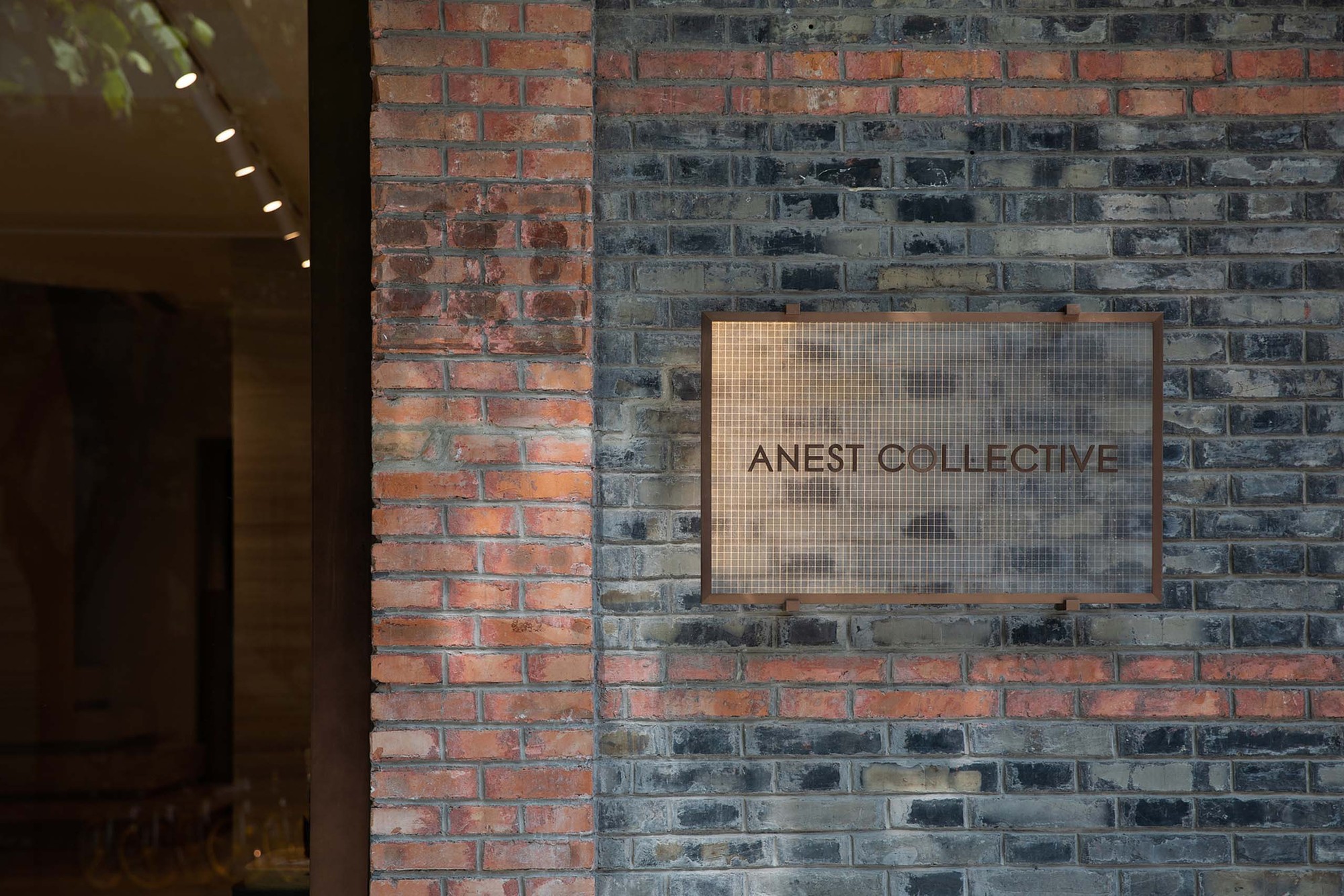
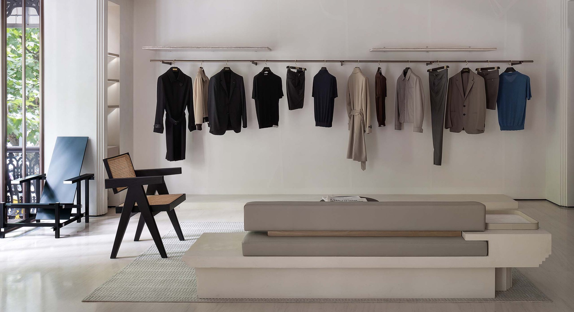
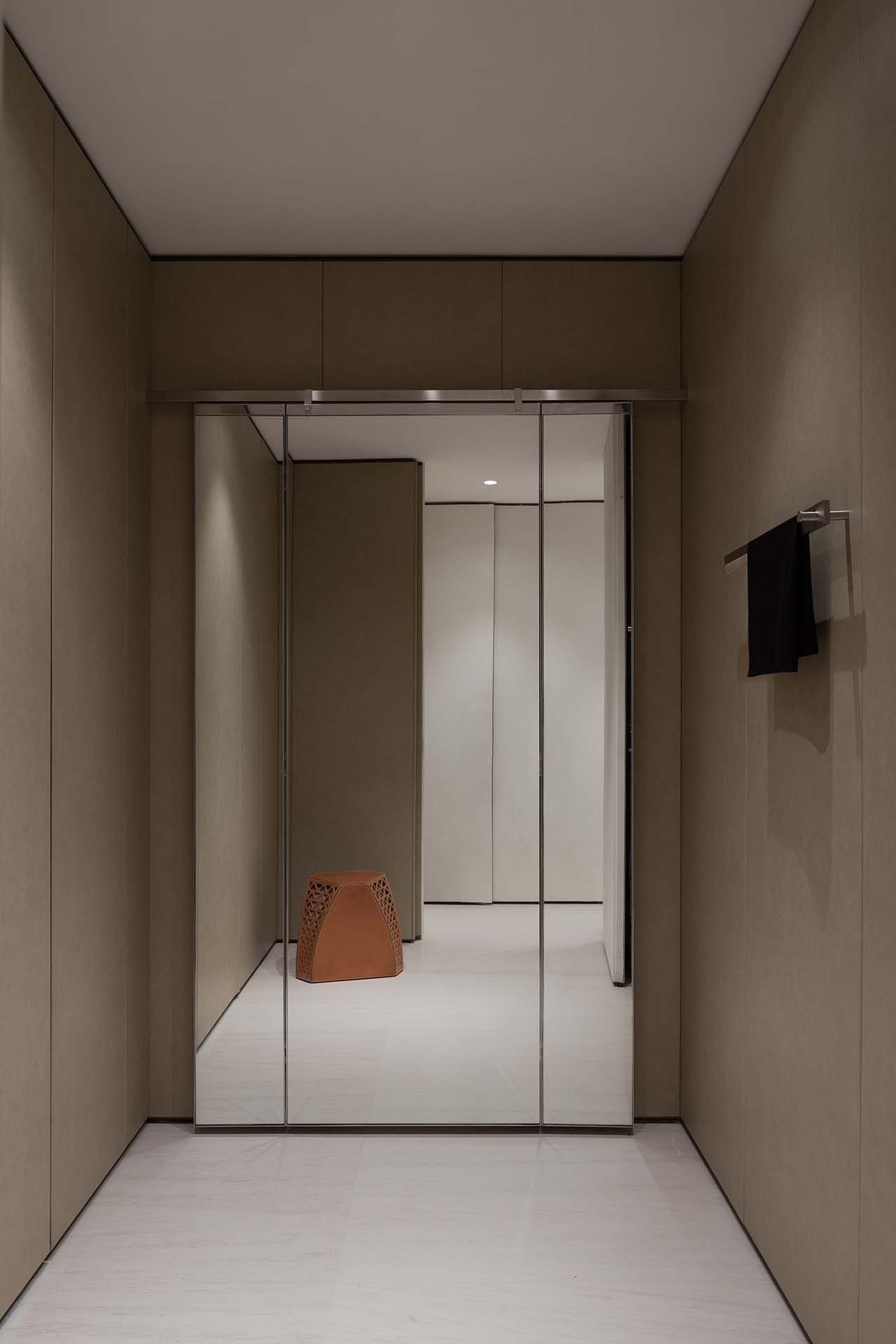
In SHANGHAI XINTIANDI where the past meets the present, if you are looking for a site that tells unforgettable stories, the map must be tagged with the fashion brand - ANEST COLLECTIVE. Neither a well-known boutique nor a street fashion brand, ANEST COLLECTIVE is a unique Italian luxury brand that offers high-quality ready-to-wear collections. Instead of following the bustling trend of fast-changing silhouette and color preferences, it remains low-key and focused on the aesthetic vision that is accumulated through life, and creates a narrative space through the fusion of the elements of clothing, artwork, furniture and architecture This is the place where people can enjoy the grace and freedom of aesthetics.
Streetscape· Staircases
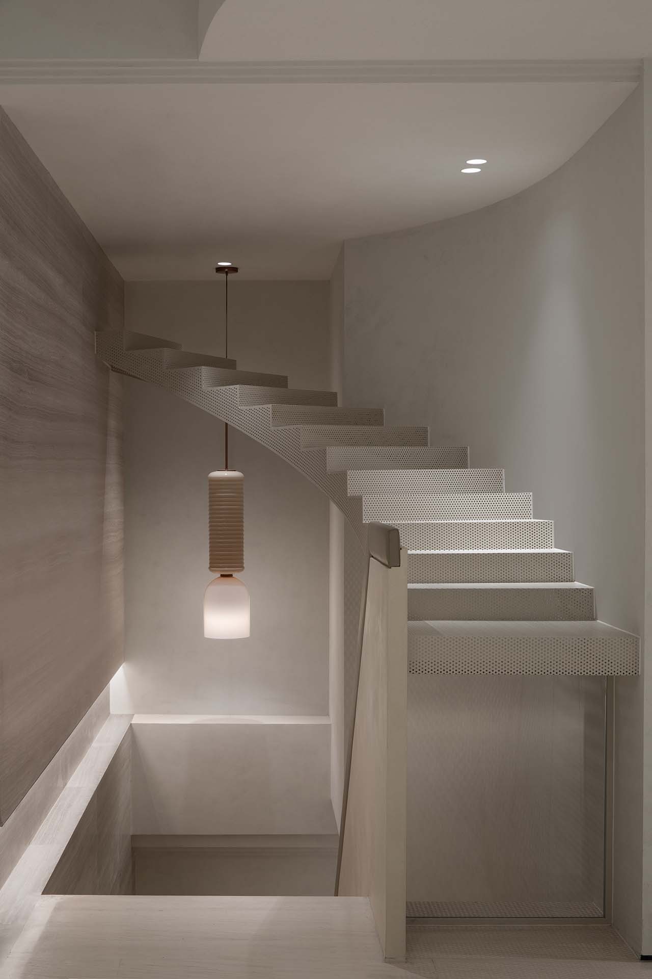
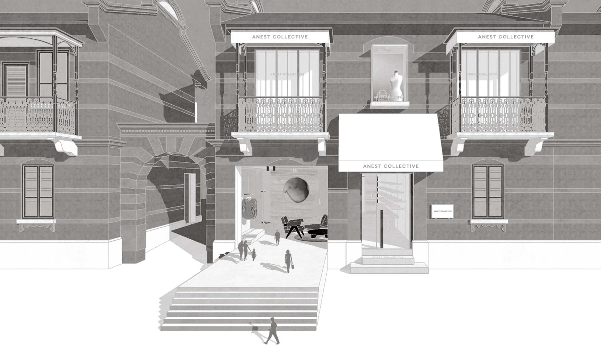
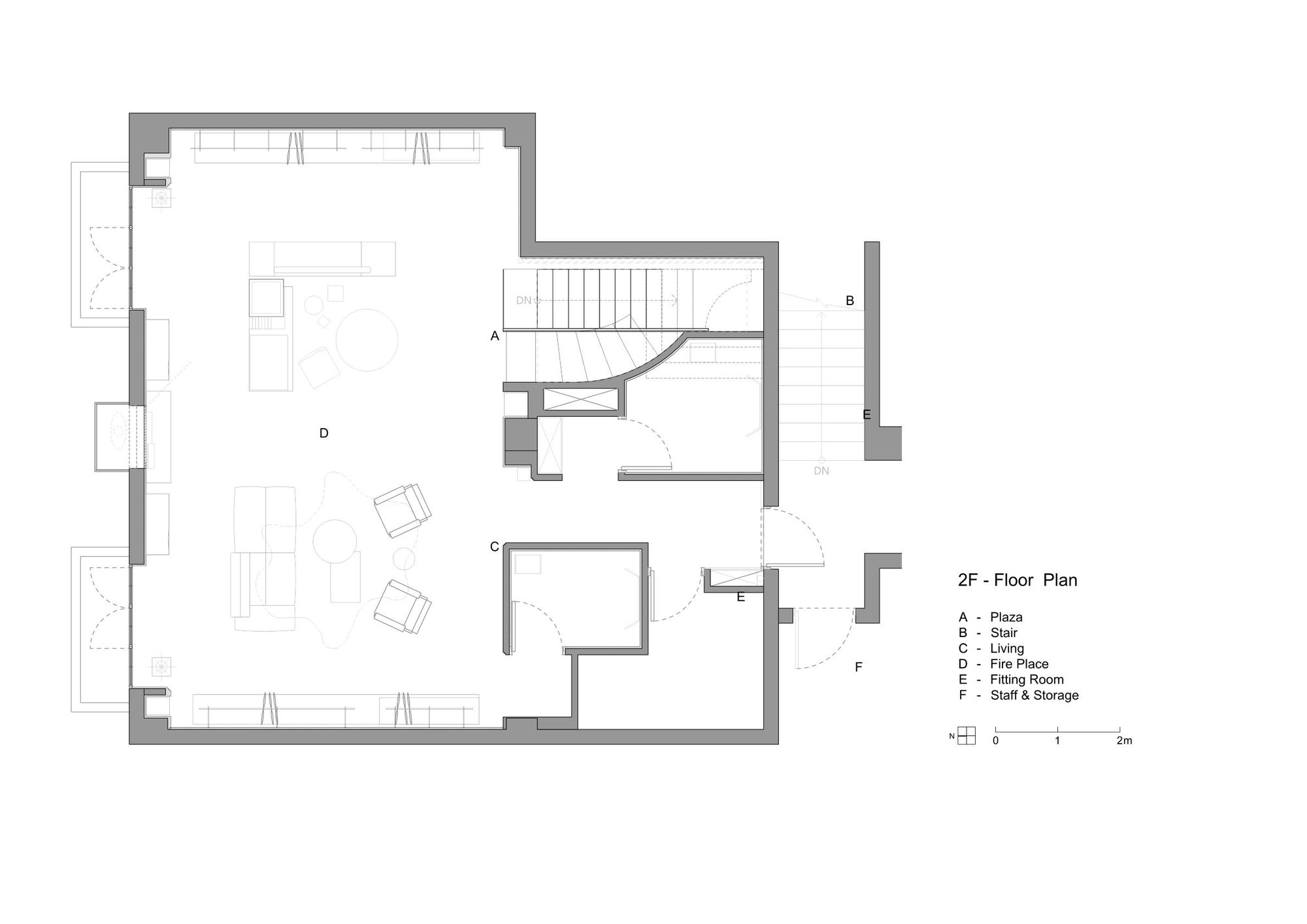
Clothing is a mobile building. From the tinniest spinning structure to the display space of the store, ANEST COLLECTIVE presents the basic but not simple craftsmanship. Responsible for creating space, WATERFROM DESIGN extends the creative concept to the urban landscape based on the narrative background of the brand’s foundations - Italian aesthetics and workshops. The impressive buildings are strung together by large and small squares and stairs, the platform between which becomes the place to sit on, and ancient cultural cities are the destinations to visit; each stair presents three-dimensional details of the history.
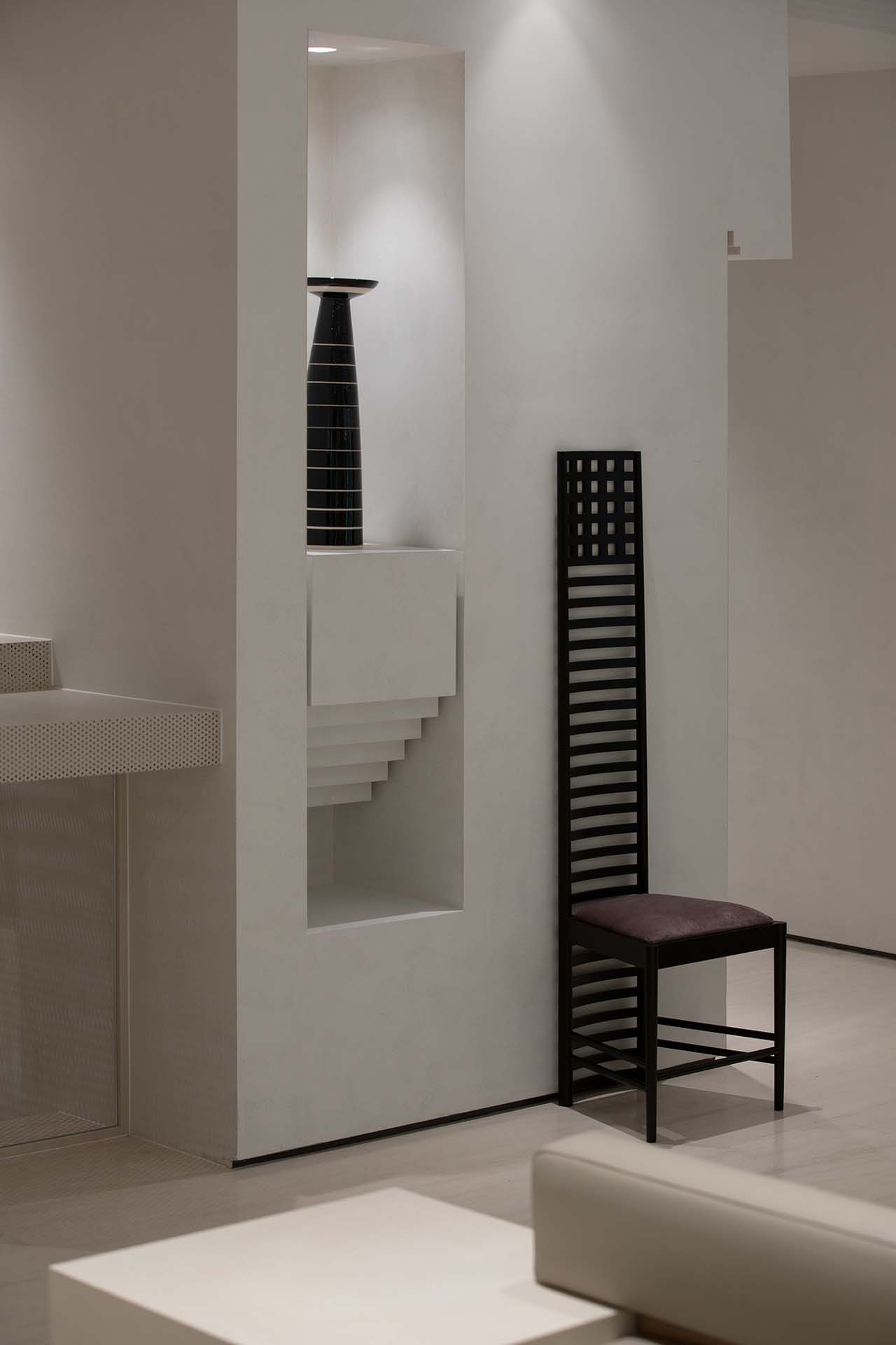
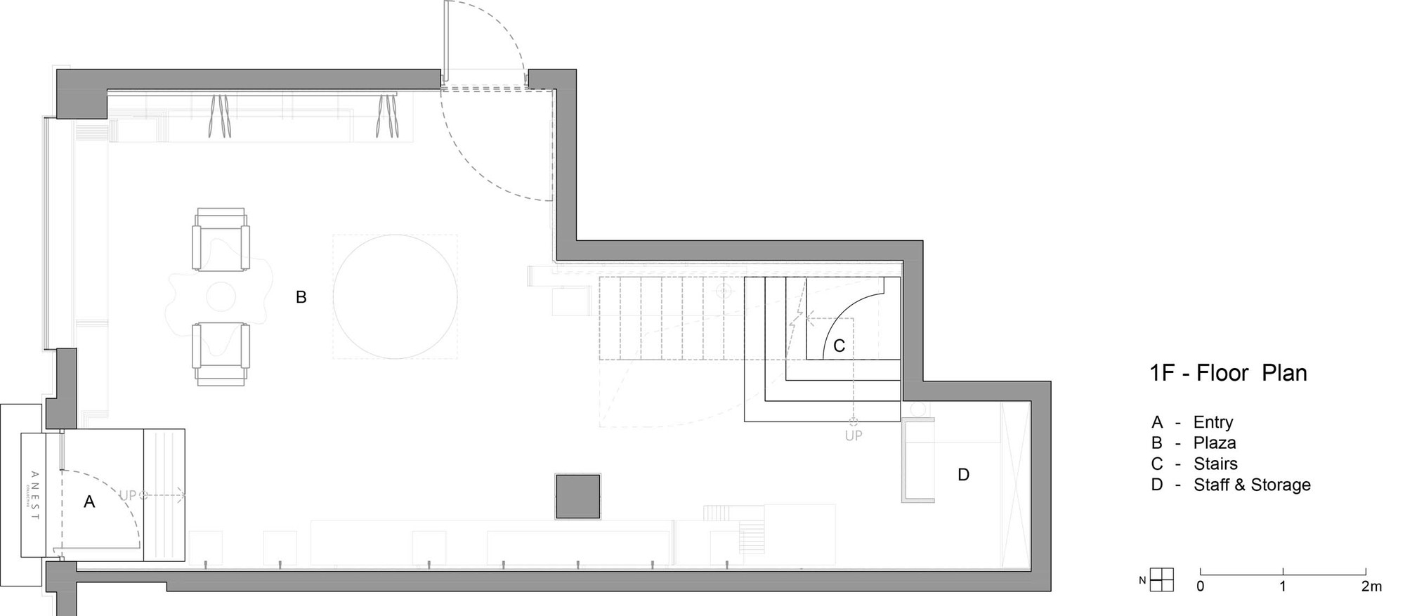
We transform the landscape vocabulary into the cross-sectional layout of the indoor building, not only deliberately highlighting the outline of the stairs, but also compressing or extending the cutting ratio of the stairs into commodity display cases and furniture cabinets, turning the dimension into a porch, the recessed facades of the wall and even the rhythmic level of the ceiling’s stair surface. The stairs and platforms that are placed or scaled down to reproduce the city’s ups and downs without the tedious details, and the sunny corners of the stairs help the interior create sculpture-like stereoscopic details. They connect like a kind of viewing rhythm, dislocation and extension, which makes people follow the turning of the stairs and unconsciously twist their perception of gravity, just like stepping into a psychedelic painting of MC Escher. Even if you look at the abruptly stopped ladder break-point, you also want to get a glimpse of the facade from another perspective.
Light and Shadow Knead out the Wrinkles of Time
At the same time, the shadows between the stairs faint deep or shallow images indoors. Through the shadows, you can perceive the height of the building and the power of the sculptures, stack the weight of the entity in the void and point out the direction of time when they rise and fall. This thought-provoking profoundness enriches the visual levels of different stairs’ cross-sectional and top views. The picture is still, and the years are tranquil, endowing the light with the outline of the story.







from archdaily
'Commerce' 카테고리의 다른 글
| *스플릿레벨 상점 [ OHArchitecture ] Shop in Osakacho (0) | 2021.02.15 |
|---|---|
| *대나무 천장을 가진 레스토랑 [ DDconcept ] que dua restaurant (0) | 2021.02.08 |
| *프랑스 비스트로 인테리어 까페 [ 2BOOKS design ] La Vie Friande (0) | 2021.01.21 |
| *무신경한 공간 [ Bone ] Terra (0) | 2021.01.20 |
| *포스트 코로나 레스토랑 [ RENESA Architecture Design Interiors Studio ] "Social With Distancing" Restaurant and Bar (0) | 2021.01.12 |