728x90
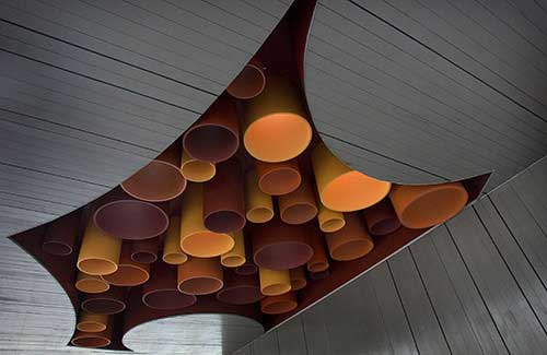
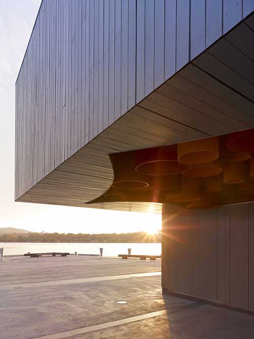
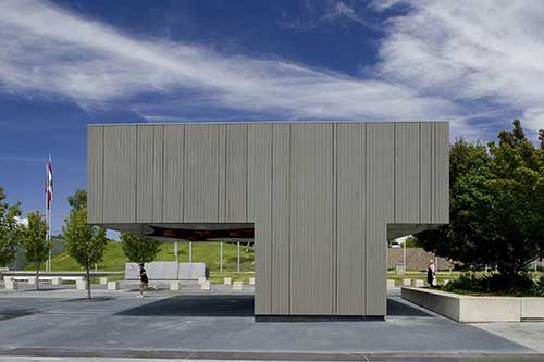
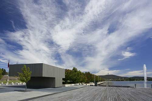
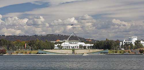
Canberra is distinctive in international terms as a planned city and seat of government. At the centre of the planning geometry sits the Parliament House, the foreground of which consists of a range of buildings containing Australia's major public institutions - a sort of "architectural zoo" including masterworks such as the High Court and National Gallery. The conceptual framework for the kiosks was generated from questions we asked in response to this context. How does one install a toilet and kiosk just metres from the central axis connecting our Parliament and lake? What is an appropriate form for an ice-cream stand seen at a distance with Parliament looming on the horizon? These questions explored the tensions that existed within the brief and provided an engine which drove siting, planning and detail solutions.
The decision to locate a small public amenity in this context was a positive gesture intended to increase the daily use of the Parliamentary Zone, building upon other recent works such as the adjacent jetty. However, with this brief came a risk that an amenity building would adversely impact upon this context given its prominent siting. In the context of this risk, we started to understand the amenity building in terms of its potential as a public sculpture (but which could also sell ice creams). The uncanny nature of the planned city resulted in the realisation of the sculptures as blank timber boxes installed within this largest of sculpture parks.
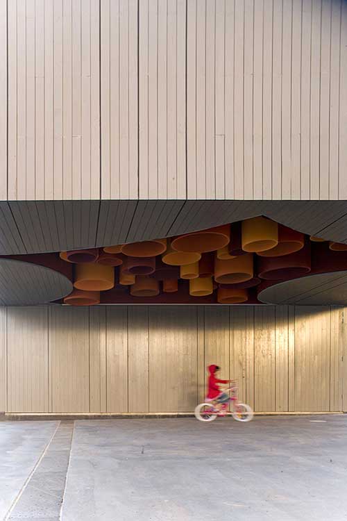
The sculpture was locked to the stand of Bradford Pears where they terminate either side of Commonwealth Place, capping an existing piece of landscape infrastructure. By cladding the buildings in timber, we could gather together the adjacent trees into a constructed object. The finish of the timber object in grey stain locates the sculpture between the material quality of the cladding (which is perceived at close range and in relation to the jetty) and the larger responsibility to relate to the adjacent institutions (the concrete forms of which are seen in relation to the kiosks from a distance). This tendency to a singular sculptural response resulted in the consolidation of all program elements (kiosk, toilets and covered area) into a single gesture. The result is a solid timber "t" - a formal resolution which further distances these objects from the prosaic reality of its use.
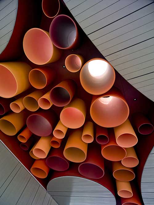
The danger with such an earnest approach may have been the lack of wit or joy in the final building which resulted from such careful observations. So, rather than employ formal or detail embellishments from outside the project, we chose to push the logic of the siting and context observations. The potential for absurdity when Griffin's overarching geometry of the city plan is pushed to its limits was exploited by the hidden system of coloured tubes filtering and dispersing light. The colours themselves are based upon the tonal range of the autumn leaves of these trees, connecting this timber and coloured object back to its formal landscape context.
그리드형
'Pavilion&Installation' 카테고리의 다른 글
| [ Keiko + Manabu ] Heart of Shapes (0) | 2009.01.15 |
|---|---|
| [ SMAQ ] BAD (bath), Stutttgart, Germany, 2004 (0) | 2009.01.05 |
| [ Alan Lu ] Scent Pavilion (0) | 2009.01.05 |
| [ Andreas Hoerl ] Flotsam (0) | 2009.01.04 |
| [ HHF architets ] Ruta Peregrino (0) | 2009.01.02 |