728x90
Location: Washington DC, USA
Principal Architects: Gert Wingårdh & Tomas Hansen
Architects in Charge: Gunilla Murnieks
Competition Team: Gert Wingårdh, Thomas Hansen, Ulrika Davidsson, Fredrik Gullberg, Pål Ericsson, Jacob Sahlqvist, Jacek Zalecki, Petter Leyman, Ola Frödell, Henrik Schulz, Tobias Fasth, Robert Hendberg
Building Team: Gert Wingårdh, Thomas Hansen, Gunilla Murnieks, Susanna Ringnér, Birgitta Stenvaller, Andreas Henriksson, Gustav Appell, Markus Furby, Björn Nilsson, Therese Ahlström, Taito Lampinen, Robert Hendberg, Daniel Frickeus, Fredrik Gullberg, Sven Nestgaard, Sara Helder, Pål Ericsson, Maria Olausson, Fredrik Prytz, Anna Palm, Hanna Samuelson, Alexandra Pripp
Construction Year: 2004-2006
Project Managment: National Property Board Sweden
Structural Engineering: Flygfältsbyrån AB
Lighting: Ljusarkitektur P & Ö AB
Constructed Area: 8,157 sqm
Photographs: Wingardh
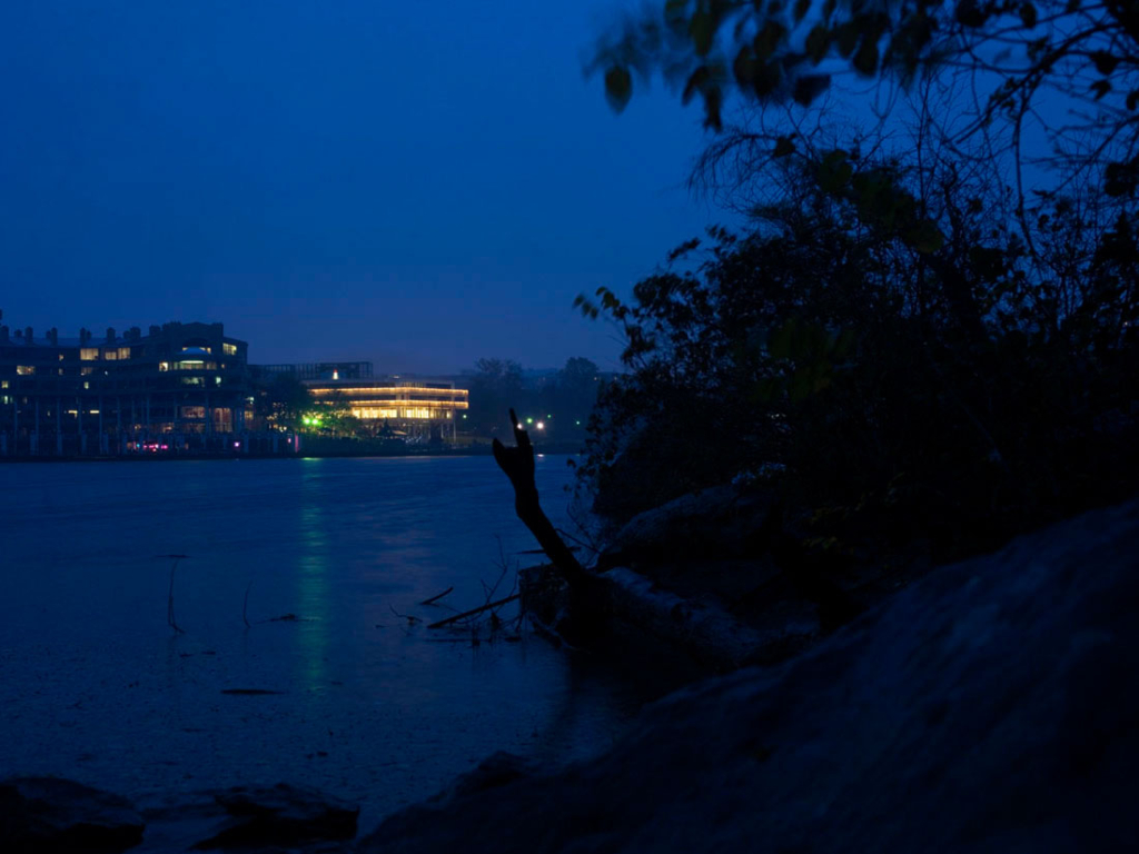
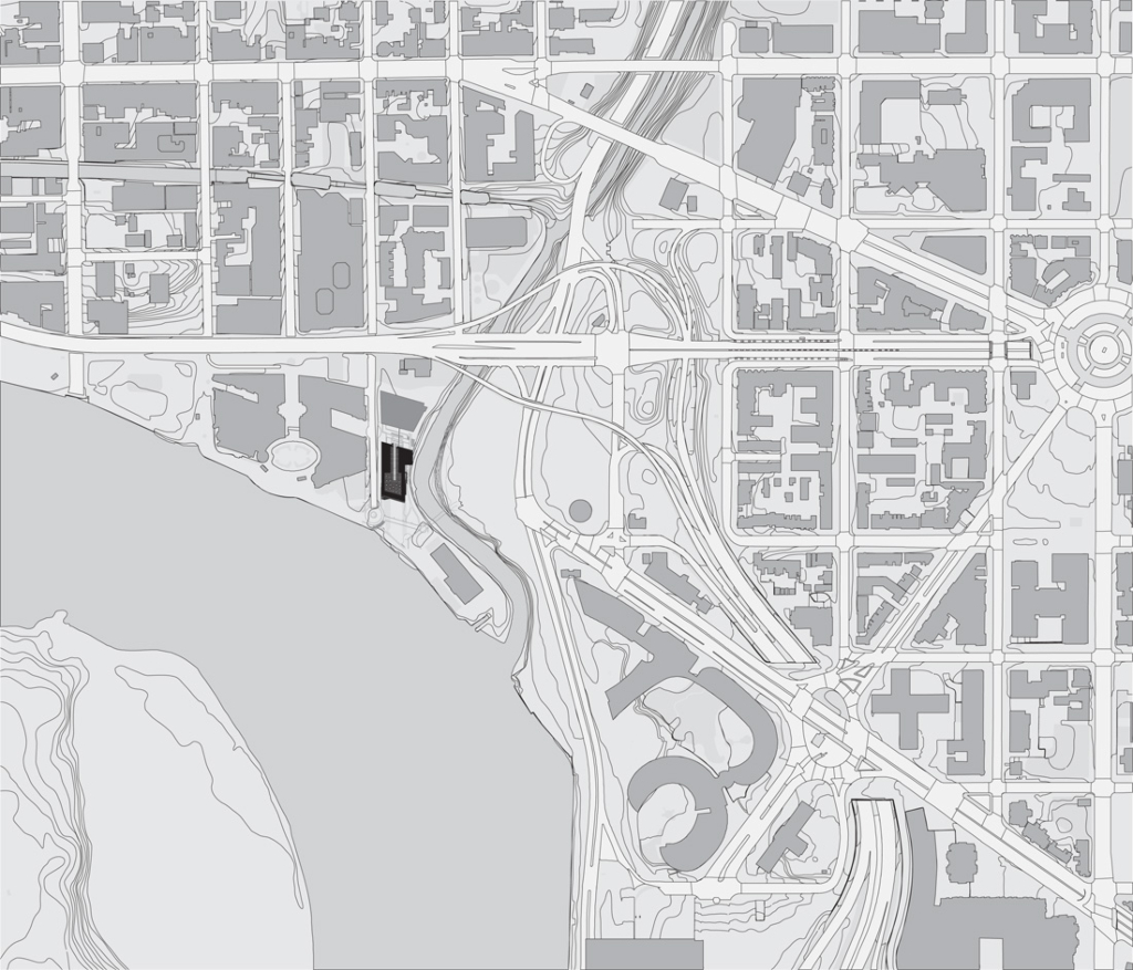
Sweden has the chance to win a spectacular site - a peninsula surrounded by the Potomac and Rock Creek.
The National Swedish Property Board, with Jan Thews as its representative, has a clear goal. The city plan allows a certain volume and that has to be exploited to make the project financially reasonable. There is one drawback with this site, however - it floods regularly.
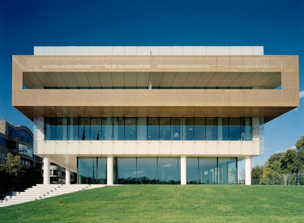
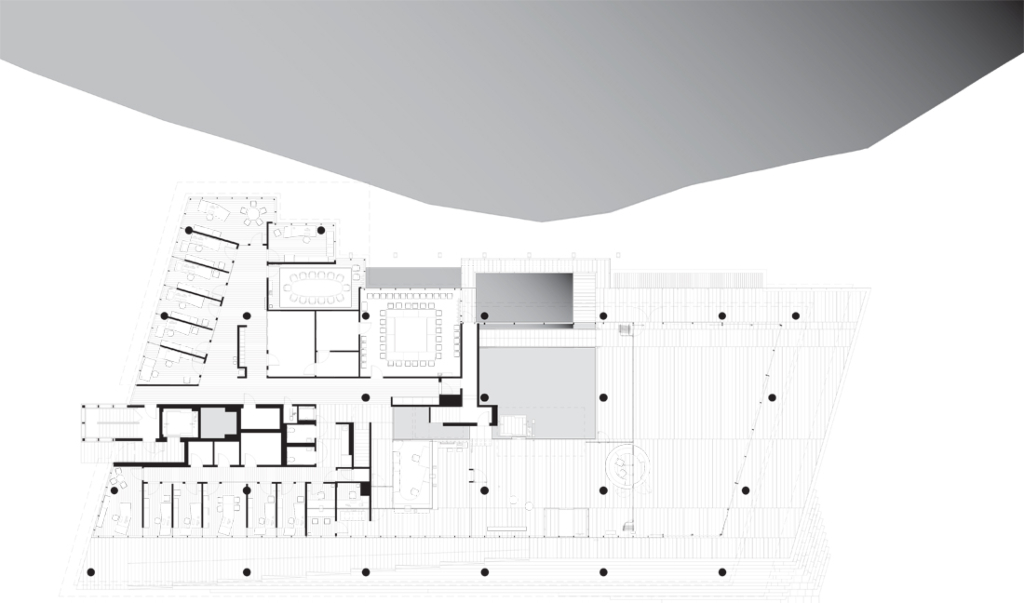
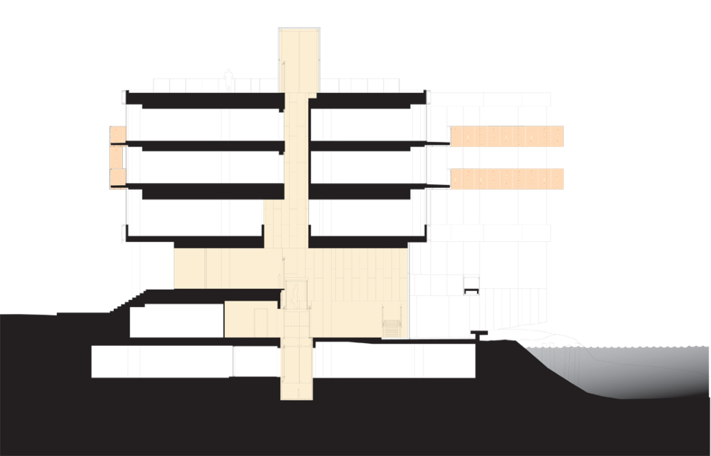
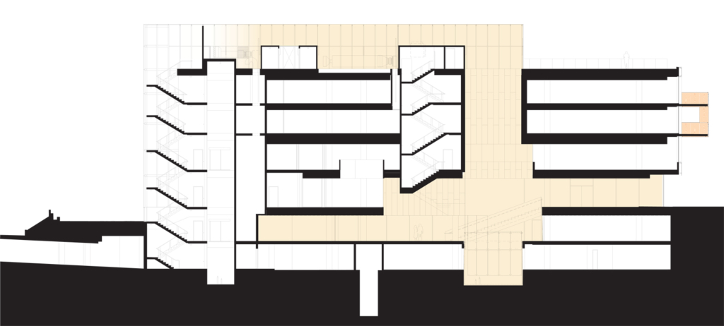
What we propose to do is to create a seven-level building, including a rooftop terrace and underground parking, and to build at least to the property boundary, except at entrance level. The entrance level lies at the highest point to which the Potomac River is expected to rise.
A large flight of steps and a ramp along the entrance side of the building leave the pillars exposed and create a loggia in a classicistic and classically modern style (compare this with Villa Savoie). Here, the cars will draw up and deliver the guests arriving at the embassy.
The Swedish Government has approved guidelines for how embassies should be designed and how they should act. One has to bear in mind that embassies should serve as display windows for Sweden where procedures are completely open and transparent and where exhibitions, talks and conferences are important and should be available to the general public.
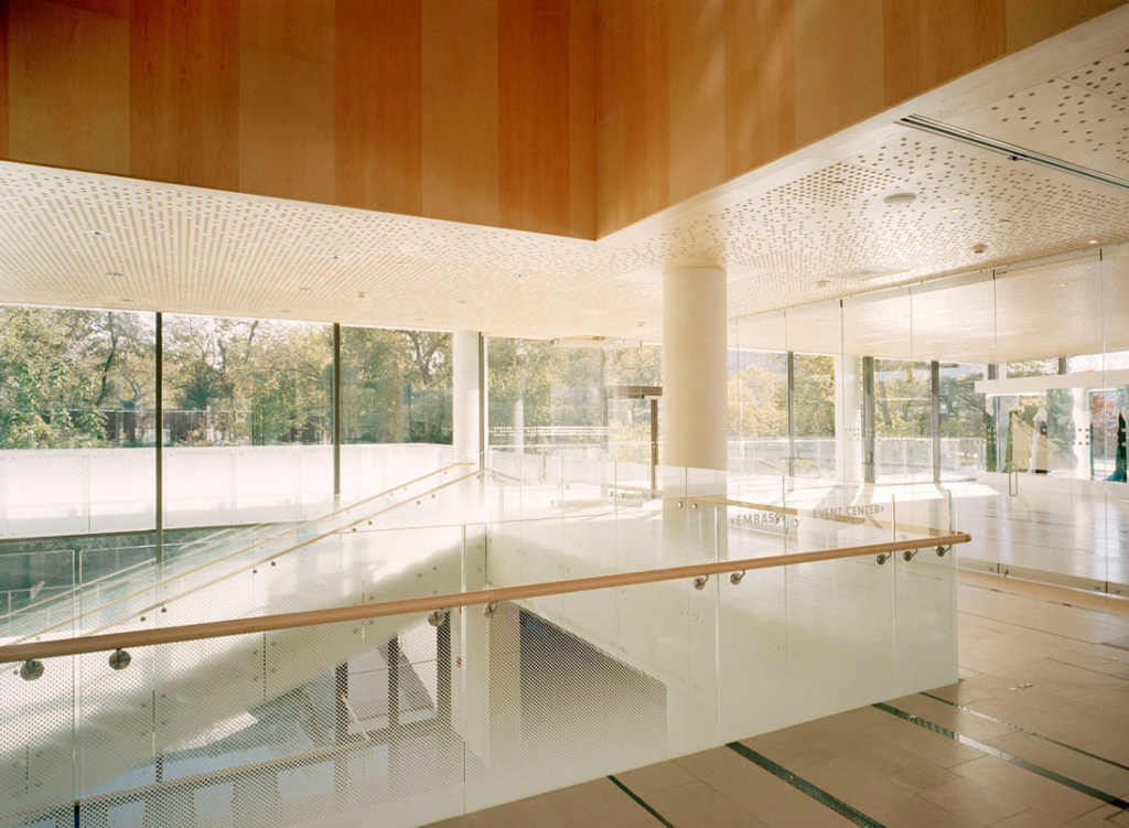
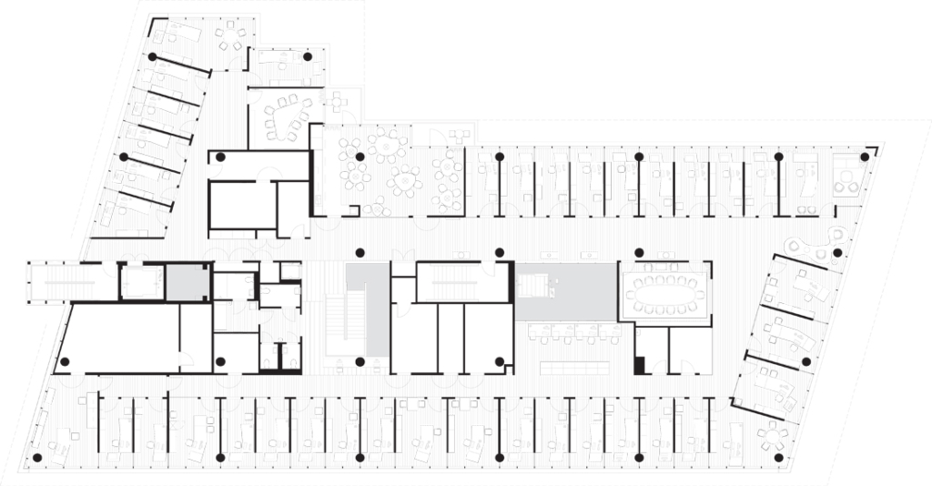
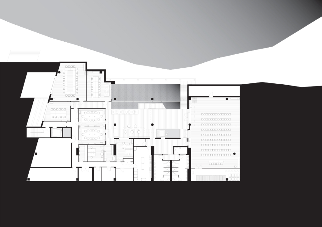
The entrance floor is the hub of all operations. The part of the building used exclusively for the embassy is on the left with its reception area and with offices up on the next floor. The public part of the building has its reception on the right, with a large, glazed exhibition space (the Anna Lind Hall) facing the Potomac River and with a series of multi-purpose exhibition and conference rooms leading off a lower lobby.
Never before have the public areas been allowed to take up so much room. And the building really attracts the public. There are constant streams of people moving along the banks of the Potomac. Massive sliding doors make it possible to open up the Anna Lind Hall at both corners. The public is welcome to gaze from any side through the entrance hall, where interior and exterior walls made entirely of glass provide unobstructed views.
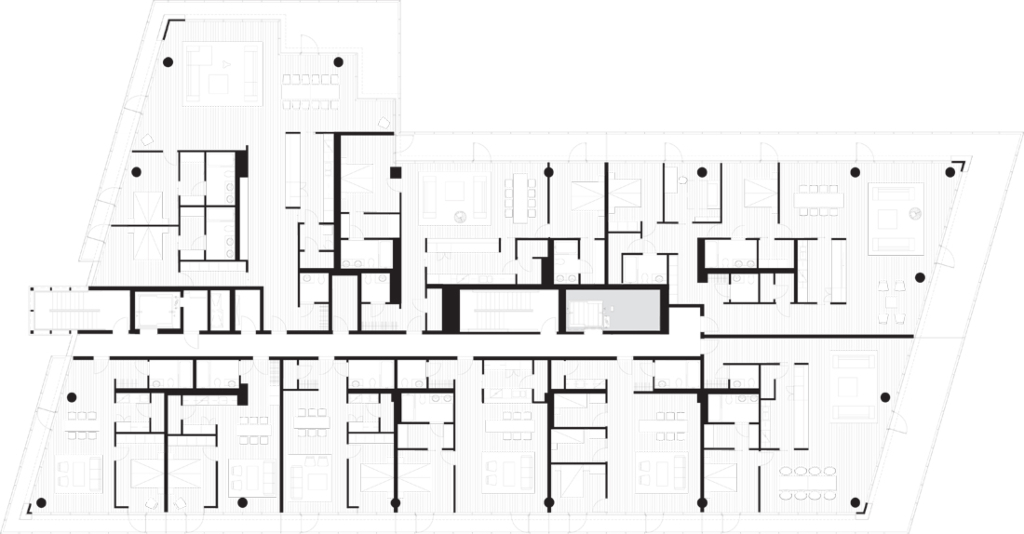
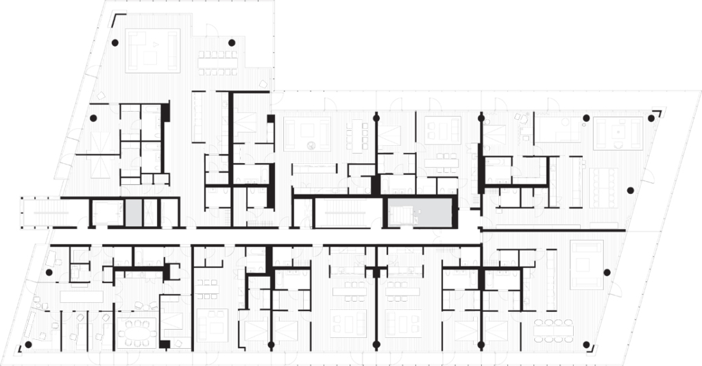
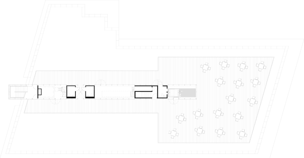
The top two floors of the building are a residential area, with 19 apartments. The two belts of balconies form a projecting box-like structure that encircles these two floors. It is built, with the consent of the authorities, out over the building rights, as is the northern escape stairs and the rooftop terrace’s ‘glass fins’ containing tops of the elevators, fans, restrooms and catering support areas.
What is typically Swedish?
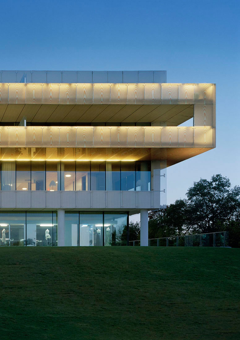
Our answer is the red light that appears with the low setting sun at dusk. Sweden’s northern latitude is radically different to Washington’s geographical location. We wanted to create “the Nordic light in the dark Southern night”. This was achieved by backlighting the panels cloaking the balconies around the building. The architects originally intended to use real wooden veneer on the balconies, enclosed between two sheets of glass. However, they decided instead to use computer-generated images which were printed straight onto the laminated film. Six different patterns of exaggerated wood grain were combined to form an elegant façade around the private apartments. The whole of the façade is illuminated from behind in the evenings and at night, making the building glow like a huge lamp. The computer-generated image we submitted with our original proposal is almost identical to the building today.
Sweden is also a kingdom of pure water. Mist that rises in the mornings with the dancing elves. Crisp snow covering the panes of glass. The black pond reflecting the pines. Warm breath misting the window. We work with a gradient of white dots on glass panels. On the exterior, the gradient extends over three storeys. Crystal-clear glass at the bottom that gradually becomes
speckled with more and more dots until it is completely white when it reaches the blue sky. It is the opposite way round in the northern escape stairwell.
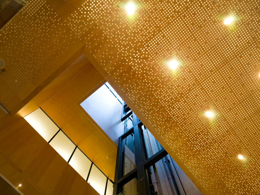
Above the entrance hall’s “spark gap” of openness, the building is suspended as though carved from blond, American maple.
The technically compact façade, thirty centimetres behind the glass gradient, moves seamlessly from external to internal ceiling where the entire atrium is clad with wood veneer panels, finishing with the horizontal wooden surfaces of the rooftop terrace. It is the Swedish tradition to clad a building in wood (expertly executed in Gothenburg by Asplund in the town hall extension and by Nils Einar Ericksson in the concert hall). The stairs, walls and floors inside the embassy are also made of maple. The light reflects warmly from the wood and imparts a flattering warmth to everyone and everything.
A cloud hovers above the entrance floor. The maple ceiling is cut through with unevenly spaced, round holes. A pixelling effect whose compactness increases inwards. Lamps across the ceiling shed their light. The resulting effect is a shimmering, shifting cloud of light. The many holes are covered by white cloth and act naturally as an absorbent. The white stone Timpa floor incorporates black, shiny stripes of polished granite. The floor looks as though it has been rolled out like long mats, side by side, resembling traditional Swedish rag-rugs.
We encounter the most sophisticated details in the sensitive zone, between the indoors and outdoors. Two, real water-filled walls stand like curtains along both short sides of the windbreak. On the right, a manmade pond of polished, black granite with narrow, frosted streaks complement the stone “rug floor” alongside. The building’s most stunning glass installation faces the embassy, standing freely like a wall from floor to ceiling. The thick crystal glass has been pinched out using bone glue to create patterns that bring to mind the very fragile film of ice that covers a pool of water on an evening in early March. Visitors to the embassy offices have to walk through a security passage, which turns with a couple of sharp bends, round the reception area. When they leave the building, they have a moment’s undisturbed view of the glass wall where they can see, in columns between the pinched-out glass, the real river flowing past just a short distance away. Two contrasts - the one frozen stiff and the other moving with life. “Magic”, by the Swedish glass artist Ingegerd Råman.
그리드형
'REF. > Architecture' 카테고리의 다른 글
| [ DCPP Arquitectos ] Bayon Artell office and warehouse (0) | 2009.01.12 |
|---|---|
| [ ACXT ] Bilbao Exhibition Centre (0) | 2009.01.12 |
| [ Cadaval & Solà-Morales ] TDA House (0) | 2009.01.10 |
| [ Workr ] Donut Stop (0) | 2009.01.10 |
| [ ARX ] Ilhavo City Library (0) | 2009.01.10 |