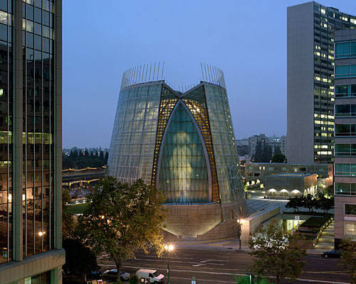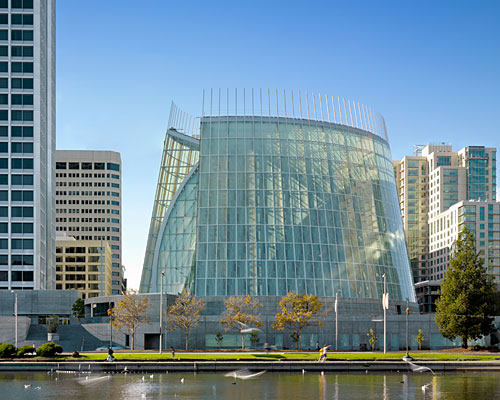
It comes as a shock to discover one of the Bay Area’s most riveting examples of recent architecture is not the work of international highfliers imported to San Francisco and its environs to rev up the local landscape. To be sure, Bay Area architects have long held their own with a calmly cool regional Modernism. But with current media hoopla, cultural institutions by Herzog & de Meuron, Renzo Piano, Daniel Libeskind, and Tod Williams Billie Tsien have tended to overshadow local architects’ achievements—at least until the conical and chiseled Cathedral of Christ the Light opened a few months ago in Oakland. Designed by the San Francisco office of Skidmore, Owings & Merrill (SOM), with Craig Hartman, FAIA, as the design partner (and Kendall Heaton Associates the architect of record), the glass, wood, and concrete structure reaffirms the power of an abstract Modern form to function as both a spiritual and civic presence. It also evokes the manipulation of light and space memorably demonstrated by the modern religious architecture of Eero Saarinen, Louis Kahn, Jørn Utzon, and Frank Lloyd Wright. Although Hartman and SOM received accolades for the International Terminal of the San Francisco International Airport (2000), this poetically ethereal cathedral clearly represents a different kind of architectural achievement.
Cathedral of Christ the Light
Interestingly, Santiago Calatrava had originally won the commission from the Oakland Diocese to design the chief church for 60,000 Catholics when it lost its Francis de Sales Cathedral to earthquake damage in 1989. Calatrava and SOM, along with Ricardo Legorreta (now Legorreta + Legorreta) had been asked to come up with schematic designs from a group that included Foster and Partners, and Kevin Roche, FAIA. But by 2003, after some fits and starts involving site changes, Calatrava and the diocese dissolved their union. The church officials turned back to runner-up Hartman’s scheme.
In designing the 226,000-square-foot cathedral complex for the 2.5-acre site, SOM positioned the sanctuary on a poured-in-place concrete podium containing a mix of uses, including a legal clinic, a health clinic, a conference center, and administration offices for the diocese. An interior courtyard embedded in the podium along with skylights provides ample daylight to the underground recesses. Rectilinear outbuildings—an archive, a rectory, a shop for the church, and a café—sit atop the podium, while a mausoleum is located directly under the sanctuary. At this point, a circular chapel and campanile have not been added to the cathedral, which is now estimated to have cost $112.9 million for the construction plus fittings, furnishings, and equipment.
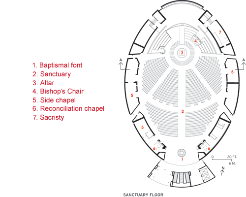
An abstracted curvilinear form had appealed to Hartman from the start: When the late architecture critic Allan Temko, an adviser for the cathedral’s architect selection, added SOM to the list, Hartman asked Walter Netsch, long the design partner of SOM’s Chicago’s office, about his inspiration for the striking Cadet Chapel at the Air Force Academy (1962). Netsch cited the 1958 translation of The Church Incarnate, written by German church architect Rudolf Schwarz (originally Vom Bau der Kirche, 1938). Schwarz had proposed designing a church with a circular plan around the altar, rather than relying on the typical Latin or Greek cross. Hartman, conscious of the diocese’s adherence to the Vatican II’s stated mission to promote a sense of community through church design, took for his plan the ovoid form of the vesica pisces—an intersection of two circles and a historic Christian symbol.
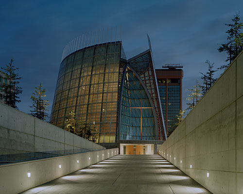
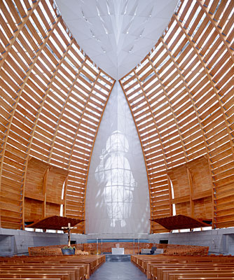
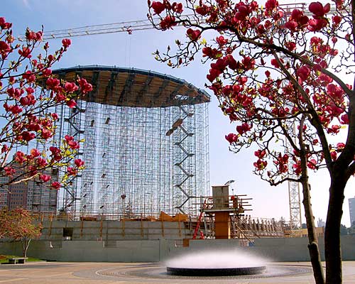
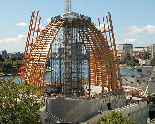
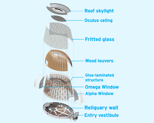
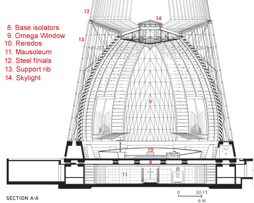
The resulting sanctuary, 118-feet high on the exterior and seating 1,350 inside, brings together two geometrical forms, the cone for the glass carapace, and a sphere for the ribbed and louvered Douglas fir inner structure, both of which rise from an oval poured-in-place concrete base. Called the reliquary wall, it contains chapels, a vesting room, and a sacristy. (For structural and mechanical details, see page 88.) In order to endow the sanctuary with a luminous quality yet avoid heat gain and glare, Hartman and his team developed a diaphanous outer skin that combines fritted glass (opaque and translucent) and translucent film laminated on glass, with clear low-E glass. The geometric pattern for the fritting is distributed in a way that “looks organic—like the bark on a tree,” says Hartman. White aluminum mullions and transom bars, based on a 10-by-5-foot grid, frame the glass; the mullions extend past the top of the enclosure to give a sense of verticality to the tapering form. Atop the structure, a vesica pisces–shaped oculus of dichroic glass admits more light to the sanctuary, albeit filtered by faceted aluminum panels. In bright daylight, the veil-like glass enclosure can look too uniformly opaque yet too lightweight—like rice paper stretched over a large drum. But by night, the wood frame begins to show from within: The skin reveals as it conceals.
The detailing of the glazed, monumentally abstract artifact, as complex as it is, does not fully prepare the visitor for the experience of entering the cathedral. The procession begins at the street, with a walk up a plain concrete ramp (called Pilgrim Path, referring to the history of pilgrims climbing up a path to a cathedral atop a hill). Where the ramp terminates at the south entrance, visitors shift their axis of movement as they are drawn into a low-ceilinged vestibule. And then suddenly, the space explodes dramatically upward in a luminous hall framed by semicircular pews and curving lattice walls.
The major surprise comes from encountering the 58-foot-high apparition of Christ, based on a Romanesque sculptural relief (1145–1150) on the Royal Portal of the west facade of Chartres Cathedral. Rather than erecting a stained-glass window behind the altar, the architectural team took a digital image of the Chartres Christ and created a mammoth artwork with 94,000 laser-cut perforations on 10-by-5-foot anodized-aluminum panels. Light admitted through the translucent frosted film on the glass of the north-facing Omega Window seeps softly through the panels. The process enhances the image’s ethereal quality: The Christ seems to float like a hologram above the circular altar.
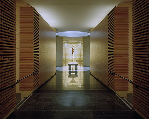
Chapels within the thick gray concrete reliquary wall surrounding the sanctuary contain paintings and sculpture displayed dramatically against a background of polychromed Venetian plaster surfaces. Hartman designed the mausoleum underneath to respond to the sanctuary’s oval plan and reinforce the sense of integration between the two levels. Here, the pristine craft of the Douglas fir wood, the sheen of the polished granite floor, and the dramatic use of lighting bring out the stateliness of the 1870 stained-glass windows taken from the previous church.
The light, space, and overall architectonic quality of the cathedral create the appropriate religious setting without its architecture being subsumed by an intensely figurative program of art. To be sure, the architecture belongs to the Modernist tradition. But its resonance also relies on its strong underpinnings in traditional religious architecture, such as the concentric plans of Renaissance chapels or the manipulation of light in Baroque churches. Forceful, spiritual, inventive, the cathedral retains an admirable typological continuity with the past.
from archrecord
'REF. > Architecture' 카테고리의 다른 글
[ Longhi Architects ] Lefevre House (0) | 2009.11.06 |
---|---|
[ KHR ] The Church of the Holy Cross (0) | 2009.11.06 |
[ Vicens + Ramos ] kirke med karakter (0) | 2009.11.06 |
[ 70ºN Arkitektur ] Kindergartens (0) | 2009.11.06 |
[ Die Baupiloten ] Kita Taka-Tuka-Land (0) | 2009.11.06 |