728x90
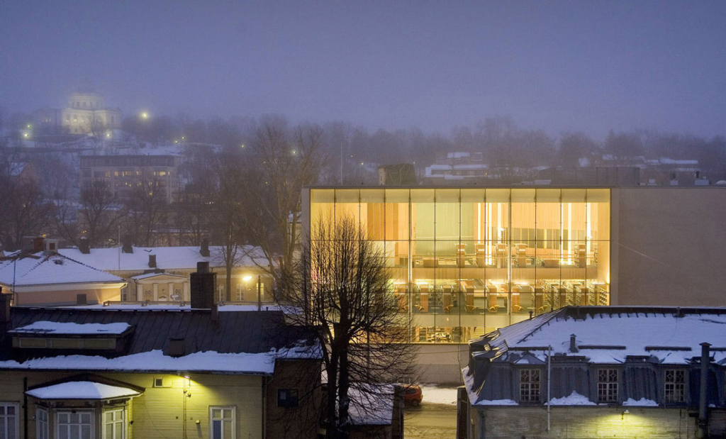
Location: Turku, Finland
Main Designer: Asmo Jaaksi architect SAFA
Design Team: Teemu Kurkela, Samuli Miettinen, Juha Mäki-Jyllilä, Mikko Rossi, Katja Savolainen architects SAFA, Päivi Meuronen interior architect SIO
Landscaping: Molino Oy
Structural Design: Narmaplan Oy
Lighting: Eficientysul
Main Contractor: NCC Rakennus Oy
Constructed Area: 6,900 sqm
Project Year: 2007
Photographs: Arno de la Chapelle, Asmo Jaaksi, Harri Falck, Jonny Holmen, Jussi Tiainen, Michael Perlmutter, Patrik Rastenberg
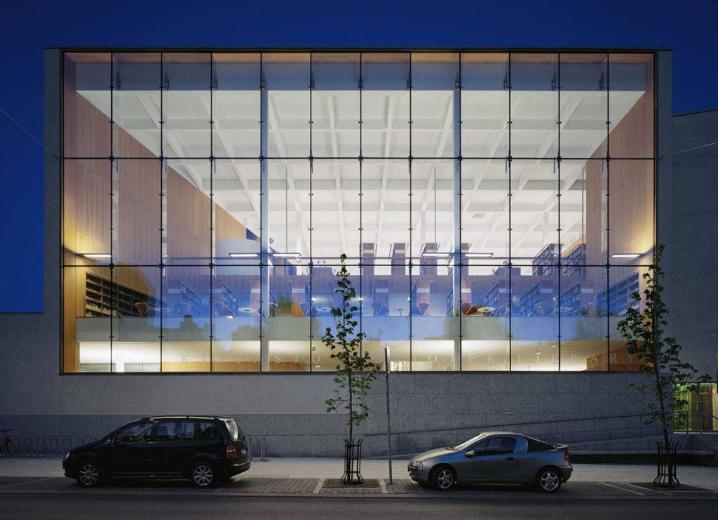
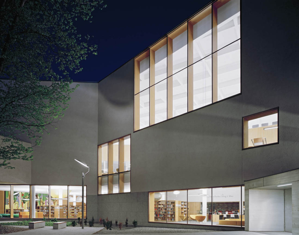
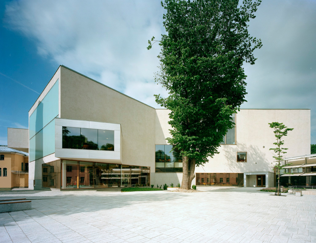
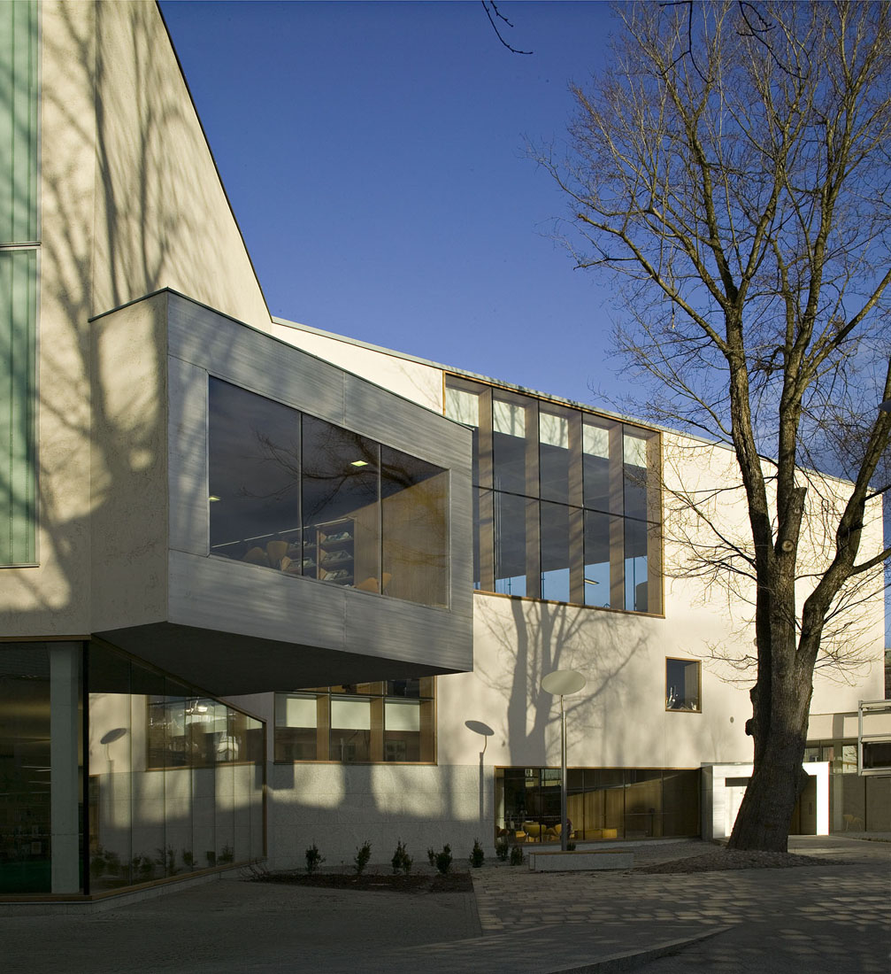
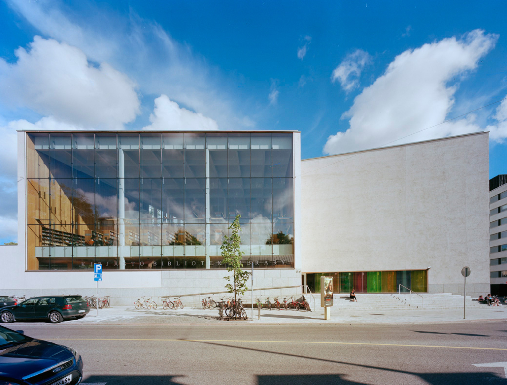
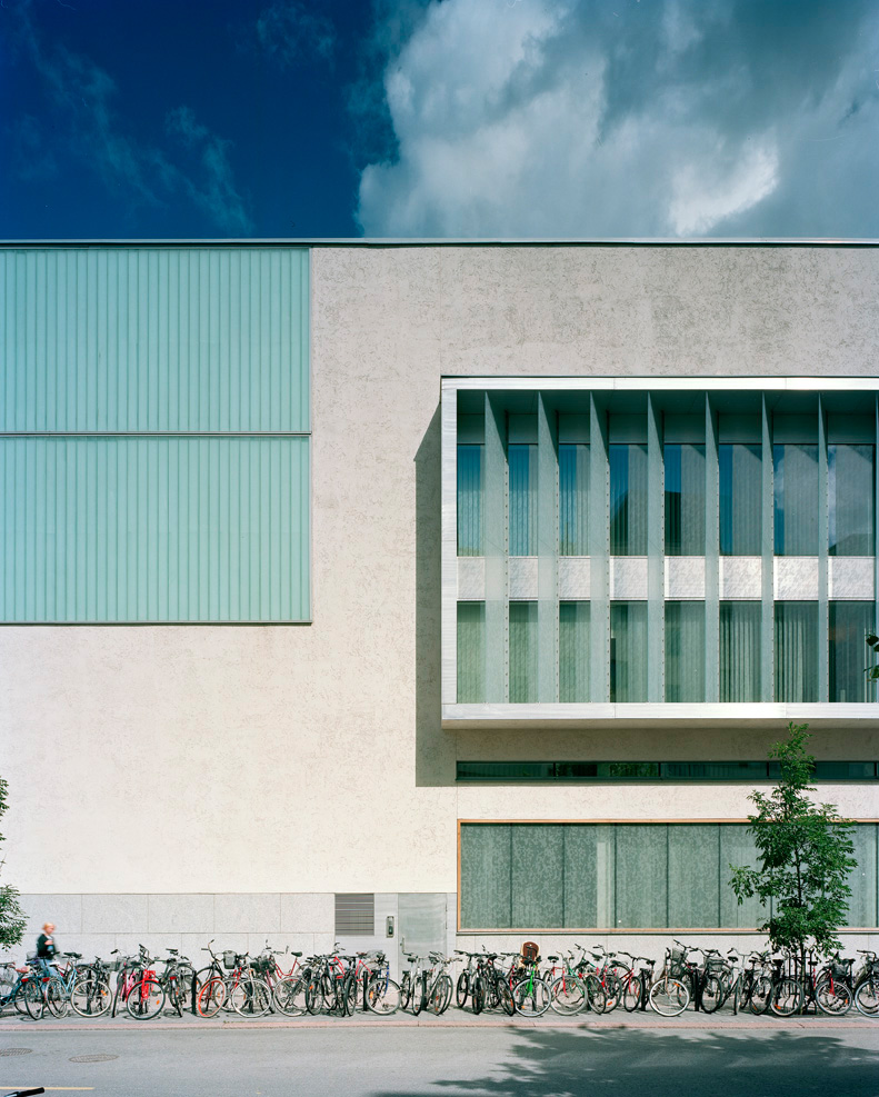
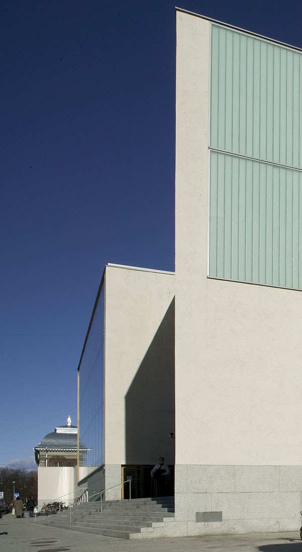
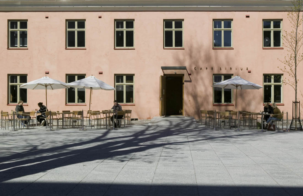
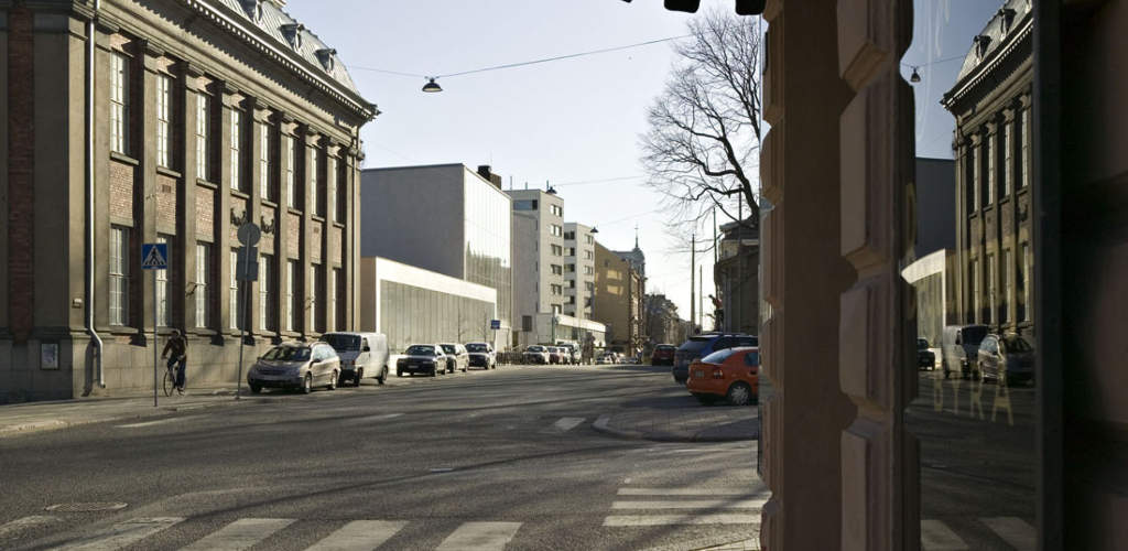
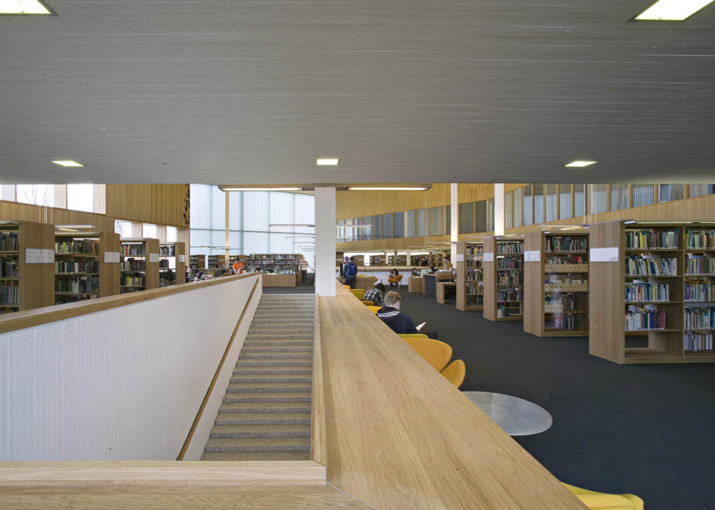
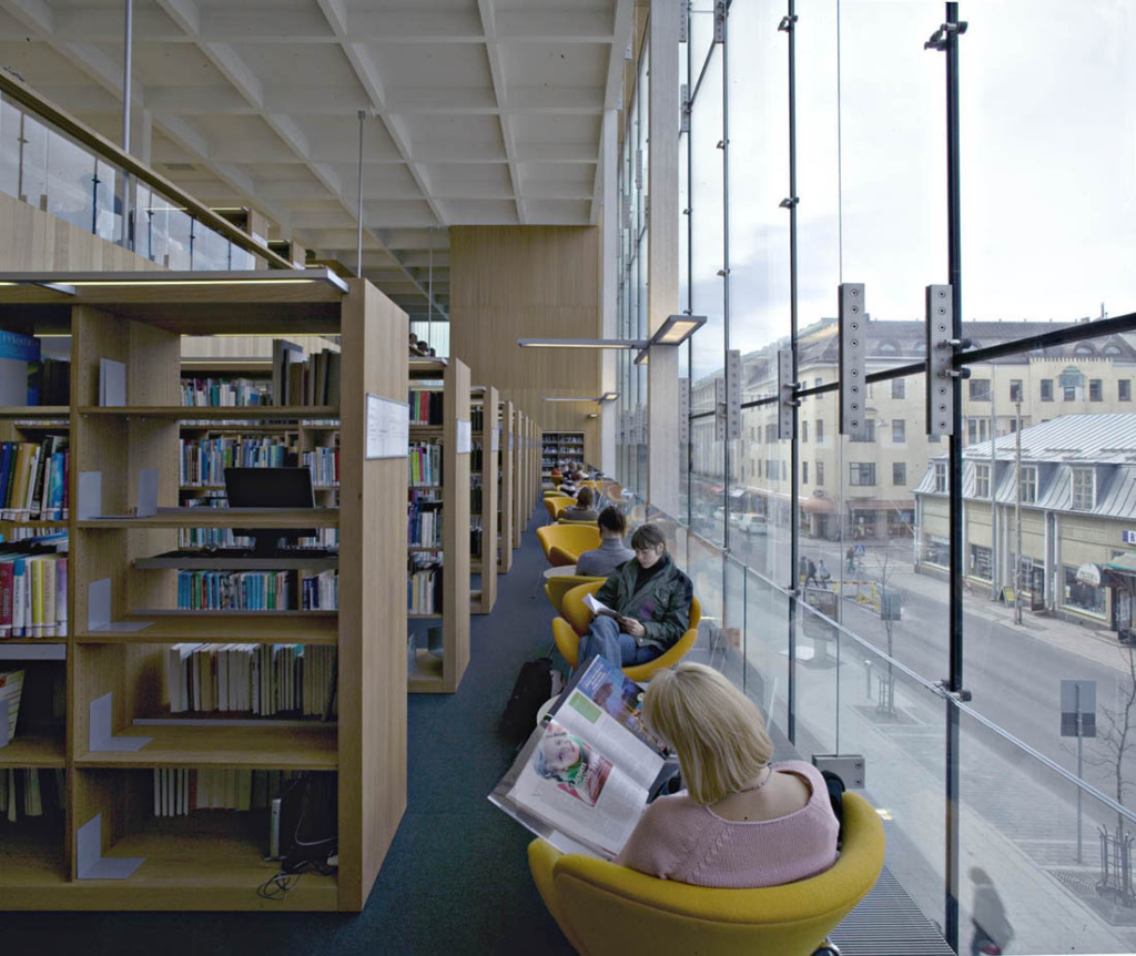
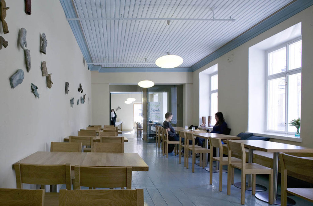
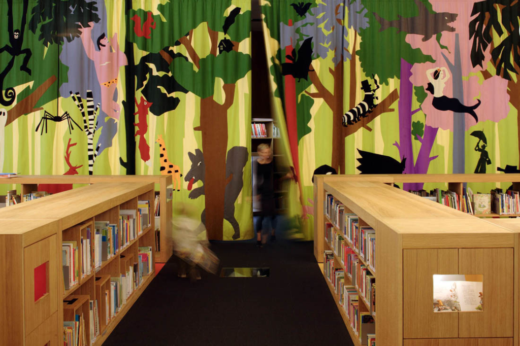
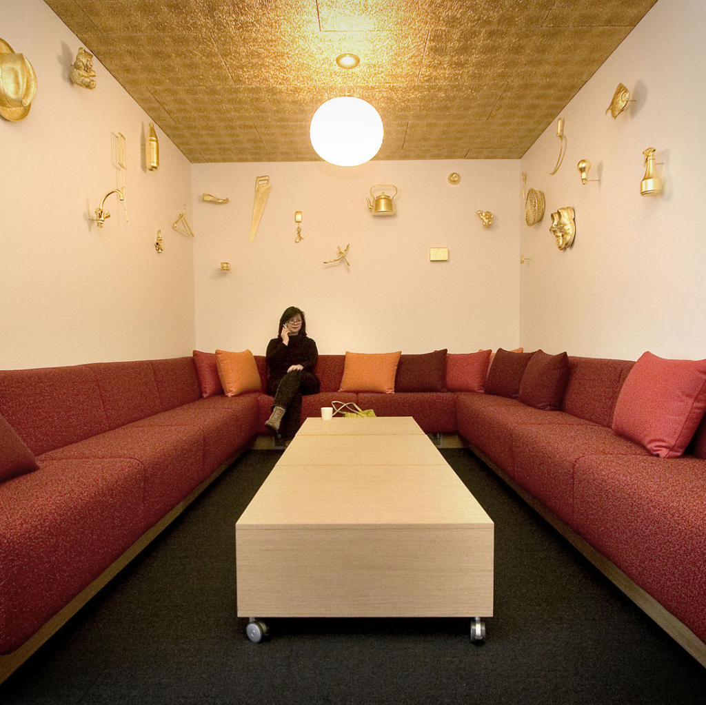
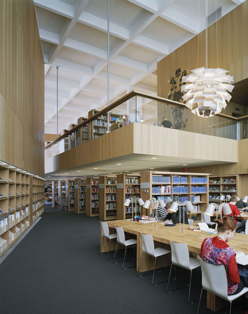
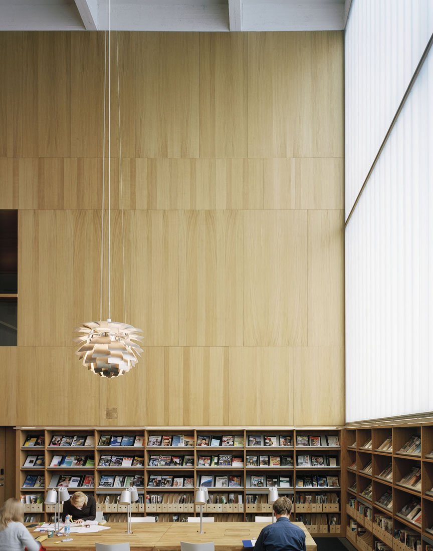
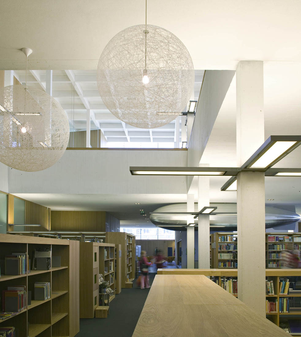
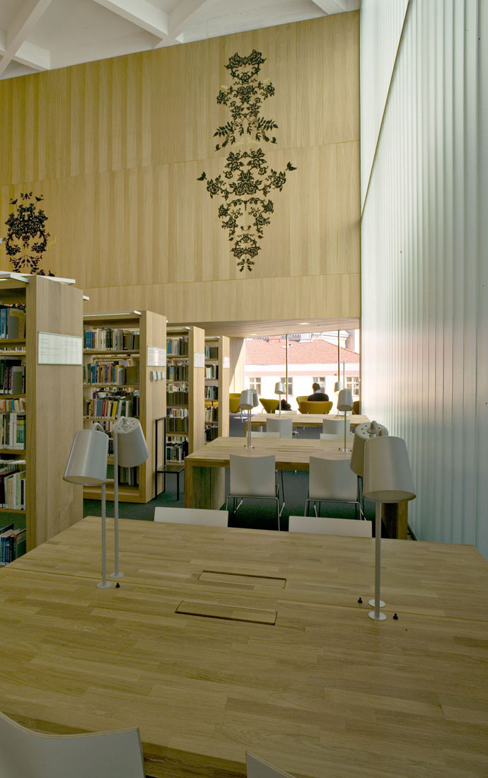
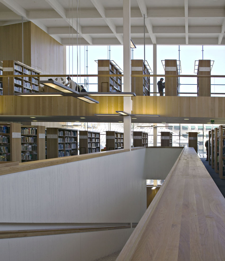
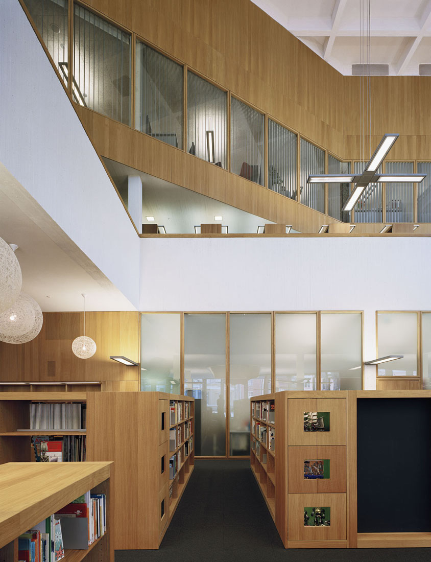
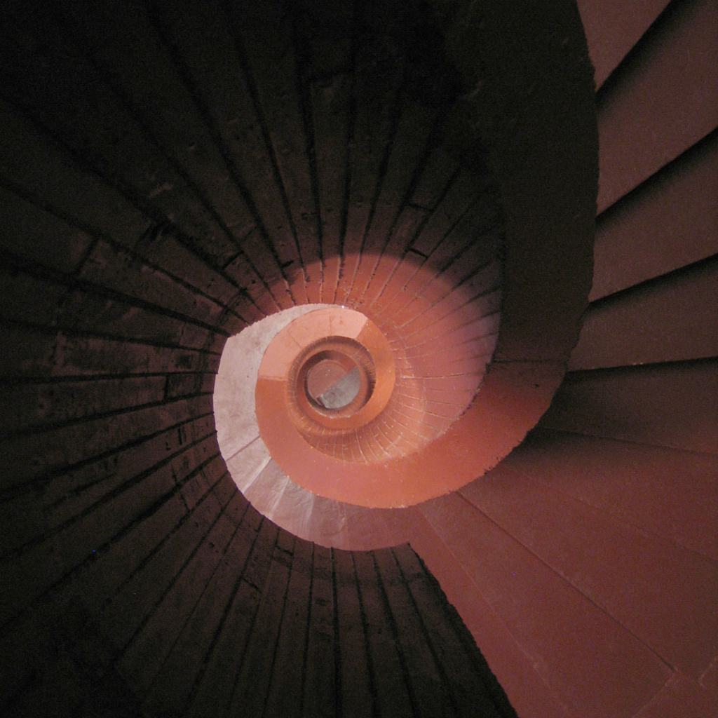
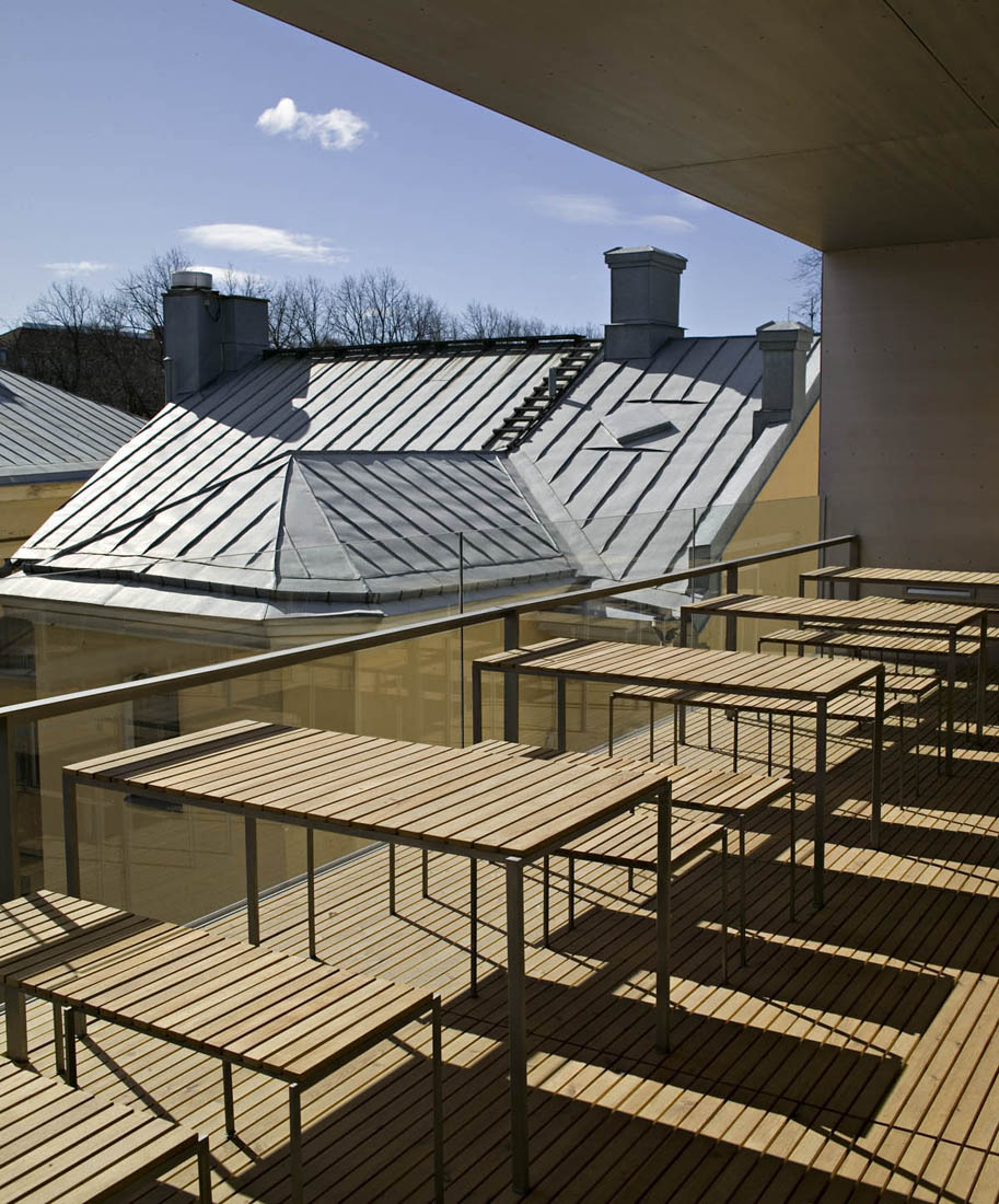
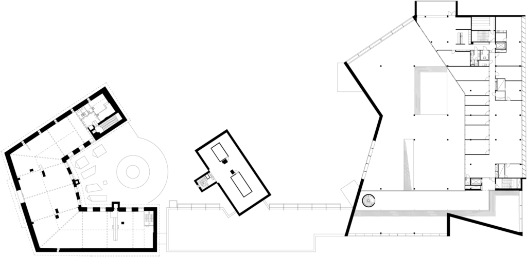
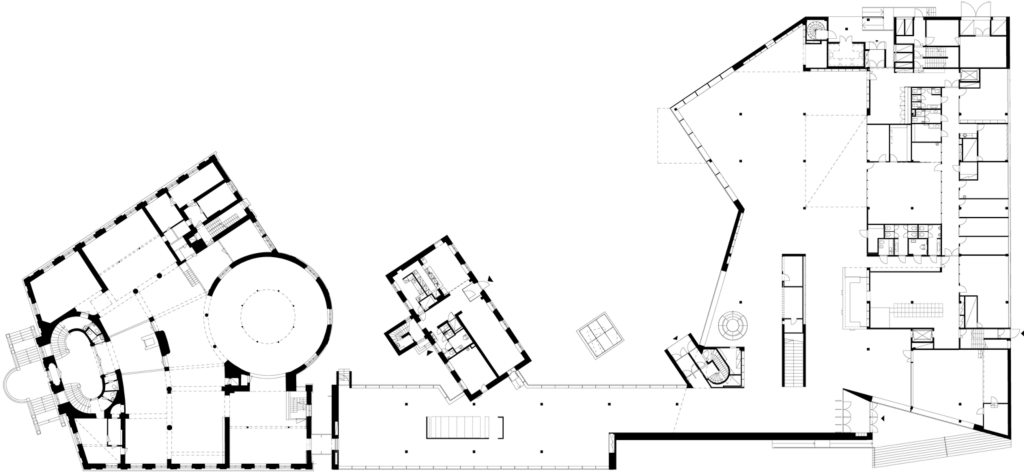
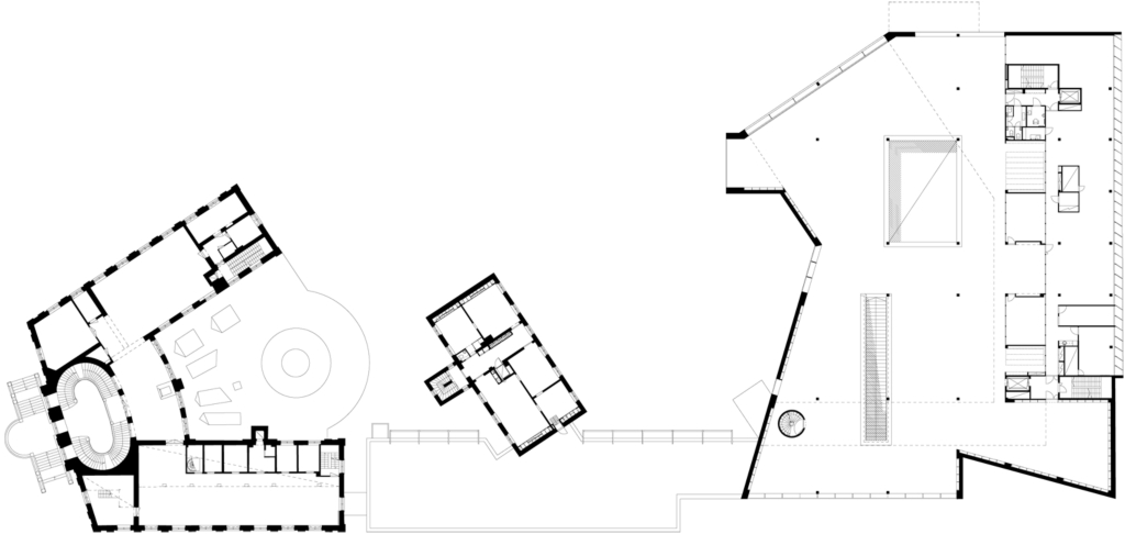
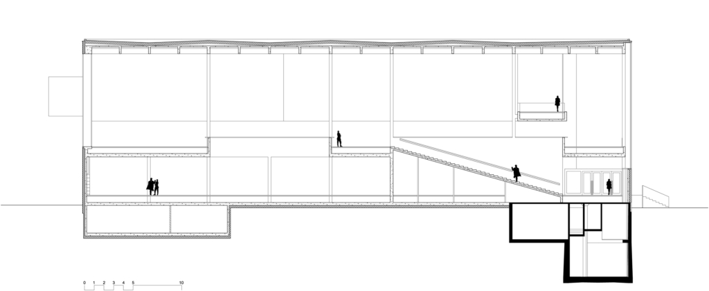
The new library has a functionally clear design. The public spaces are situated mainly on two floors surrounding the opening to the courtyard. The staff premises are located systematically on one side of the building facing the street. The new main entrance opens onto the corner of two main streets. The first floor has a reception and lounge area, a children’s and youth section, and a modernized version of a periodicals reading room called the news market, which functions simultaneously as the link between the new library and the old buildings. The main room of the new building is reached through a main stairway, which opens to a monumental space containing the non-fiction stacks and reading areas. The guiding principle in the space planning was flexibility; the functions of the library may change radically in the future with the introduction of new media. The rooms are open, and the functions are limited only by the transformability of the easy-to-move furniture.
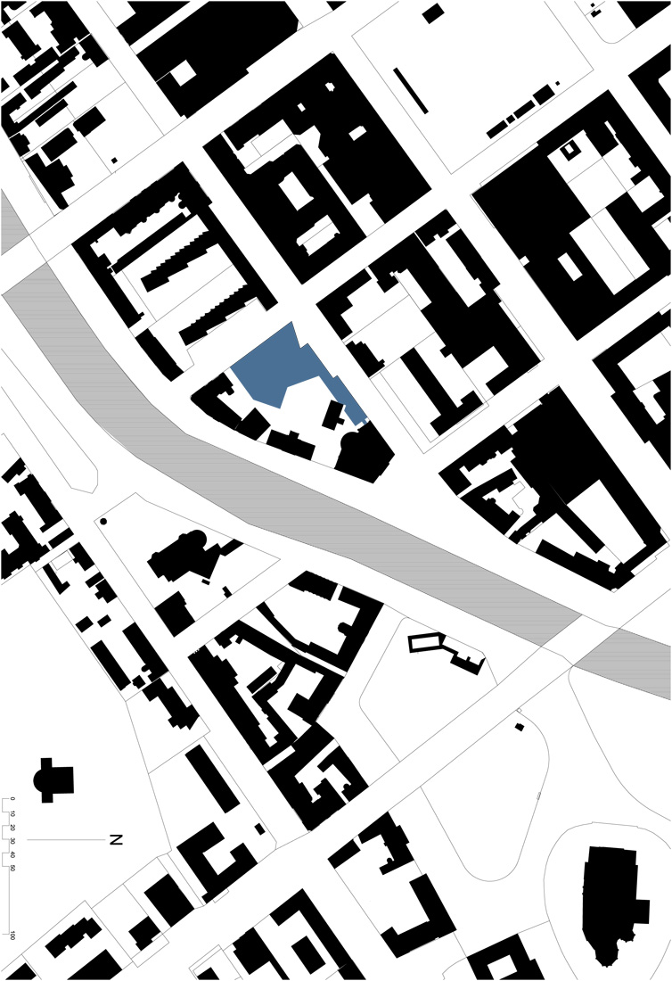
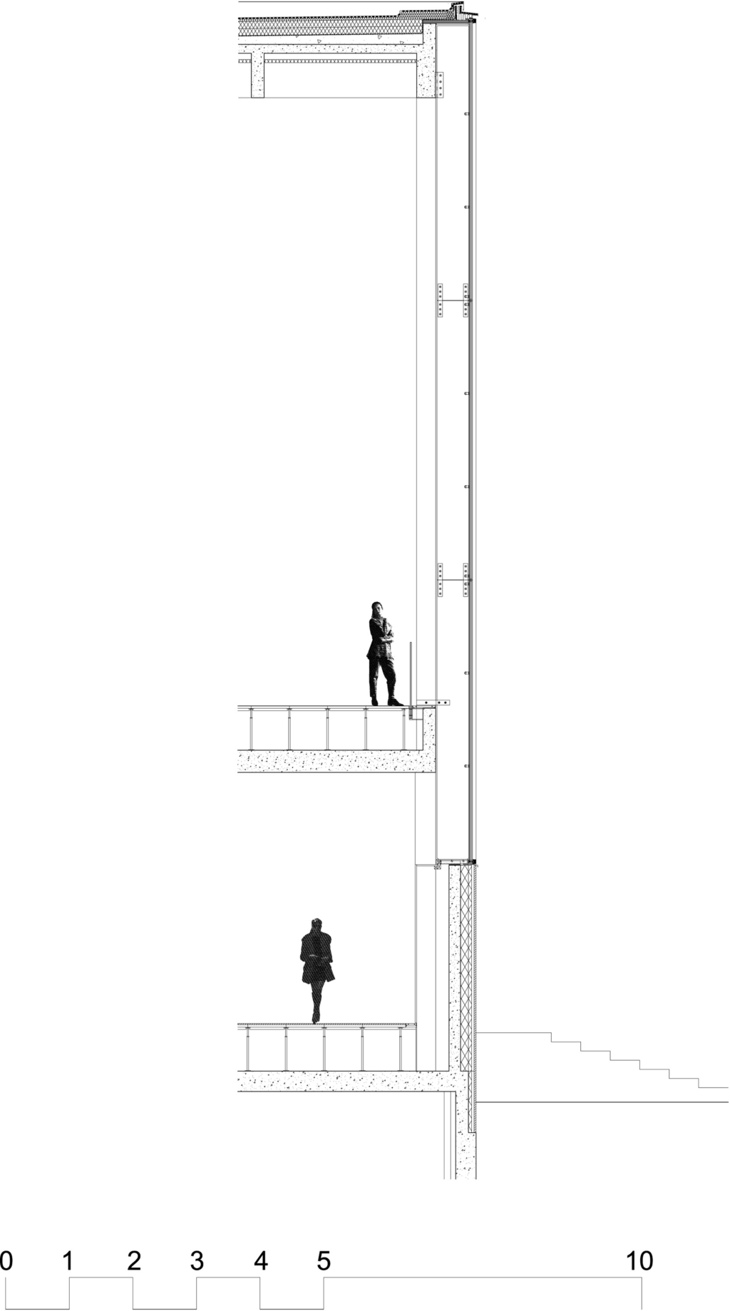
The materials of the building were chosen to accommodate the environment. The facades are mainly plastered, which is the predominant material of the old buildings in the block. Initially we considered using red brick, but gave up the idea to allow the old library building to remain the only brick building on the block thus emphasizing its primary position in the neighbourhood. We also used natural stone extensively on the facades, the stairway and the grounds surrounding the building. In the interior we used mostly European Oak in the wall furnishing and furniture. The structure of the building was made from concrete cast on site, which was left exposed as an important part of the interior design. The fair-faced concrete was formed with vertical boards to achieve the rough feeling characteristic of the material. Glass was given a seminal role both in the outer architecture and the interior world. From the first steps of the planning process it was clear that the exuberant use of glass would be the best choice. Transparency befits this type of building; a public library building should evoke the idea of openness.
The basis of the planning was to create a new library to meet up with the challenges of the future. At the same time, the library has a long and rich history, which the architecture should also take into account. The architectonic whole is formed from the union of these two oppositions, the past and the future.

from archdaily
그리드형
'REF. > Architecture' 카테고리의 다른 글
| [ Team 01Para ] Snap! - Bistable Structure (0) | 2009.01.19 |
|---|---|
| [ Studio Shift ] Miyi Tower (0) | 2009.01.18 |
| [ Tham + Videgard Hansson Arkitekter ] Kalmar Museum of Modern Art (0) | 2009.01.16 |
| [ Sander Architects ] Tree house (0) | 2009.01.16 |
| [ Shigeru Ban ] Dellis Cay villas (0) | 2009.01.16 |