728x90
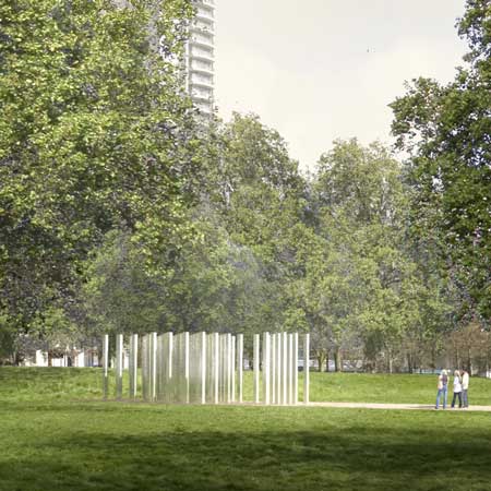
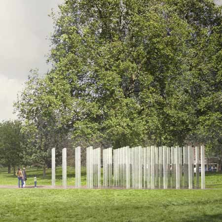
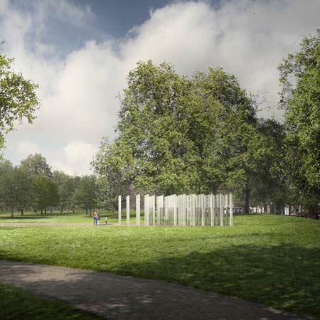
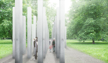
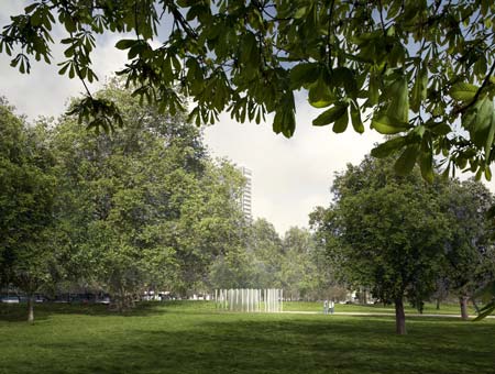
Davide Marchetti Architetto have won a competition to design the new Australian Pavilion in the Giardini at the Venice Biennale in Italy.
The 500 square metre concrete pavilion will be constructed for the 2008 Venice Architecture Biennale, which opens 14 September to 23 November.
Davide Marchetti Architetto’s design was the winning entry to a competition commissioned by Cafe Di Stasio. An exhibition of the short-listed entries is being held at Heide Museum of Modern Art until Sunday 3 August.
The following information is from Davide Marchetti Architetto:
–
The main idea underlying the design is the creation of a solid and massive object which corrodes little by little through a precise gesture, turning into a complex and articulated shape.
The original instrument comes from the detailed image of a Venetian gothic marble decoration: its composition and pattern generate a geometrical solution for the design.
The grid moves back and forth, disappears and enlarges. Its volume starts to be gently lightened and shaded following a quite elegant rhythm. Also the surrounding trees almost lie on the facades by molding their shadow upon the corners and the nooks of the facade.
The pavilion is composed of a bigger structure (the outer pierced border) enclosing a smaller space which includes the main exhibition hall plus the other service areas. The space in-between such elements is what I call “the parvis”, or better “the porch”. The porch is a “…structure attached to a building, forming a covered entrance to a vestibule or doorway. It is external to the walls of the main building proper, but may be enclosed by screen, latticework, broad windows, or other light frame walls extending from the main structure…”.
This space is designed in order to give the people the feeling of walking in a sort of a “limbo” irradiated by the sunlight both from above and the side. This is a narrow corridor that goes around the core part, where the main attractions are located.
In designing of such space I also thought of the so called “sottoporteghi” (literally “carried under”): these are tunneling passageways running through the dense urban fabric of Venice. They are ground-level open spaces, sometimes underneath a construction.
The simplest sottoporteghi are in the form of an archway built over the street, but they can be extended in length, or be open on one side as in a “loggia”. The design of the main exhibition hall is somehow a result of the exterior structural “vibration”: Diamond shapes are projected inside the inner box and multiplied up to the roof to create a unique exhibition space.
Construction materials are standard and cheap rather than luxurious and expensive: the existing gothic elegant decoration is replaced by concrete diamond-shaped walls casted in wood formwork with the aim of reducing costs and simplifying the building process.
Also “green building” is the concept of constructing we need today without depleting resources for future generations. In the new world of green building, information about the strength, durability, and indestructible nature of concrete as a resourceful building material is emerging.
Amid the teardown-and-replace mentality still pervasive in the world today, concrete stands out defiantly. Try to replace concrete with an alternative building material, and you’ll be hard pressed to find a substitute possessing the same thermal qualities, design flexibility, and permanence.
One of the most significant construction activities is the on-site fabrication of the traditional timber formwork as well as his design: this is the most flexible type of formwork so complicated sections take advantage of his modularity. Also timber defects as knots and gum veins and the positioning of the wood planks in several sizes affect the overall design aspect.
There is no difference between the outside and the inside wall finishes: the exhibition spaces reflect the building architectural “language” and instead the floor will be shiny and glossy. The building has a box structure with a double skin reinforced concrete walls. The external reinforced concrete walls are characterized by a special formwork that give a typical design of walls. The internal closed box is composed of continuous reinforced concrete walls (with some openings) and a two-way reinforced concrete slab on the top.
The horizontal forces, such as forces caused by wind or seismic actions, act on the walls of the box. The two-way reinforced concrete slab on the top have a thickness of 60 cm and is composed with a two layers of reinforced concrete and a central layer of polystyrene expanded block to reduce the self-weight. The foundation are composed by a medium foundation piles and a basement raft.
Project: Venice Biennale New Australian pavillion: Di Stasio Ideas Competition;
Program: Project for the new Australian pavillion in the Giardini of the Venice Biennale;
Location: Venice, Italy;
Client: Mr. Rinaldo Di Stasio;
Dimensions: 500 square metres floor area: Entry and books -10 sqM, Main hall - 400 sqM, Meeting room + second gallery - 30 sqM, Offices + staff facilities - 30 sqM, Storage, plant, back of house - 30 sqM;
Status: International design competition, 1st Prize July 2008.
2008 is the 20th anniversary of Cafe Di Stasio. The cafe will celebrate all year with an ongoing program of support for the Australian Pavilion in Venice and the Architectural Biennale 2008 in particular. Rinaldo Di Stasio is an enthusiastic patron of art and architecture in Australia. To further his patronage, he proposes sponsoring an architectural competition for the design of a new pavilion in the Giardini of the Venice Biennale.
Norman Day, The Age architectural writer, is advising on the implementation of the competition and the graphic designer David Pidgeon will collaborate with Callum Morton, one of Australia’s artists at the last Biennale, on the display and promotion of the entrants.
The object of the exercise is to add to an ongoing momentum of support for the rebuilding of the Australian Pavilion, an invaluable cultural showcase of Australian artistic talent in Europe. The existing pavilion is dated and inflexible. It is hoped that the unrestrictive nature of the project will encourage some radical architectural solutions and excite the imagination of the public and the authorities.
그리드형
'Pavilion&Installation' 카테고리의 다른 글
| [Laura Gruosso] A different stop (0) | 2008.08.14 |
|---|---|
| [ Davide Marchetti Architetto ] Australian Pavilion (0) | 2008.08.02 |
| [100planos] stand IVDP (0) | 2008.07.25 |
| [ Oliver Bishop Young ] SkipWaste (0) | 2008.07.22 |
| [Gerry Judah] Land Rover Sculpture (0) | 2008.07.21 |