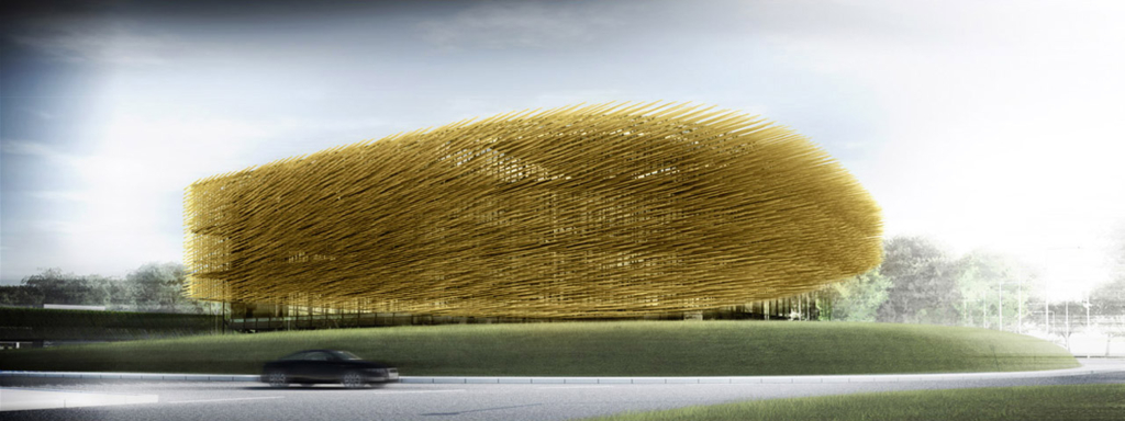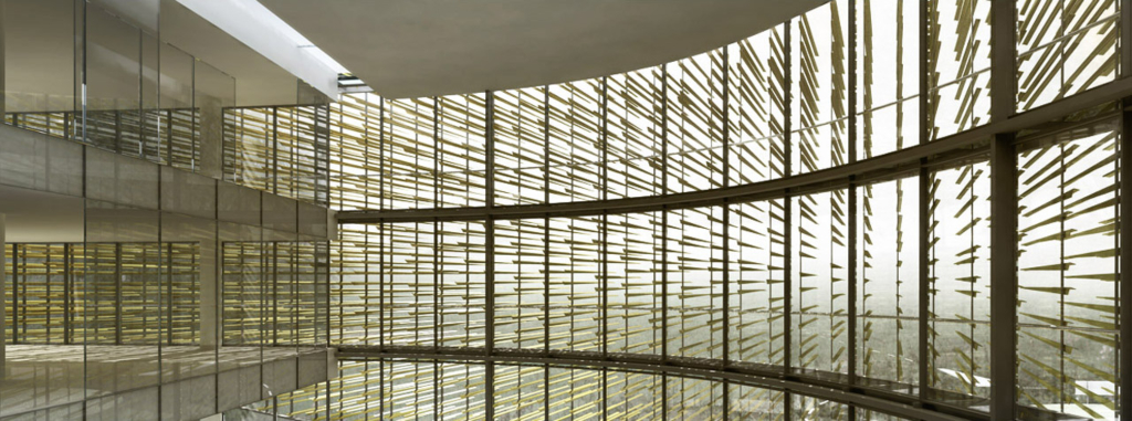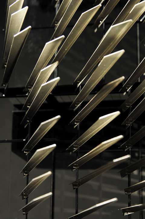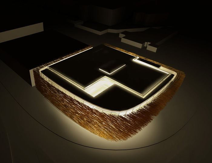
The brilliance of the three-dimensional cladding is that the appearance of the building changes quite dramatically depending on the position of the viewer. As the building is located right at a roundabout, the cladding creates an animation for the passersby. As the appearance of the building shifts from solid to transparent, the interior is revealed.
The cladding system is functional too, the architects write: ”On the SW facade they act as a large scale brise soleil and rain screen, on the SE façade they appear more permeable. Early morning and winter sunlight is able to enter the building, while high summer sun is excluded.”
What fascinates me about the design is how the building seems to be ‘caught in motion’. The hundreds of parallel lines provide the building with a direction. The building looks as if one moment it speeded across the surface of the earth, while at another moment it froze at this roundabout.
Comic books feature similar parallel lines, to illustrate a fast moving figure or vehicle. In photography moving subjects create parallel, meandering lines when the film or sensor is long enough exposed. Other references include reed, fur and a school of fish.
The design by Moxon reminds me of a design I once made in the studio of Kas Oosterhuis at the TU Delft. For a site next a motorway we had to parametrically design a showroom building. I came up with a building featuring an asphalt skin and glass fibre LED hair.
The design by Moxon architects was the winning entry in RIBA competition that was held in 2007. In the autumn of 2008 ‘163 PRS / Olivers Place’, as the plan is called, was submitted for planning approval.


from eikongraphia
'REF. > Architecture' 카테고리의 다른 글
| [ Laetitia Delubac and Christian Félix ] Ecolodge (0) | 2009.10.17 |
|---|---|
| [ Johnston Marklee & Associates ] Mameg + Maison Martin Margiela (0) | 2009.10.16 |
| [ REX | OMA ] Dee and Charles Wyly Theatre (0) | 2009.10.16 |
| [ Adamo Faiden ] Community Centre of La Candida (0) | 2009.10.16 |
| [ Salto AB ] Villa Nord (0) | 2009.10.16 |