728x90
Location: Grand Rapids, Michigan, USA
Client: Grand Rapids Art Museum
Area: 125.000sqf
Construction start: 2004
Completion: 2007
General contractors: Rockford / Pepper Construction
Concrete contractor: Grand River Construction
Structural Engineer: Dewhurst Macfarlane and Partners
Environmental Engineer: Atelier Ten / Design Plus, Inc.
Lighting Consultant: Isometrix Lighting + Design
Curtain Wall Consultant: W.J. Higgins & Associates
Landscape Design: Design Plus
Photos: Steve Hall, Scott McDonald & Chris Barret
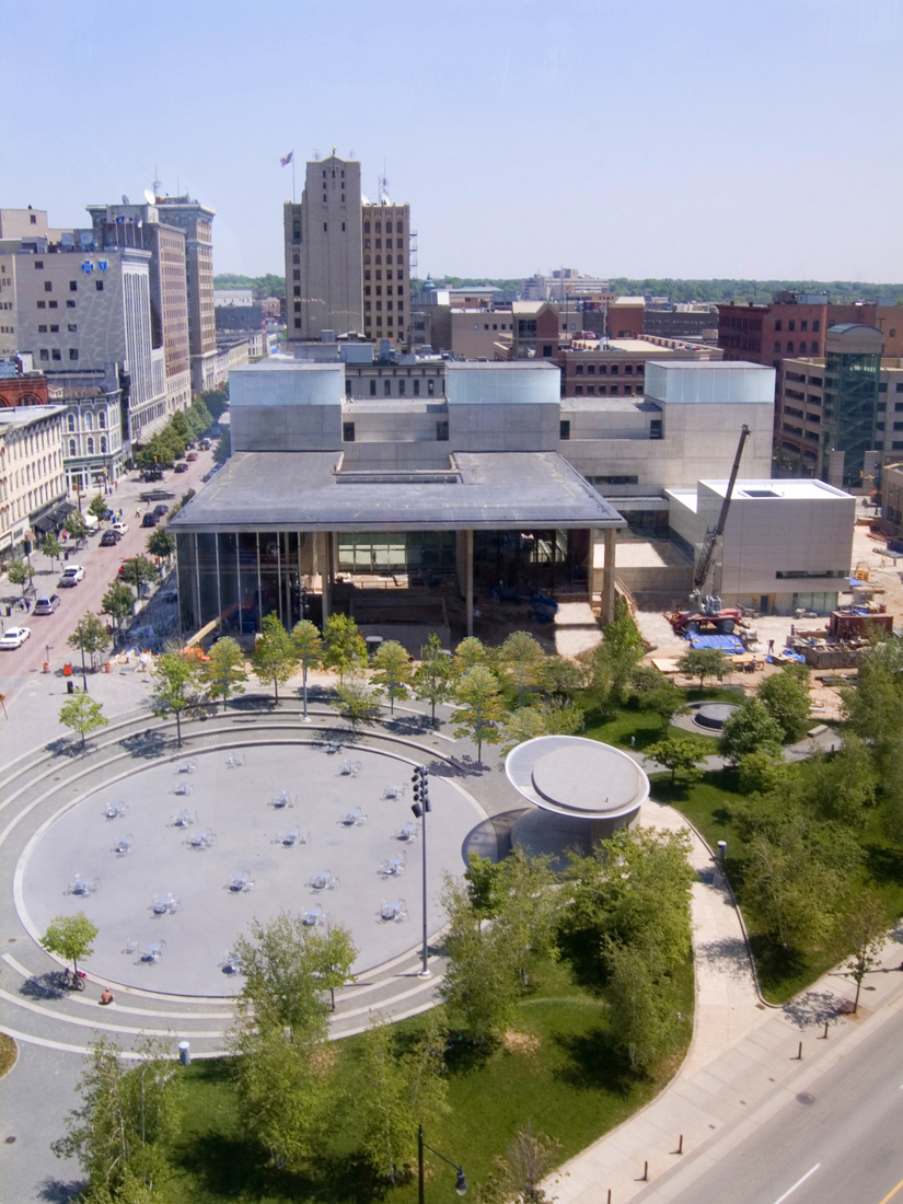
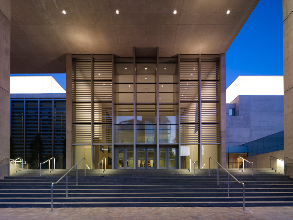
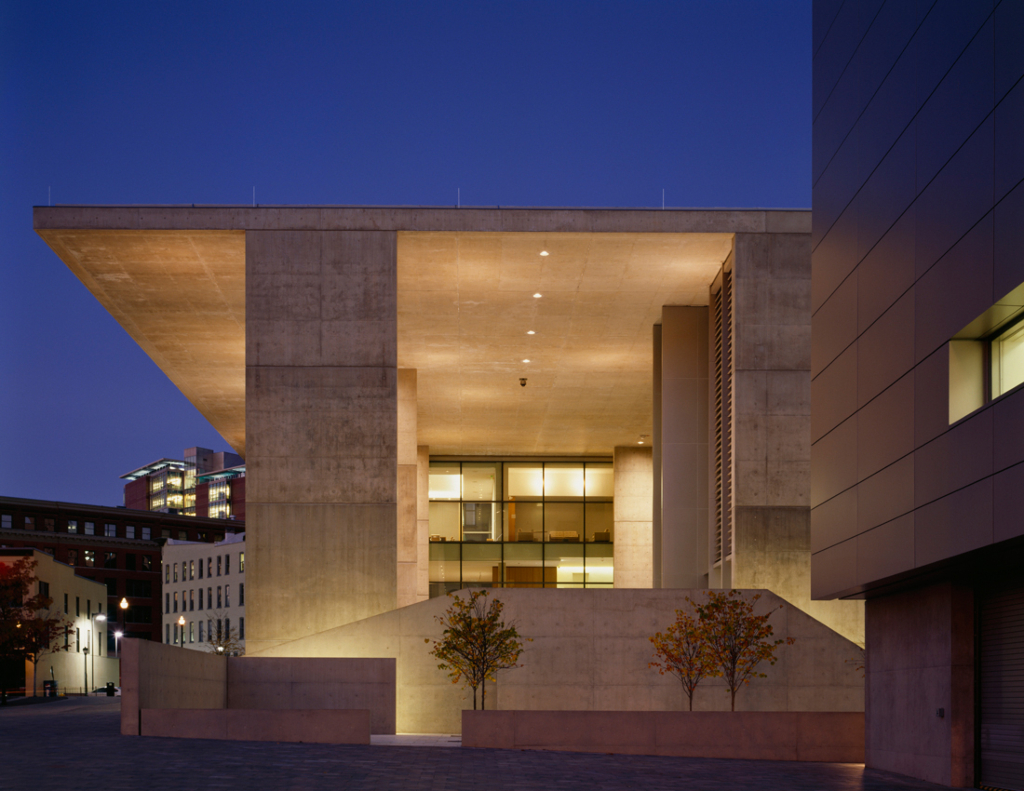
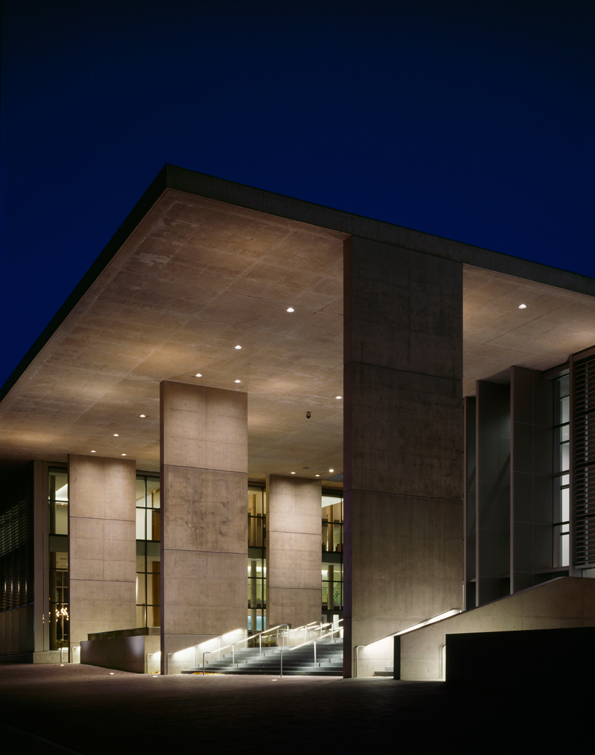
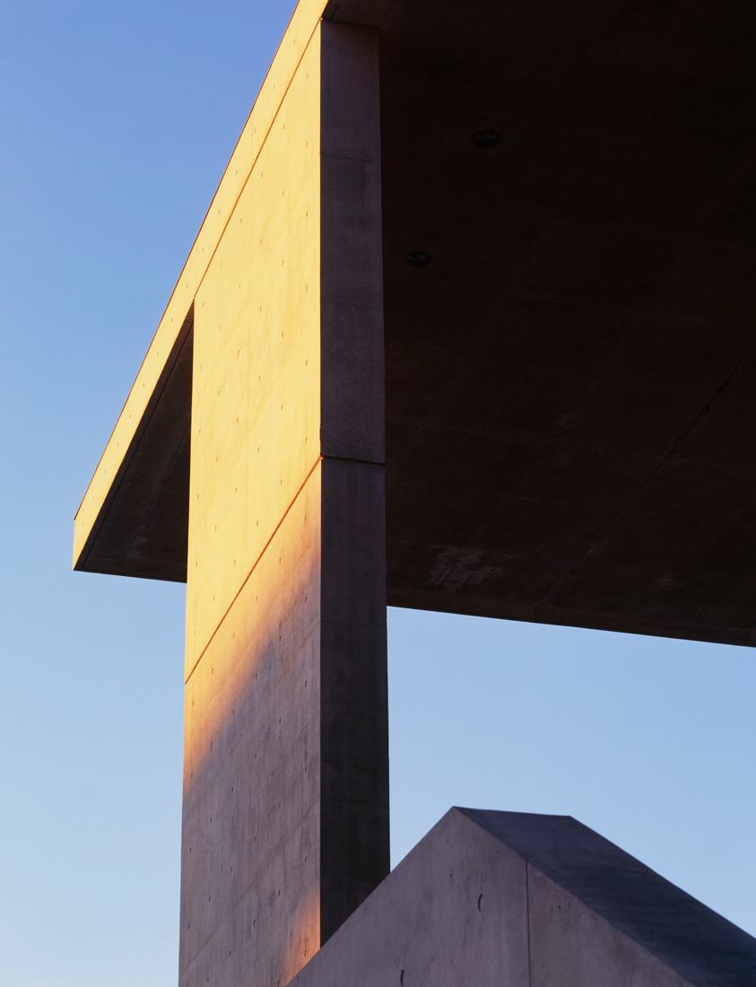
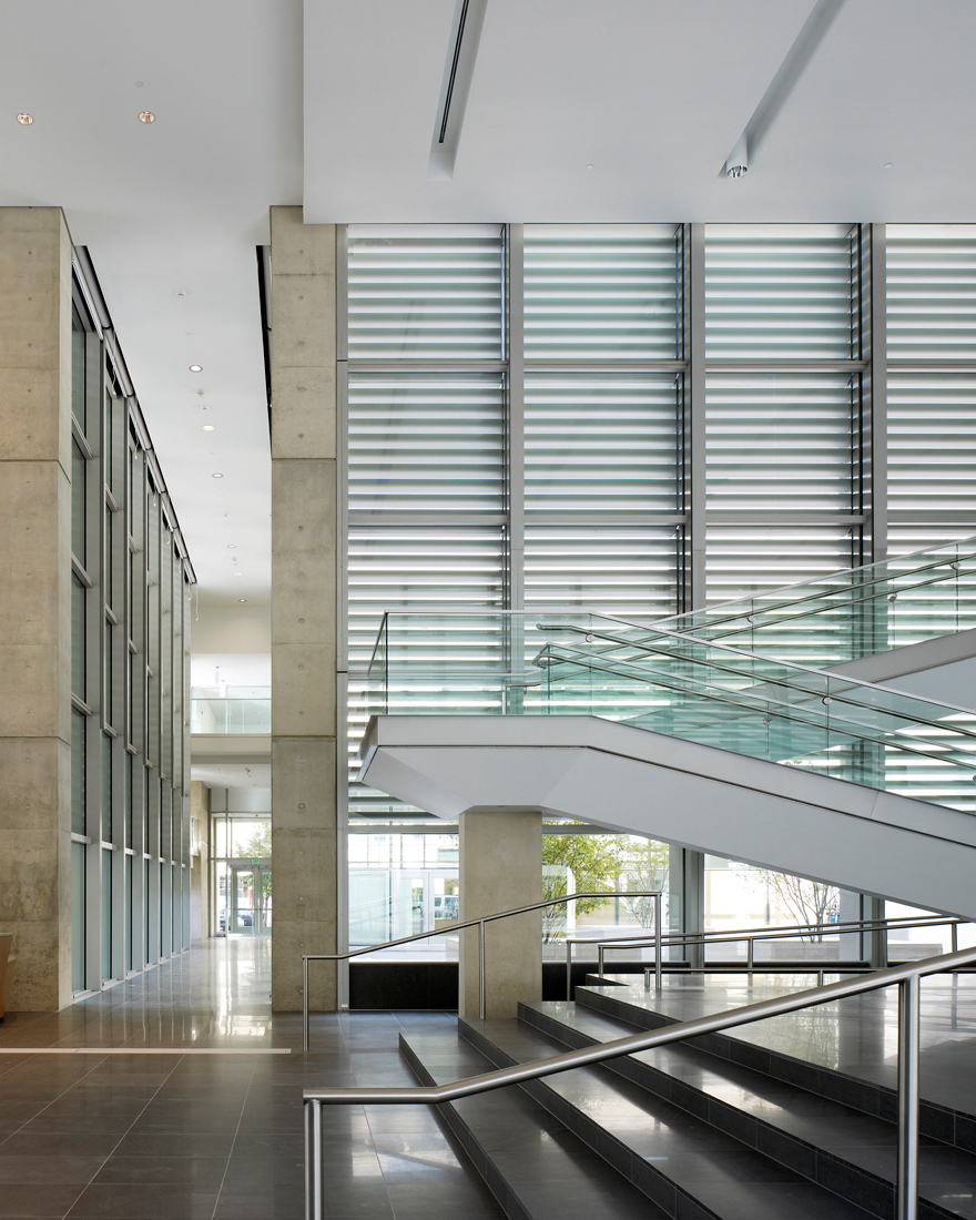
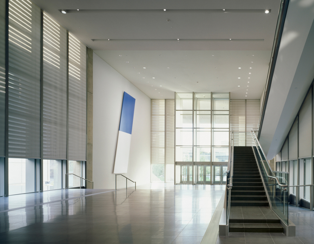
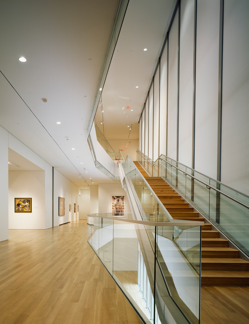
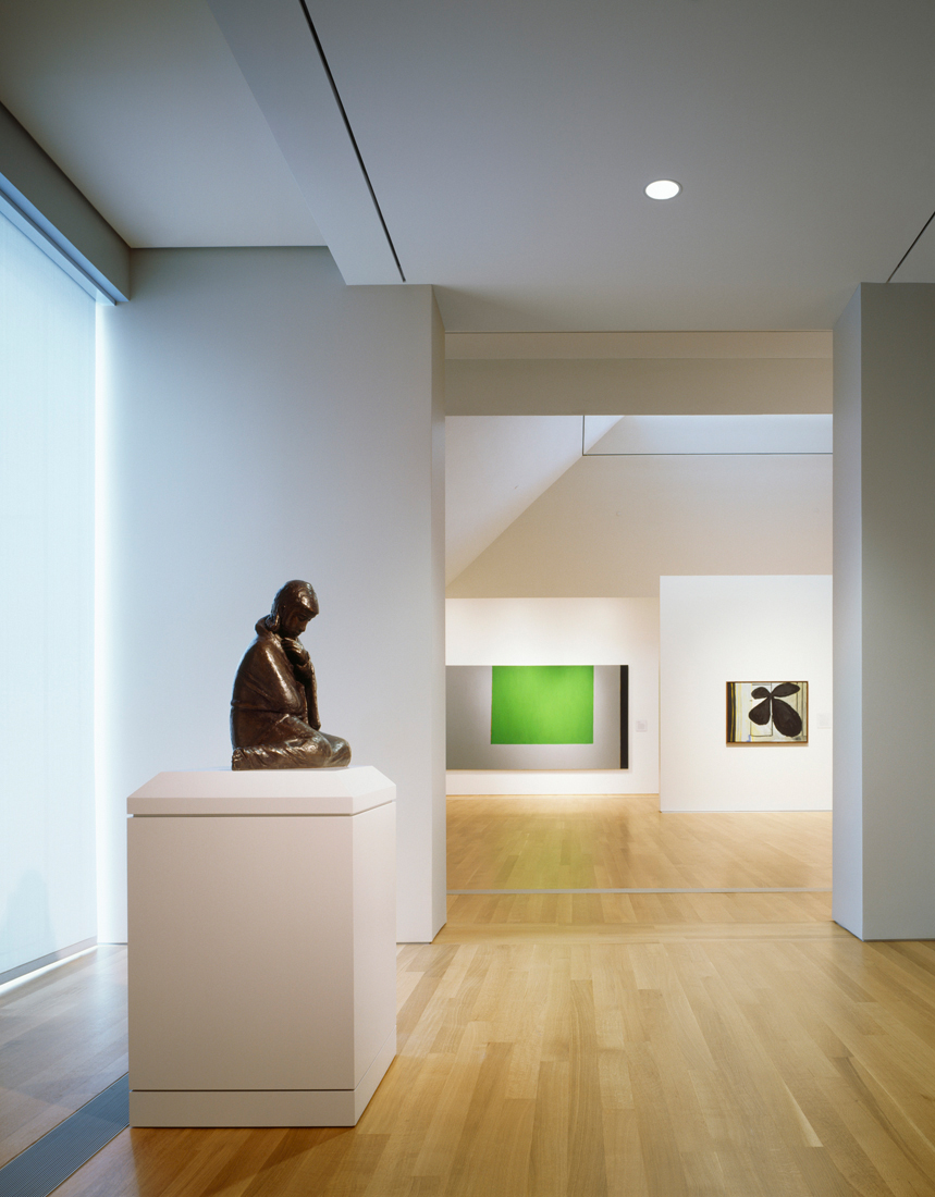
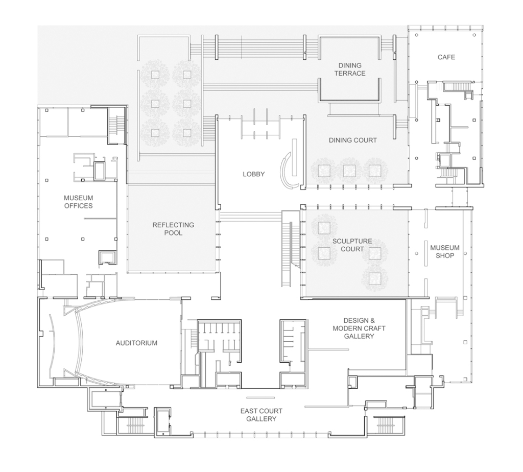
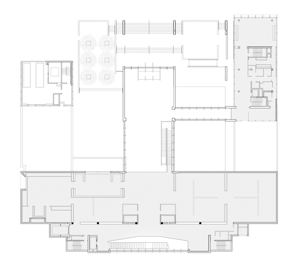
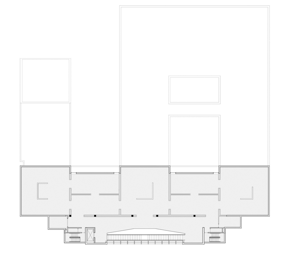
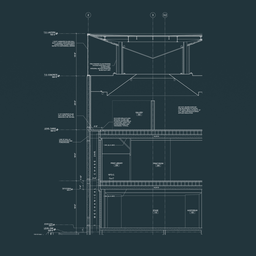
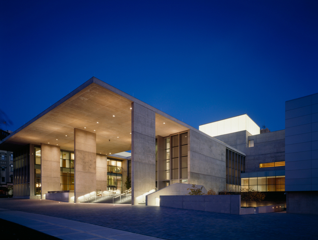
The new Grand Rapids Art Museum occupies one city block right in the heart of Grand Rapids, Michigan. Grand Rapids is a city well known for its legacy and influence on commerce, craft and modern design and it is the home to many international companies -
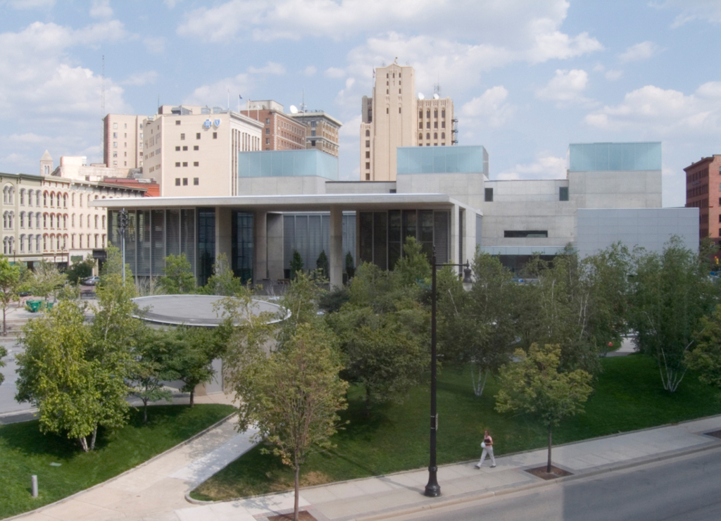
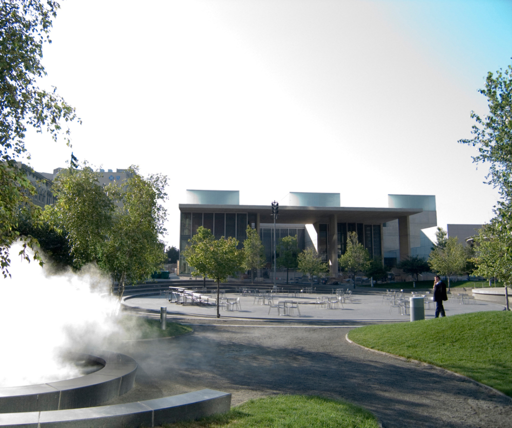
AmWay, Steelcase, Herman Miller, Haworth, among others. The new museum has 125,000 SF of floor area with more than 50,000 SF of gallery and art exhibition spaces. The new building is located adjacent to the park with sculpture “Ecliptic” by Maya Lin, forming an urban oasis surrounded by tall buildings.
GRAND within its context and HUMANISTIC in its mission
The design stresses both the symbolic need of a museum to be a civic icon within the city, plus fulfilling humanistic needs for people to have their own experience with art. It is grand in its presence, and intimate in the experience, working in harmony.
Floating canopy: A frame of the city and a place for all.
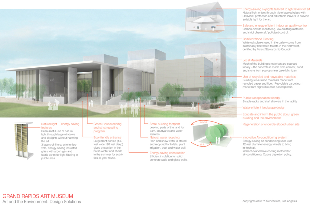
The projecting canopies, like large canopies of trees extend up and reach out to frame the park and the city, similar to the Japanese concept of “borrowed scenery”. The sheltering canopy defines a place for multiple urban activities, as a gathering place for people.
Fingers into the green / Pockets of nature
The front of the building is formed like fingers extending into the green of the park. Museum lobby, restaurant, education center are projecting pavilions towards the park with pockets of nature between them.
Experiencing Art in the City: CONNECT and DISCONNECT
Arriving in the museum, pockets of nature between museum pavilions slow people down from hectic pace of urban life. The presence of nature within allows the visitor to reach a state of repose, adjust their eyes and conscience state for the art to come. Layers of screening - louvers, glass and shades soften the light and calm the mind.
Lanterns: URBAN SYMBOLS and Light for art
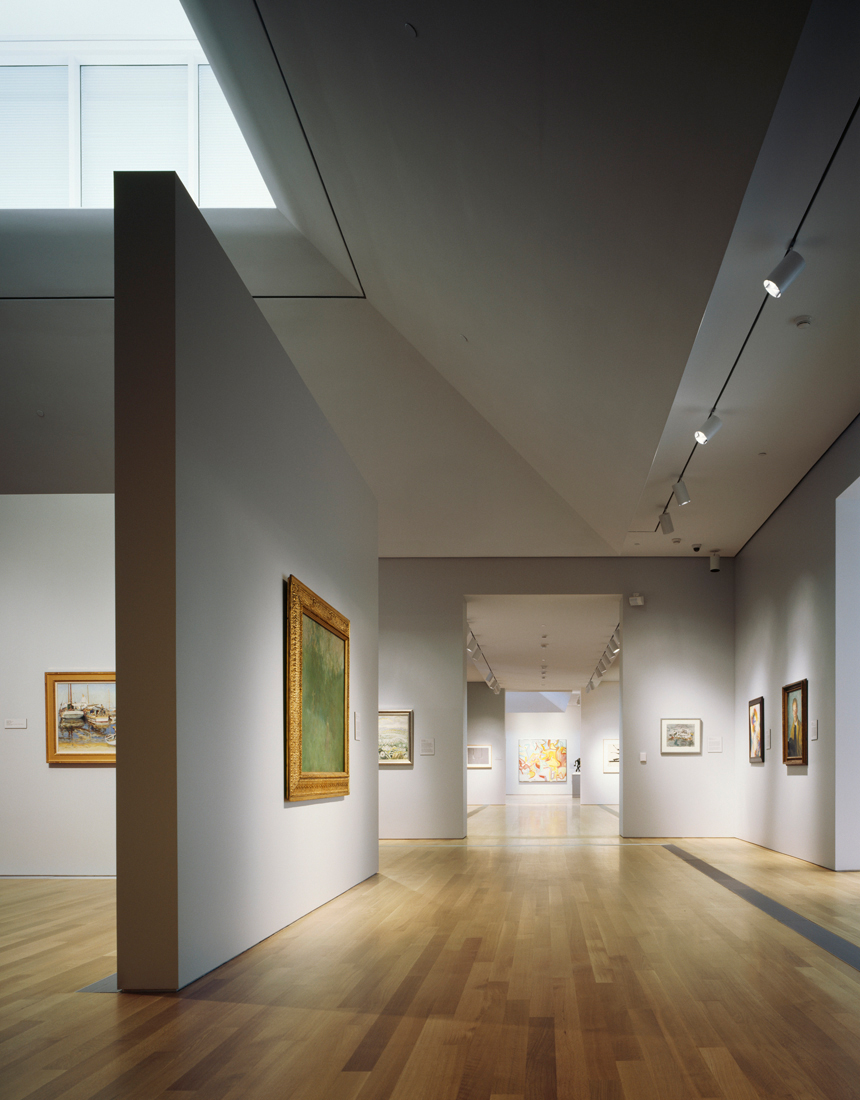
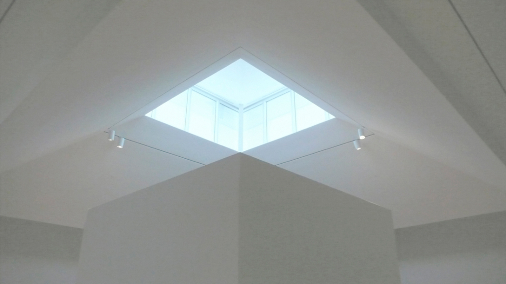
The inner sanctum beyond is the 3-level gallery tower where top floor galleries are lit with lantern skylights, serving as light givers to the galleries as well as illuminating “beacons” in the urban night sky.
Light: POETIC and PRACTICAL
Light truly breathes in the gallery- the changing of time is sensed in the changing light of the galleries. Being one of the very first art museums in the US designed with the goal for LEED certification, the use of natural light in the building is carefully planned. Most public areas of the museum have natural light, and gallery rooms welcome light from top lantern skylights as well as large windows which also connect art to surrounding urban life. Grand Rapids Art Museum’s design emphasizes the important balance of both the exterior openness and the interior calmness, both people’s needs to connect and also their needs to take inner joumeys with the arts. Both for people to enjoy the uplifting quality of light in the galleries as well as for them to enjoy wonderful outdoor time under the canopy.
그리드형
'REF. > Architecture' 카테고리의 다른 글
| [ Zellnerplus ] LTSC Project (0) | 2008.09.06 |
|---|---|
| [ ZLG Design ] Boh Visitor Center (0) | 2008.09.05 |
| [ Sami Rintala ] Hotel Kirkenes (0) | 2008.09.02 |
| [ Marcio Kogan ] Volume B store (0) | 2008.09.02 |
| [ HOK ] British Embassy in Jakarta (0) | 2008.08.31 |