728x90
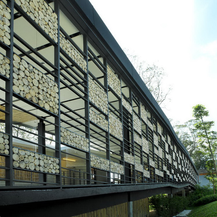
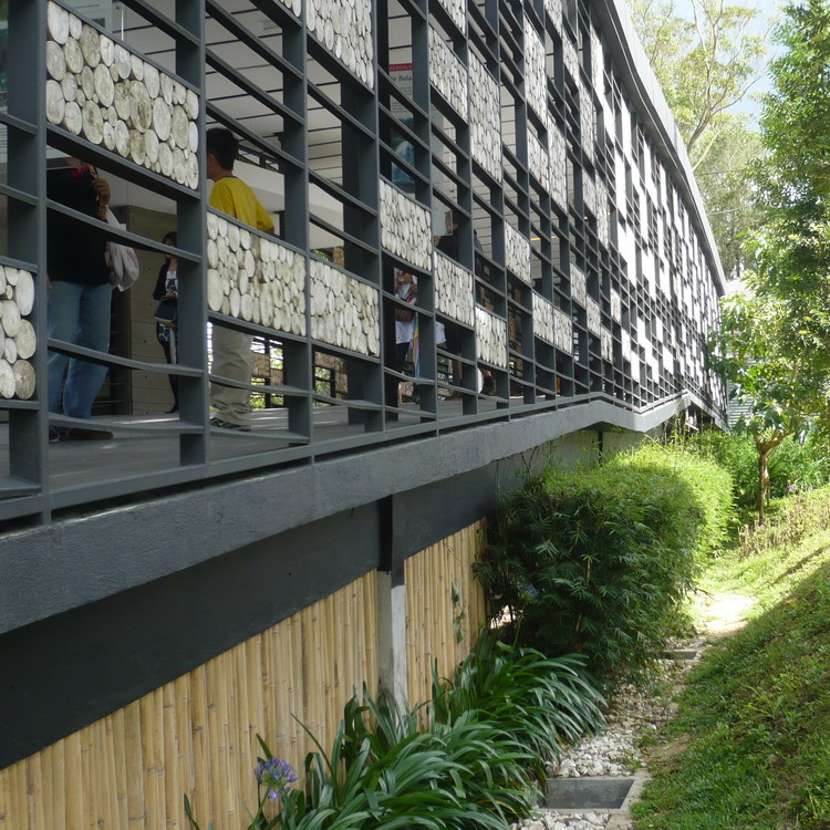
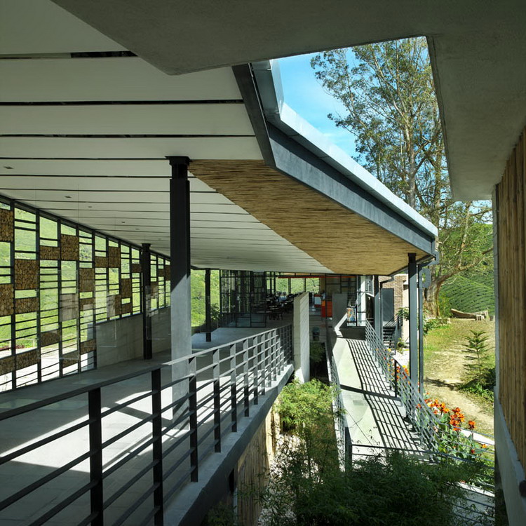
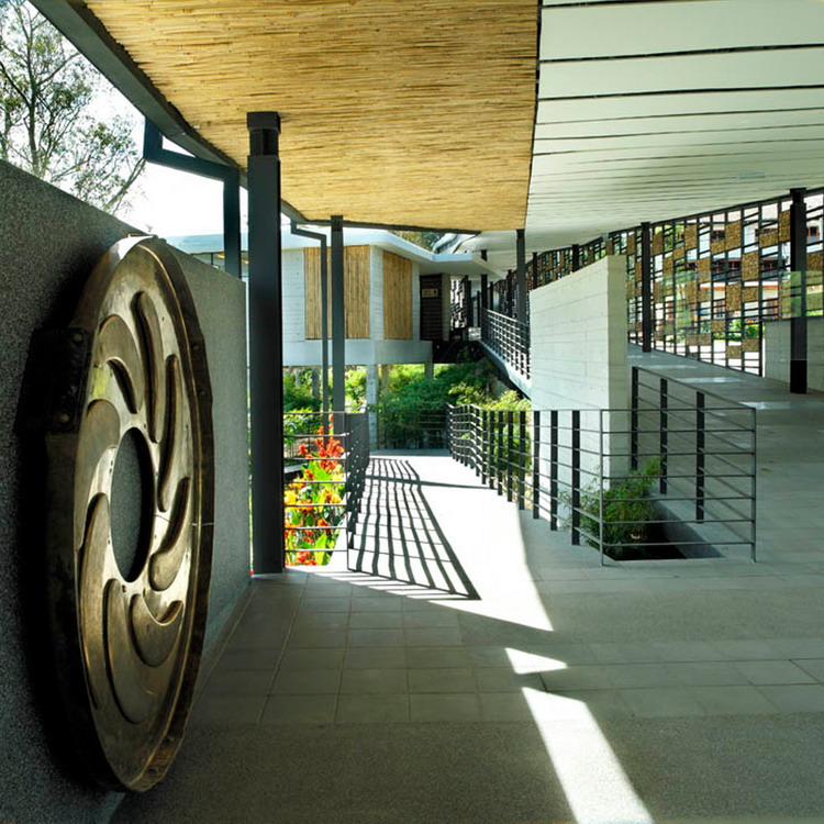
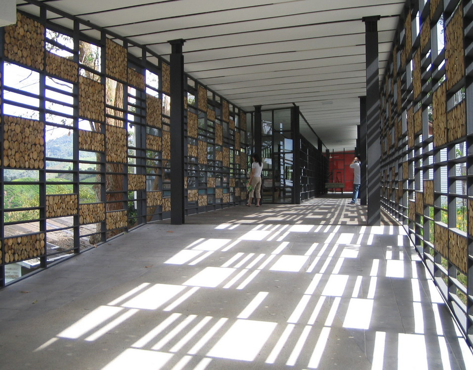


Of the things i really love about maintaining this blog is that it gathers architects from all around the world. In this case, the people from ZLG Design in Malaysa sent us their project for the BOH Visitor Center through our contact form - same as many other offices we will publish in the next days. Everyone is invited!
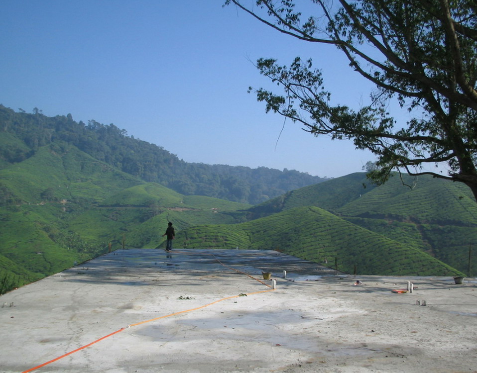
This great building -my personal favorite in the last month- is located in Malaysia, overlooking an amazing landscape. I think that its tectonic work really frames the natural surrounding.
Architect: ZLG Design
Team: Huat Lim, Susanne Zeidler, Jimmy Wong, Mary Verhaeghe, Hong Chieh
Location: Sungai Palas, Cameron Highland, Boh Visitor Centre, Malaysa
Locale description: Tea plantations and factory
Site area: 12,168.32 sqm
Built area: 1,233.8 sqm
Building start: November 2005
BUilding completion: July 2006
Budget: USD$498,652.29
The BOH Visitor Center will provide visitors to the estate opportunities to view and appreciate the landscape. This “building” would not only address the Owner and operator’s requirements to meet certain sales targets, it was also there to house the existing tea shop and improve the visitor facilities.
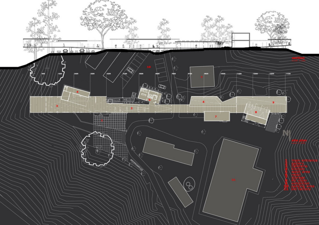
It is well worth knowing finally that the best experience of a building can actually be achieved through mere disposition and not entirely on detailing or indeed resolution of a design through construction techniques alone. BOH was totally about placing a simple path to lin an arrival experience atop a hill to a destination point at the end of an enclosed space, which is the old factory where tea is observed made by hand.
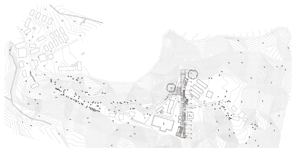
It was never intended to displace or rehouse any of the existing structures and facilities in this Visitor Center: it was more of collecting the various buildings into a single unified whole. The alignment of the building footprint became critical, and the execution of this gesture to leave things as they are, resulted in a form that appears to be completely natural, completely belonging to the place. It is now hard to believe the new structure had not been there for the 50 years or so before it was built. This is probably the most rewarding and notable experience.
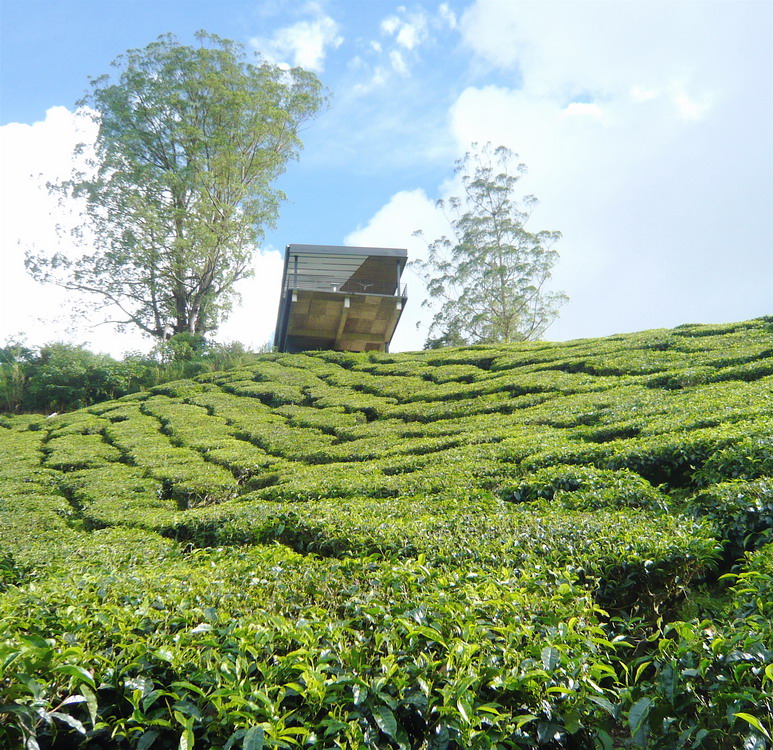
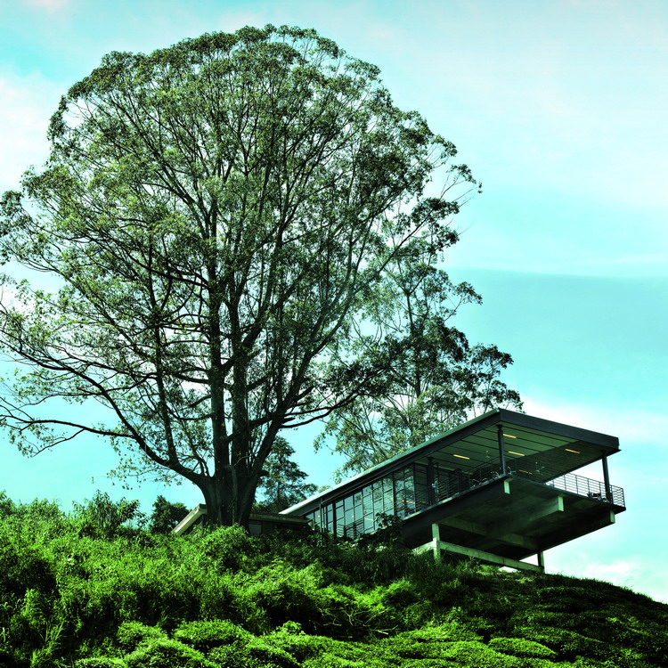
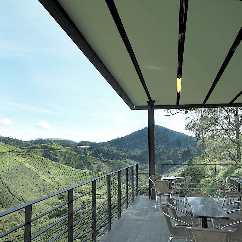
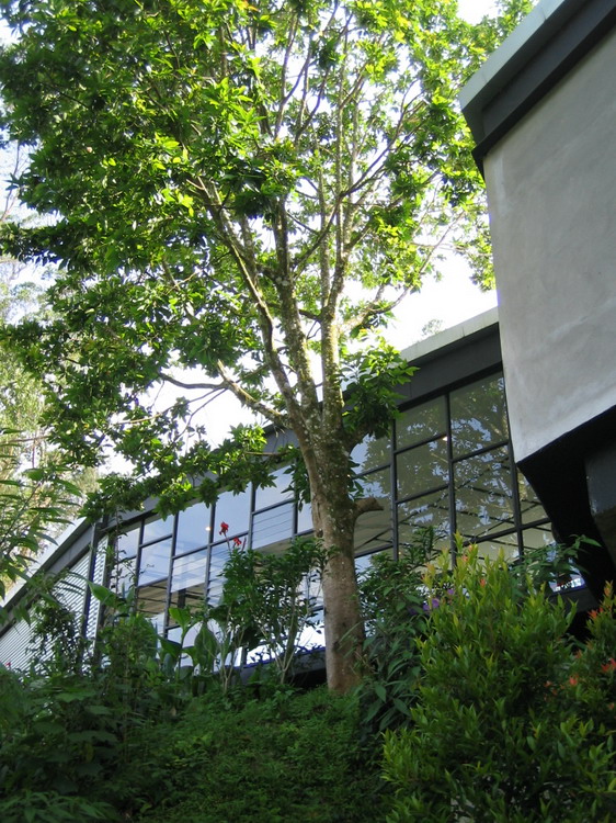
The approach view of the 145m long and 9m in width building reveals the large cantilever of the balcony overlooking the valley. A very large tree has been preserved and it now anchors the building to its surrounding natural landscape.
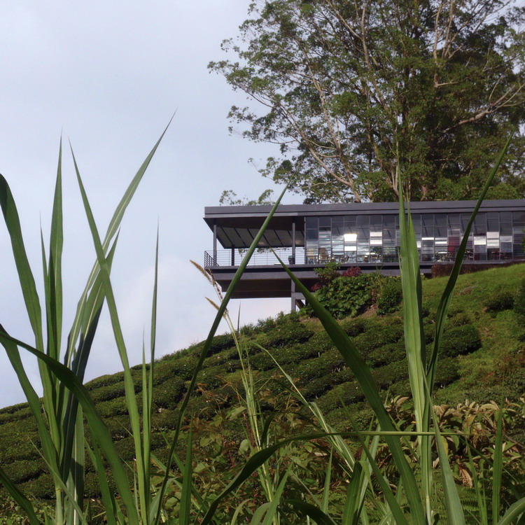
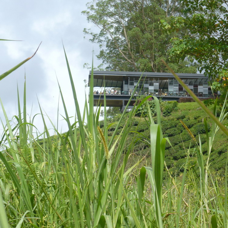
The terrace holds seating for those staying outdoors. This is linked to the F+B area partially enclosed by sliding glass panels allowing maximum views and natural ventilation on warmer days.
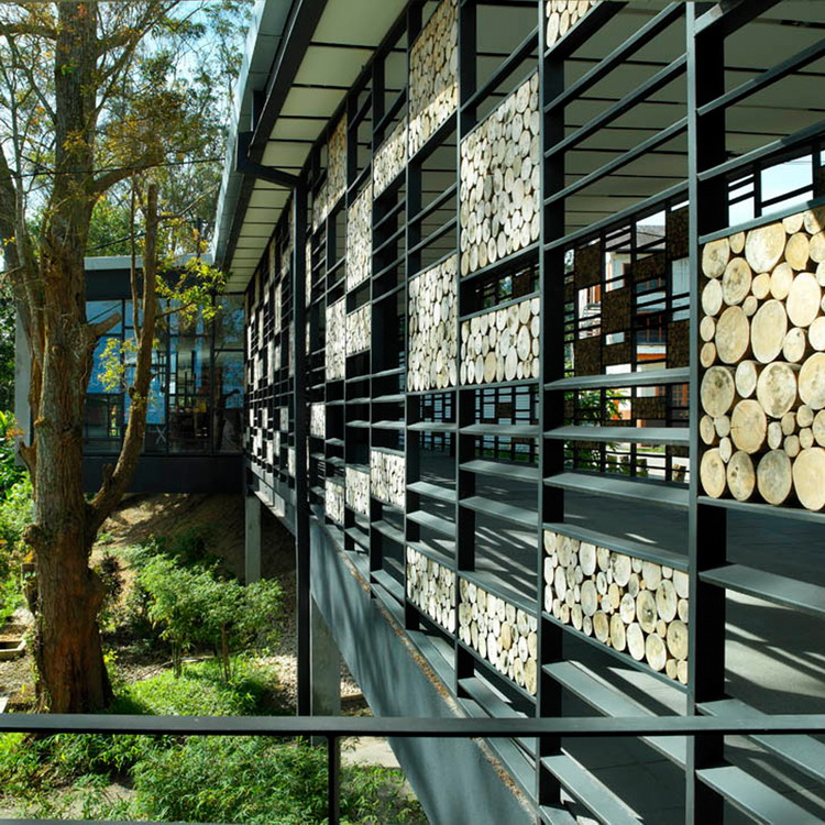
The shape of the building and its location is a direct response to the site with cut outs in the structure to avoid cutting down existing trees or demolition of other important site features. A new car park area for the visitor has been allowed for at the back accessible by drive below the “bridge” segment of the new building.
The Visitor Center is naturally ventilated building with a minimum need for any mechanical ventilation or air conditioning. It has extensive daylight penetration to reduce contrast between outside and inside lighting conditions and to allow for maximum external awareness.
For the most part of the building, it is elevated to provide space below the underside of the structure, a gesture to reduce impact on any of the original contours of the terrain. Moreover, this makes the building “float” above the ground.
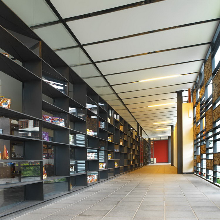
The retail area has a clearly defined and therefore secure access and exit design. A 20m long fixed partition shelf-wall allows for views into the retail and display area for the BOH and other products. The shelves are made from mild steel plates welded together with fixed glass panels in random order inserted.
One of the key features of the design was the area in front of the main entrance, the approach. The designers called for a big outdoor terrace area for seating as well as for appreciating the panorama view of the Estate and the valley. This area is finished in a simple and affordable concrete tiled flooring material with grass or loose chippings in between.
The budget constraint appears to have a hidden blessing; the decision to utilize simple and humble materials provided us with a palette that has now become the signature to the project. Indeed the entire aesthetic would have been quite different if the budget was anything more than what was given to the team. Out commitment to use basic rudimentary materials and technology gave this building its essence.
Building Structure
The choice to use metalwork was based strictly on the need to reduce on site construction activities. We were also contemplating to expedite erection of steel frames in order to mitigate delivery problems of the tea leaves to the currently operating factory nearby. The structural components were kept very simple, using mainly standard section sizes. No major welding were done, except for smaller components. The side windows and facade were fabricated off site and assembled quickly and put into place between posts on a span of 9m grid. The steelwork is limited strictly to the upper storey structure, this is then assembled in situ to sit atop a reinforced concrete frame consisting on 350×1000 deep beams spanning the 9m grid. The floor slabs are then finished in exposed but sealant treated cement render. These were applied a dark receding colour. The ramped concrete floor allows for a truck and general vehicles to pass under for the next phase of construction.
Roof Structure
Roof is constructed of a simple mild steeel edge capping assembled to terminate the open trussed metal beams. Such devices were used to reduce the weight of the structure overall and also to ease the distribution of services inside the voids between the trusses. A sligth slope towards the back allows draining of the rainwater of the roof towards only one side of the roof which simplifies building elevation treatment.
그리드형
'REF. > Architecture' 카테고리의 다른 글
| [ Grimshaw ] Horno 3 (0) | 2008.09.06 |
|---|---|
| [ Zellnerplus ] LTSC Project (0) | 2008.09.06 |
| [ wHY Architecture ] Grand Rapids Art Museum LEED Gold Certified (0) | 2008.09.04 |
| [ Sami Rintala ] Hotel Kirkenes (0) | 2008.09.02 |
| [ Marcio Kogan ] Volume B store (0) | 2008.09.02 |