Mark Raab and Hemant Chowdhry of SOWA Restaurant Group, LLC
Architect:
Office dA, Inc.
Personnel in architect's firm who should receive special credit:
Project Design: Nader Tehrani, Monica Ponce de Leon
Principal in Charge: Nader Tehrani
Project Architect: Dan Gallagher (registered)
Project Coordinators: Catie Newell, Brandon Clifford
Project Team: Harry Lowd, Richard Lee, Lisa Huang, Remon Alberts, Janghwan Cheon, Jumanah Jamal, Aishah Al Sager
Engineer(s):
Structural: Simpson Gumpertz & Heger Inc.
MEP: Wozny/Barbar & Associates, Inc.
Consultant(s):
Lighting: Collaborative Lighting, LLC
Acoustical: Acentech, Inc.
Building Code: Harold R. Cutler, P.E.
Kitchen: TriMark USA, Inc.
General contractor:
Homeland Builders
Photographer:
John Horner
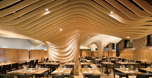
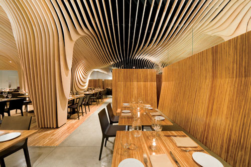
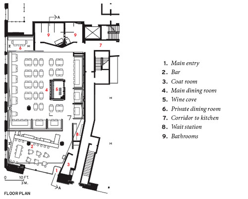
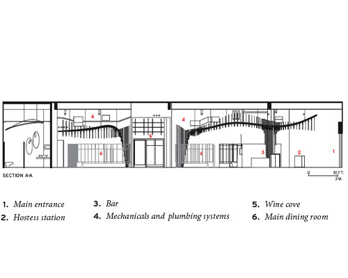
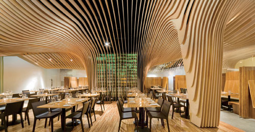
Office dA uses a single gesture to address pragmatic concerns and create an identity for a new restaurant inside a historic South End bank.
By Beth Broome
This is an excerpt of an article from the January 2009 edition of Architectural Record.
“Restaurants are like calisthenic exercises,” says architect Nader Tehrani, a partner, with Monica Ponce de Leon, of Boston-based Office dA, explaining how these projects are great places to flex experimental muscles. “You test out a technique, certain means and methods of production, and they give you a way to expand on them.” With BanQ, a new Boston restaurant serving French-inspired food with Southeast Asian influences, the architects had the opportunity to continue their long-standing investigation of CNC milling. Here, Tehrani says, “The experiment was to radicalize the difference between the ground and sky; to do something economical, but have its effect appear incredibly luxurious.”
BanQ
Photo © John Horner Photography
Rate this project:
Based on what you have seen and read about this project, how would you grade it? Use the stars below to indicate your assessment, five stars being the highest rating.
Rated by 2 people
Rate This
----- Advertising -----
Program
Like much of Boston’s South End before its recent renaissance, the Boston Penny Savings Bank, a once resplendent Classical Revival marble building dating from 1917, had suffered from long neglect. After sitting abandoned for years, the building was given new life by a local developer who converted it into condominiums, restoring its historic facade, gutting its interiors, inserting new structural elements, and popping a glass box out of its roof to provide an additional three stories of residential space. The project provided two retail spaces at ground level, one of which was claimed by restaurateurs Hemant Chowdhry and Mark Raab. Since Chowdhry had previously worked with Office dA on Mantra, another of his Boston restaurants, he and his partner brought the firm back to work on the new space. Their programmatic requirements were limited to a private dining room that could be closed off, a long banquette section able to accommodate 20, a wine room, and a separate bar/lounge area.
Solution
Visiting the raw space with the clients, the architects realized they were inheriting structural and mechanical systems that were likely to compromise the interior. The cheapest solution would have been simply to paint the ceiling, its ducts, and plumbing black to make them go away. But the roughly $1.5 million construction budget (excluding kitchen equipment) allowed them to consider a more interesting intervention. So, Tehrani says, they asked themselves: “How do we control everything overhead to take advantage of the height and give the most flexibility to the ground?” He found the answer while passing through Amsterdam’s Airport Schiphol, whose metal ceiling system acts as a visual foil for the infrastructure behind it. Instead of metal, the architects fabricated their baffle system out of CNC-milled Baltic birch plywood. To engage, rather than ignore, the services, the architects in effect “shrink-wrapped” them. The ceiling’s undulations are defined as they wrap around and yield to columns, a wine room, sprinkler system, ducts, windows, and even exit signs.
One hundred sixty-eight plywood ribs (each made of four to 10 component pieces) hang across the length of the restaurant’s ceiling, suspended with steel hurricane ties from six birch structural members painted black (like the mechanicals behind them) running from the front to the back of the room. No two pieces are alike. The thickness of the ribs ranges from 2 inches near the walls to 6 inches at the middle and 18 inches around the wine room and columns. Spacing between the ribs varies from about 9 inches at the restaurant’s center to 3 inches around columns, causing a rhythm of compression and release. Plyboo floors, tabletops, and banquettes carry the stripe theme through the dining room, and visually separate it from the lounge area at the front of the building, whose bar, floor, and tabletops are made of dark walnut. Splashes of green inject color into the woody interior, as seen in the private dining room’s translucent curtain, a resin wait-station screen, and illumination emanating from the wine cove — a trunklike structure that almost appears to support the canopy above. While creating a distinct interior landscape, the ceiling serves as a counterpoint to the exterior. Its relationship to the facade, says Tehrani, is based “more on dissonance, rather than on integration.”
Commentary
Combining an economy of means with an intrepid spirit, Office dA gets maximum mileage out of its elegantly simple system. With a single gesture, the architects, in the process of concealing mechanicals and providing an acoustic baffle to mitigate sound for the residences above, have given the restaurant its identity, at once obscuring and exaggerating the infrastructure, creating motion, and introducing a topography and texture to an otherwise featureless space. There is nothing subtle about BanQ — it is in-your-face architecture, eagerly calling out for attention and never letting guests forget where they are. But it does so at a tenable volume and, while pouring on the drama, manages to carve out zones that reinforce dining out as an intimate experience.
'REF. > Interior' 카테고리의 다른 글
| [ wHY Architecture ] Royal_T project (0) | 2009.01.08 |
|---|---|
| [ Studio Arne Quinze ] Die Kunstbar (0) | 2009.01.07 |
| [ Christian Precht ] OrganiCube (0) | 2009.01.04 |
| [ curiosity ] mars the salon (0) | 2009.01.02 |
| [ VLS Interior Architecture ] 2.MOOD (2) | 2008.12.28 |