Architects: wHY Architecture
Location: Culver City, California, USA
Area: 929 sqm
Project Year: 2008
Program: Art Gallery, Cafe and Retail Shop
Photographs: wHY Architecture
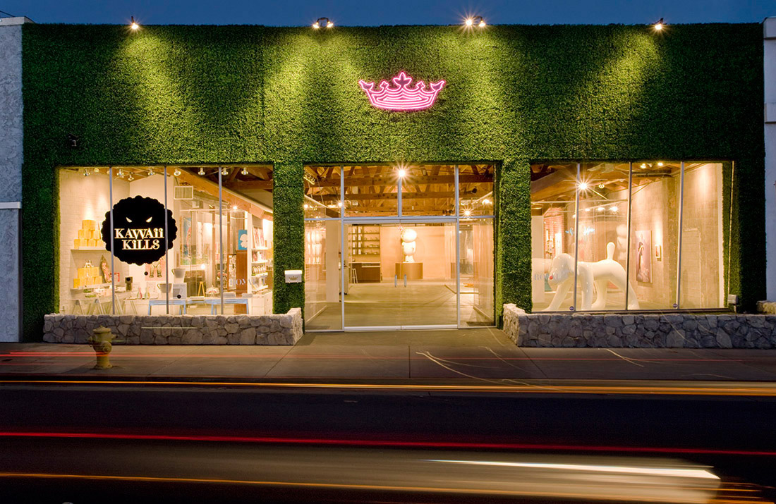
Royal/T is a playful collision of art gallery, cafe and retail shop within a 10,000 sf warehouse in Culver City, California. wHY Architecture designed the space unlike any other, playing upon traditional rules of gallery, retail and restaurant design. Rather than the ‘white box’ space, existing walls remained unpainted, and undulating ribbons of ten foot high acrylic walls contain the art and retail offerings in architectural vitrines. It is these vitrines that allow for the juxtaposition of disparate programs that yields a whole that is greater than the sum of its parts. Patrons can dine in close proximity to the multi-million dollar art collection, the only barrier being the hyper-clear, butt-glazed cast acrylic. Diners become voyeurs and participants in the architectural fusion of pop-culture and high-end design. Like a private club, the Washington Boulevard entrance is covered in faux boxwood, with only the Royal/T crown logo in hot pink neon.
Inspired by the Maid Cafes in Tokyo’s Akihabara district, the highly conceptualized space of Royal/T reflects the interior realm of fantasy that strongly influences the artists included in owner Sue Hancock’s private collection. Recontextualizing the underground ‘okaku’ (geek) culture of Japan that celebrated ‘cosplay’ (costume play), the cafe servers dress in maid uniforms with a Lolita-esque touch. The look-but-don’t-touch theme continues with the art and retail offerings contained within the acrylic vitrines. Even the requisite cafe ceiling is acrylic, allowing the existing bowstring trusses to remain visible.
from archdaily
Location: Culver City, California, USA
Area: 929 sqm
Project Year: 2008
Program: Art Gallery, Cafe and Retail Shop
Photographs: wHY Architecture
Royal/T is a playful collision of art gallery, cafe and retail shop within a 10,000 sf warehouse in Culver City, California. wHY Architecture designed the space unlike any other, playing upon traditional rules of gallery, retail and restaurant design. Rather than the ‘white box’ space, existing walls remained unpainted, and undulating ribbons of ten foot high acrylic walls contain the art and retail offerings in architectural vitrines. It is these vitrines that allow for the juxtaposition of disparate programs that yields a whole that is greater than the sum of its parts. Patrons can dine in close proximity to the multi-million dollar art collection, the only barrier being the hyper-clear, butt-glazed cast acrylic. Diners become voyeurs and participants in the architectural fusion of pop-culture and high-end design. Like a private club, the Washington Boulevard entrance is covered in faux boxwood, with only the Royal/T crown logo in hot pink neon.
Inspired by the Maid Cafes in Tokyo’s Akihabara district, the highly conceptualized space of Royal/T reflects the interior realm of fantasy that strongly influences the artists included in owner Sue Hancock’s private collection. Recontextualizing the underground ‘okaku’ (geek) culture of Japan that celebrated ‘cosplay’ (costume play), the cafe servers dress in maid uniforms with a Lolita-esque touch. The look-but-don’t-touch theme continues with the art and retail offerings contained within the acrylic vitrines. Even the requisite cafe ceiling is acrylic, allowing the existing bowstring trusses to remain visible.
from archdaily
'REF. > Interior' 카테고리의 다른 글
[ Trust in Design ] B.institut beauty parlour (0) | 2009.01.09 |
---|---|
IKEA decks out Kobe train (0) | 2009.01.09 |
[ Studio Arne Quinze ] Die Kunstbar (0) | 2009.01.07 |
[ Office dA, Inc. ] BanQ (0) | 2009.01.06 |
[ Christian Precht ] OrganiCube (0) | 2009.01.04 |