



Location: Solothurn, Switzerland
Project year: 2004
Construction year: 2005
Engineering: H. Katzenstein AG
Constructed Area: 1,720 sqm
Photographs: Hansruedi Riesen
When the critic, in his early forties, already while leafing through the programme on the website, begins to feel like snow white in the forest - mesmerised, but also without a clue and any orientation -, then the makers of the Kofmehl deserve the credit of a subculture that the youth culture intends to be. “The Koofmäu” (with a neutral connotation - it - such as for the “Konsum” which gives a notion of familiarity and intimacy of the local village life) represents as an institution a coherent system of social and cultural codes, that on first glance has little to do with contemporary architecture. The architectural symbol of the youth culture is found in abandoned barracks, warehouses and stalls that were occupied in the 1980s by angry youth who played colourful electric guitars and drums through loudspeakers on black walls as a sign of protest.
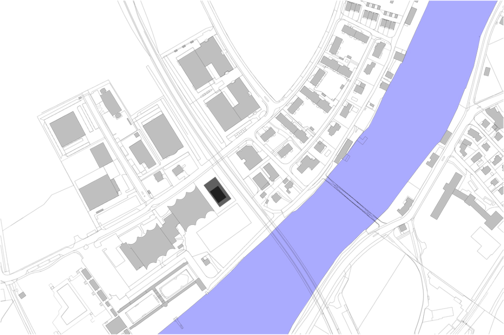
However, most probably the relation to architecture of this generation was more related to the criticism voiced by the squatter scene, the fascination of decay considered chic, and the Zeitgeist rather than any interest in the architectural content of the building. Given this background, it becomes clear that the forced exodus of the angry youth and the concert organisers from the Eisenwarenfabrik Kofmehl posed a particular challenge to the architects: how to transfer the essence and the core of a “non-place” which is loved as a counterculture and home? The rare surname of the industrialist from Solothurn, known all over Switzerland through radio announcements, may have played a helping role. However, from the business plan it becomes clear that the architects did not rely exclusively on this fact. Rather, they intended to “create a similar atmosphere in a different location”. It thus becomes clear with what the new construction situated in an industrial zone on the periphery of a small town deals.
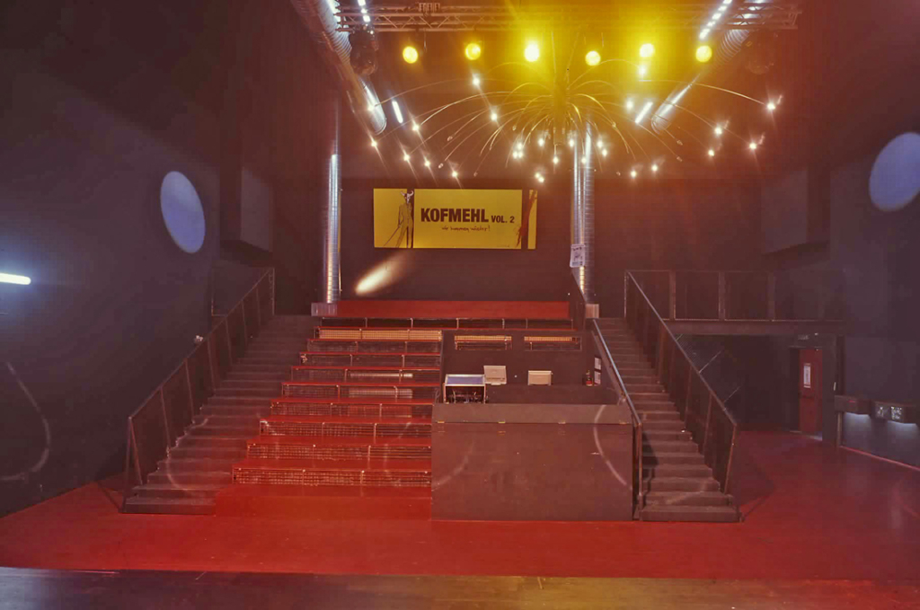
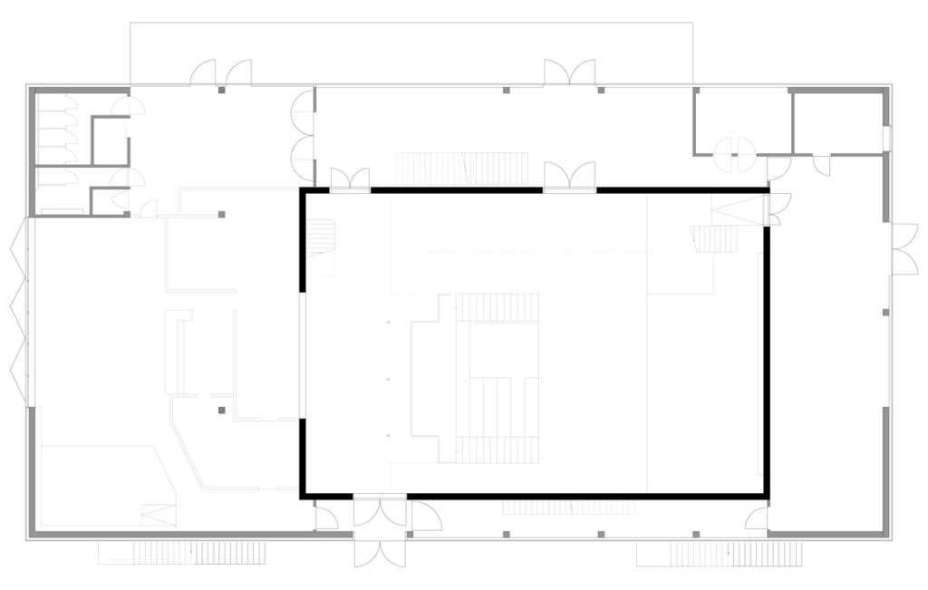
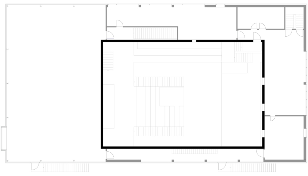
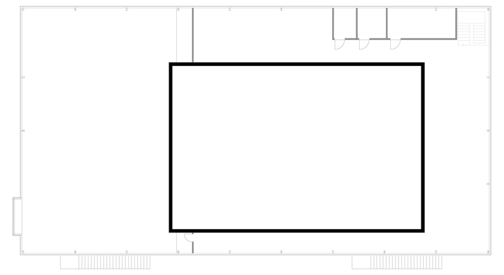
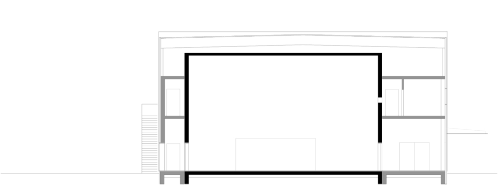
Let us first of all deal with space and structure, which are similar to the much bigger established concert halls such as Rem Koolhaas’ Casa de Musica in Porto or the KKL although the former functions rather differently: the core is a concert hall which is set as a cube within a bigger cube although structurally and acoustically separated from the latter. This configuration differs from the usual ones in as much as it prevents sound from travelling to the outside rather than the other way round. The proportion of 1 : 1.6 : 2.33 ensures excellent acoustics. Everybody praises the excellent sound quality. The lobby, lavatories and backstage, all accessible through a separate entrance, are placed like a buffer zone around the concert hall.
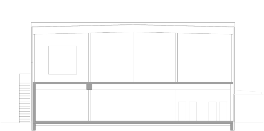
The “Raumbar” to the front serves as stage for smaller events. The upper floor houses a large room for youths, backstage and offices. Technical appliances and air conditioning are located in the remaining space below the roof.
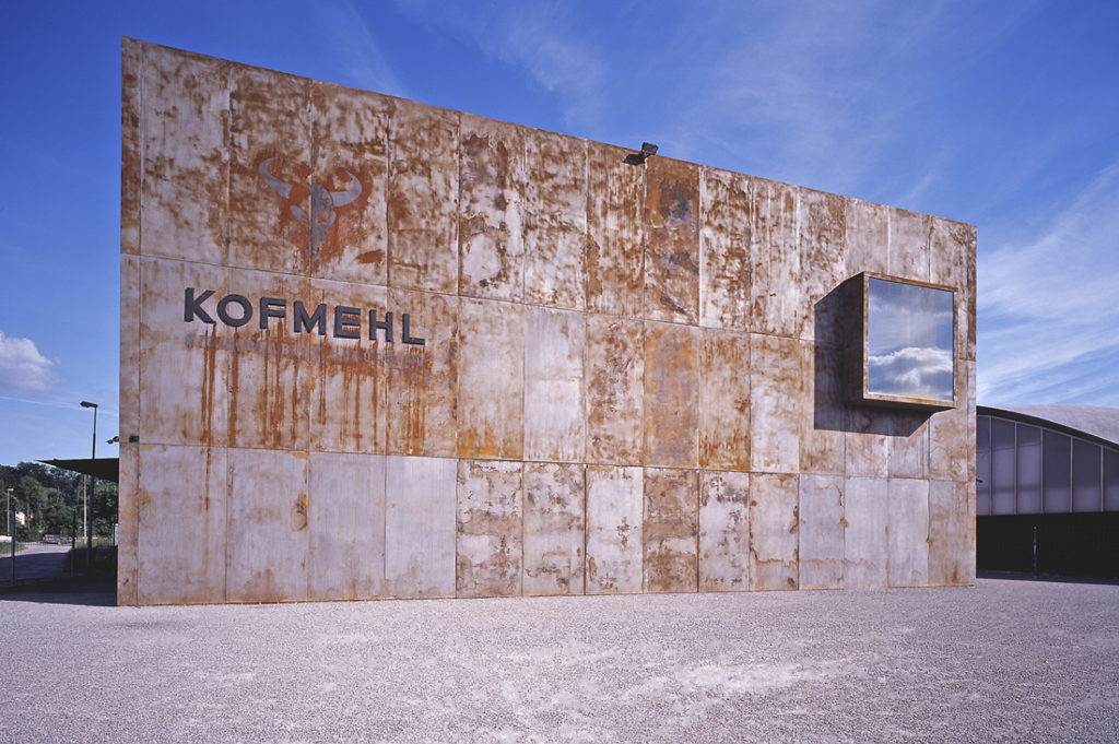
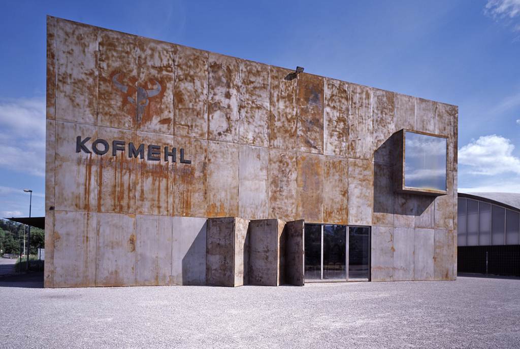
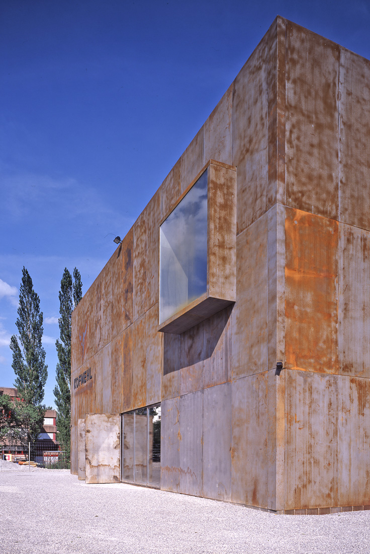
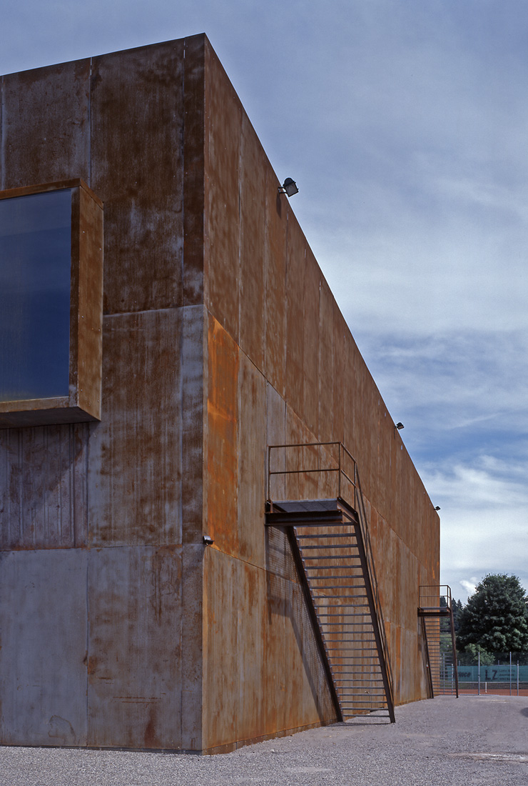
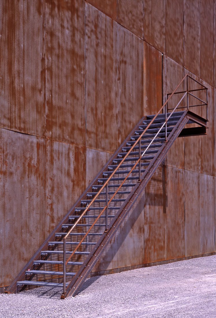
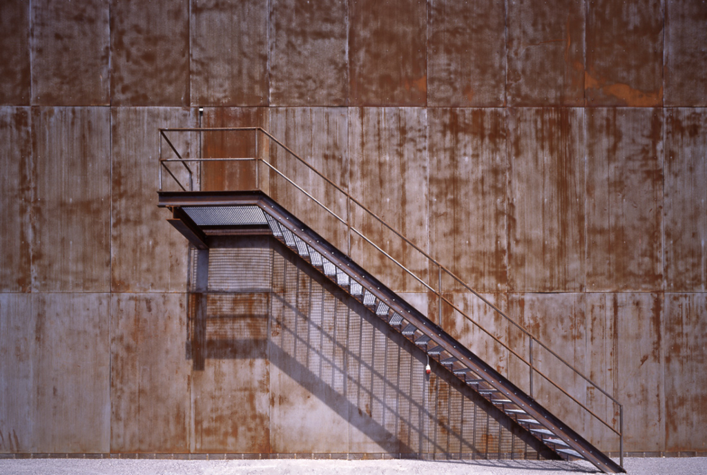
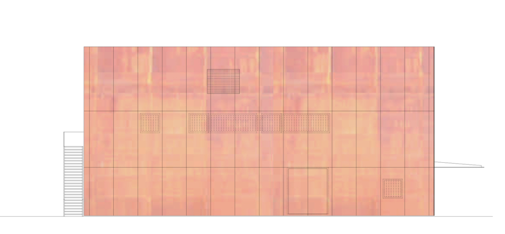
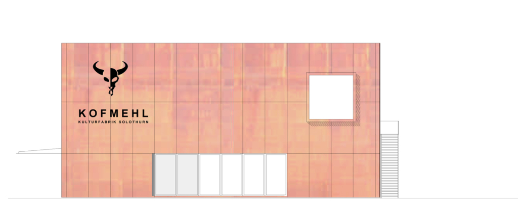
All is housed in a cube, which is covered in steel sheets. Each side is with a few elements individually designed. The front wall is directed towards the street and is marked by eyecatchers such as the inscription and the sliding gate that seems to disconnect itself almost weightlessly from the wall. Reference to contemporary art is made through a cubic window, which the architects used as a connection - as a blink so to speak - to the town and the Jura mountain range and which fits in well with the rest of the structure. A cantilever roof on the northeastern wall serves as shelter to people waiting to enter into the foyer through a portal, which is “veiled” with perforated metal sheets. Two stairways give the opposite façade its own strong identity. Practically all elements of the façade, beams, extended roof as well as the stairways and their handrails, are built of steel. This is the only radical aspect of the building, however one that contributes significantly to the good result.
The inner structure, with (KS-Wänden?) and steel elements that complement the concrete structure, has a particular significance for the acceptance and the atmosphere of the object. The shell and the wooden floors are painted red, black and occasionally yellow; all colours that refer to shades previously found in the original Kofmehl. The concert hall and the “Raumbar” have been fitted with red floors whereas the service or publicly accessible spaces have dark floors. Doors, radiators and other elements are kept in shades similar to the floor.
Concise markings with white majuscules in typical Kofmehl-graphics facilitate orientation. The simple finishing which left space for improvisation combines the dark blue-red-yellow shade of the steel with the familiar colours of the original Kofmehl. Thanks to a manageable complexity, it was possible to independently build the interior structure that was inspired by the original building. This has on the one hand helped lower the costs by several hundred francs and on the other hand accelerated the ownership process. The robust, but at the same time refined interior design came about in much the same way as the concert hall in the old Kofmehl more than a hundred years ago. The result is a combination of intelligently dosed use of designer tools, and the support of the large and dedicated group of helpers. The revival of the old aura is made possible by the transfer of colouring and surface finish as well as by symbolic gestures such as the inscription that is reminiscent of catholic relic cult. This transfer has been successful. On the one hand, it was possible to credibly integrate elements and themes of the old house into the new structure. On the other hand, the new users benefited from a relinquishing of control and were able to be part of the authorship.
The house has acquired a life of its own shortly after the opening photo shoot. The difference between the more authentic interior and the original heavy metal of the exterior shell has developed into a monochrome entity. The façade sheets have corrugated in the heat; the shining red scab of the oxide has now surfaced on the blue rolled surface. All accessible surfaces have been filled within a short time with graffiti. In short, the building has become the “hut” to which it was endearingly referred already by the Kofmehl-people during the construction period. The new, unplanned elements did not harm the overall character of the building. The multi-coding, typical of minimalist buildings, is still present: the interpretation and use of Solothurn’s history as a city of heavy industry of the Von Roll between Gerlafingen and Choindez, the depressing-provocative image of the barbed wire in the limelight of the floodlights, and the timeless decay. However, when the infamous fog of Solothurn settles upon the area and the red of the rust merges with the reflection of the lit city, then one gets the impression of a hypnotic effect beyond the semantic fields. This effect is so strong that one believes to be able to commence a discussion with the Heinz Isler tennis hall lying in the dark, on the tasks and possibilities of architecture.
'REF. > Architecture' 카테고리의 다른 글
| [ BIG ] Denmark Pavillion for Shangai Expo 2010 (0) | 2008.09.22 |
|---|---|
| [ FARO architecten bv ] Experimental home in Ijburg (0) | 2008.09.22 |
| [ Pilar Garcia, Carolina Portugueis, Martin Labbe ] House in Zapallar (0) | 2008.09.21 |
| [ German del Sol ] Remota Hotel (0) | 2008.09.20 |
| [ Erick Van Egeraat ] Metzo School (1) | 2008.09.19 |