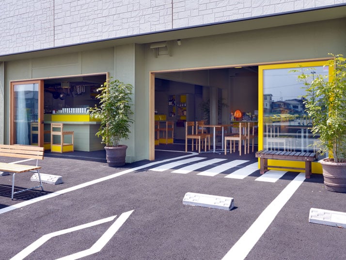
흐름을 보여준다.
외부 도로라인과 심볼이 내부 공간으로 유입되는 컨셉은
드라이빙 스쿨의 모티브에서 시작되었다.
언제부턴가 우리는 내외부의 경계를 없애고
소통하기 위해 많은 디자인 어휘를 사용하고 있다.
특히 이와같이 바닥의 재료 또는 어휘를 같이 사용함으로써
자연스럽게 내외부 공간을 통합하는 컨디션을 취하는 경우가 많다.
내부 홀바닥에 사용하는 바닥돌을 외부 광장까지 계획하여
공간을 연속시키는 디자인은 많은 건축가와 디자이너들이
지금도 하고 있다. 이것은 내부공간으로 인하여 형성되는
형태에 디자인을 국한 시키지 않고 주위 환경과
동조하는 디자인을 하려는 건축가,디자이너의
깊은 의미가 베어 있다.
요 며칠 실시설계를 마치었던 나도 이와 같은
디자인 어휘를 사용하였다.
정해진 금액에, 정해진 프로그램에서 많은 다양성을 만들어 낼 수는 없었지만
이와같은 몇가지 어휘로도 디자인을 완성시키는 맛도 느낄 수 있었다.
많은 부분을 건들고 움직인다고 디자인을 잘하는 것은 아니다.
조그만한 의미도 어떤사람이 어떠한 곳에 적절히
부여함에 따라 그 의미는 충분히 달라진다.
reviewed by SJ
japanese architectural office Suppose Design Office who we’ve previously seen on Yatzer imbued the Café/day coffee shop in Shizuoka, Japan with a spacious feel mainly by extending road lines and symbols onto the space’s floor, which is made of asphalt whereby the bold white lines on the asphalt denote route directions and zebra crossings. Inspired by the adjacent driving school, Suppose Design Office brings the outside inside, and makes reference to the architectural design from the driving school.
Project name: Café/Day
Architects: Suppose Design Office
Location: Numazu city, Shizuoka, Japan
Principal use: cafe
Construction Company: Kanou Kenchiku
Structural Engineer: N/A
Main Structure: existing building
Site Area: N/A
Total floor area: 73.71sqm
Completion: December 2010
Design period: May – September 2010
Construction period: October 2010-November 2010
Project team: Suppose design office | Makoto Tanijiri
Overseer: Hajime Nagano
Photographer: Toshiyuki Yano

Located within a serene residential area, five-minutes way from the Numazu-shi, Shizuoka train station, the architects were called on to renovate the double unit of an ‘Izakaya’ (a traditional Japanese style bar) located on the ground floor of the two storey building. Right in front of the building the lot was occupied with car parks, a driving school and the zebra crossing; it seemed as if the road continued forever! With a glimpse at the driving school, it seemed as if yellow cars dominated the area, even the poles that configured the driving lane were yellow! Yellow was everywhere, and indeed proved very influential for Suppose Design Office as this proximate element was the inspiration for the café’s interior design.
> When you give a name to an object, it inherits the function of the name but if you design a place without a name then it is free to develop its own name through the activities that take place.<< Suppose Design Office
Café/Day’s building shell gives the impression that the structure was frivolously sited upon a pre-existing parking lot, unveiling the bold white lines of the traffic markings and the asphalt. Even the door frames and furniture details were painted in yellow, matching the flagpoles from the driving school that occupies the car park. The cafe features benches modelled on bus stop seating and its chairs are made of recycled car seats. With its large glass walls and unusual flooring solution, Café/Day extends this casual relaxing space out into the urban environment.
The architectural plan behind the renovation was to merge the two Izakaya spaces into one large open space by demolishing the dividing partition wall, and selectively demolishing parts of the wall to open up the space. The counter, lighting fixtures and fixed fixtures were maintained and painted in a particular colour so as to erase the ‘signs’ which would betray the former Izakaya space. The only additional material that was added to this renovation was the most obvious material – the asphalt – which was brought into the shop to create an interior space which seems to be the continuation of the exterior space. The usage of the same material and the preservation of a single level throughout both the interior and the exterior spaces identify this café as a true open café.
The former Izakaya was easily transformed into the Café/Day without betraying any element from the former program. It has incorporated socializing and gathering over a mug of coffee with a now new bolder effect. The architects used the power of a ‘word’ in a paradoxical manner and found a new approach in the renovation works’ design process of. Suppose Design Office has stated that they would like to start out their design process without giving a particular ‘name’ to the program, but by defining the space through the program.
from yatzer
'Commerce' 카테고리의 다른 글
| *다크 와인바 [ Studio SKLIM ] The Tastings Room (0) | 2011.08.24 |
|---|---|
| *소호 하우스 [ OUVI + A-ASTERISK ] y house (0) | 2011.08.16 |
| *레스토랑과 나이트클럽의 이성적 만남 [ Forte, Gimenes & Marcondes Ferraz Arquitetos ] Na Mata Café (0) | 2011.08.05 |
| *아부다비 럭셔리 나이트클럽[ Orbit Design Studio ] Allure Nightclub, Abu Dhabi Marina (2) | 2011.07.27 |
| *초코렛 컬러 베이커리 [ bluarch ] Omonia Bakery (2) | 2011.07.07 |


