

In March 2001 the Danish Public Education Ministry hosted an
international design competition, invited tenders for the design of an
extension to the Ordrupgaard museum. The purpose was to provide new
exhibition space for the permanent collection, targeted to incorporate
special events facilities, a restaurant, a foyer, a bar and a
multipurpose hall. Seven architectural studios were honoured to
participate: Zaha Hadid Architects, Dominique Perrault, MVRDV,
Architekten von Gerkan and three studios from
The
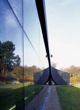
The reason why the jury selected Hadid’s project is because, “A brilliant architectonic expression that will not only be an experience in itself, it will also promote extraordinary quality experiences in connection with the presentation of the museum’s works of art.” Zaha Hadid’s concept for her design is a personal interpretation of the surrounding landscape and the relationship to the old building, translated it to geometries from which to generate structural models.
It is a chance to capture the relationships between architecture and landscape, between history and formal innovation, both in measurement and in the proportions of the new galleries. Contours have been studied and abstracted, then lifted and twisted forming a shell that becomes the museum enclosure. But then a formal language of gently lifted contours is lifted again to form walls roof and other contour form outside the structures of the extension.
Opacity is reached by the in-situ cast concrete that contradicts by large parts of glass-coverings mirroring the garden while offering quick looks of the interior. In-situ
cast concrete was selected due to its plasticity and because the
geometry could be rationalized. Prefabricated concrete elements were
not an option because of the buildings geometric complexity. Earthworks and embankments bring the building into the site at vital points around the plan.
The new entrance could be entered from a narrow courtyard that physically scatters the new building from the existing long French Gallery building. The Foyer runs parallel to the courtyard “noting” visitors in each direction to the galleries north and south in the plan.
For common lighting, the chosen solution was to merges natural light and views to the outside with a series of SELUX M100 recessed fixtures. The fixtures were arranged with Opal glass lens and staggered lamps on overlapping gear trays to send uniform, linear slashes of light that complement and strengthen the geometry of the building’s striking design. Lighting slits act as orientation devices to the visitors.
Natural light is filtered and moderated as it passes through the building shell: the roof. There is recessed downlights in the ceiling, in combination with recessed fluorescent lighting for pedestrian areas and in the multipurpose hall, and Linealuce luminaires along the walls, also recessed, to floodlight the building. The paintings are lit by exposed directional spots fitted with halogen lamps, to intensify their full expressiveness.
A long sloping independent ramp passage divides the Temporary and Permanent Gallery spaces and leads to the Multipurpose Hall and Café which face out to the garden. Also it leads visitors from the Foyer and Temporary display area to the Permanent Collection, café -descending from the Foyer to it, without ever having to pass through the galleries- and multi-purpose area. Terraces are designed to unite the new to the existing Mansion garden terraces; again providing visitors with a visual connection between the buildings.

'REF. > Architecture' 카테고리의 다른 글
| [ Norman Foster ] Swiss Re London Headquarters (0) | 2008.10.15 |
|---|---|
| [ BIG ] montenegro residences (0) | 2008.10.15 |
| [ edouard francois ] flower tower (0) | 2008.10.14 |
| [ Zaha Hadid ] Civil Courts of Justice, Campus de la Justicia (0) | 2008.10.13 |
| [FOA] JOHN LEWIS DEPARTMENT STORE AND CINEPLEX (0) | 2008.10.13 |