
 |
 |
 |
G R A M M E-Aesthé
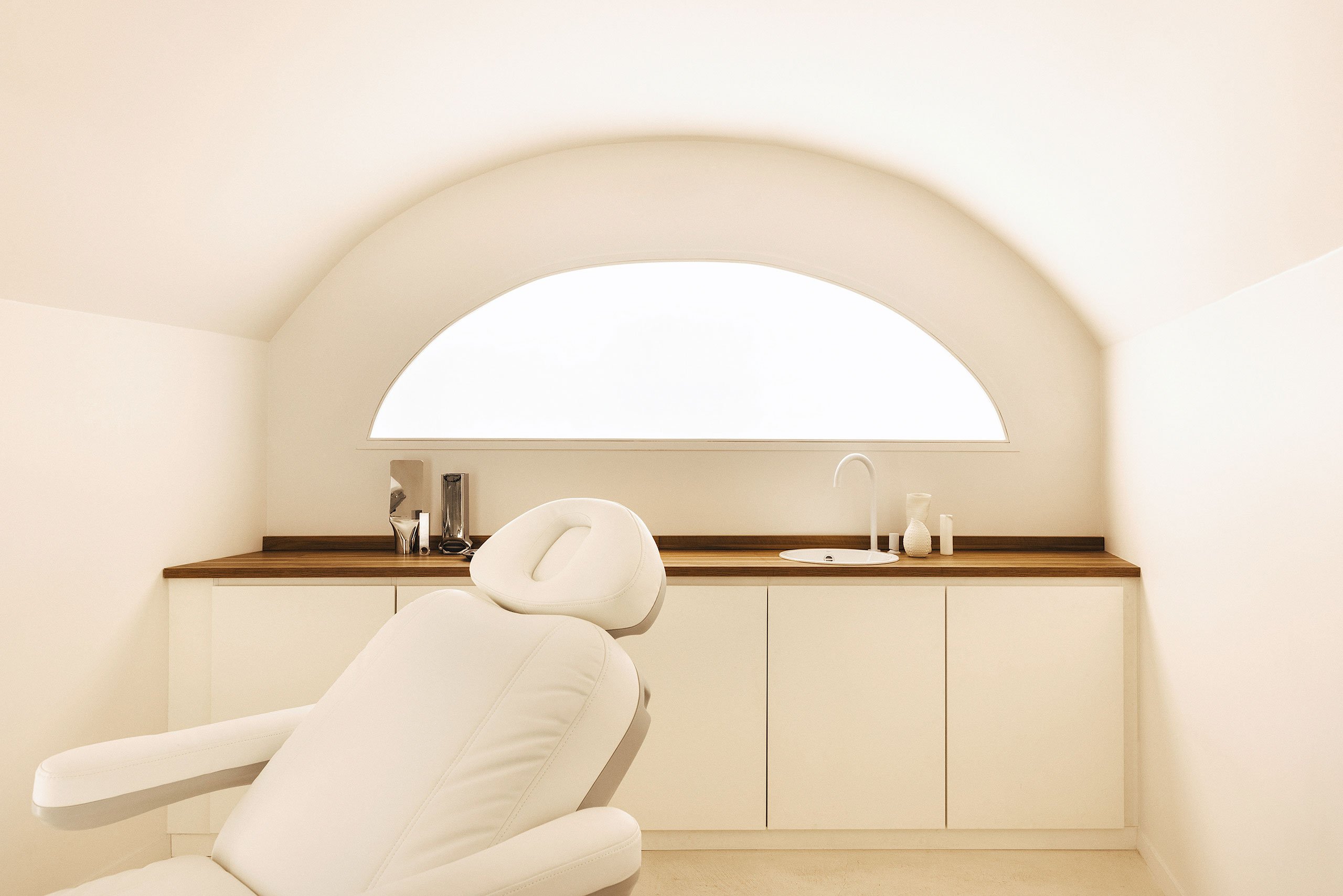
파리 마레 중심부에 새롭게 문을 연 에스테틱 메디컬 센터, Aesthé의 첫 인상은 갤러리를 연상시킨다. 위생을 위한 차가운 이미지는 버리고, 단순한 기하학과 곡선형태를 조합해서 가장 편안한 느낌의 미니멀 공간을 완성시킨다. 재료 또는 광택소재보다 조금은 거친느낌의 반무광 또는 텍스쳐 소재를 사용함으로써 재료 본연의 모습을 그대로 투영시킨다.
Organic Forms, Natural Materials and Crafted Details Imbue a Beauty Clinic in Paris with Sculptural Soulfulness
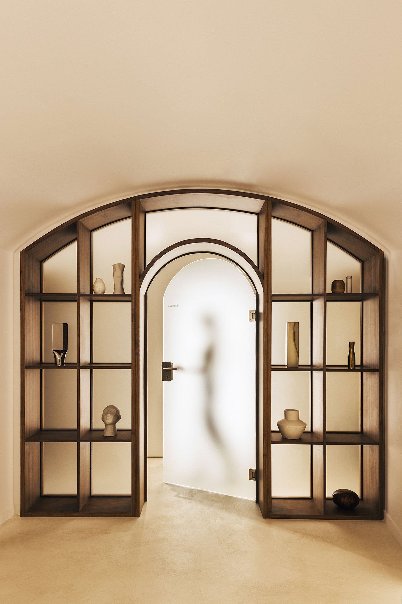
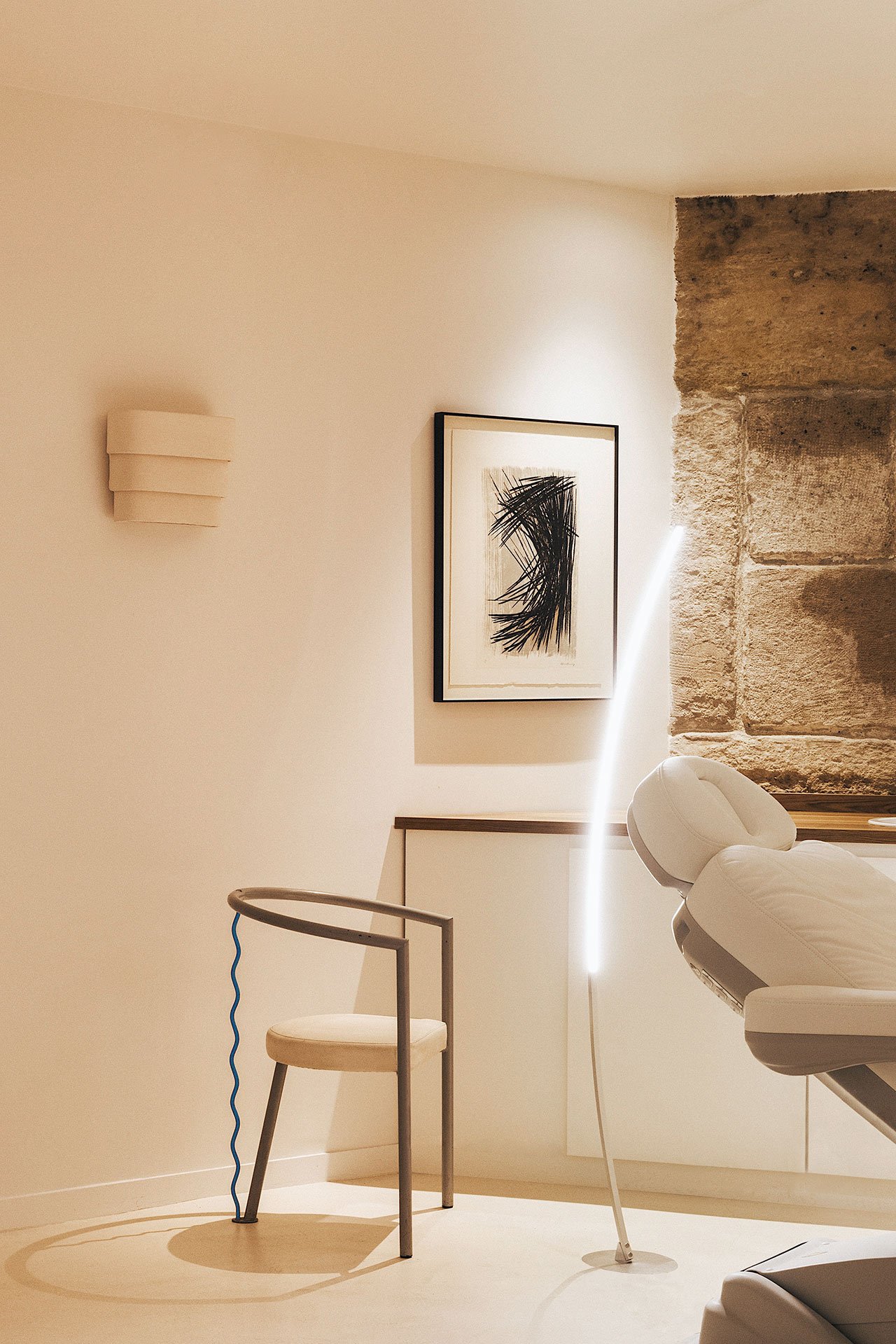

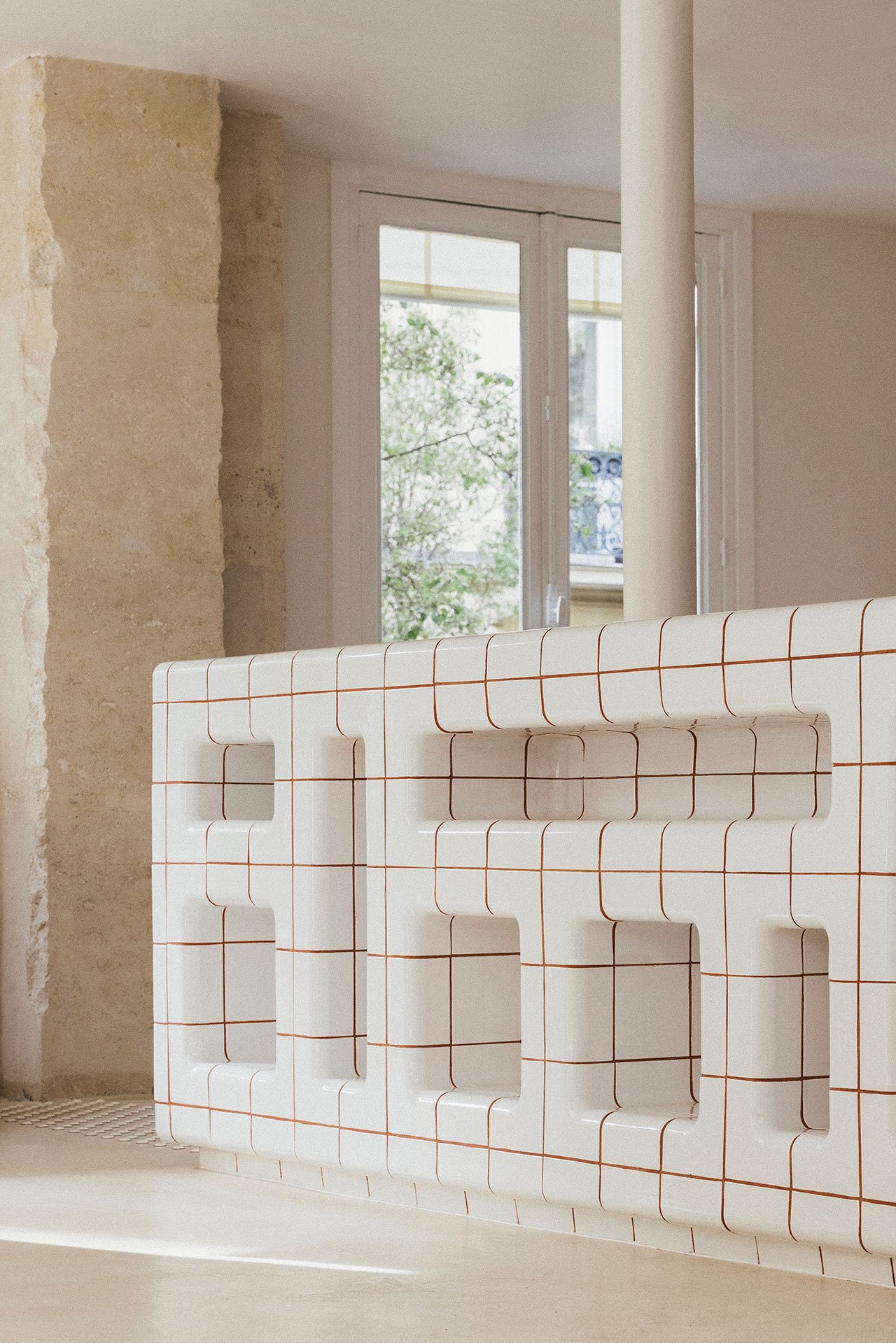

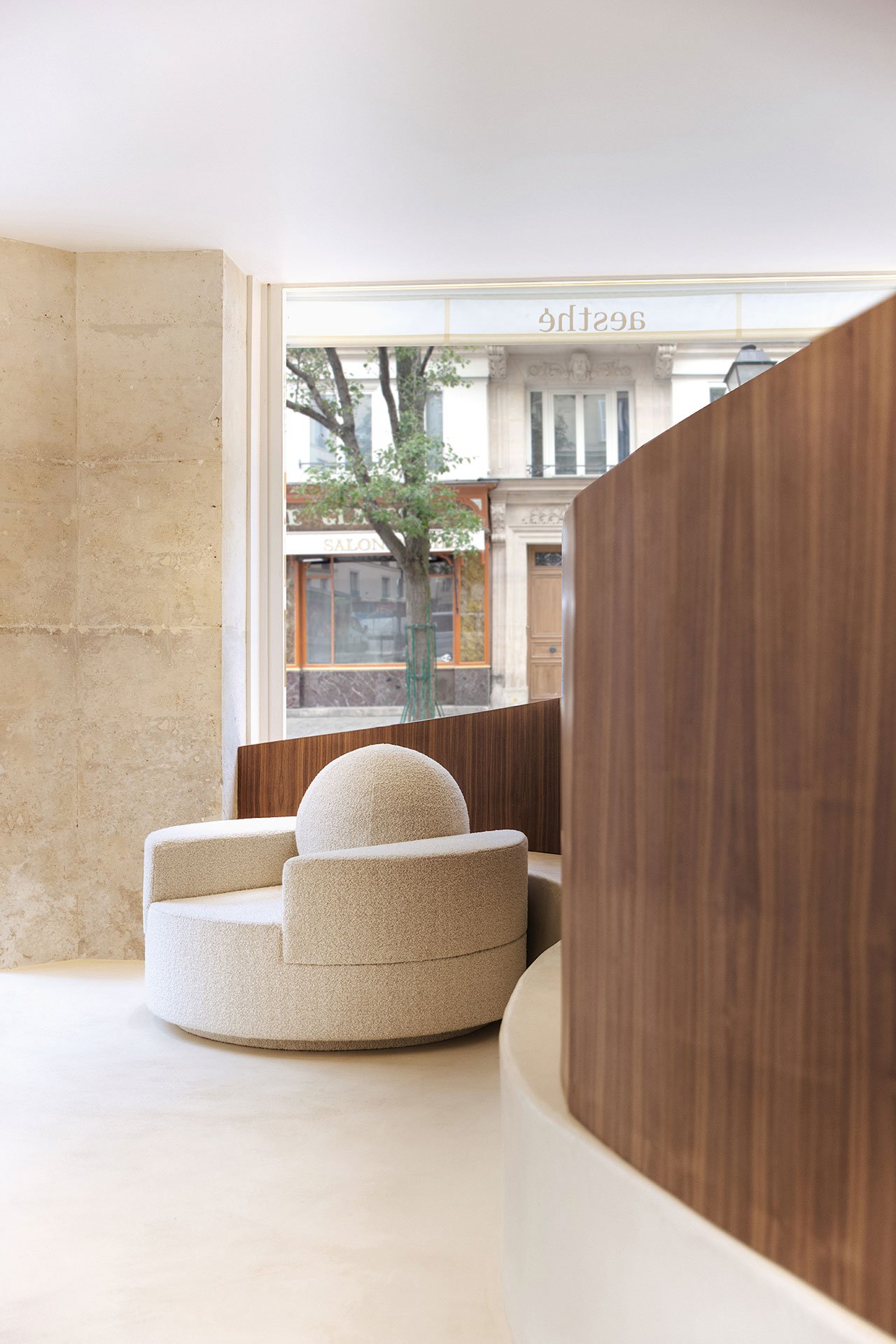
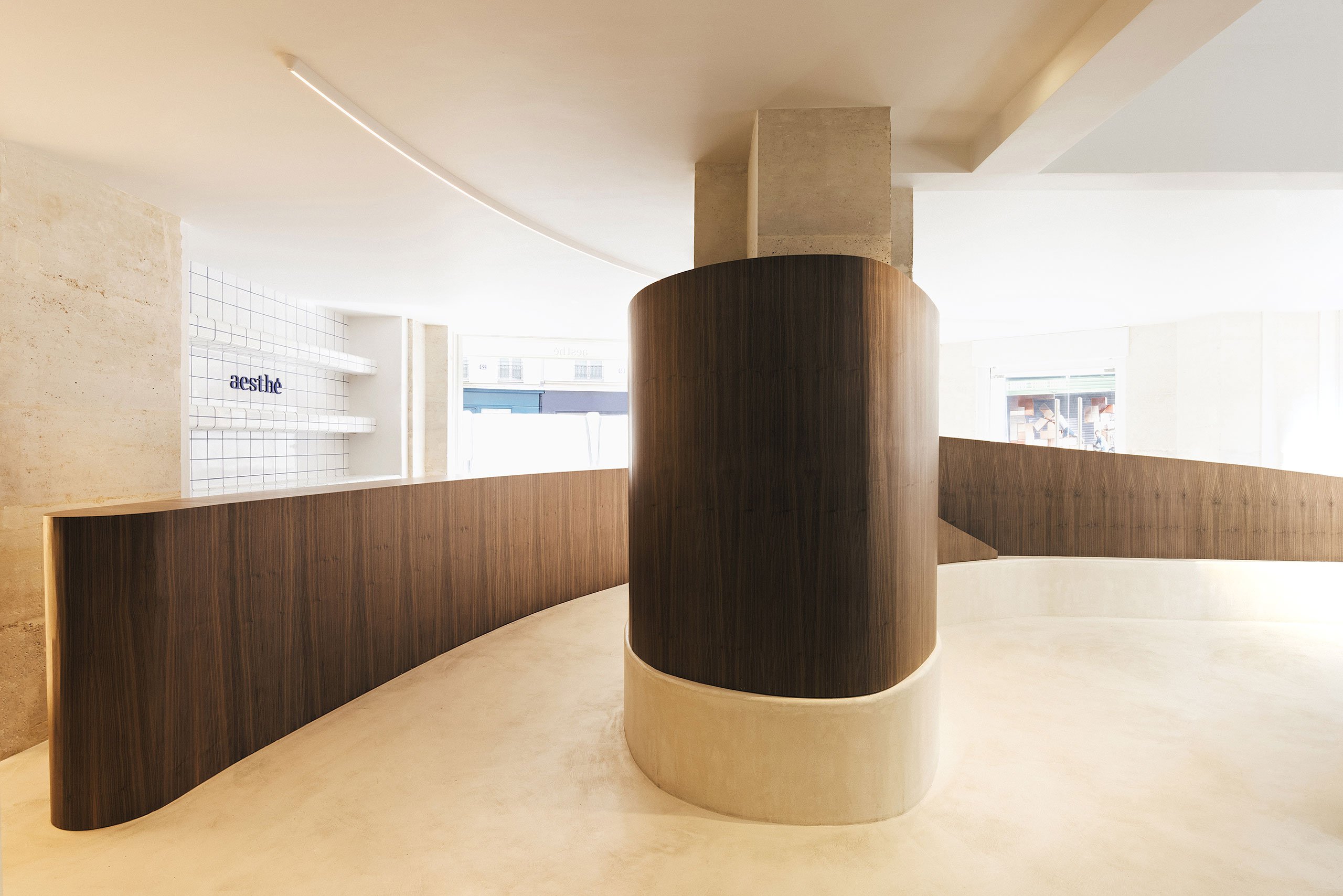

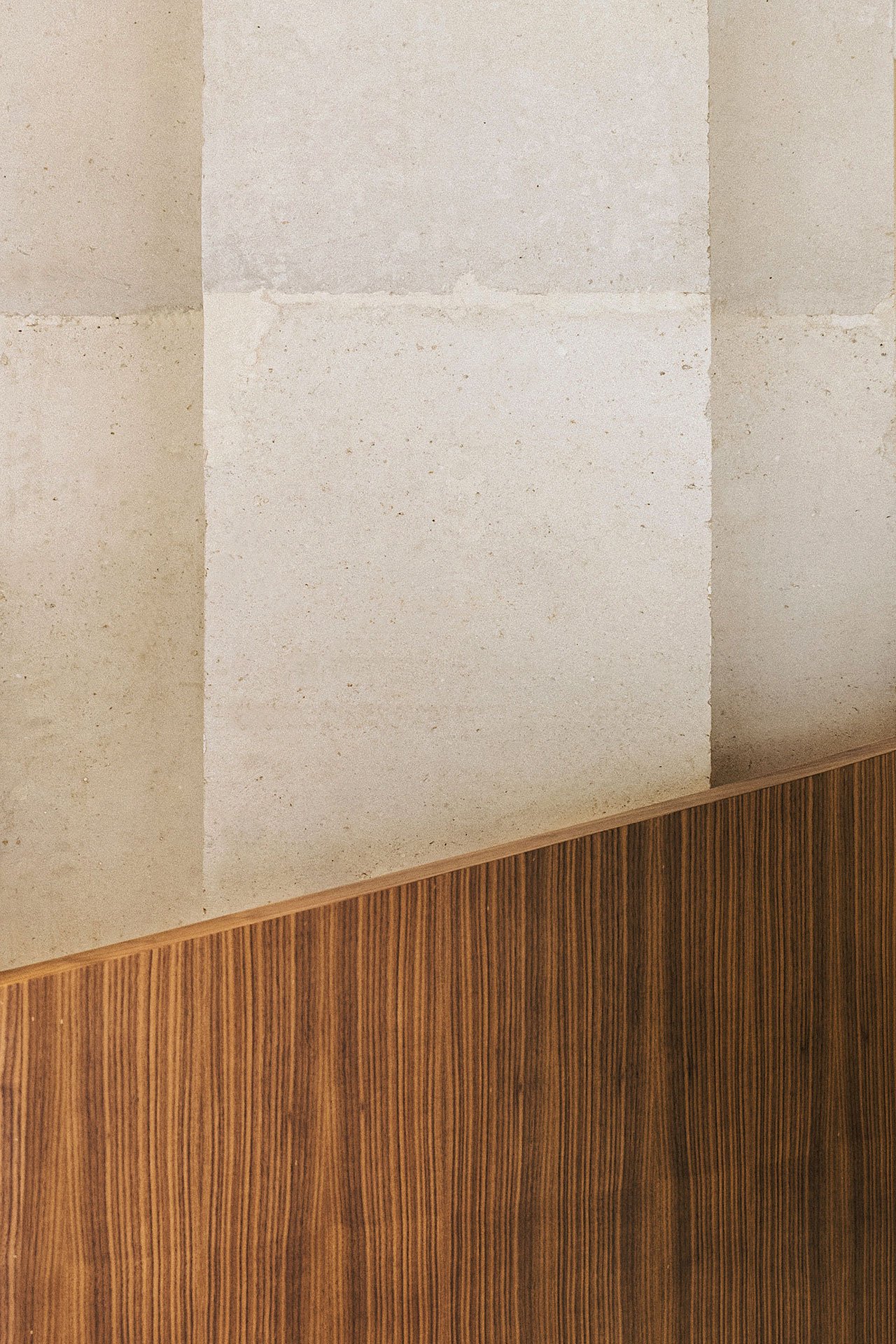
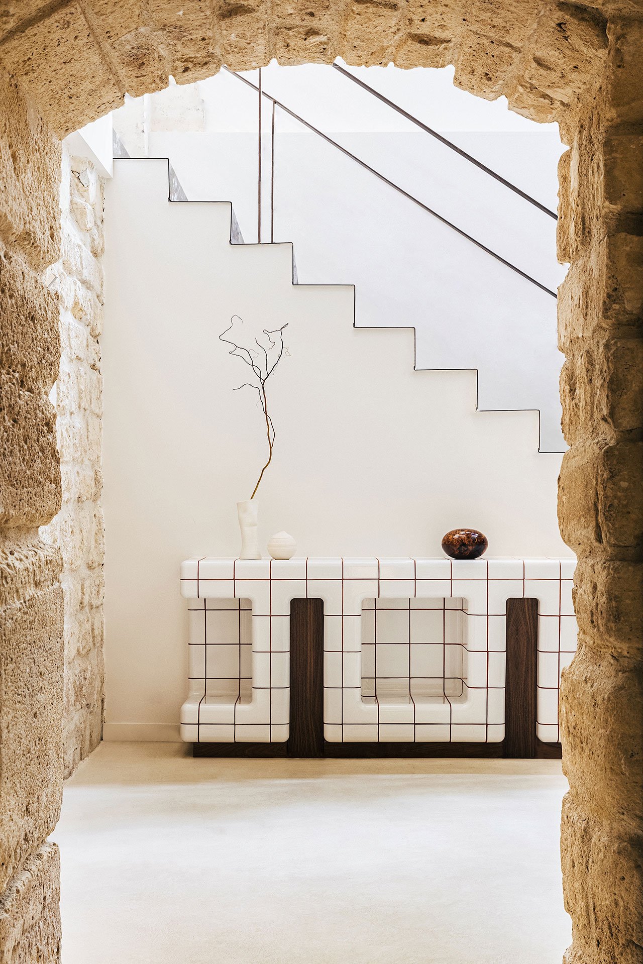
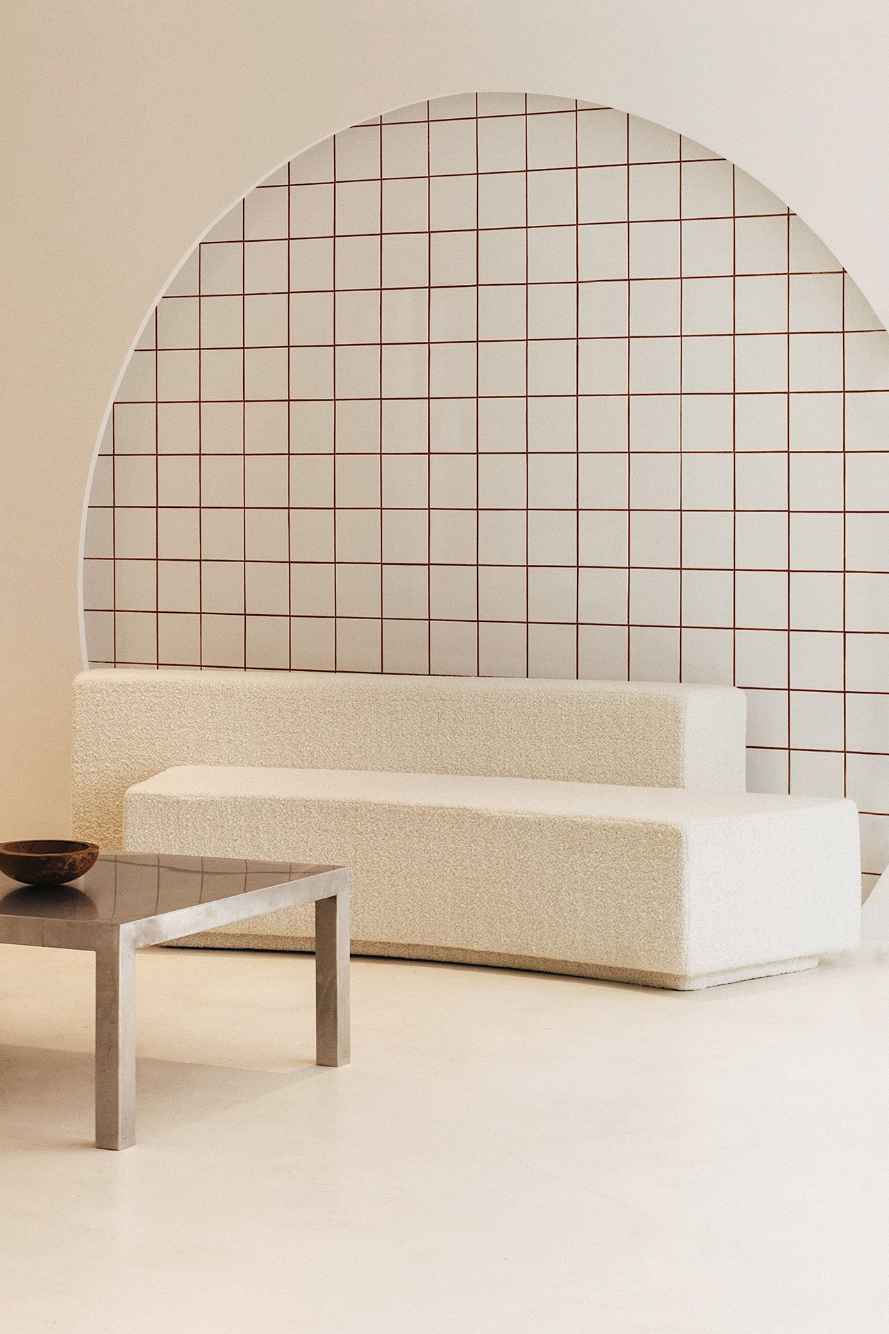


Visiting Aesthé, an aesthetic medical centre that recently opened its doors in the heart of the Marais in Paris, you’d be excused for thinking you stepped into an art gallery. Paris based design studio G R A M M E have done away with the sanitized feeling of clinical environments, opting instead for a sculptural sensibility of tactile beauty based on simple geometries, curvaceous forms and a mix of rough and polished materials. Custom-designed down to the smallest detail and the last furniture piece, the minimalist interiors convey a sense of preciousness without veering into gaudy opulence while evoking sensuality and comfort.
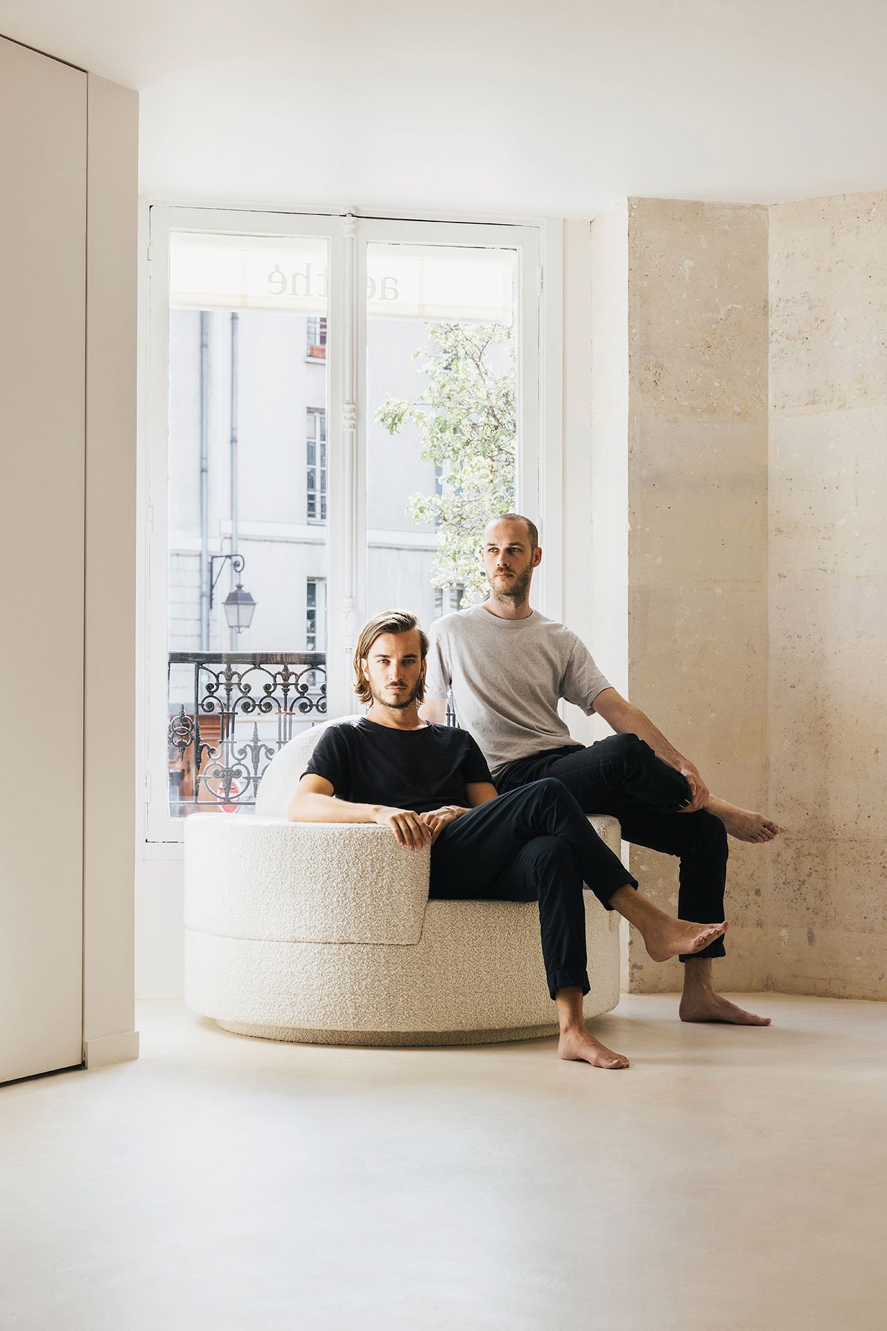
Located in a Haussmannian building erected in 1860, the studio’s founders Romain Freychet and Antoine Prax took great care to refurbish its imposing masonry construction in consultation with Les Architectes des Bâtiments de France, harmoniously juxtaposing the stone clad pillars and exposed masonry walls and vaults with a minimalist design language of contemporary sophistication. Underpinning the team’s intervention is an eclectically curated palette of ‘sculptural’ materials - cut stone carefully selected in relation to the existing building fabric, walnut, ceramic, mineral resin and frosted glass – that have been artfully crafted into bespoke furnishings that double as sculptural artefacts.
On the ground floor, the softly curved volume of the walnut reception counter echoes the voluptuous shapes of the walnut walls gently embracing a central pillar and the custom-designed armchairs and sofa upholstered in cream coloured bouclé fabric. In contrast, glossy white moulded ceramic consoles, shelves and niches, which have been painted over with a square grid in blue or red, add a dash of crisp graphic playfulness, while maintaining the prevailing aesthetic of rounded forms. Cubic pedestals in metal and wood on the other hand reflect the rectilinear geometry of the stone pillars.
The subtle mix of rounded and rectilinear forms, and rough and polished textures is carried on throughout the first and basement floors, as is the presence of beautifully crafted furnishings like the walnut worktops and walnut and frosted glass bookcases that have been custom-designed to perfectly fit into the age old building’s irregular masonry structure. Impossibly thin steel banisters, illuminated half-moon panels, curved linear floor lamps, and minimalist tables and consoles in blue melamine are just some of the bespoke elements by Freychet and Prax that subtly infuse the century-and-a-half-old premises with a sense of contemporary elegance and timeless appeal.
from yatzer
'Commerce' 카테고리의 다른 글
| *퓨리오소 와이너리 [ Waechter Architecture ] Furioso Vineyards (0) | 2022.11.29 |
|---|---|
| *문하우스 레스토랑 [ Ewert Leaf ] Moonhouse_Senses Aglow (0) | 2022.11.28 |
| *라오 딩 펭 베이징 리노베이션 [ Neri&Hu Design and Research Office ] Recast – Lao Ding Feng Beijing (0) | 2022.11.14 |
| *코찬 커버드 마켓 [ croixmariebourdon architectures ] Cachan Covered Market (0) | 2022.10.13 |
| *빈티지 코코아 카페 [ T3 Architects ] the cocoa project cafe (0) | 2022.09.30 |