
 |
 |
 |
Various Associates-Jinghope · Life Aesthetics Community
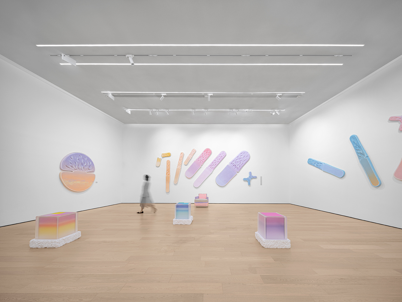
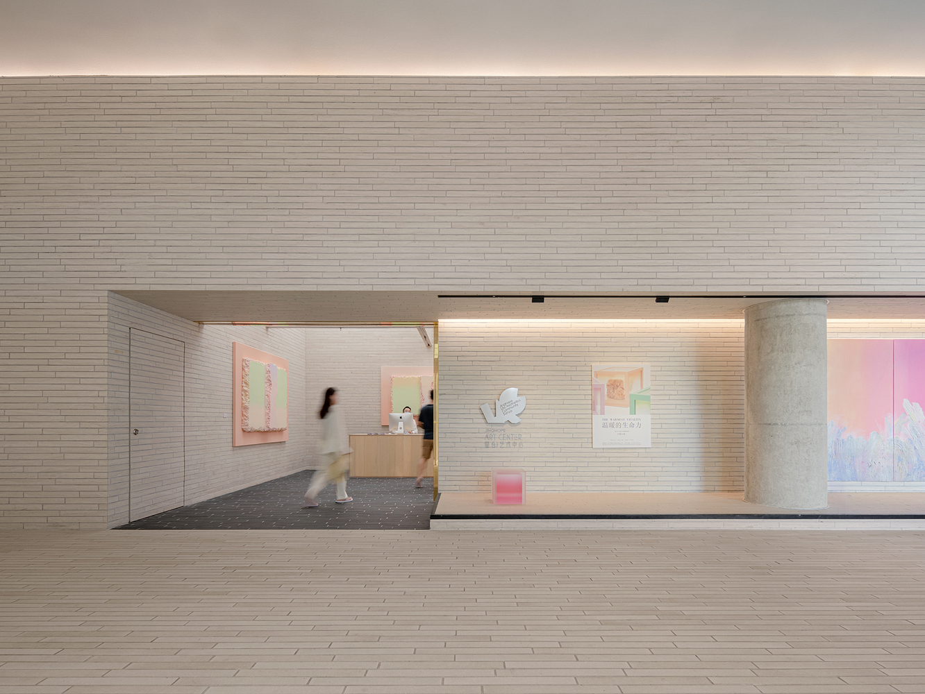
아트 갤러리와 매장의 쇼윈도 디자인은 다양한 포스터와 예술 작품을 전시할 수 있어 공공장소에 시각적 재미와 생동감을 더할 뿐만 아니라 관광객들에게 신선하고 독특한 경험을 선사합니다. 아트 센터는 예술적 감각을 전달하고 전체적인 분위기를 향상시키는 데 중요한 공간입니다. 디자인 팀은 기존의 공간 형태와 층고를 바탕으로 아트센터의 레이아웃을 재치 있게 배치했습니다. 리셉션 공간은 독특한 십자형 천장이 특징이며, 검은색 바닥으로 더욱 뚜렷하게 구분되는 시각적으로 눈에 띄고 차별화되는 공간을 구축했습니다. translate by DeepL



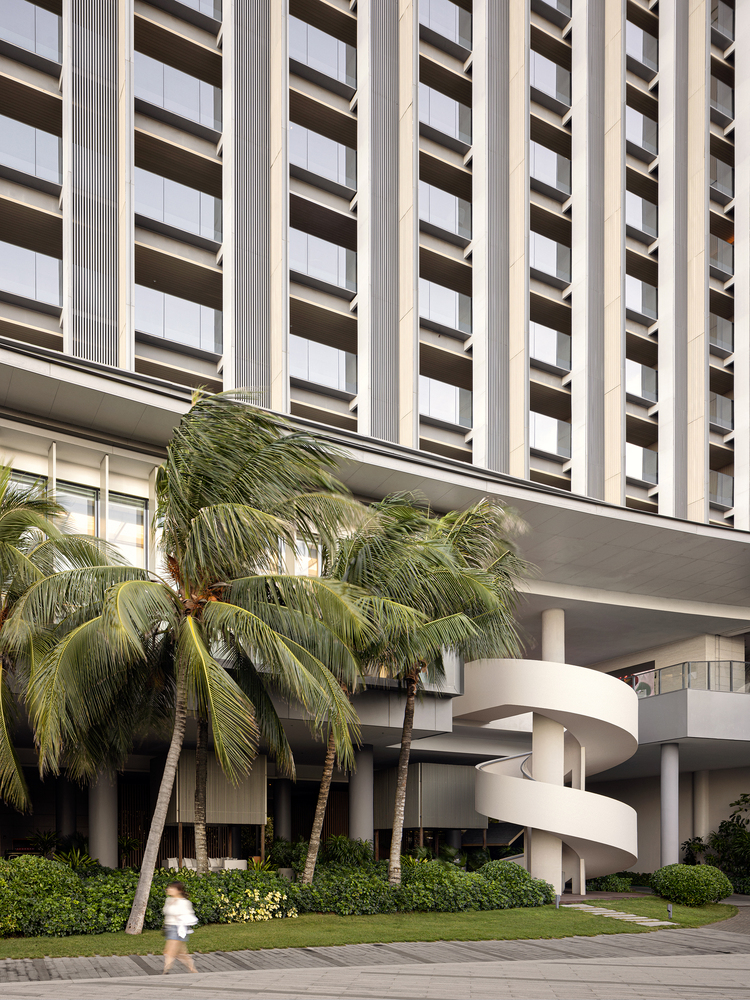


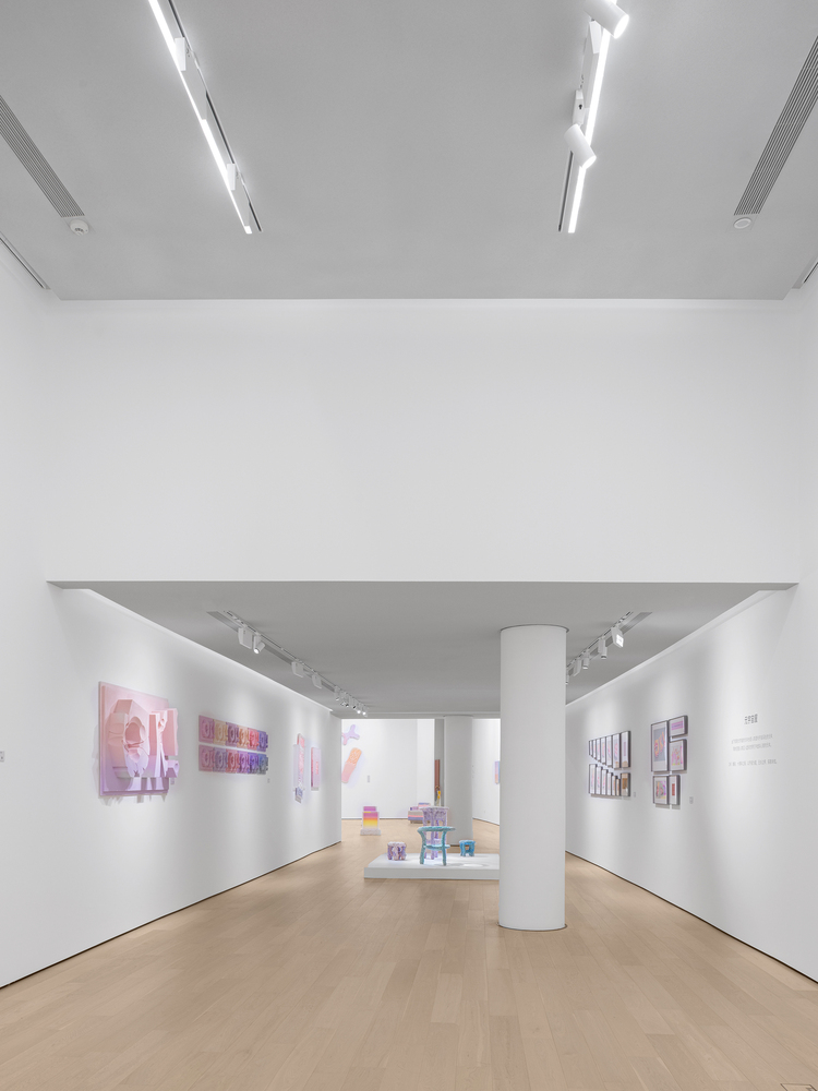
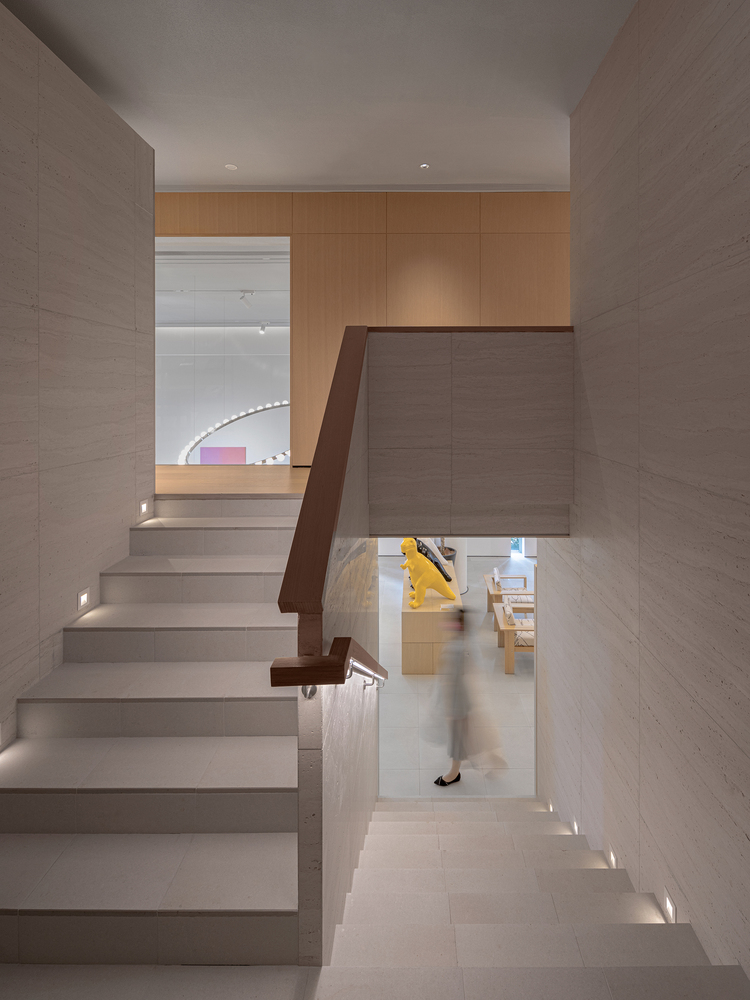
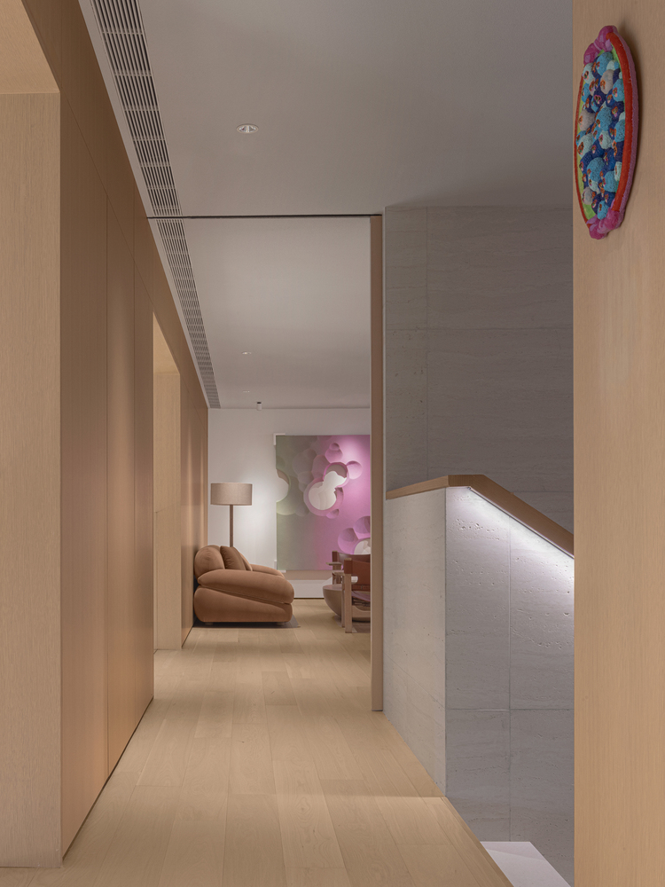
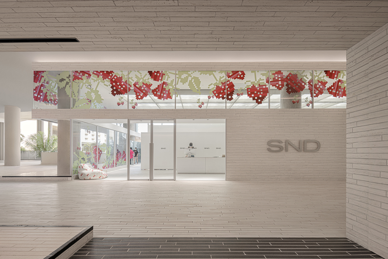
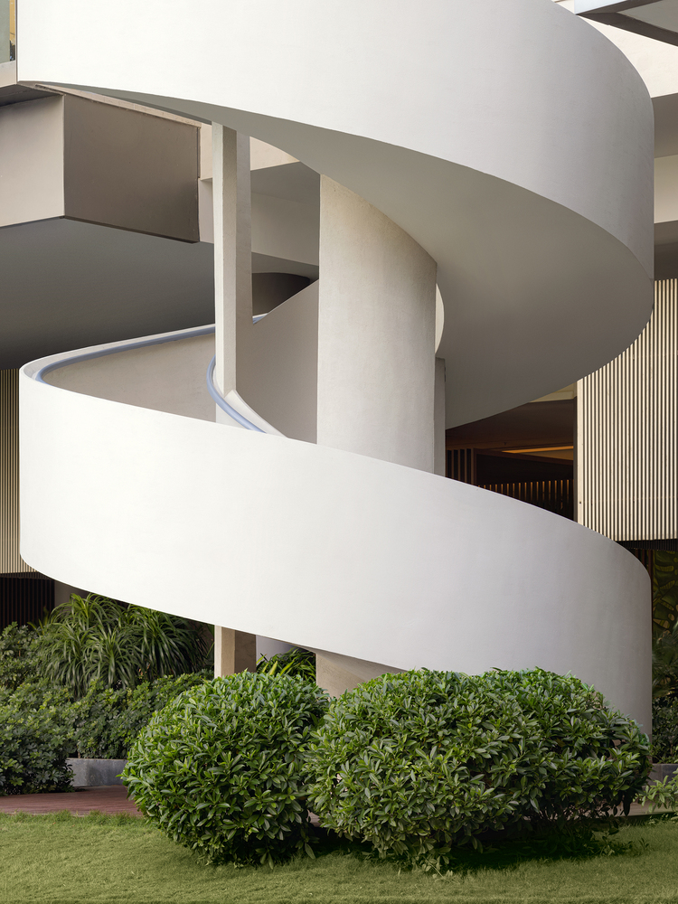
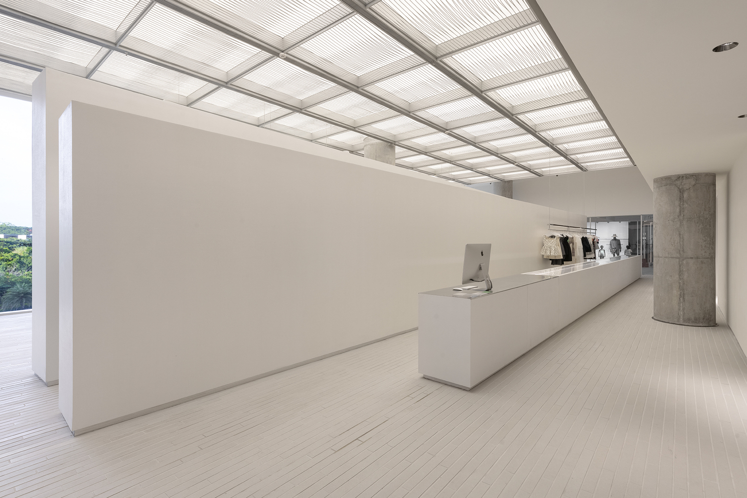


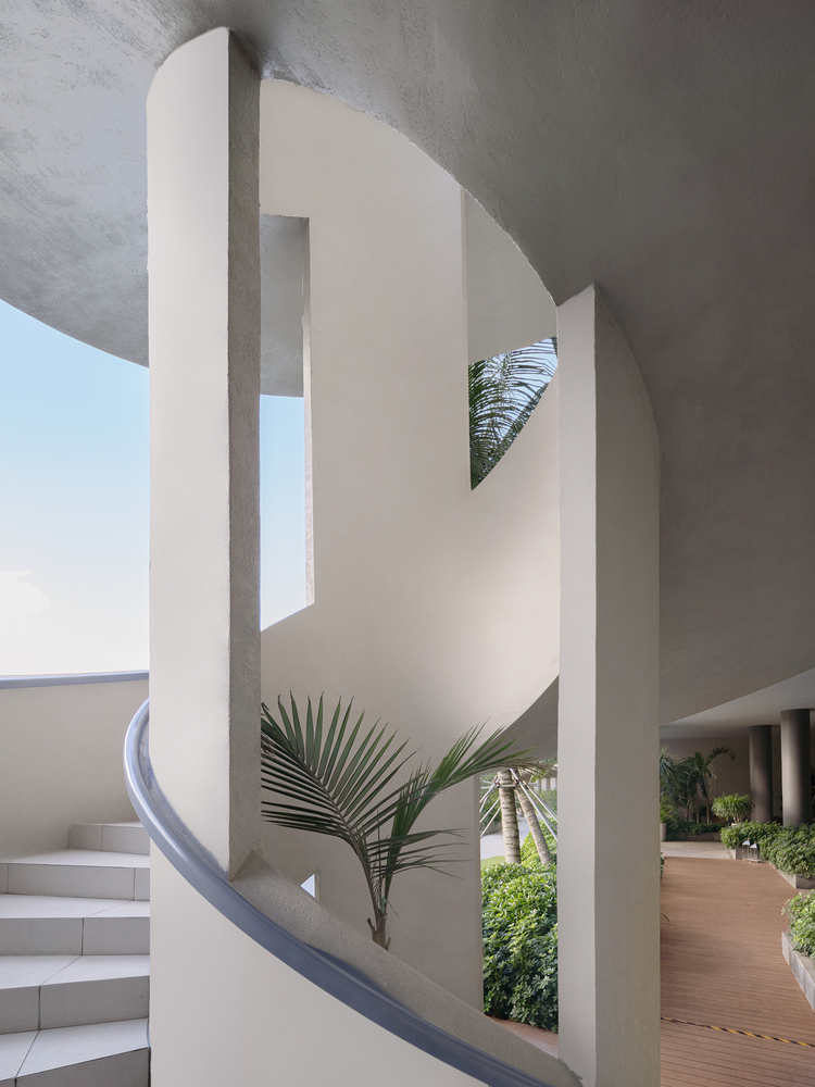
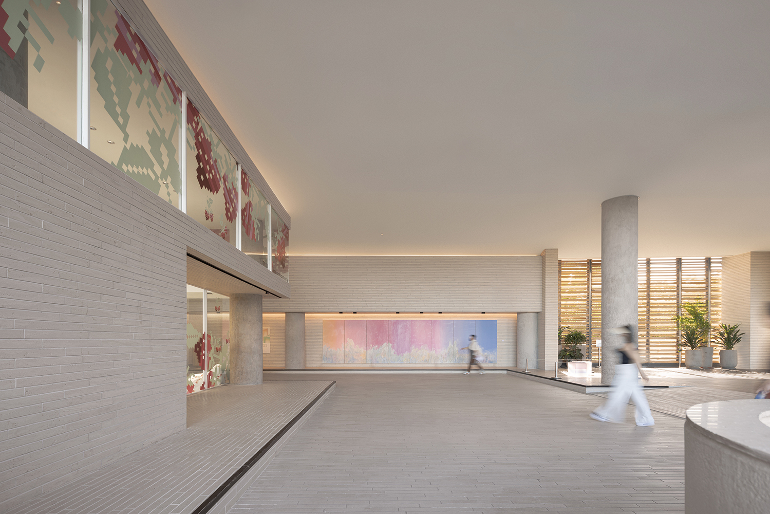


The Jinghope · Life Aesthetics Community adopts a design direction different from the popular Beach Club at The Sanya EDITION, which features bamboo woven structures designed by Various Associates earlier. In this project, the focus is on creating a seamless connection with the hotel's overall vibe and balancing the needs of the hotel and the new businesses. The Jinghope · Life Aesthetics Community connects with the main entrance of the hotel and stands in the circulation route leading to the guest room area, injecting vitality into the public space through the addition of a new circulation. The newly built spiral staircase connects the ground floor to the second floor, directing visitors from the ground floor to the commercial space. Nestled amidst lush vegetation, the open-air contemplation and relaxation areas seamlessly integrate with the indoors.
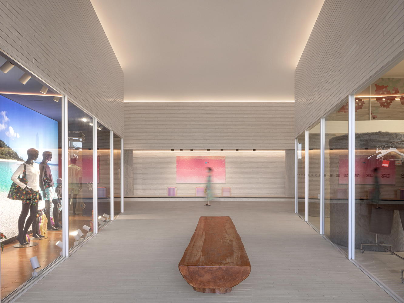
The spiral staircase is crafted with an elegant curved design language, echoing the flair of an art gallery with its pure form. When ascending the pure white steps, visitors are treated to a breathtaking panoramic view of the stunning tropical landscape, making this spot one of the sought-after instagrammable attractions for tourists. The existing 6-meter high floor height of the public area posed a challenge in controlling the guests' sightlines at an appropriate level. Taking advantage of the floor height, the design team incorporated glass curtain walls into the upper and lower levels of store facades combined with new shopfront designs. The introduction of natural daylight enhances transparency and brightness in the indoor area, while the large show windows act as a platform to display artworks or products, creating a pleasant shopping experience for customers.
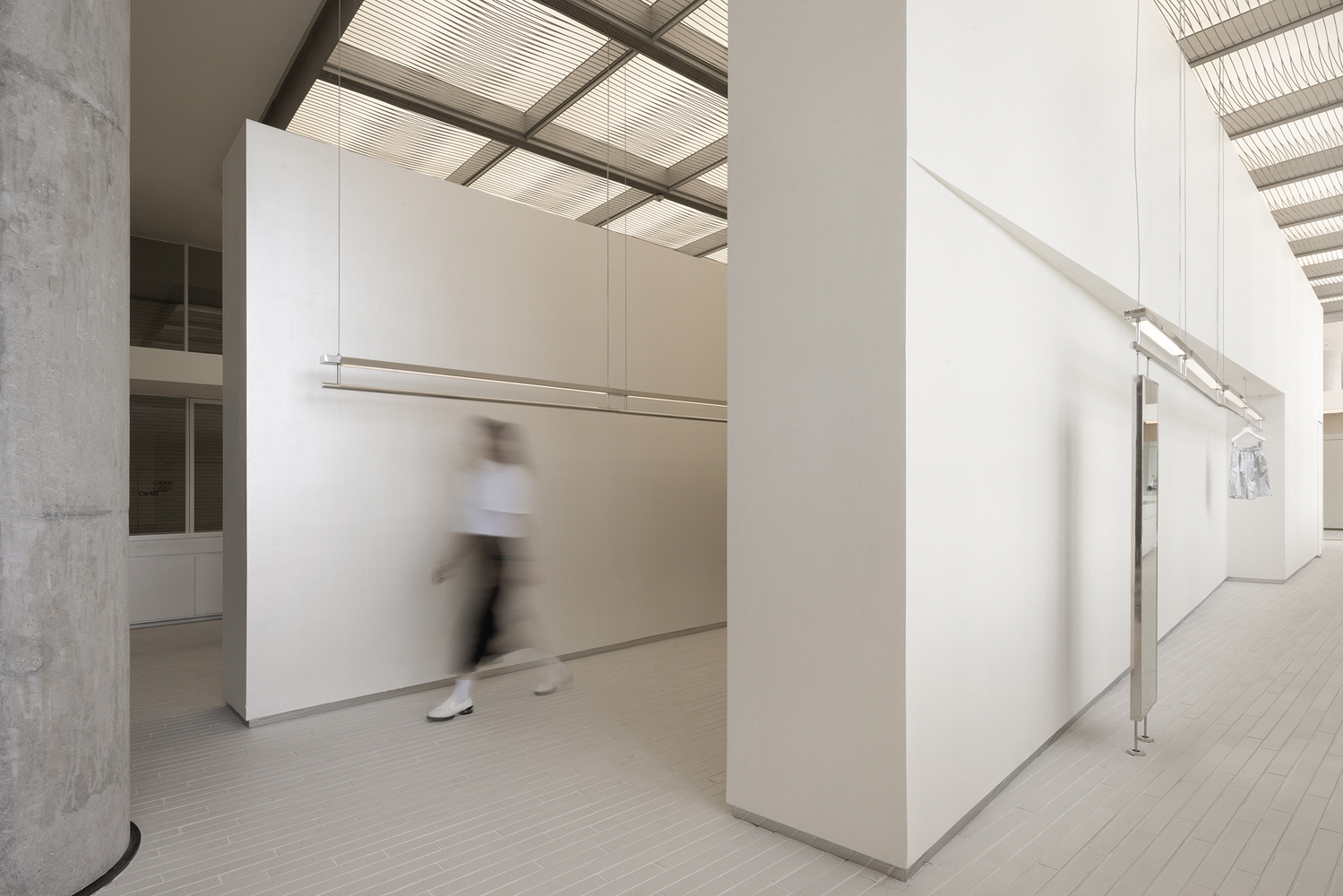
The floorings at the passageway are extended into the shops, creating a feeling of spaciousness via the consistent material texture and color. The top strip lights softly illuminate the building frame, with the brightness flexibly adjustable to meet commercial and operational needs at different times.The open viewing areas are strategically placed in the gaps between the shops, providing a delightful view of the outdoor natural landscape. The openness and simplicity of the space create a serene, cozy, and relaxing atmosphere. The clever arrangement of structural blocks resulted in a meandering passageway, which helps to eliminate the monotony and exhaustion that can arise from traversing a long passageway.
The show window design of the art gallery and stores allows for the display of a wide range of posters and artworks, which not only adds visual fun and liveliness to the public area but also offers tourists a fresh and one-of-a kind experience. The Art Center is a vital area to convey the artistic sense and enhance the overall ambiance. The design team tactfully arranged the layout of the Art Center based on the existing spatial forms and floor heights. The reception area features a distinctive cross-shaped ceiling, establishing a visually striking and distinguishable space, further defined by the black floor.
from archdaily
'Culture' 카테고리의 다른 글
| *뮤직아카데미 [ STAUT Architecten + Perifer ] Jan Frans Willems Kindergarden and Music Academy (0) | 2023.12.22 |
|---|---|
| *레드박스 [ Mix Architecture ] Red Box Exhibition Center (0) | 2023.12.18 |
| *메모리홀 [ Atelier Deshaus ] Taoyiqiu Memorial (0) | 2023.11.30 |
| *코르텐강 닷 소피아 [ I/O architects ] DOT Sofia (0) | 2023.11.28 |
| *아치콘크리트 [ CCA Centro de Colaboración Arquitectónica ] Community Center (0) | 2023.11.24 |