
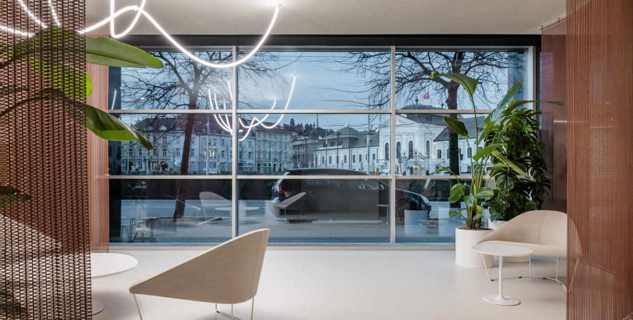
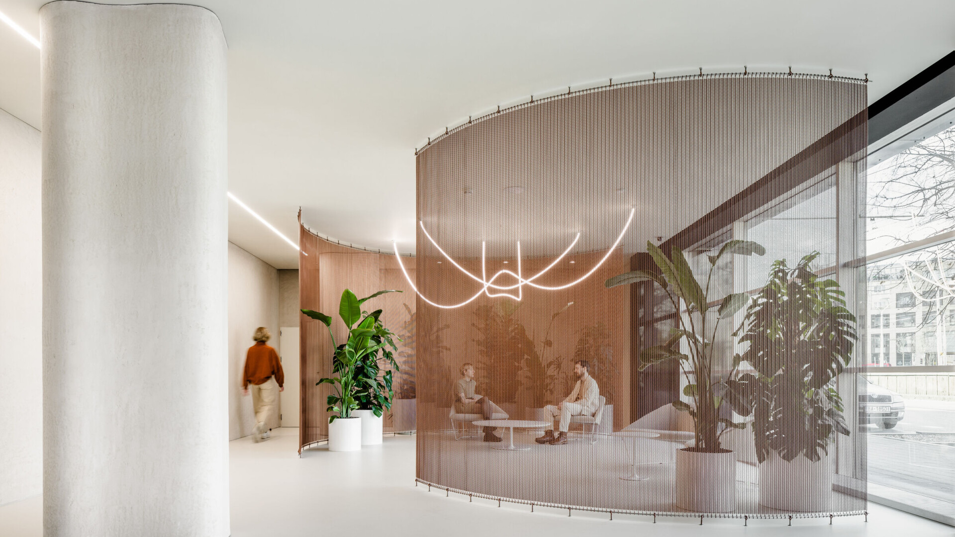
The original design of the entrance lobby of Tatra banka, which carried some characteristics of the last decade of the 20th century, no longer conformed to the requirements for a good flow of employees. Therefore the assignment said to simplify, streamline and modernize the space in a way that will also represent the progress in the brand identity itself.
Initially, after in-depth analysis, we decided to open up the space by removing all of the original partitions. Although this solution brightened up the lobby, the layout seemed a little incoherent and in need of some unifying principle. This principle should bring tranquility to the chaotic space as well as a strong aesthetic and representative effect.
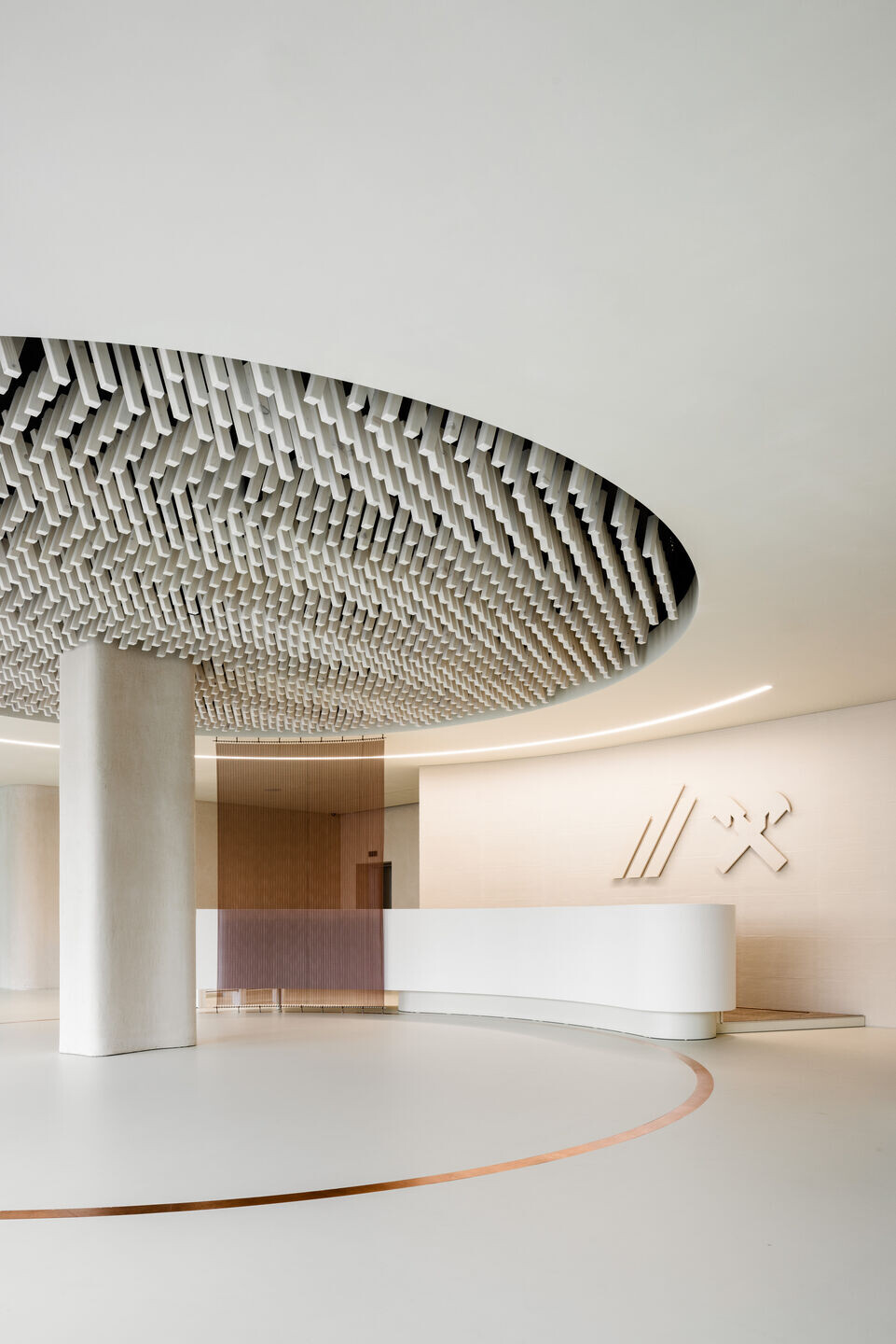
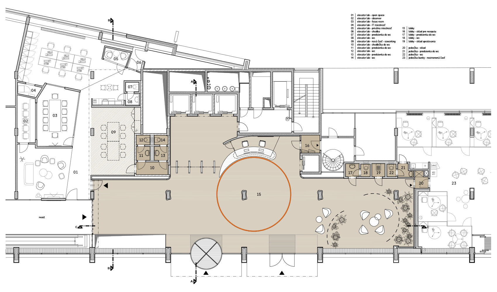
Based on the limits and requirements we placed an imaginary cylinder in the center of the layout to anchor the space of reception and bring a sense of unity and softness to the space. This element is emphasized by a copper ring inserted into the cast floor and its counterpole cutout in the ceiling. A partially perforated ceiling enables the distribution of fresh air from the air-conditioning system. An interesting component of the suspended ceiling panels consists of wooden prisms representing a simplified logo of the bank. The cylindrical central space is enhanced by the curved design of the reception desk.



from archello
'Commerce' 카테고리의 다른 글
| *바텔 스토어 [ Estúdio 41 ] Batel Store (0) | 2023.08.23 |
|---|---|
| *골드윈 하라주쿠 빌딩 [ Studio Hashimura ] Goldwin Harajuku Building (0) | 2023.08.22 |
| *브루스 스트리트 커머셜 빌딩 [ Carr ] Bruce Street Commercial Building (0) | 2023.08.14 |
| *티룸 니고 [ G architects studio ] Tearoom Nigo (0) | 2023.08.09 |
| *미니멀 베이커리 [ oftn studio ] avant+bakery (0) | 2023.07.31 |