
Knight Associates-Lonely Melrose Boutique in LA
건축적인 협업과 컨셉
이 부티크는 Knight Associates와 Lara Hoad Architecture & Design의 협업으로 탄생했다. 디자인 팀은 주요 판매 공간을 개조하고 이전에는 전시 갤러리였던 곳을 현대적이고 매력적인 쇼룸으로 개조하는 어려운 작업에 맞섰다. 이 프로젝트는 웨스트 할리우드 시의 방대한 디자인 및 허가 과정을 거쳐 부티크의 모든 세부 사항이 정밀하게 그리고 혁신적으로 제작되었다.


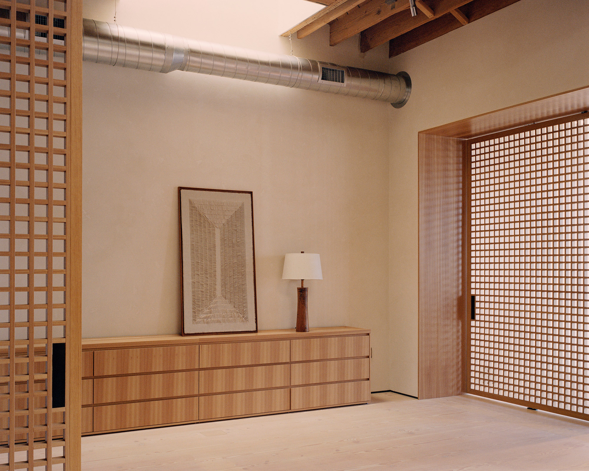
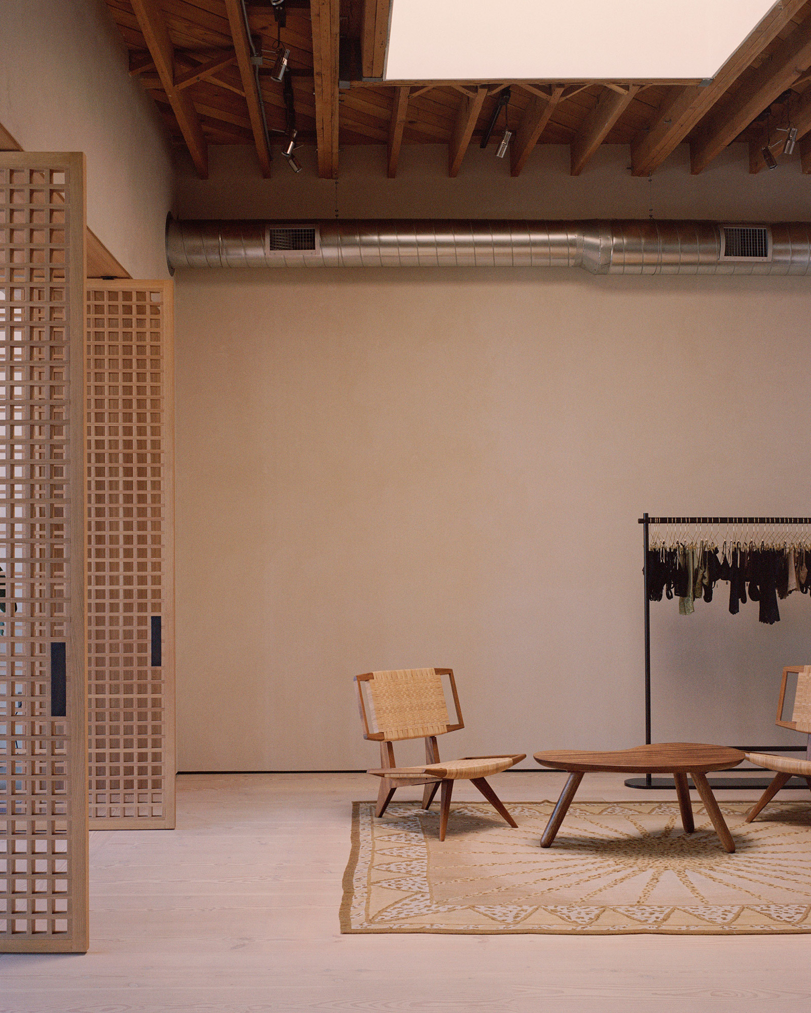

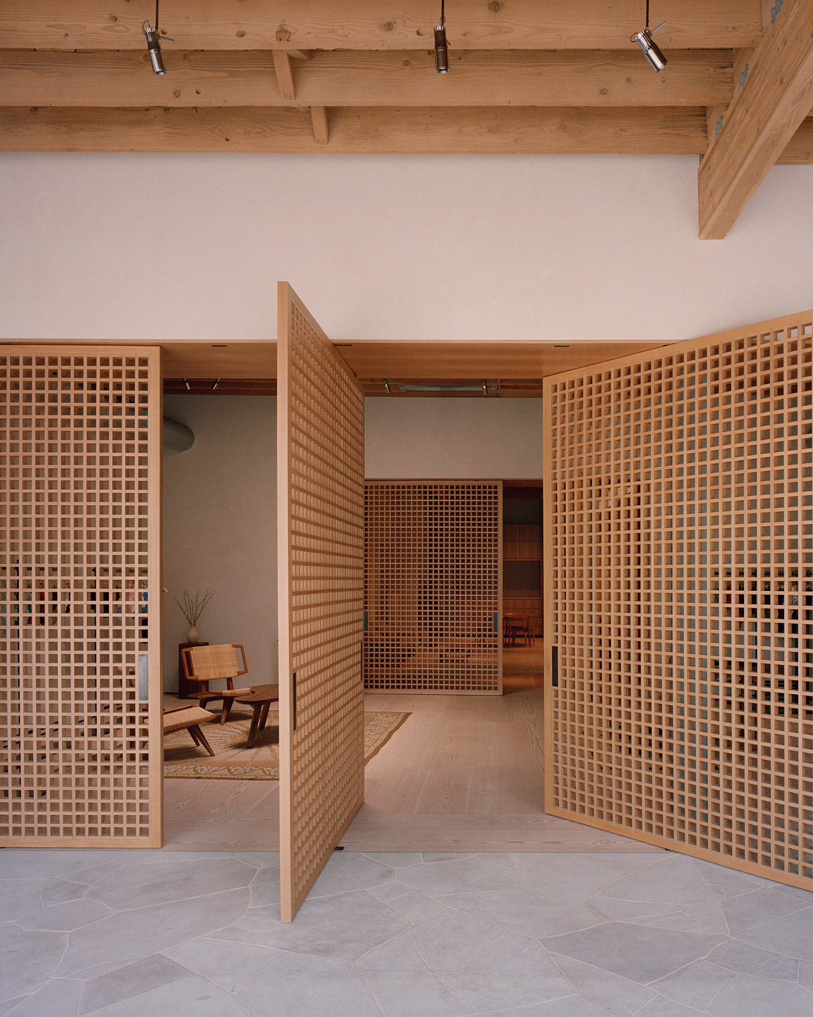
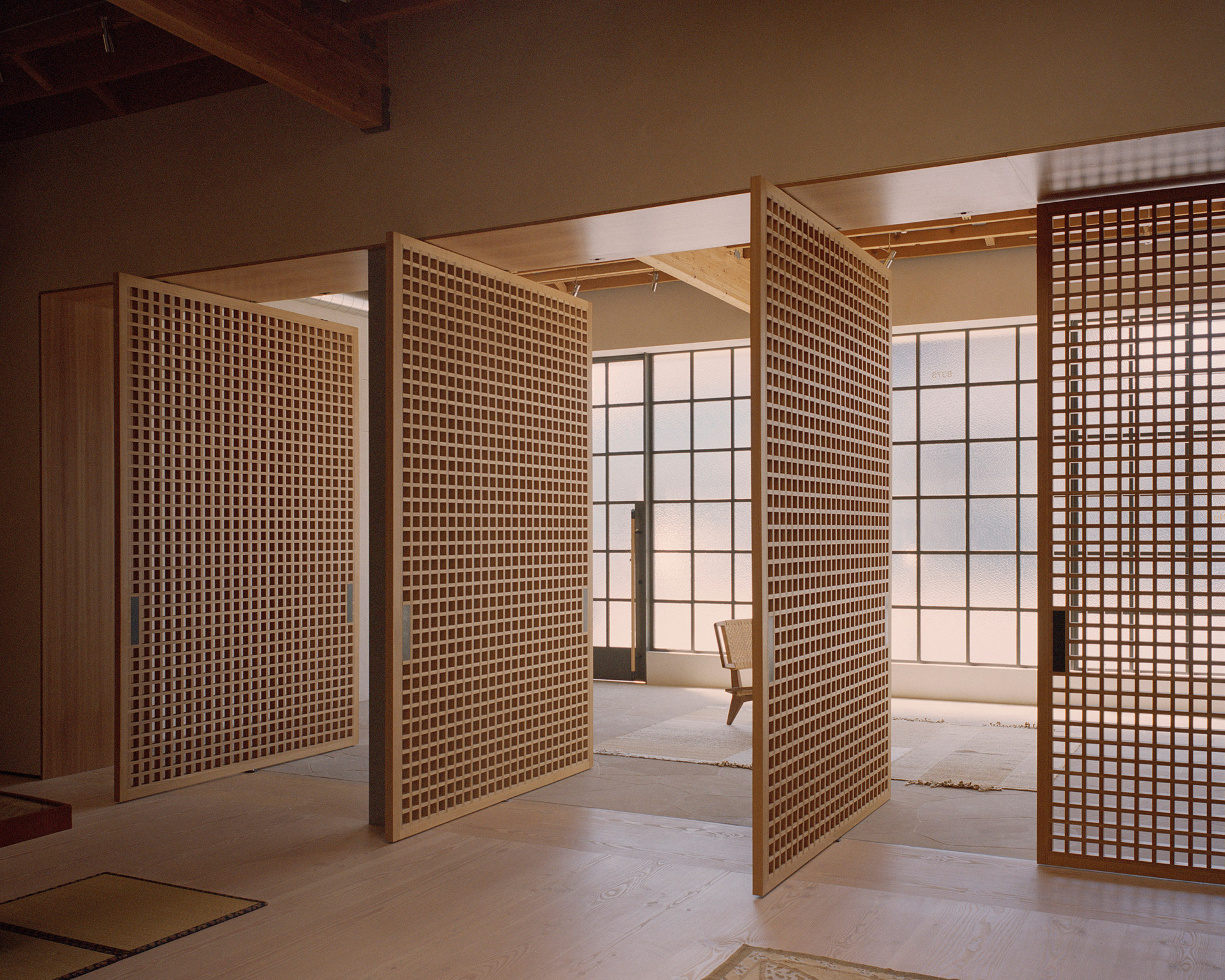

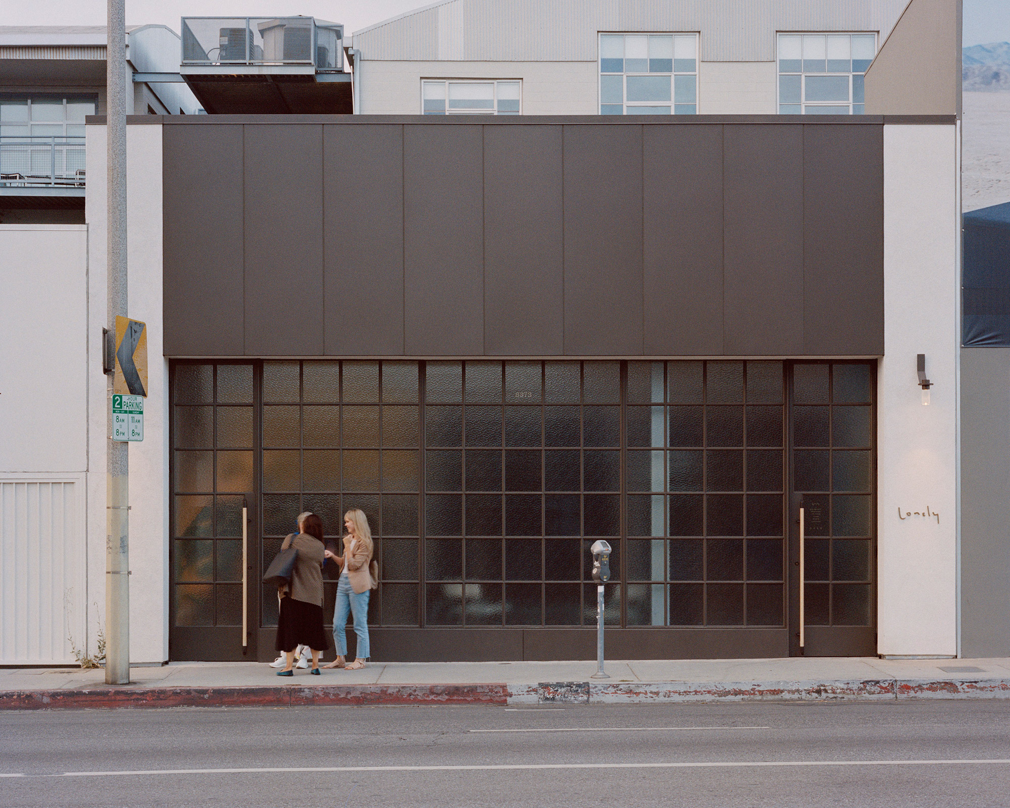
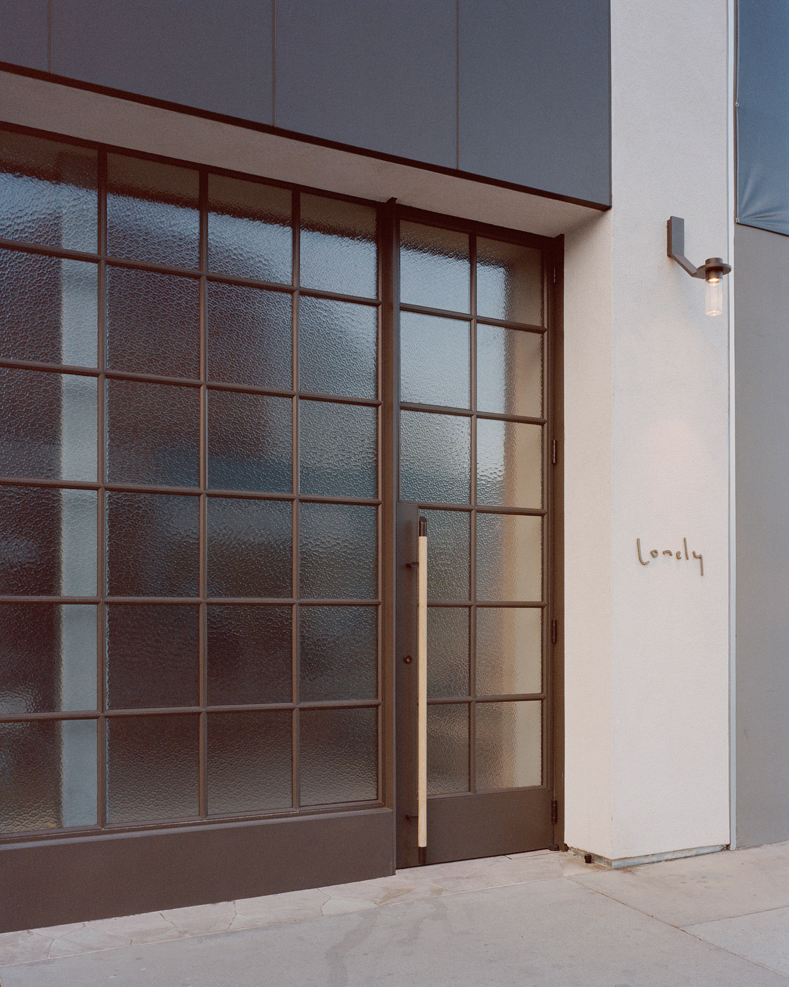
The Lonely Melrose boutique on Melrose Avenue in West Hollywood exemplifies the convergence of digital sophistication and serene retail therapy. A flagship store for the New Zealand based brand Lonely, known for its evocative lingerie, womenswear, and lifestyle products, this new establishment marks the brand’s first foray into the international retail space.
Lonely has long championed the ethos of self exploration and enjoyment through its products, designed to transform customers into muses of their artistic expression. The new Melrose boutique furthers this narrative, providing a calm, sanctuary-like environment where self-love and honor are paramount.
Architectural Collaboration and Concept
The boutique was brought to life through a collaboration between Knight Associates and Lara Hoad Architecture & Design. The design team faced the challenging task of refurbishing the main retail space and modernizing what was formerly a gallery into a contemporary, inviting showroom. The project underwent an extensive design and permitting process with the City of West Hollywood, ensuring that every element of the boutique was crafted with precision and innovation.
Design Aesthetics: Blending Hard with Soft
The design of Lonely Melrose distinctly departs from the cooler, more modern aesthetics of its Auckland and Wellington counterparts. Instead, it opts for a softer, more enveloping approach. The interior design facilitates a dialogue between hard and soft surfaces, echoing the brand’s themes of raw sophistication, honesty, and simplicity. Materials such as Douglas Fir, aged brass, pitted plaster, and stained Elm are employed to create muted yet tactile experiences, crafting an ambiance that is both romantic and undeniably modern.
Customer Experience at the Core
True to Lonely’s customer centered approach, the store’s layout emphasizes service and experience. Large operable joinery allows the space to transform seamlessly from an open-plan showroom to private areas for more intimate consultations and fittings. This flexibility ensures that each customer’s experience can be personalized to their comfort and needs.
The store’s storage solutions are subtly integrated, utilizing freestanding vintage furniture that complements the boutique’s aesthetic while keeping administrative and stock fulfillment areas discreetly out of sight. The newly constructed façade, finished with cathedral glass, not only enhances the boutique’s external allure but also plays a crucial role in modulating the natural light that enters the space and providing privacy to the shoppers inside.
Embracing Digital Integration
While the focus remains on in-person service, Lonely Melrose is forward thinking in its digital integration. This aspect caters to the evolving retail landscape where digital and physical shopping experiences converge, allowing Lonely to reach a broader audience while maintaining the intimacy and personalized service that are core to its philosophy.
from archeyes
'Commerce' 카테고리의 다른 글
| *샤프베르크반 스테이션 [ dunkelschwarz ] Schafbergbahn Station (0) | 2024.05.27 |
|---|---|
| *우산과 나무 그루터기에서 영감을 받은 독특한 카페와 놀이터 [ NITAPROW ] Little Stove & Little Stump Coffee Shop and Playground (0) | 2024.05.23 |
| *더 리버 콰이 레스토랑 [ PHTAA ] Restaurant The River Kwai (0) | 2024.05.16 |
| *하이옌커탕 [ Yanfei Architects + Elepheno Architects ] Haiyan Ke Tang (0) | 2024.05.02 |
| *버티컬 우드 [ Snøhetta ] Vertikal Nydalen (0) | 2024.05.01 |