Client: Louis Vuitton Malletier
Program: Flagship store / Landmark building. Retail, café, spa, bookstore, event and exhibition space.
Building surface: ca. 6.000 m2
Building volume: ca. 40.000 m2
Building site: 746 m2
Competition dates: Nov 2006 – Feb 2007
Credits
UNStudio: Ben van Berkel, Caroline Bos, Astrid Piber with Mirko Bergmann and Sebastian Schott, Ger Gijzen, Cristina Bolis, Juliane Maier, Albert Gnodde, Andreas Brink, Michael Knauss, Morten Krog, Silvan Oesterle, Machteld Kors.
Advisors:
Structure, SMEP: Arup, Amsterdam
Lighting design: Arup Lighting, Amsterdam
Façade Engineering: Arup GmbH, Berlin
Flagstore Louis Vuitton, Japan
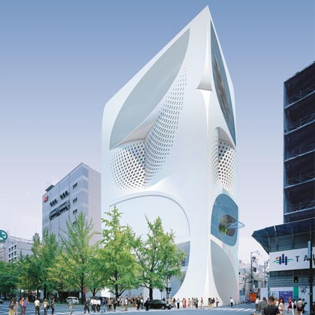
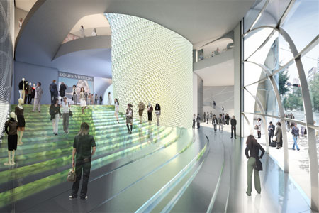
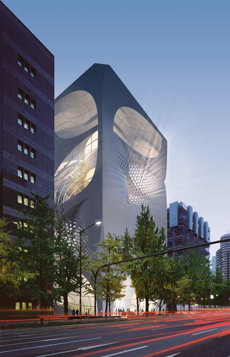
The design for the 10 storey (54 meter tall) flagship Louis Vuitton store in Japan aims to establish an architectural equivalent of the identity of Louis Vuitton in which classical and modern qualities are blended, reinforcing each other. The design inspires the visitor with a feeling of being in the House of Louis Vuitton by celebrating the qualities that make up the essence of the company, its products, its history and its future.
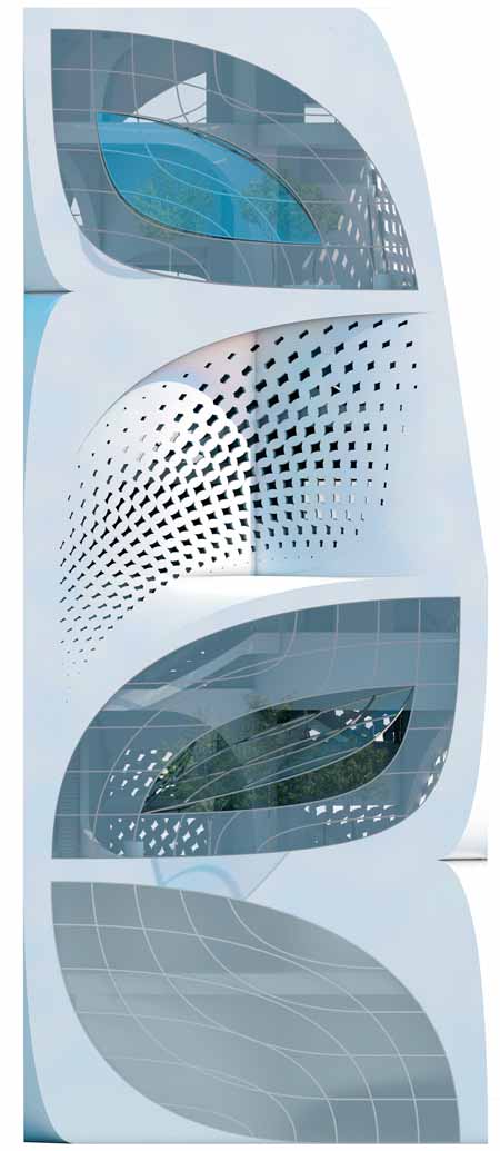
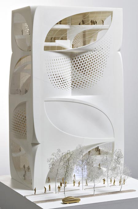
The elements that represent the classical values connected to the Louis Vuitton brand are implicitly present throughout the design. These elements are to a large extent identical to the modernity also implicit in the name Louis Vuitton, along with the value of inventiveness. The element that moves through all the scale levels of the design is the leaf shape. The leaf is found in the floor plan, in the section and in the elevation. It has been applied to the construction also, responding to location-specific constructional demands. Leaf-shaped openings in the façade give the building a strong identity with landmark potential, while complying with the necessity for discreetness with respect to visibility from the outside. The leaf shape can be seen as bearing a connection to the famous Louis Vuitton monogram.
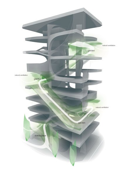
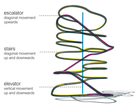
The building follows the structure of a (grand) house: with three levels, each spanning a varying number of split-level floors and each with its own atmosphere and purpose. Each floor is in principle divided into four leaves, which are set in a spiral pattern with a height difference between each leaf of 2.70 meters. Terrace zones, which offer a mix of functions in a garden setting, mark the different vertical sections of the house, with the sense of intimacy growing towards the top of the building.
'REF. > Architecture' 카테고리의 다른 글
| [ nolaster ]AGUAS VIVAS (0) | 2008.08.07 |
|---|---|
| [UNStudio] Ta Lee Plaza (0) | 2008.08.05 |
| [LAN Architecture] EDF NATIONAL ARCHIVES CENTER (0) | 2008.07.25 |
| [Wiel Arets] Low-Income Housing with Heart (0) | 2008.07.24 |
| [ Gus Wüstemann ] Feldbalz (0) | 2008.07.23 |