
 |
 |
 |
sou fujimoto designs concave 'tokyo toilet' as large water vessel open to all
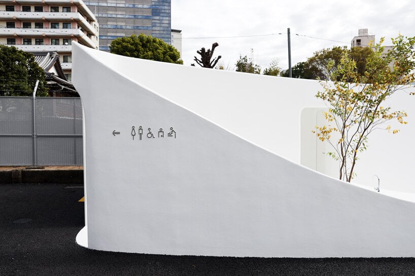
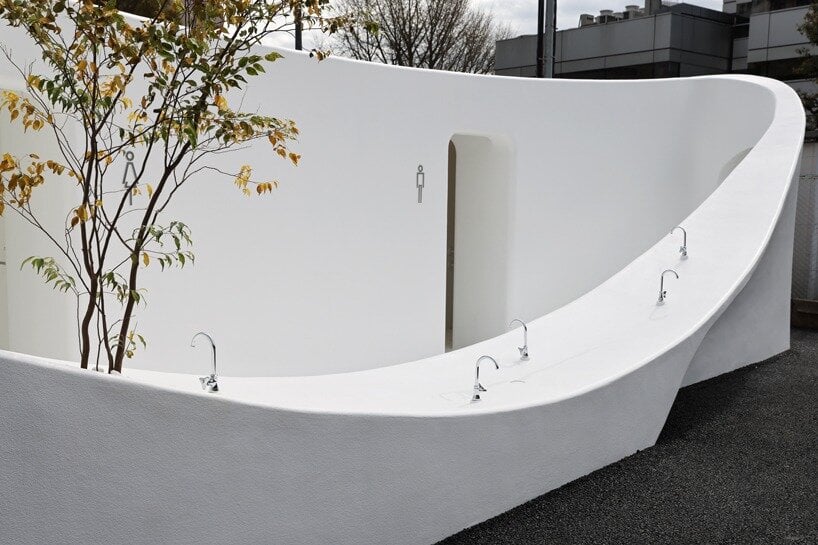
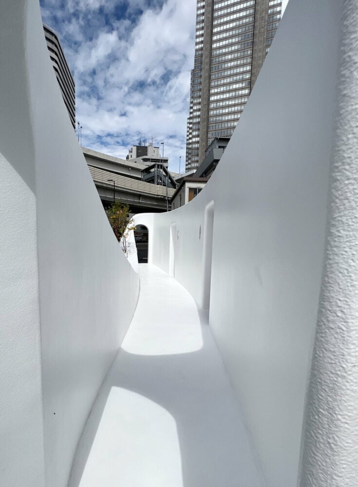
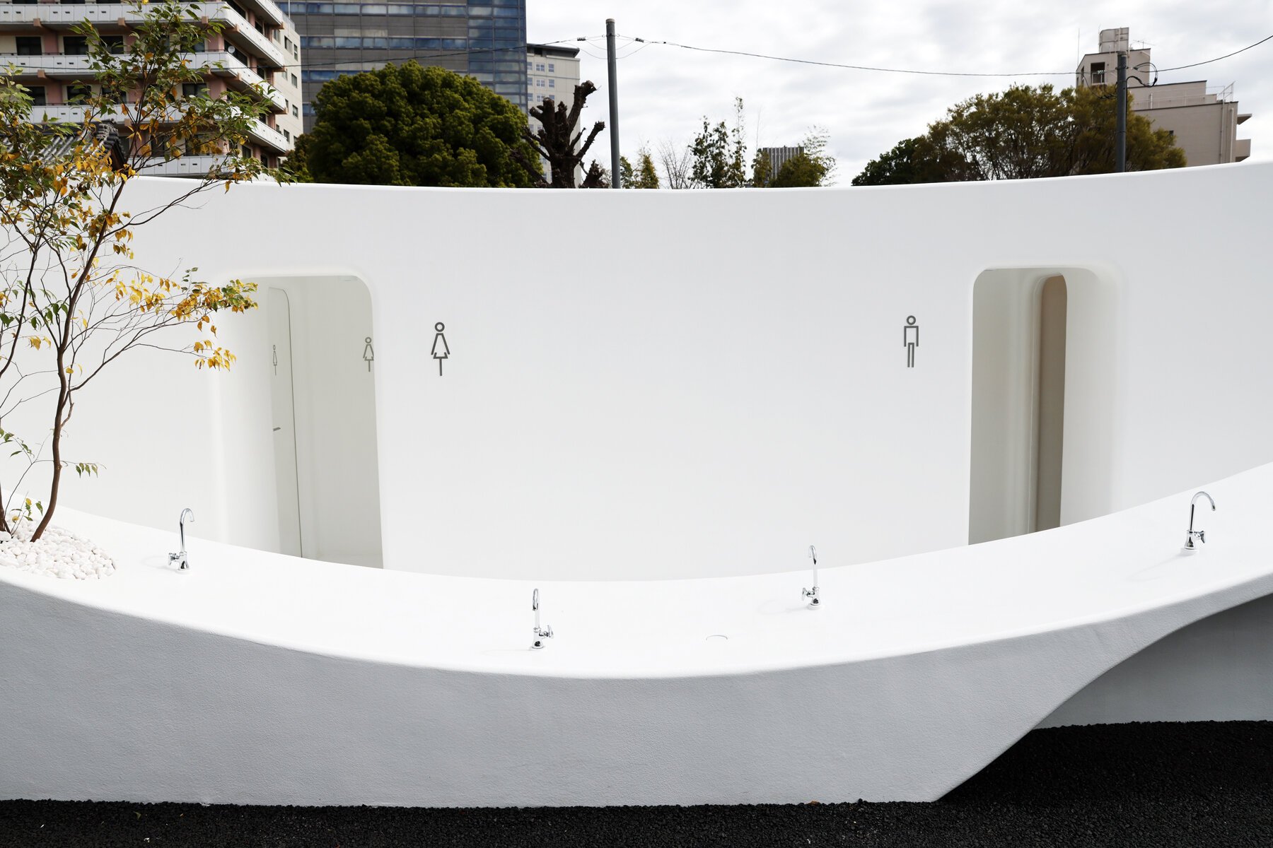
도로에 면한 낮은 높이의 벽은 내부와 외부에서 동시에 사용할 수 있도록 다양한 수전이 배치되어 있다. 이러한 건축적 어휘는 내외부 다양한 접근방식을 열어둠으로써 높낮이 없는 소통을 구현한다. 유기적인 형태를 통해 어린아이와 휠체어를 탄 사람들도 함께 이용 할 수 있는 유니버셜 디자인이 되어 있다.
THE TOKYO TOILET BY SOU FUJIMOTO
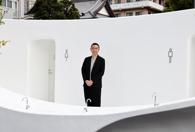
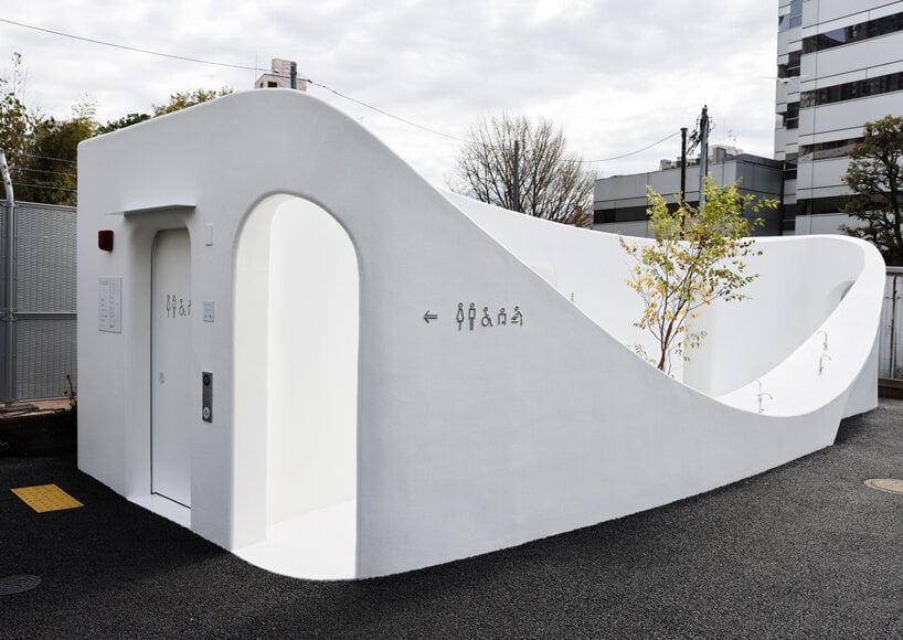
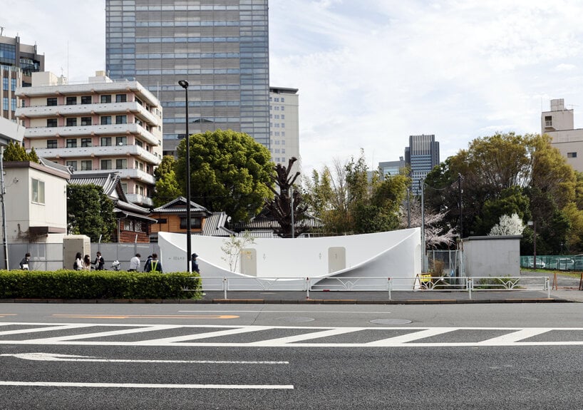
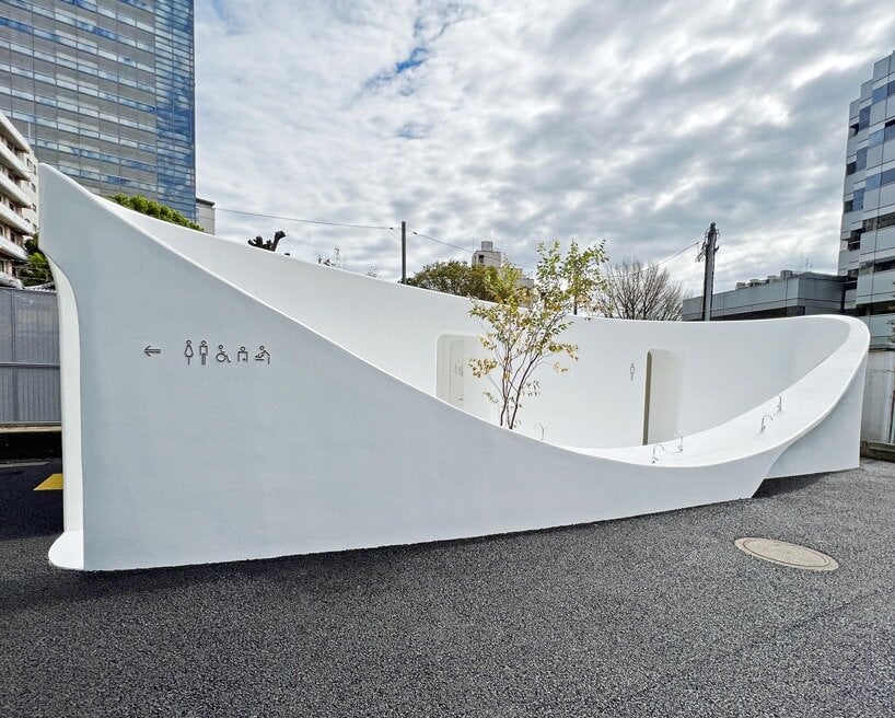
As part of ‘The Tokyo Toilet‘ initiative, Sou Fujimoto has completed the design of a new restroom on the shopping street of Nishisando, Japan. Taking shape as a giant washbasin amid the busy neighborhood, its curvaceous silhouette stands out discreetly against the large buildings on the backdrop. The design team sought to form a ‘vessel open for everyone’ with a recessed center that can host people of all ages,‘ becoming part of our lives’.
designboom attended the inauguration of Fujimoto’s project, navigated through its curvilinear body, and saw the meticulous design of the small yet spacious area. The renowned Japanese architect was also there and shared with us the challenges and reasoning behind the concept.
‘In the concept phase, we spent a lot of time developing various ideas on how to shape the public nature of the toilet. This process wasn’t easy. After testing different shapes and sizes, we opted for a structure reminiscent of a large water vessel. It was challenging to achieve the shape exactly as designed during construction, so our team and Daiwa House, who did the construction, were on site, supervising the progress. After we reached the desired form, we focused on details and fine adjustments, achieving the visible high quality,’ Fujimoto said to designboom.









SHARING ONE VESSEL WITH EVERYONE
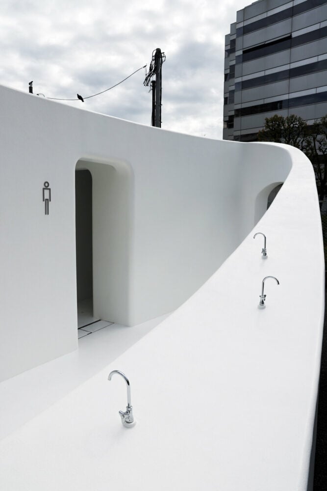
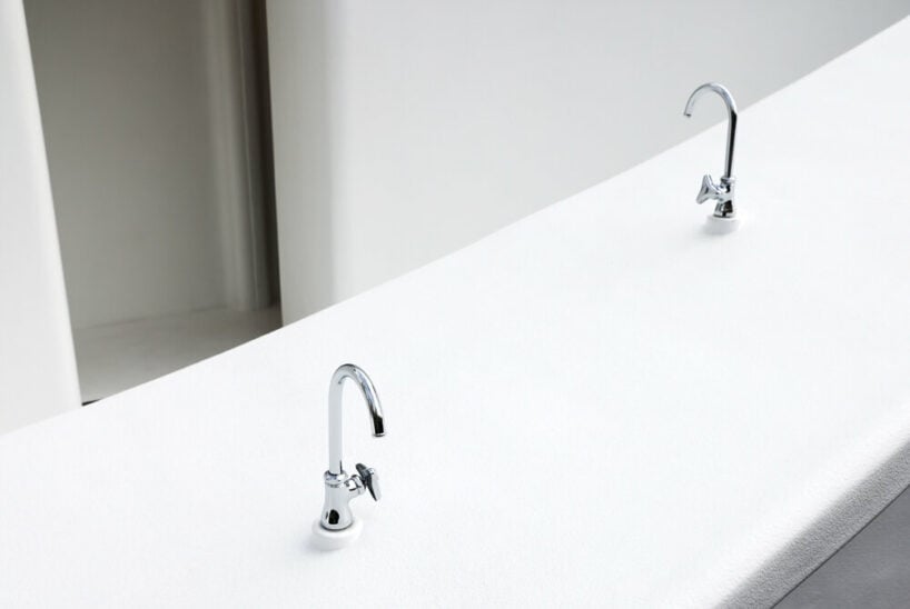
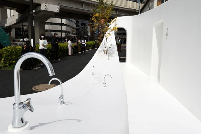
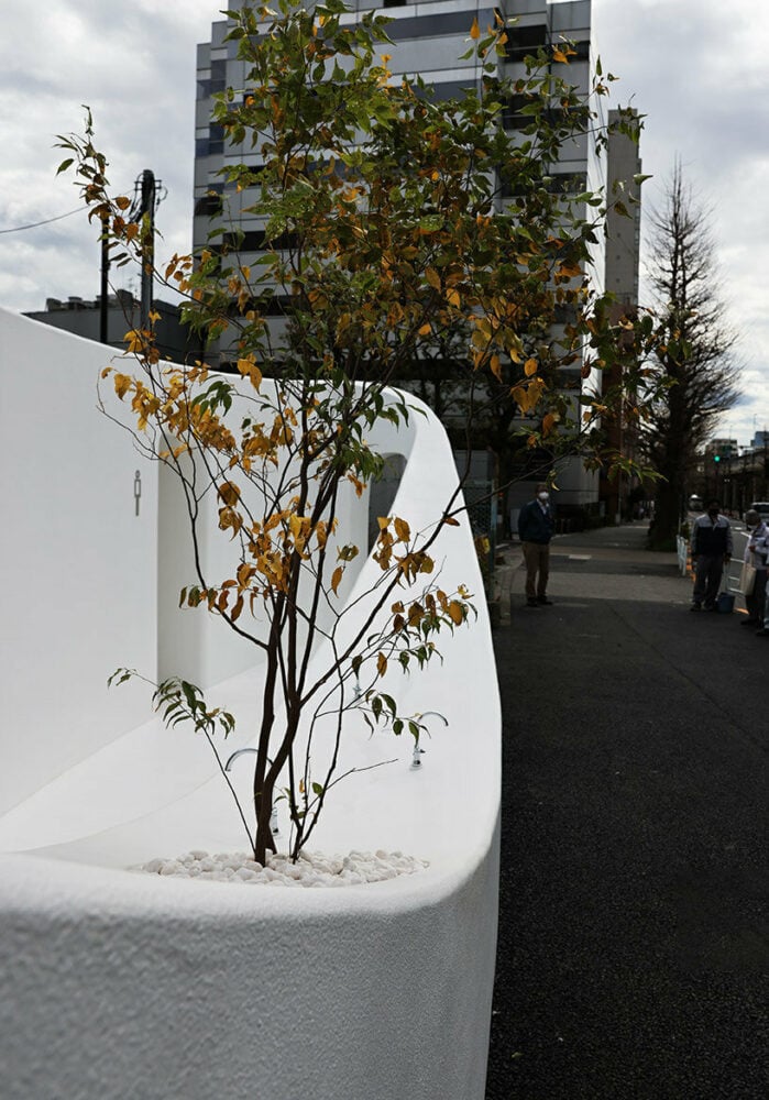
The street facing wall bents at a low height, accommodating a series of washbasins that can be used from inside and outside the Tokyo Toilet structure. This inviting gesture engages passers-by to a pleasing stopover, drinking water, washing their hands, and interacting with other visitors. Its organic shape enables people of different ages and states to visit the area easily. Young children can reach the lowest point of the curve, as well as people in wheelchairs can operate the hollowed spots.
The open air scheme with soft lines calms the eye, giving the impression of a more spacious site. This layout brings in pops of the green surroundings, which come in a gentle juxtaposition with its clear white paint. The bright color improves the structure’s visibility and accessibility throughout the hazy city. ‘The intention of making it white expresses cleanliness; if it gets dirty, you must clean it. The fact that the white color is maintained indicates that maintenance has been carried out,’ explained Sou Fujimoto (see more here). Emerging from its bent form, a small tree reminds us of the need for water that connects all living beings and, thus, our respect for them.
Inspired by the idea of a fountain, the architect tried to create a playful yet functional interpretation in the heart of the busy district. This symbolic approach tries to bring strangers together like a fountain attracts visitors. Despite its welcoming bowl shape, the structure doesn’t compromise guests’ privacy and security. Two small arched portals on each end guide visitors to the facilities. ‘It’s a new way of public space where people gather around water,’ he added.
from designboom
'Pavilion&Installation' 카테고리의 다른 글
| *상상놀이터 vibrant AI series conceives children's playgrounds as spaceships, boats, and zeppelins (12) | 2023.06.12 |
|---|---|
| *헌터를 위한 전망대 [ Lemmo Architecture and Design ] Clear Rock Ranch (12) | 2023.06.06 |
| *체코 파빌리온 리노베이션 A8000 wraps stepped Czech pavilion in translucent skin (12) | 2023.02.03 |
| *색다른 오피스랜드스케이프 [ Studioninedots ] Wet Beast Office (12) | 2023.01.23 |
| *야시마 마운틴탑 파크 [ SUO + Style-A ] Yashima Mountaintop Park (0) | 2023.01.18 |