 |
 |
 |
Tenhachi Architect & Interior Design-Tototo&Soymilk Café
텐하치 건축가 & 인테리어 디자인-토토&두유 카페
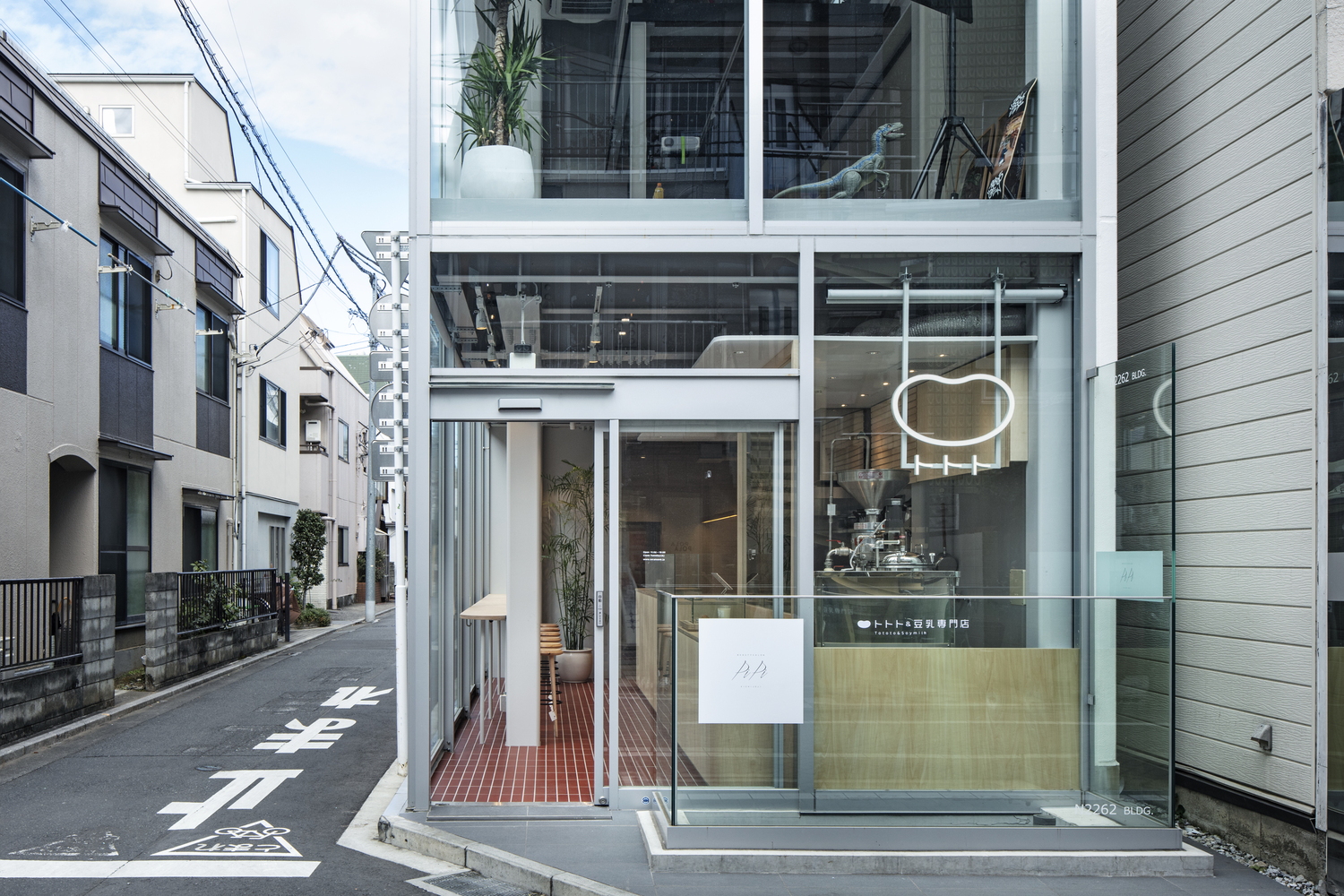
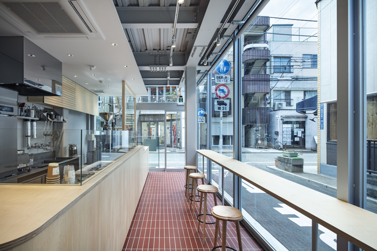
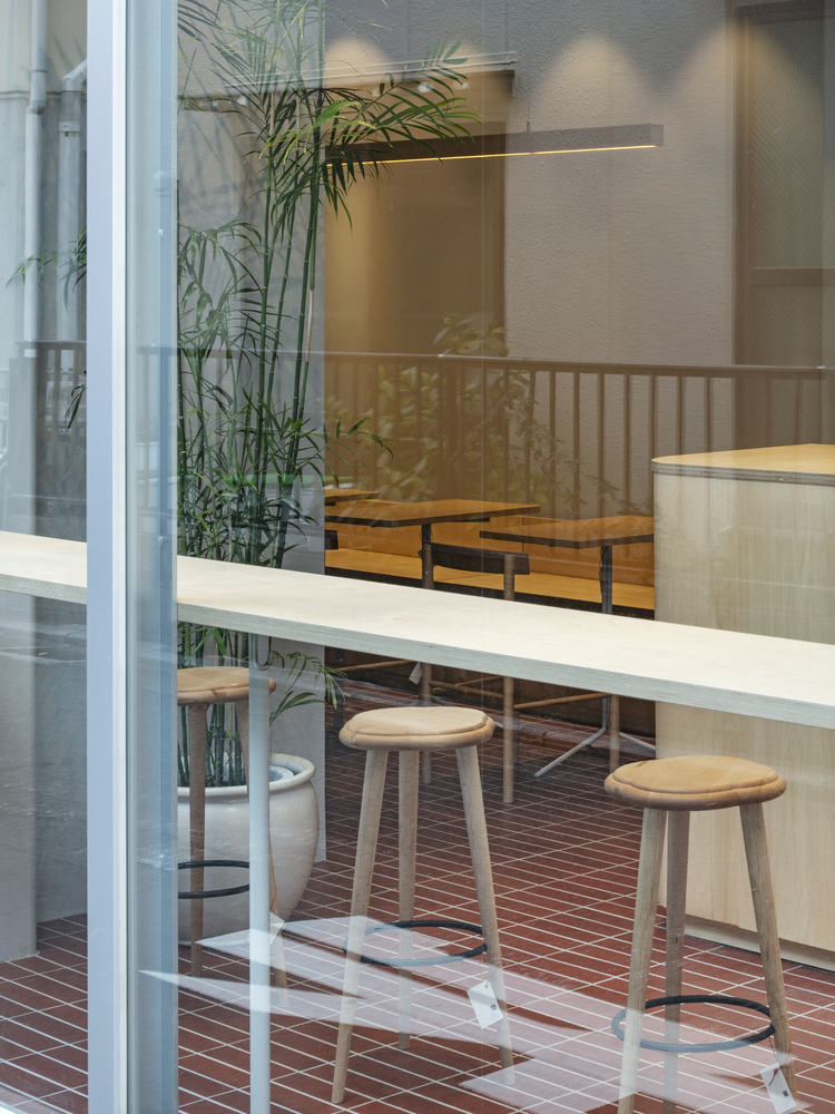
텐하치 건축에서 디자인한 토토토&두유 카페는 키치죠지 역 근처 나카마치 거리의 건물 1층에 위치한다. 카페 인테리어는두유생산에 대한 정성과 마음을 담는 따뜻한 자작나무 합판과 도자기 적벽돌 타일로 구성한다. 재료의 소재는 콩과 유사한 색감을 갖고 있다.




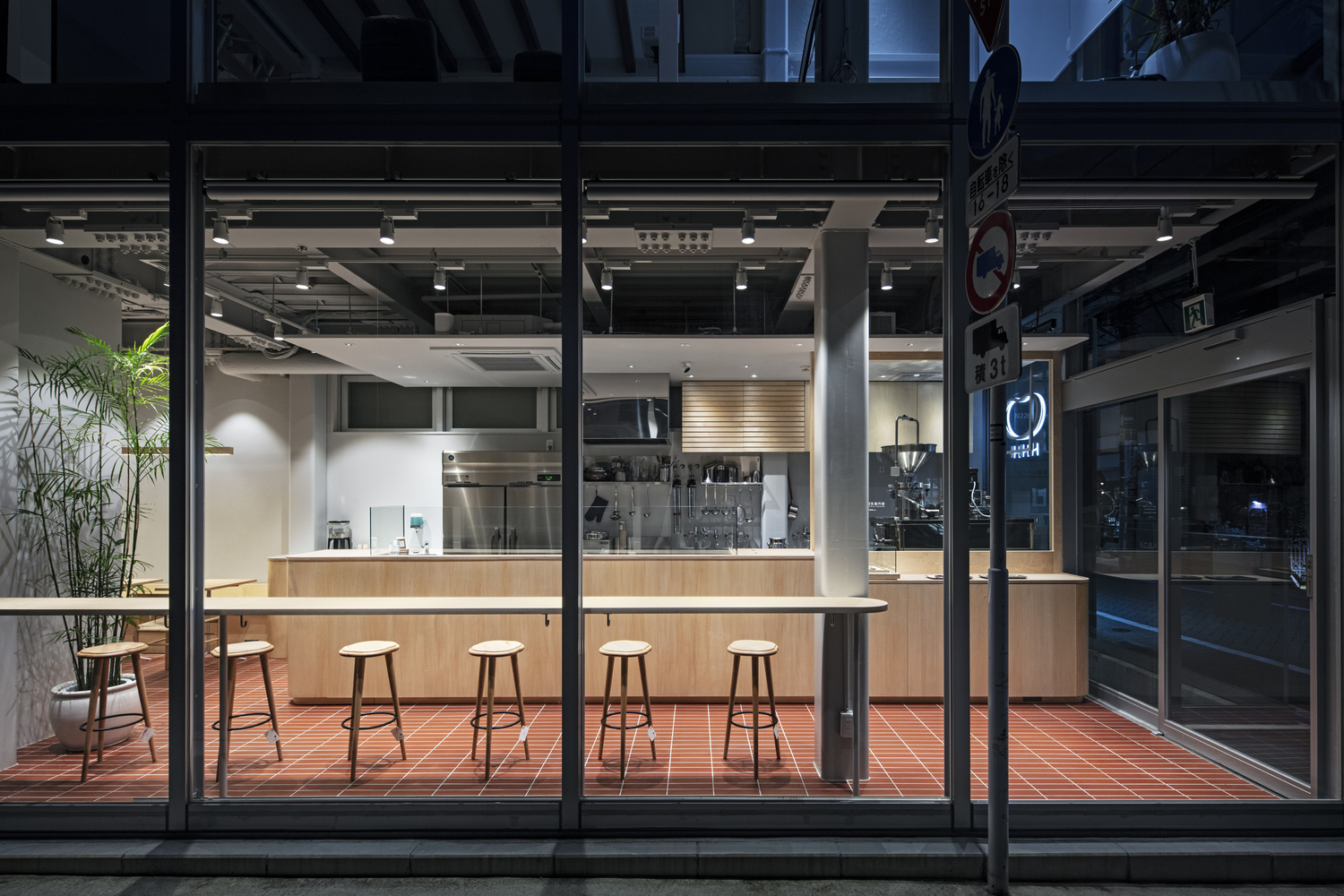


On the first floor of a building along Nakamachi Street, near the Kichijoji Station this is where the first branch of the soymilk specialty store, “Tototo & Soymilk” is located. This soymilk store is a new business for the client, and they researched and investigated the soymilk production process. After repeated investigations into adjusting the taste, they produced smooth and delicious soymilks while keeping the original taste of the soybeans in the soymilks.
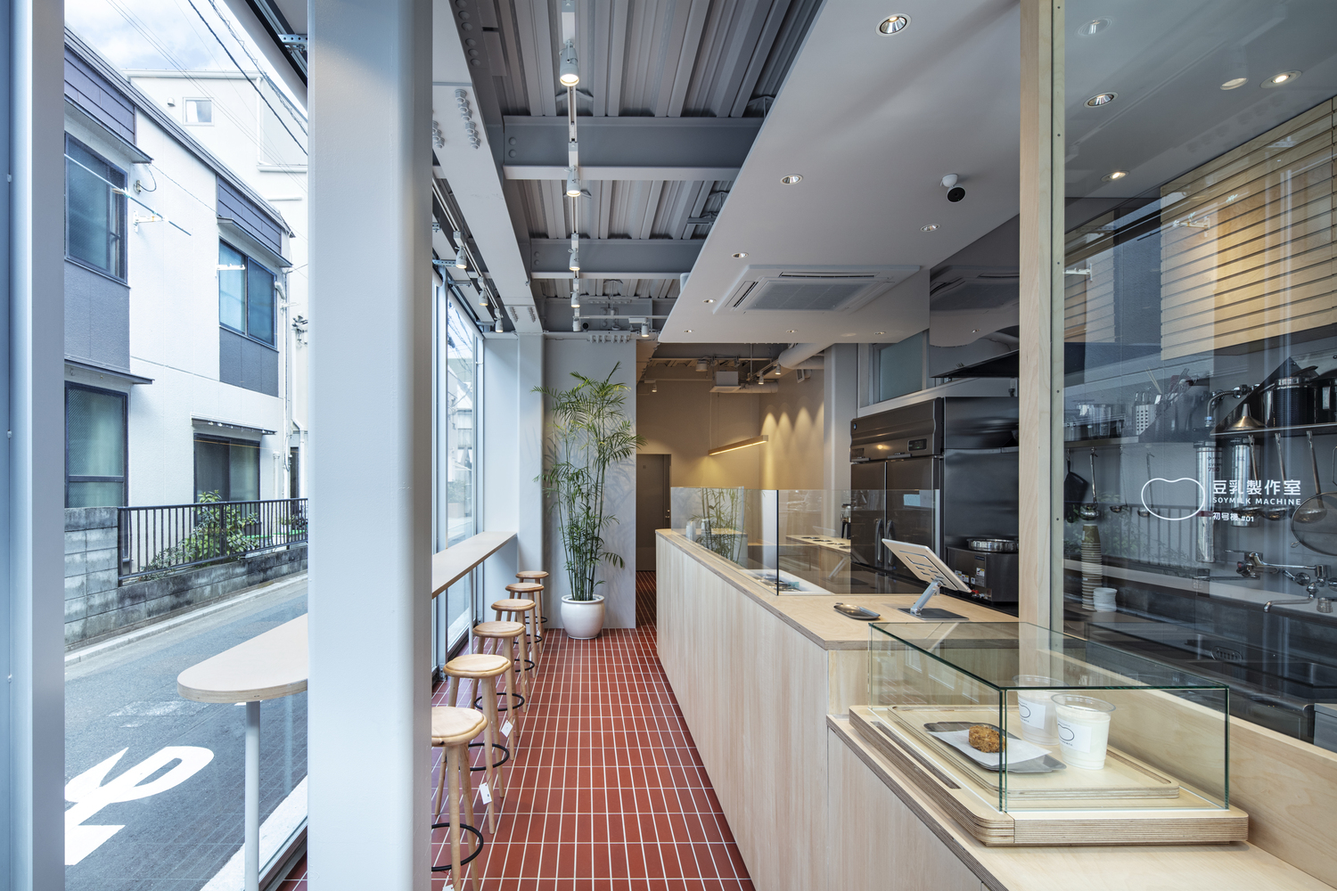
The store has a large soymilk squeezer machine equipped, which they use to make fresh soymilk every morning. We expected soymilks to be white, but the taste and color of the soymilks vary depending on the type of soybean used to produce the soymilk. Tototo offers a variety of soymilks on their menu, even for the plain flavor alone. For example, the “White” is made from white soybeans, the “Sakura” is made from red soybeans, and so on.
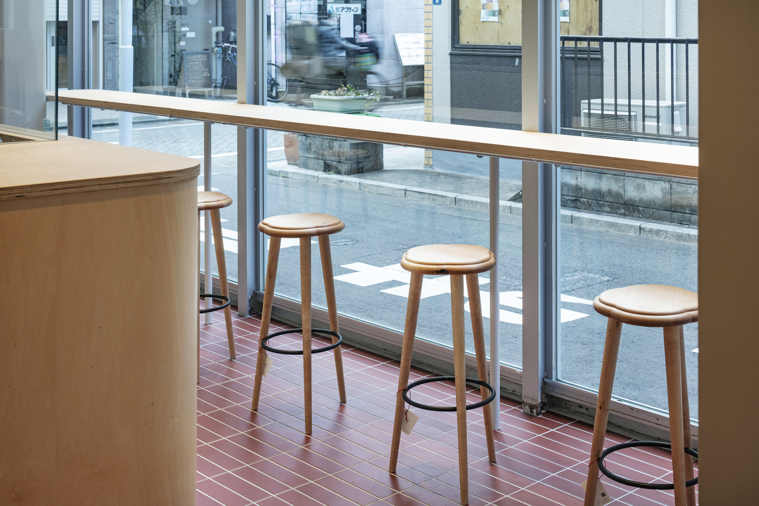
When designing the store, we put ourselves in the client’s shoes and considered their commitment and feelings toward soymilk production; this made us focus on selecting materials with natural textures, such as birch plywood for furniture and porcelain red brick tiles for the floor. These materials also have colors similar to that of the soybeans.
To make it easily identifiable that the soymilks are fully handmade with no additives, we placed the large soymilk machine by the street behind the glass window. The large machine made of stainless steel gives the sense of a handmade laboratory, and this catches the eyes of the people walking down the street, making them stop by as they get interested in the store. In contrast to the existing building covered with glass, the café counter and high tables open up towards the city – and we hope this landscape will appear as if there were an open public space in this corner of the shopping district.
from archdaily
'Commerce' 카테고리의 다른 글
| *아톰 블루 오모테산도 스토어 [ SAKUMAESHIMA ] atmos BLUE Omotesando Store (0) | 2023.09.18 |
|---|---|
| *에르메스 워크샵 [ Lina Ghotmeh Architecture ] Hermès Workshops (0) | 2023.09.13 |
| *바텔 스토어 [ Estúdio 41 ] Batel Store (0) | 2023.08.23 |
| *골드윈 하라주쿠 빌딩 [ Studio Hashimura ] Goldwin Harajuku Building (0) | 2023.08.22 |
| *티비 로비 인테리어 [ AT26 architects as Architects ] TB Lobby (0) | 2023.08.16 |