“투숙객이 푹 앉아 쉬면서 객실을 잠자는 곳 이상의 공간으로 느끼길 바랍니다.” — 알렉스 홀러웨이(Alex Holloway)
 |
 |
 |
From Office Memory to Social Stage
런던 카나리 워프 수변 타워에 로크 아파트호텔이 들어섰고, 19개 층에 스튜디오와 스위트 279실을 갖췄다. 홀러웨이 리는 업무지구에 남은 이미지를 1960년대 사무실 풍경에 겹쳐 놓는다. 드라마 ‘매드맨’에서 본 듯한 짙은 목재와 반짝이는 래커, 금속의 광택이 눈길을 끈다. 하루의 쓰임을 바꾸려는 공간 구성 속에서 이 재료들은 일터의 분위기를 퇴근 후의 모임으로 옮긴다.
콘크리트 기둥 사이의 작은 장면들
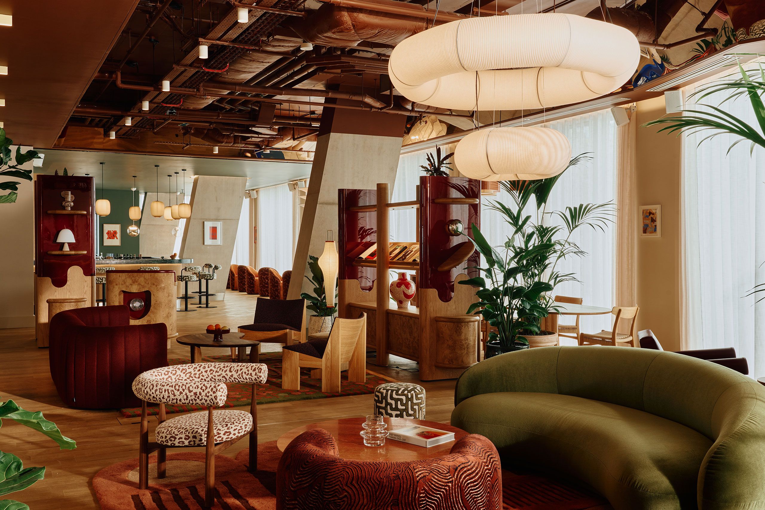
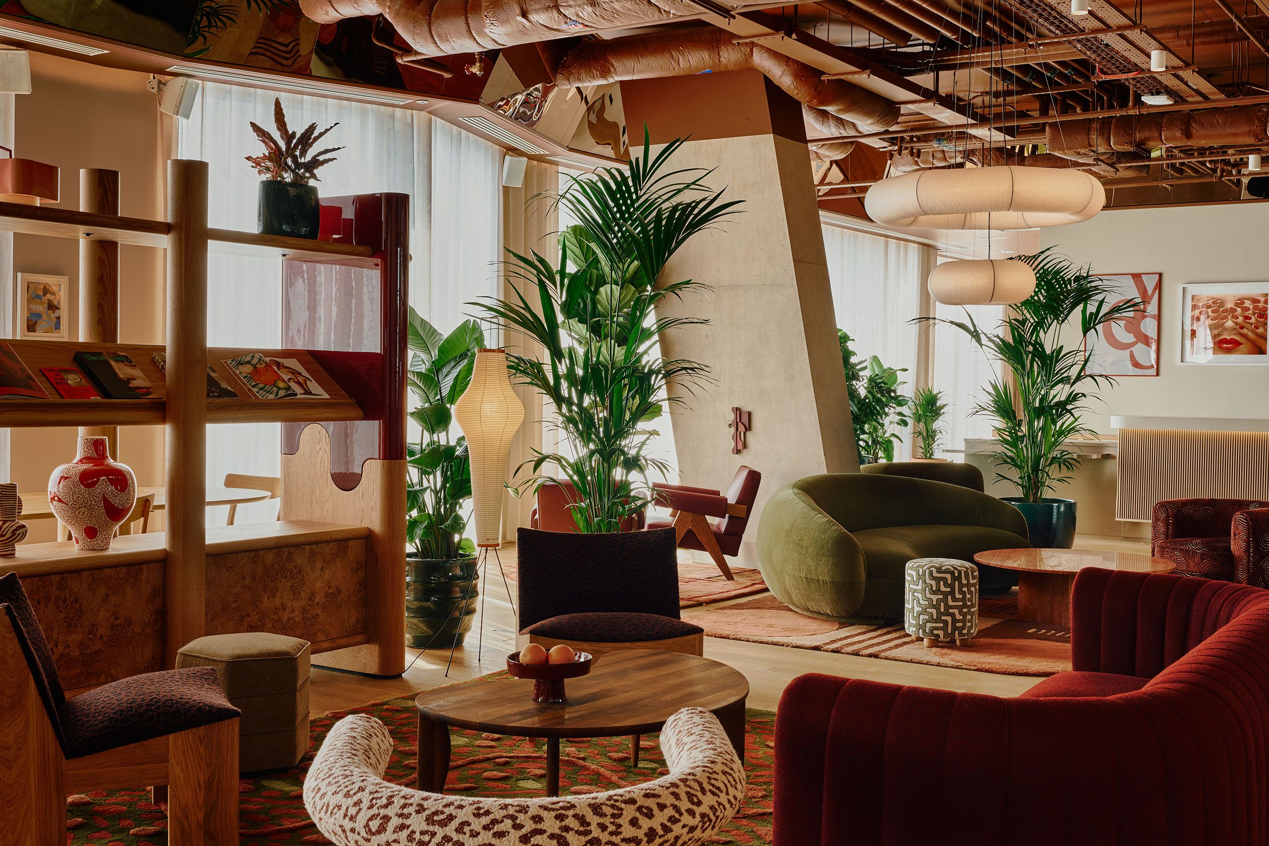
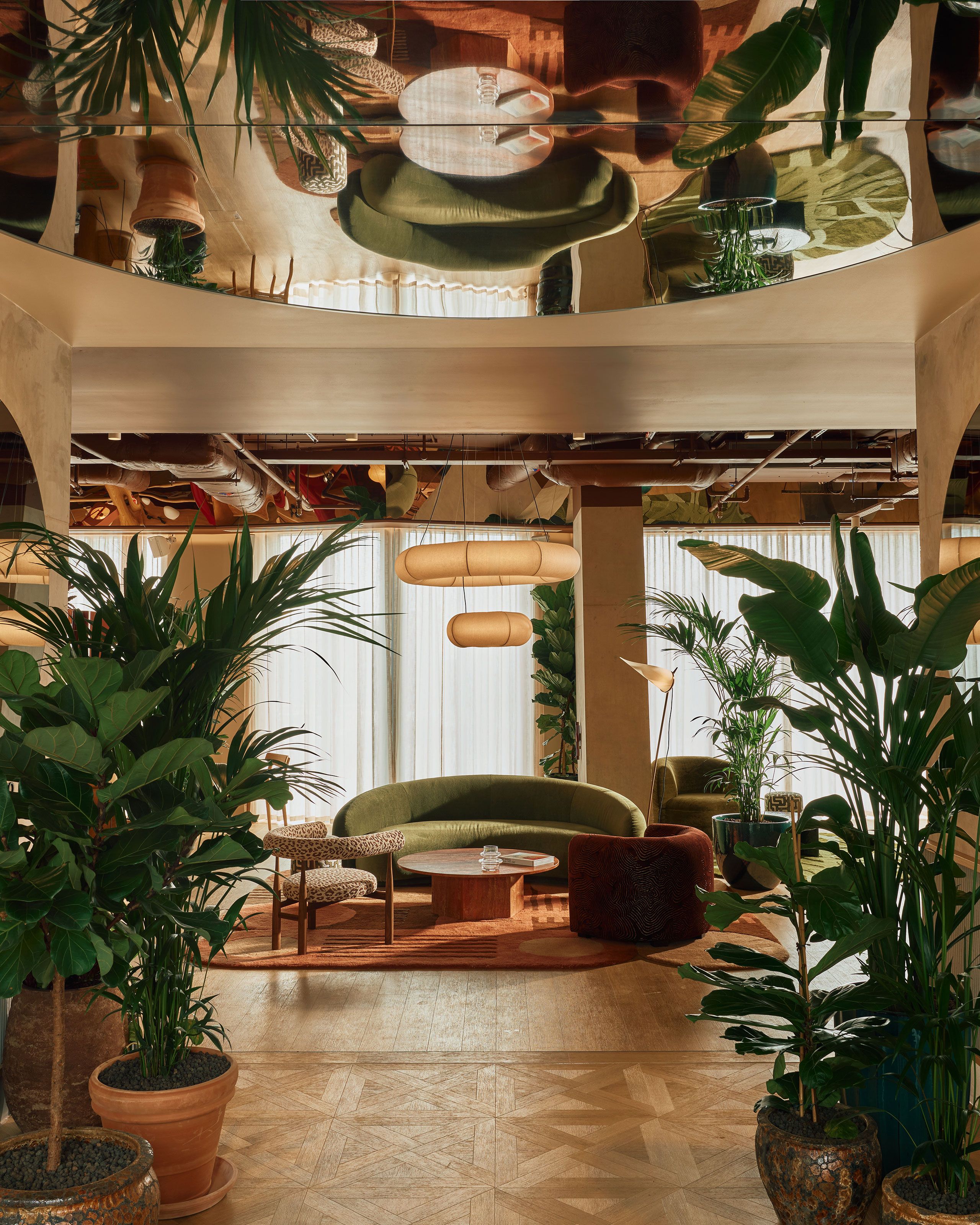
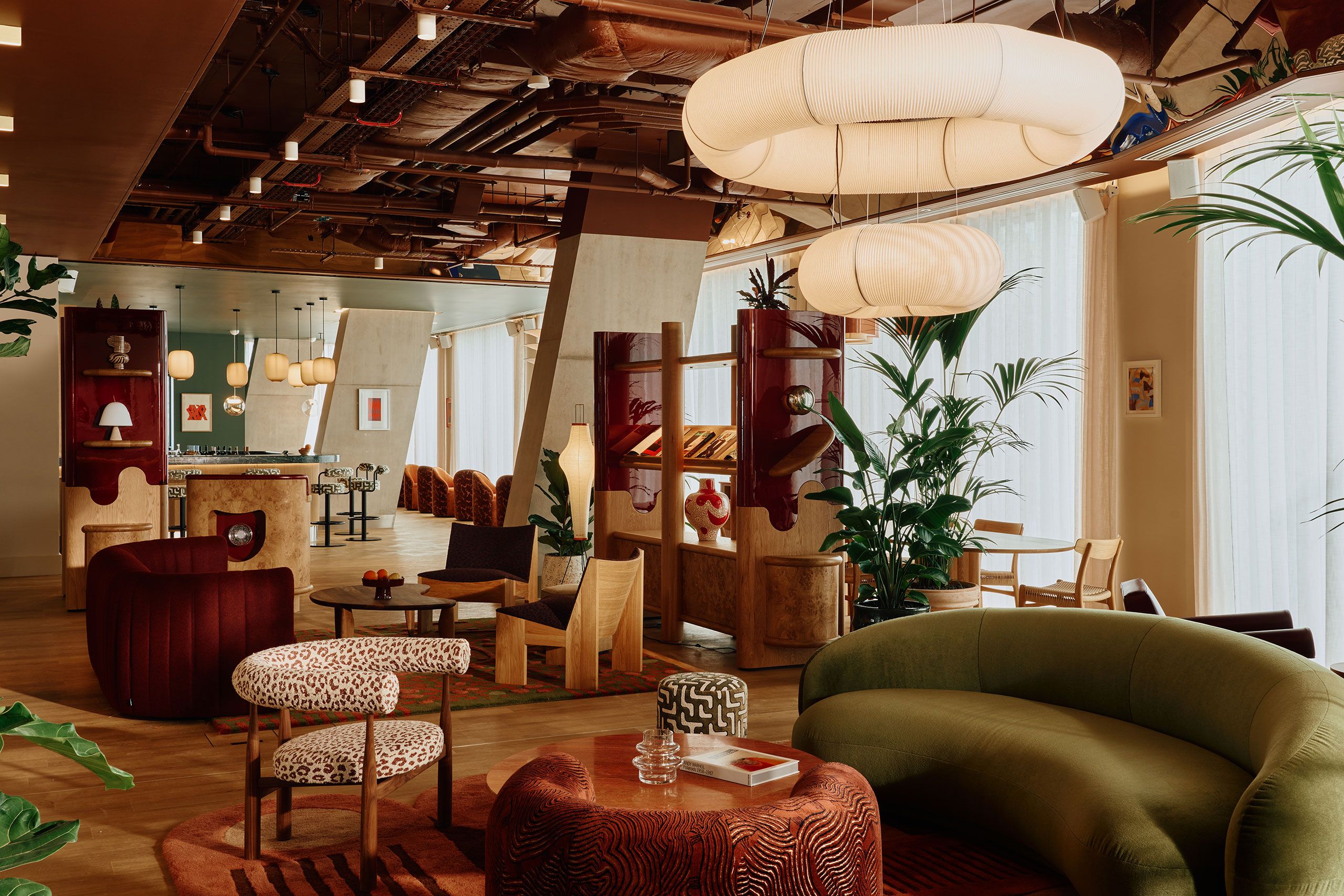
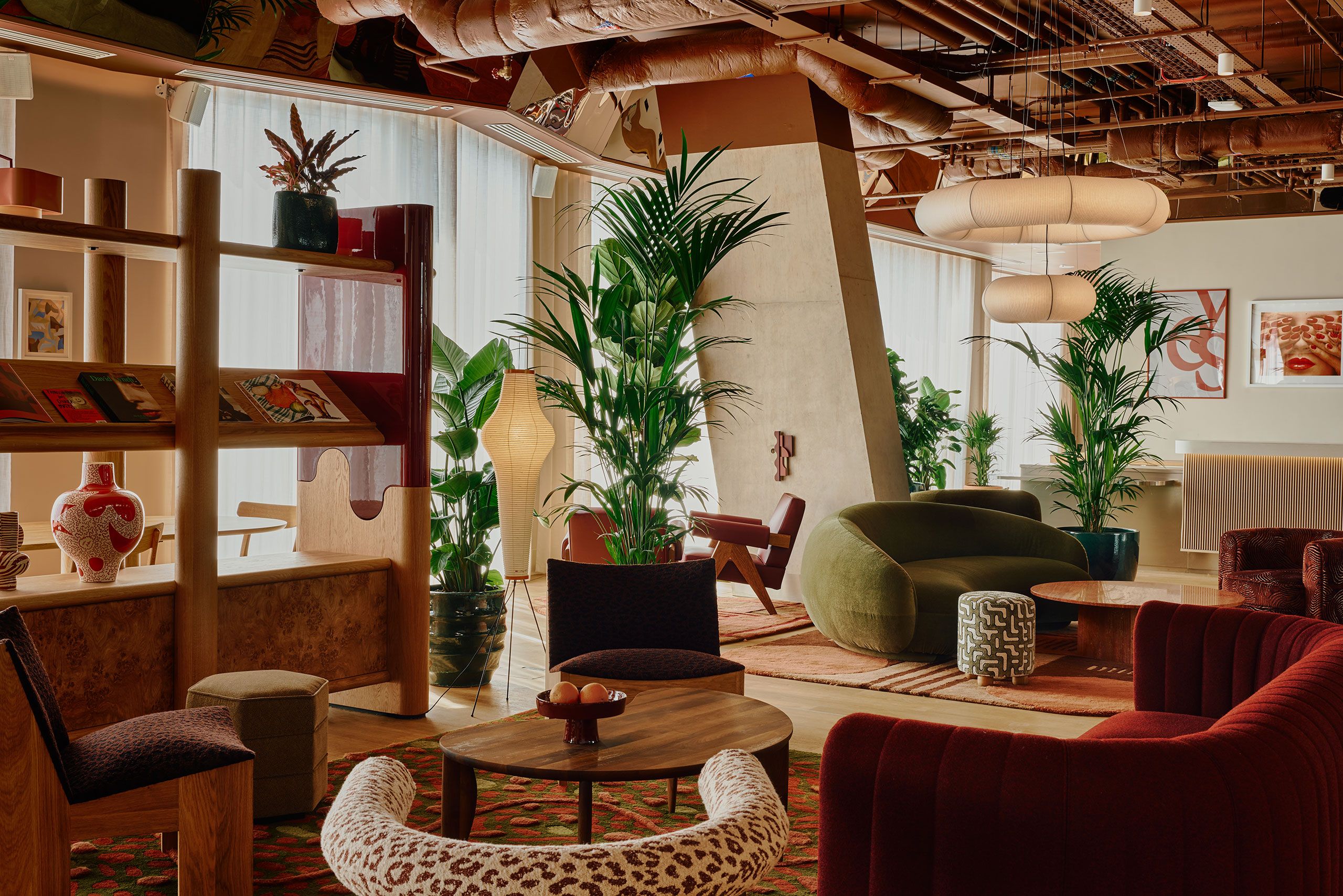
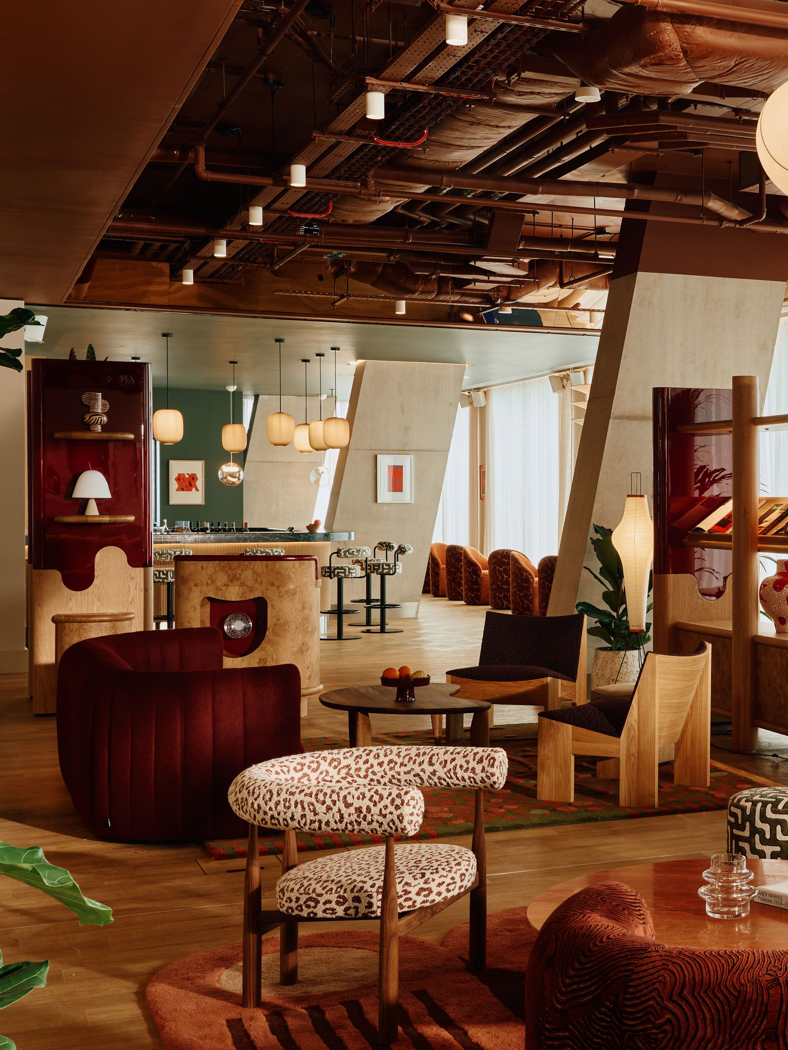
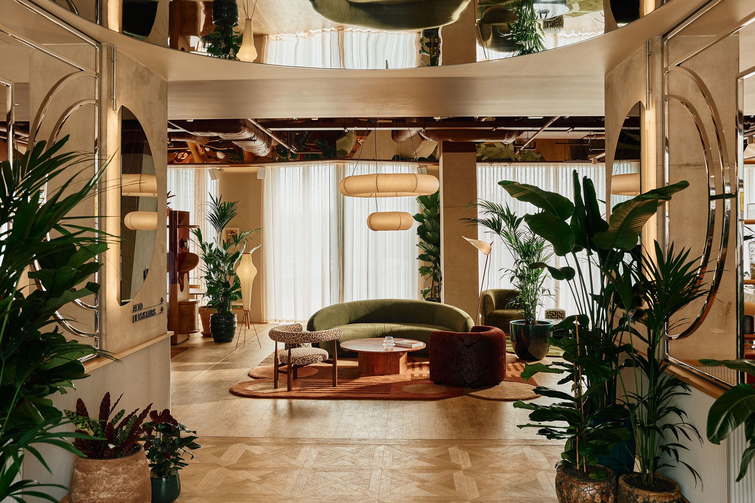
1층에는 라운지와 코워킹 공간, 카페와 바가 한데 모여 있다. 각진 콘크리트 기둥과 드러난 천장 설비 사이로 곡선 소파와 큰 펜던트 조명, 식재와 무늬 러그가 자리 잡는다. 넓게 이어진 로비 안에서도 앉을 곳의 크기와 분위기가 조금씩 달라진다.
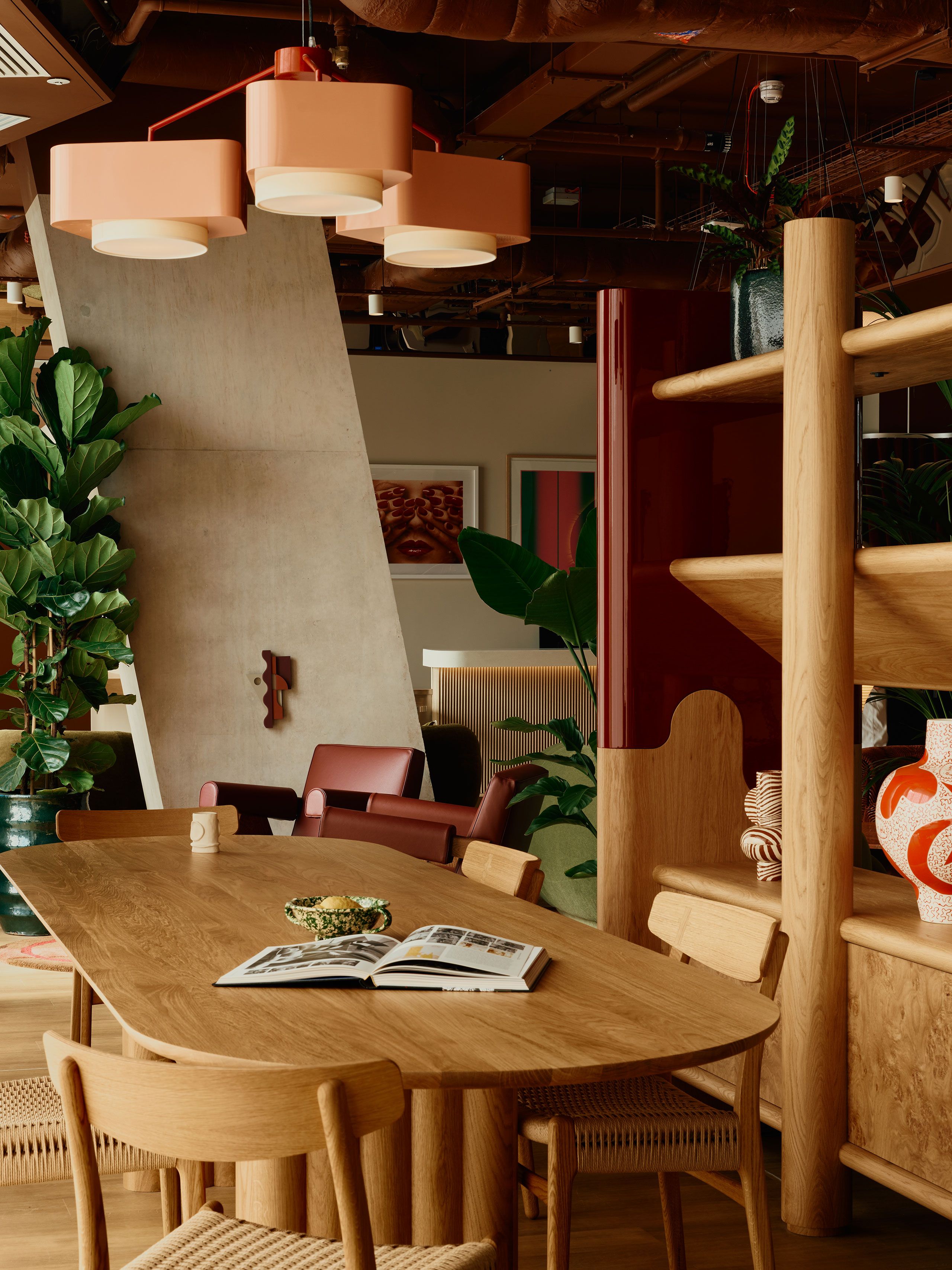
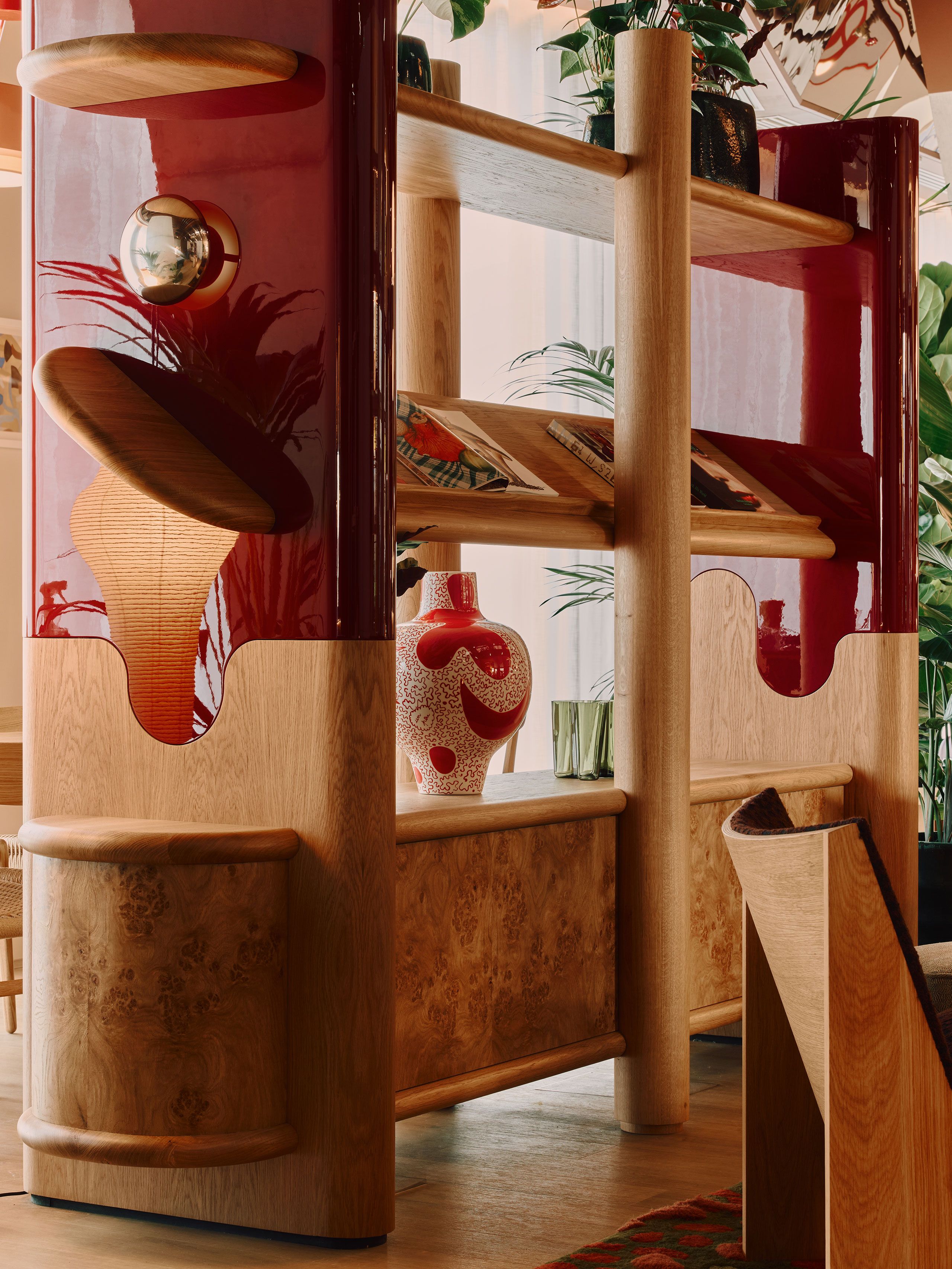
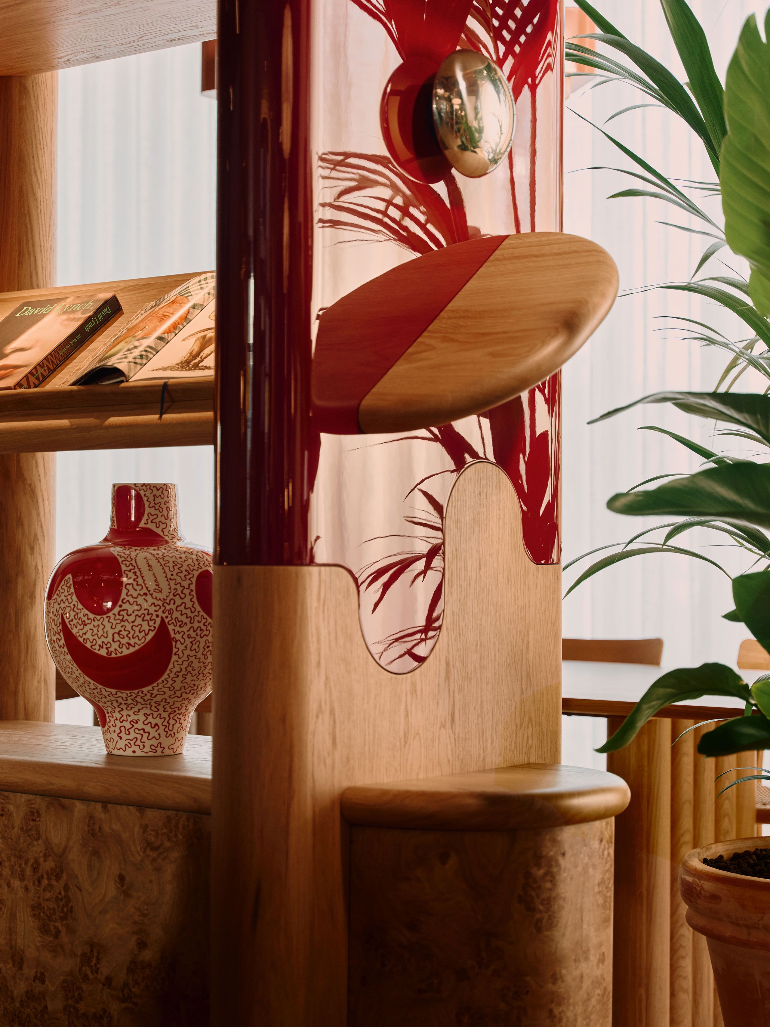
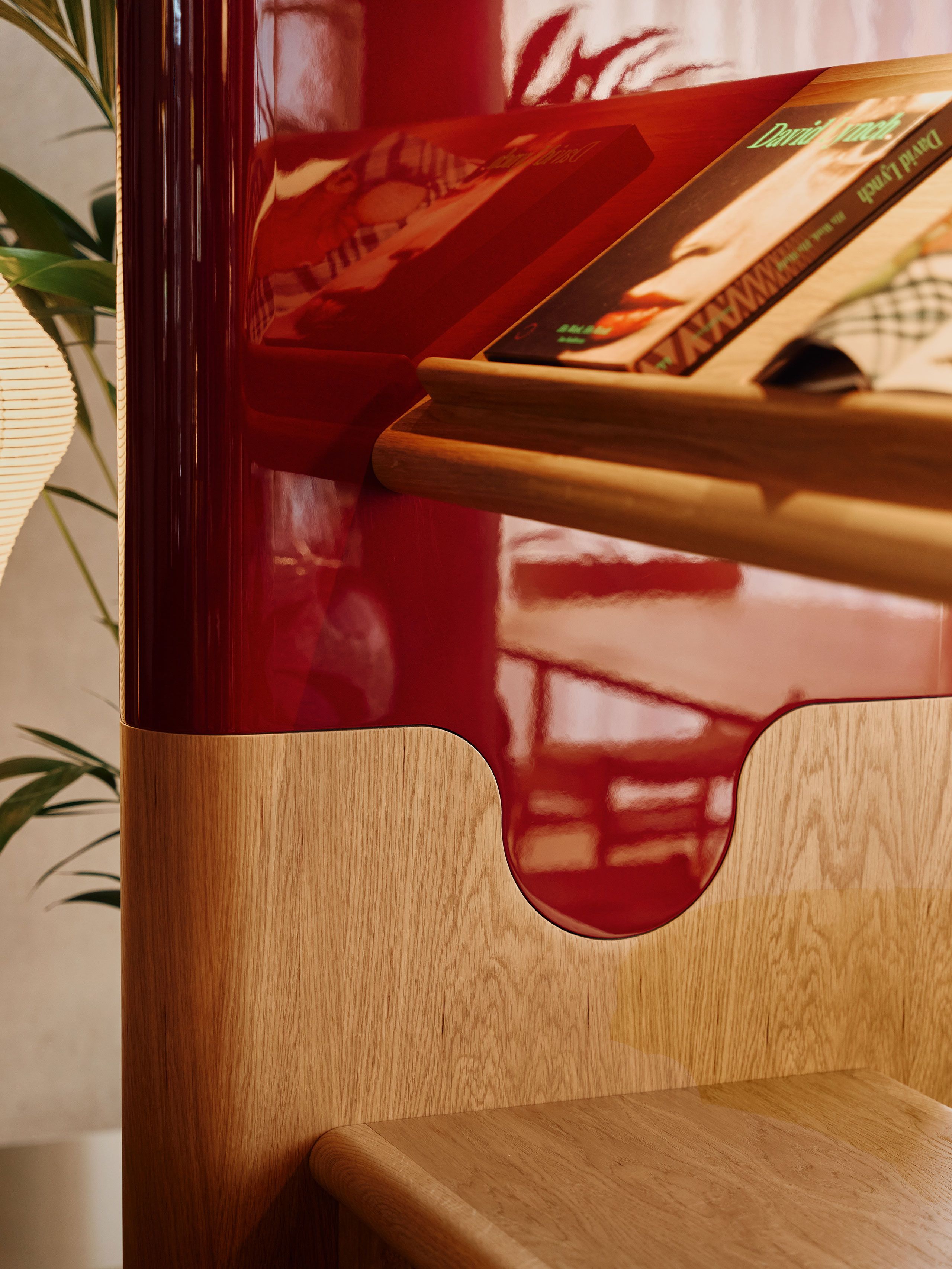
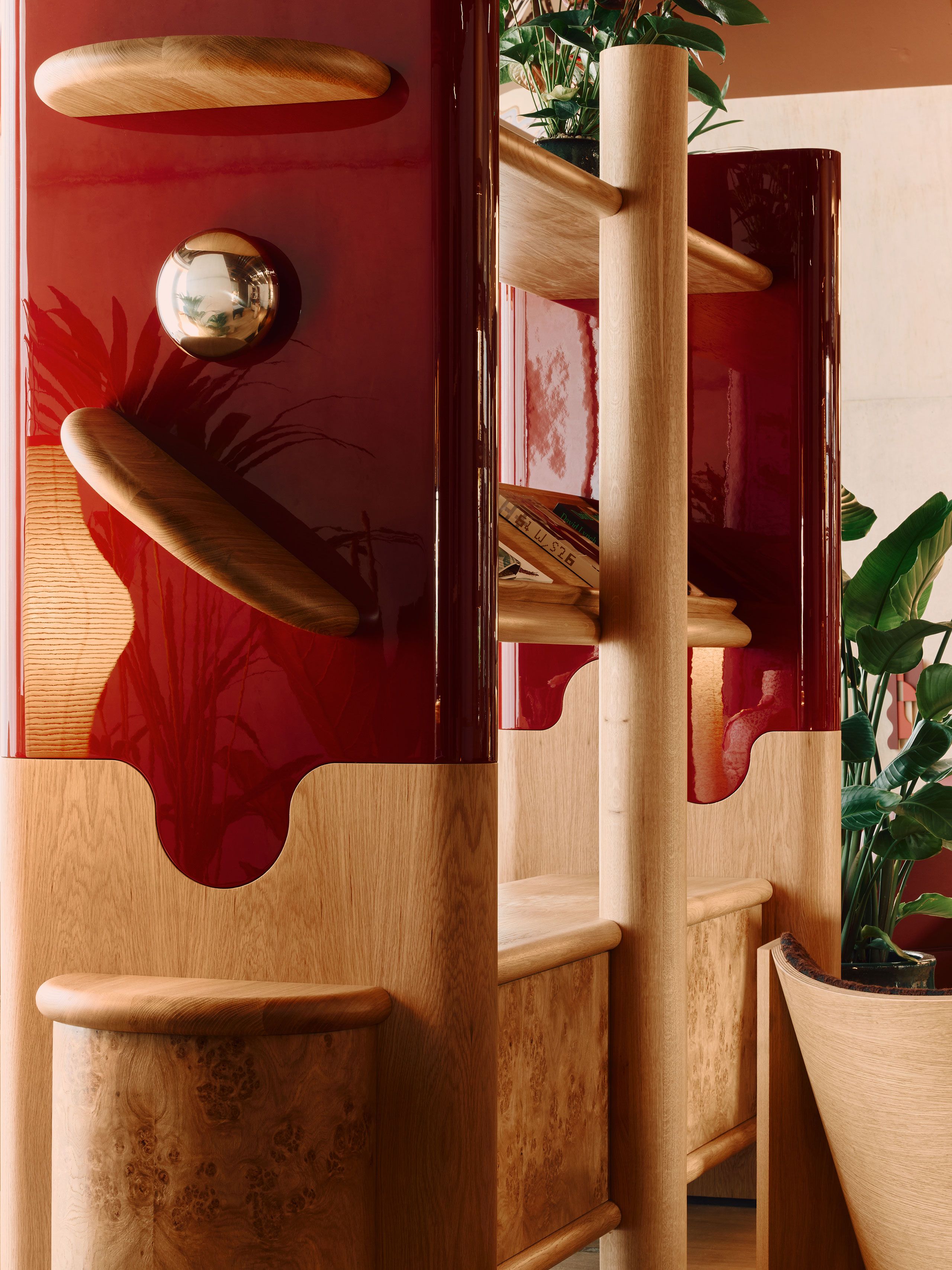
두 맞춤 책장이 변화에 윤곽을 준다. 결이 도드라진 오크와 버건디색 유광 래커로 만든 서가는 물건을 담으면서 좌석 사이를 가른다. 기둥이 긴 공간에 박자를 주면 서가와 가구는 머물 만한 곳마다 쉼표를 찍는다. 벽을 늘리지 않고도 자리마다 다른 성격을 읽게 한다.
소품이 공간의 역할을 맡을 때
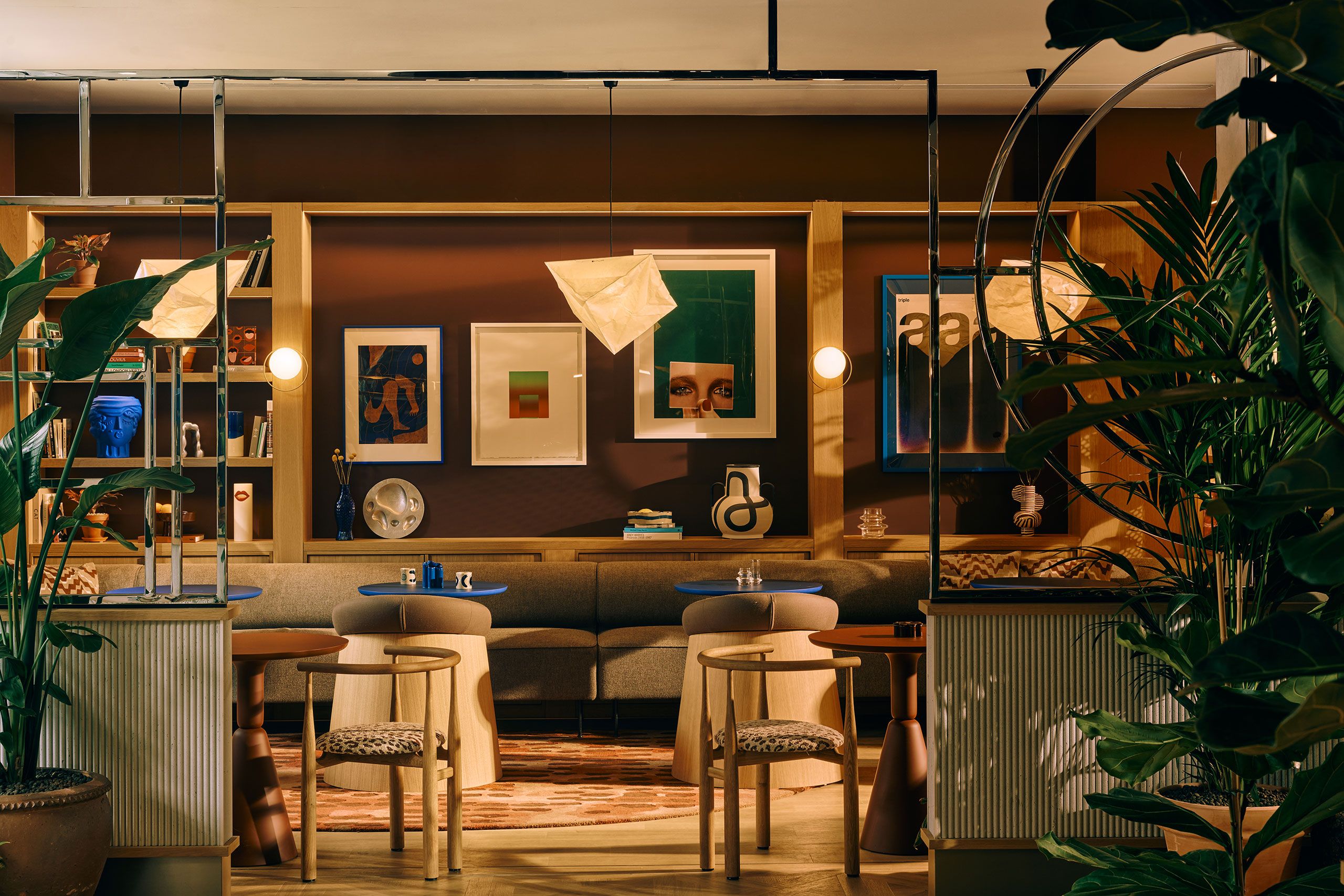
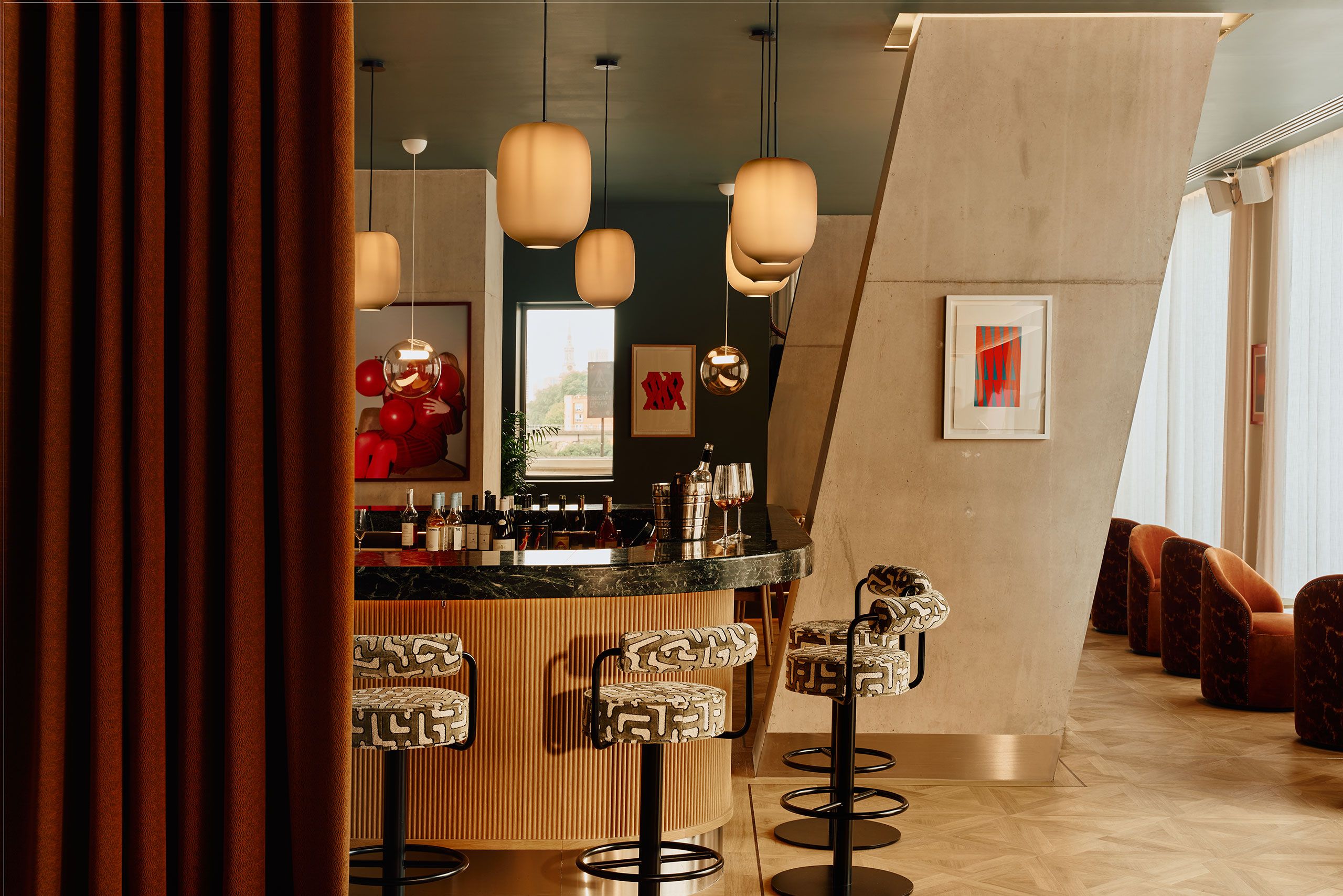
물결처럼 휘어진 잡지 선반은 창밖 템스강을 은근히 떠올리게 한다. 라이브러리 카페 입구에는 크롬 프레임을 두르고, 갈색 바탕에 선명한 울트라마린 상판을 놓았다. 영화 촬영에 쓰는 블루 스크린을 가리키는 색이다. 곁에 놓인 LUQA 바는 세로 홈이 파인 오크와 녹색 대리석 상판으로 분위기를 낮춘다.
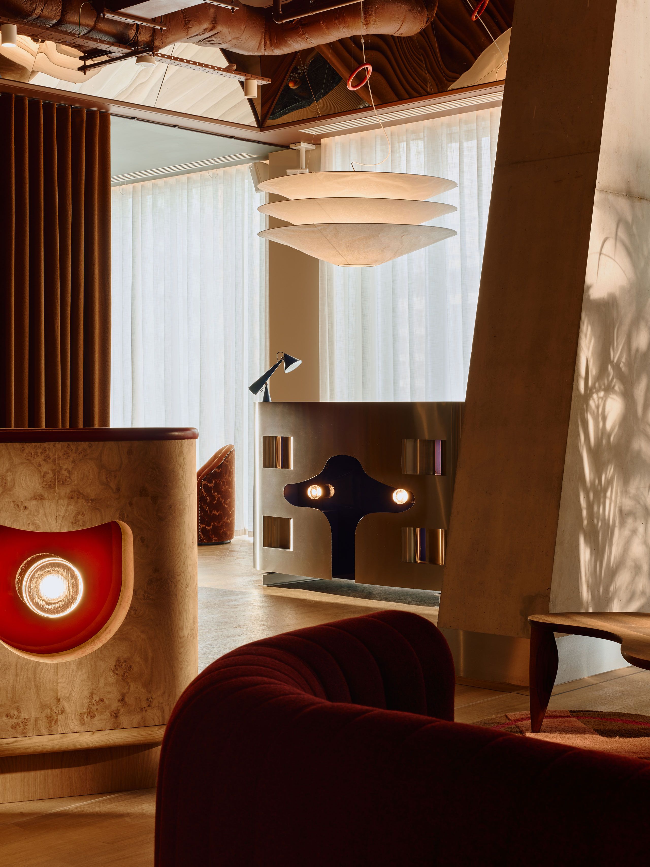
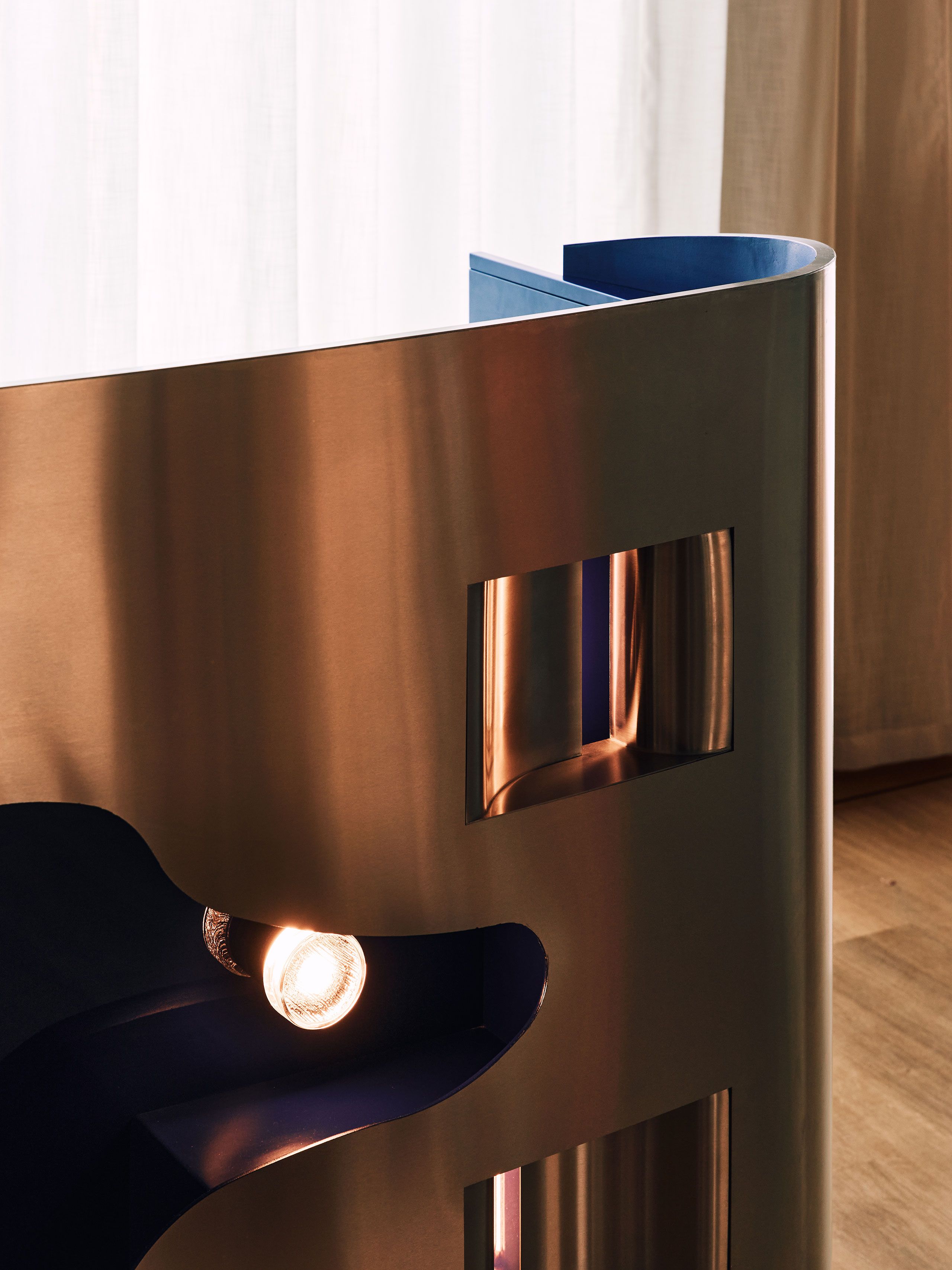
한층 노골적인 장치는 파란 래커와 스테인리스 스틸로 만든 DJ 부스다. 1960년대 자동차를 연상시키는 곡선 끝에서 전조등 같은 조명 두 개가 댄스플로어 쪽으로 빛을 보낸다. 영화적 참조는 입구를 표시하고 좌석을 나누며 활동 중심을 드러낸다. 화려한 표면이 쓰임을 갖는다.
객실 안의 작은 응접실
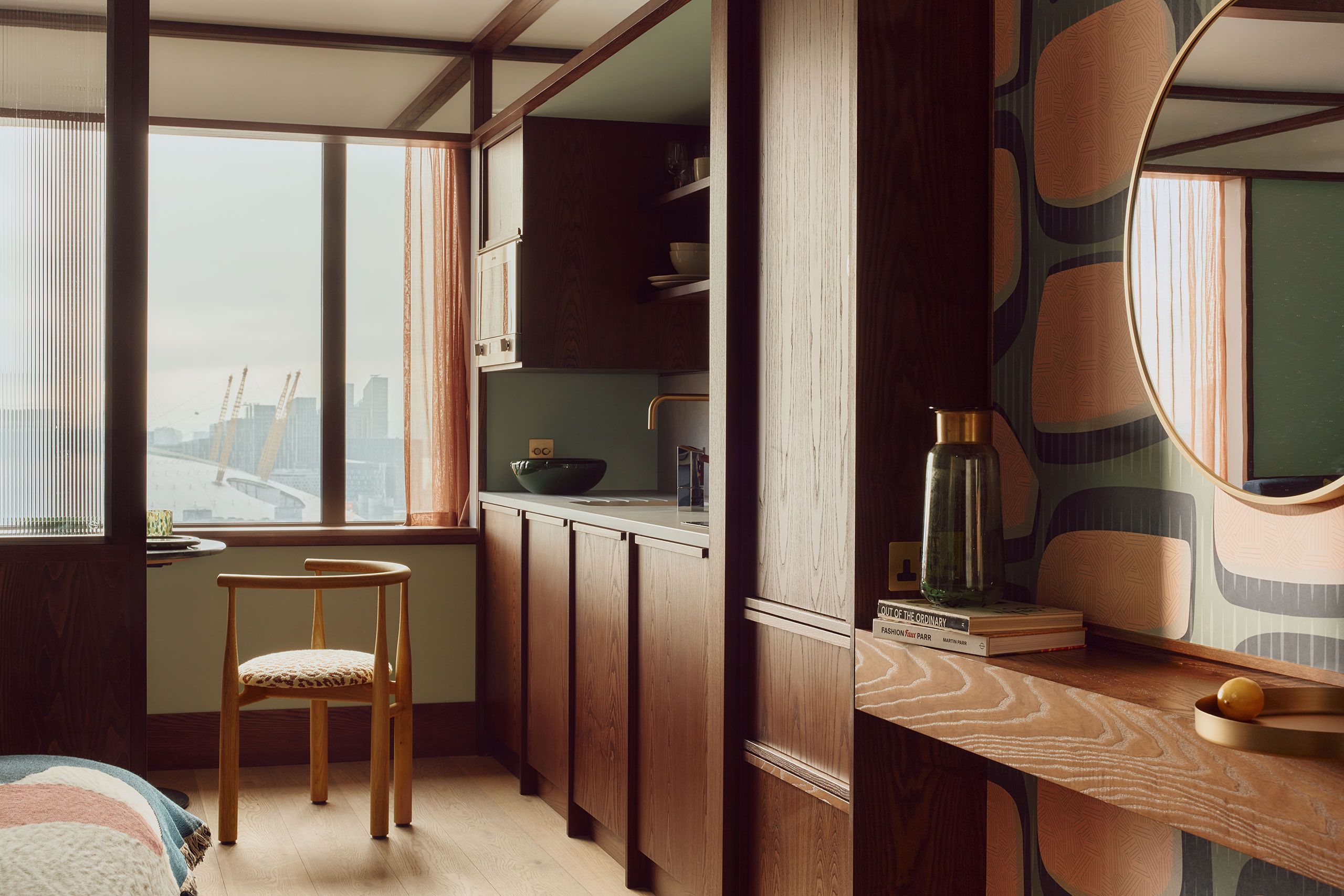
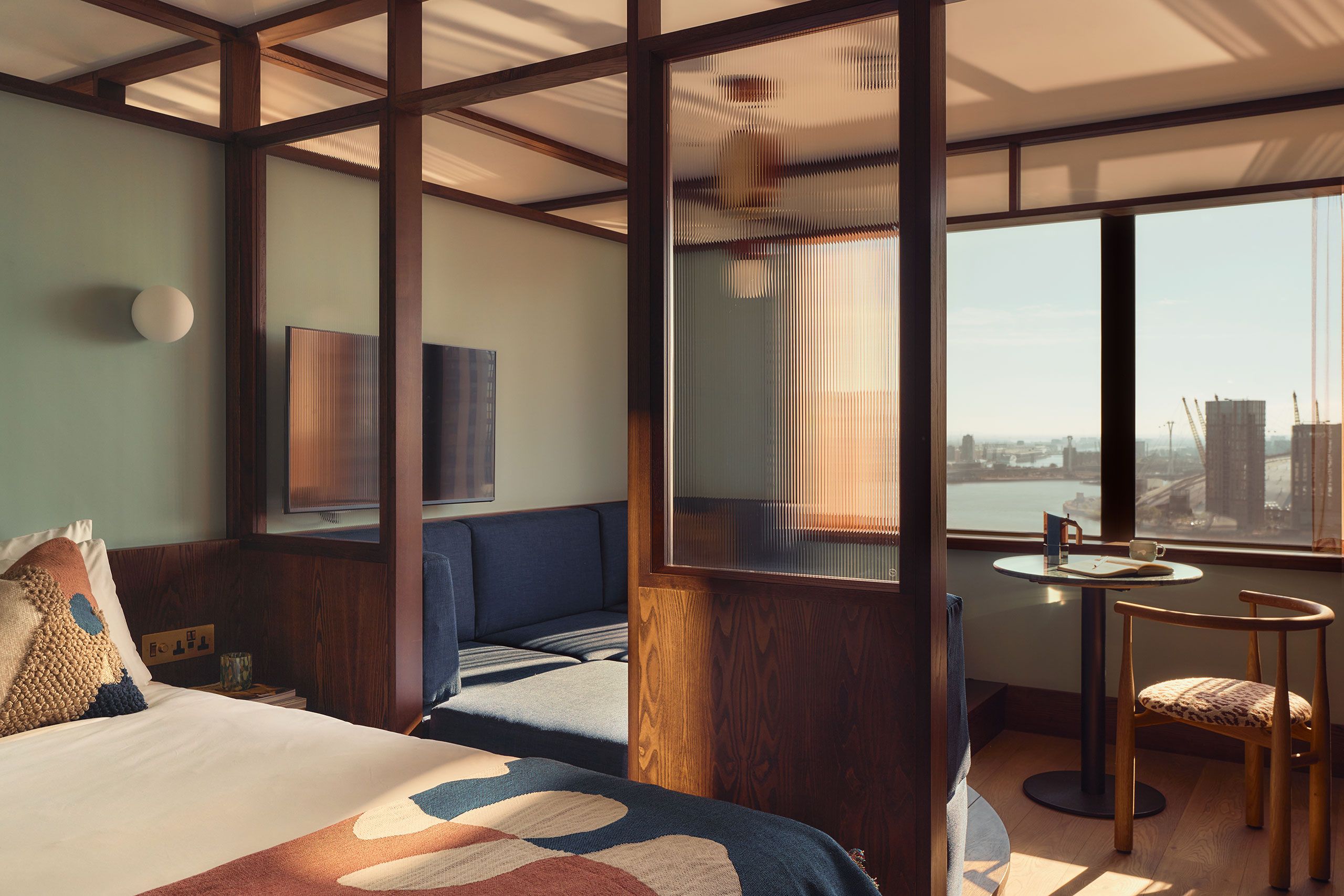
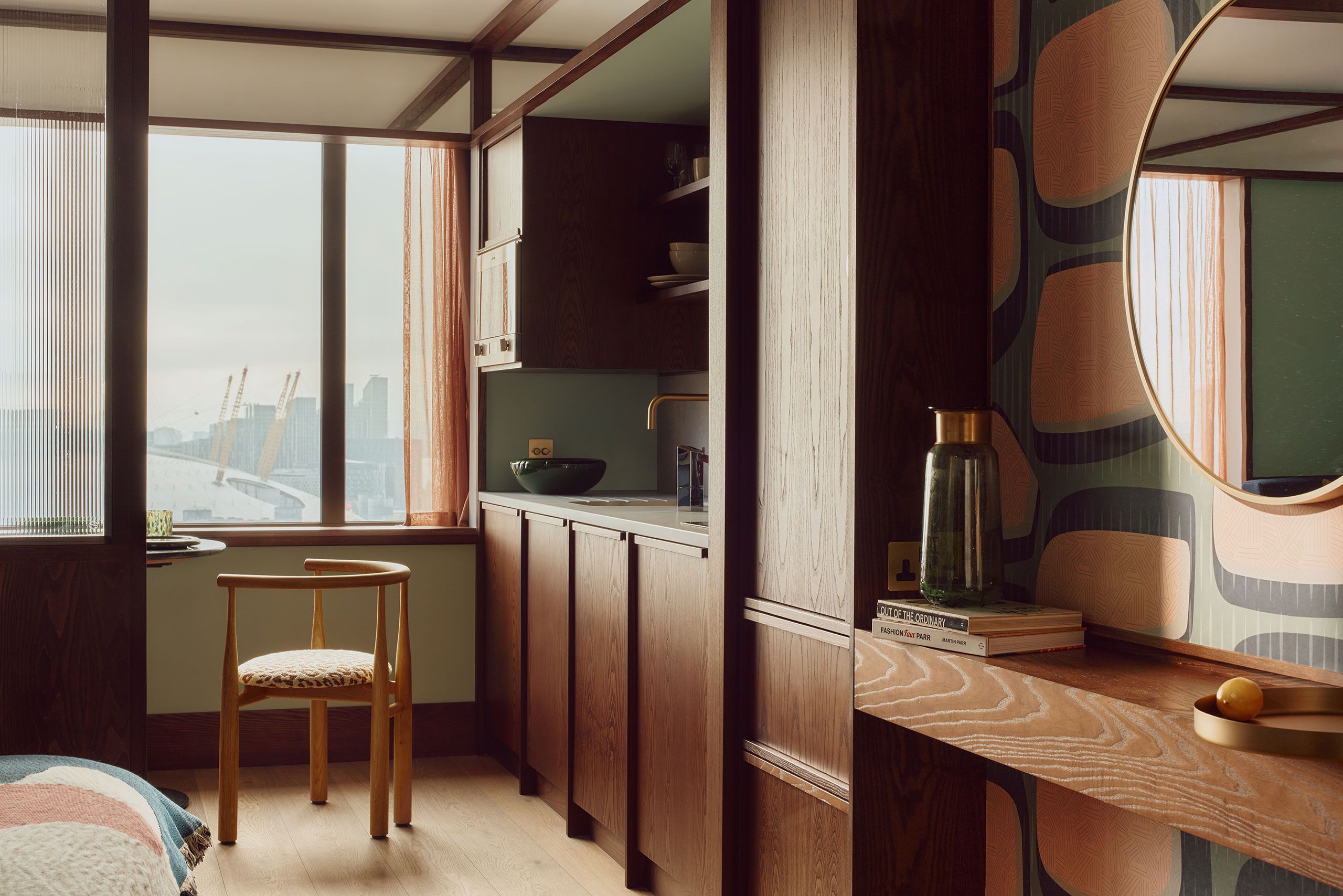
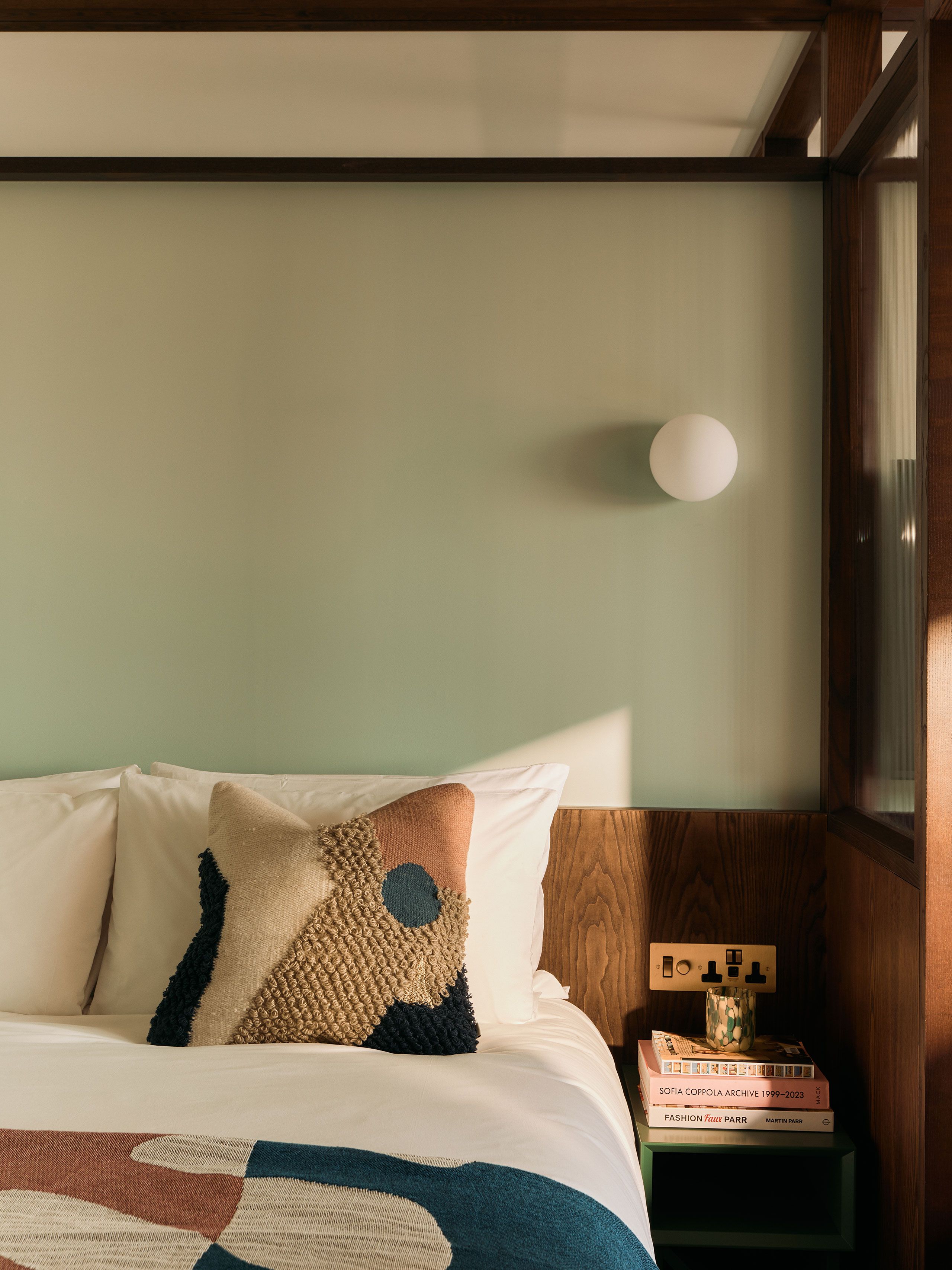
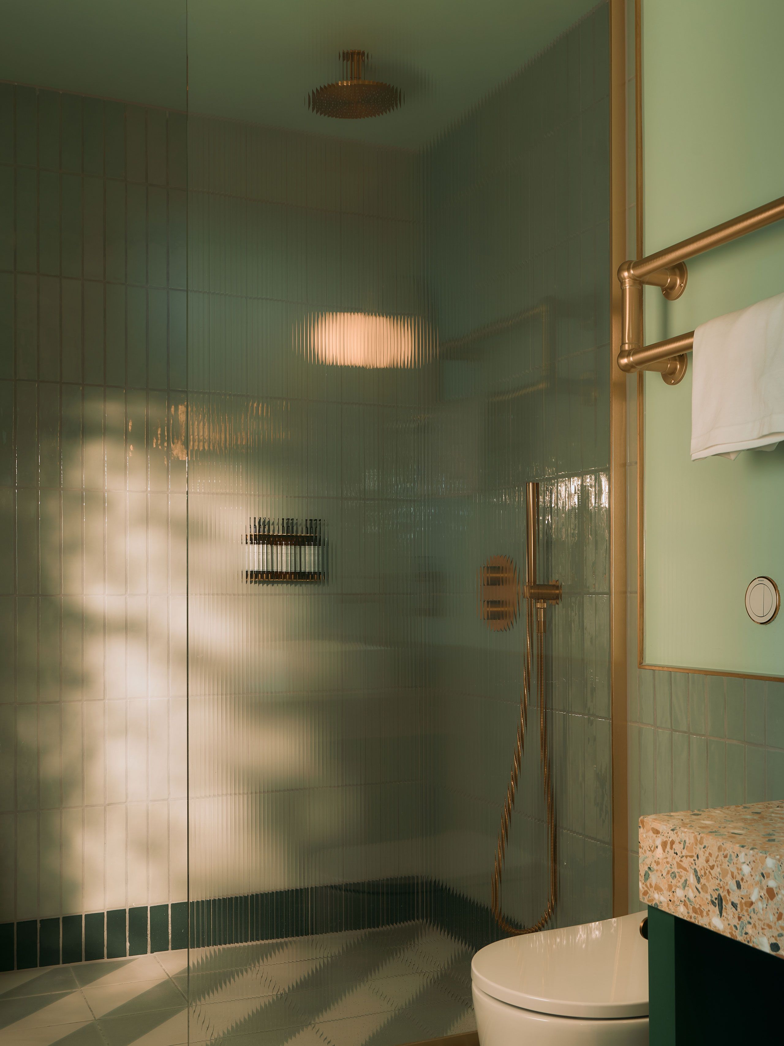
객실에서는 공용층의 짙은 색채가 한결 잦아든다. 어두운 호두나무 격자가 벽과 천장을 따라 이어지고, 침대와 거실, 식사 자리를 나눈다. 일부 칸막이에는 세로 결이 있는 골유리를 끼워 영역을 구분하면서도 빛은 건너가게 했다. 세이지그린 벽과 오크 바닥이 격자가 그은 단단한 선을 누그러뜨린다.
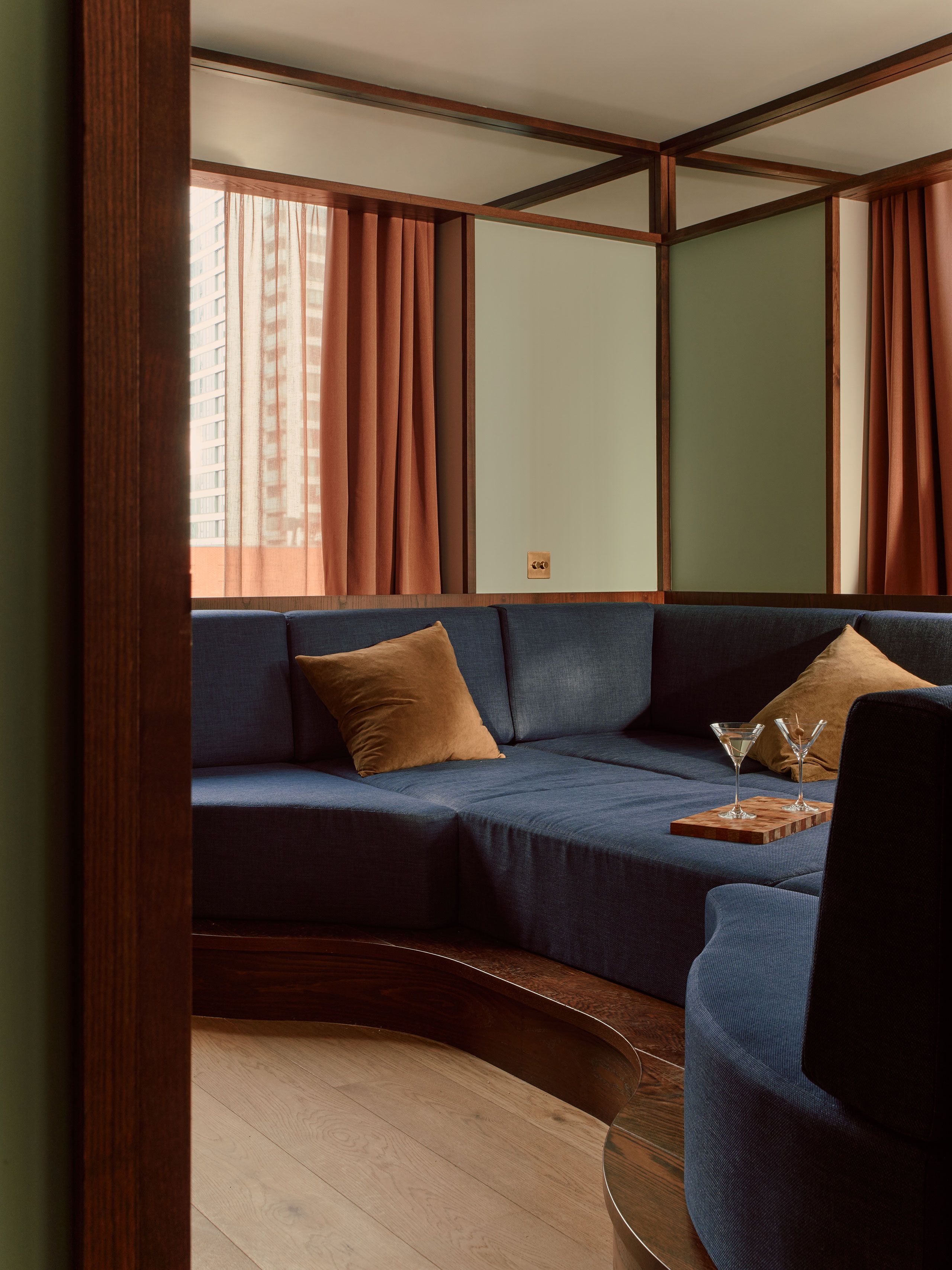
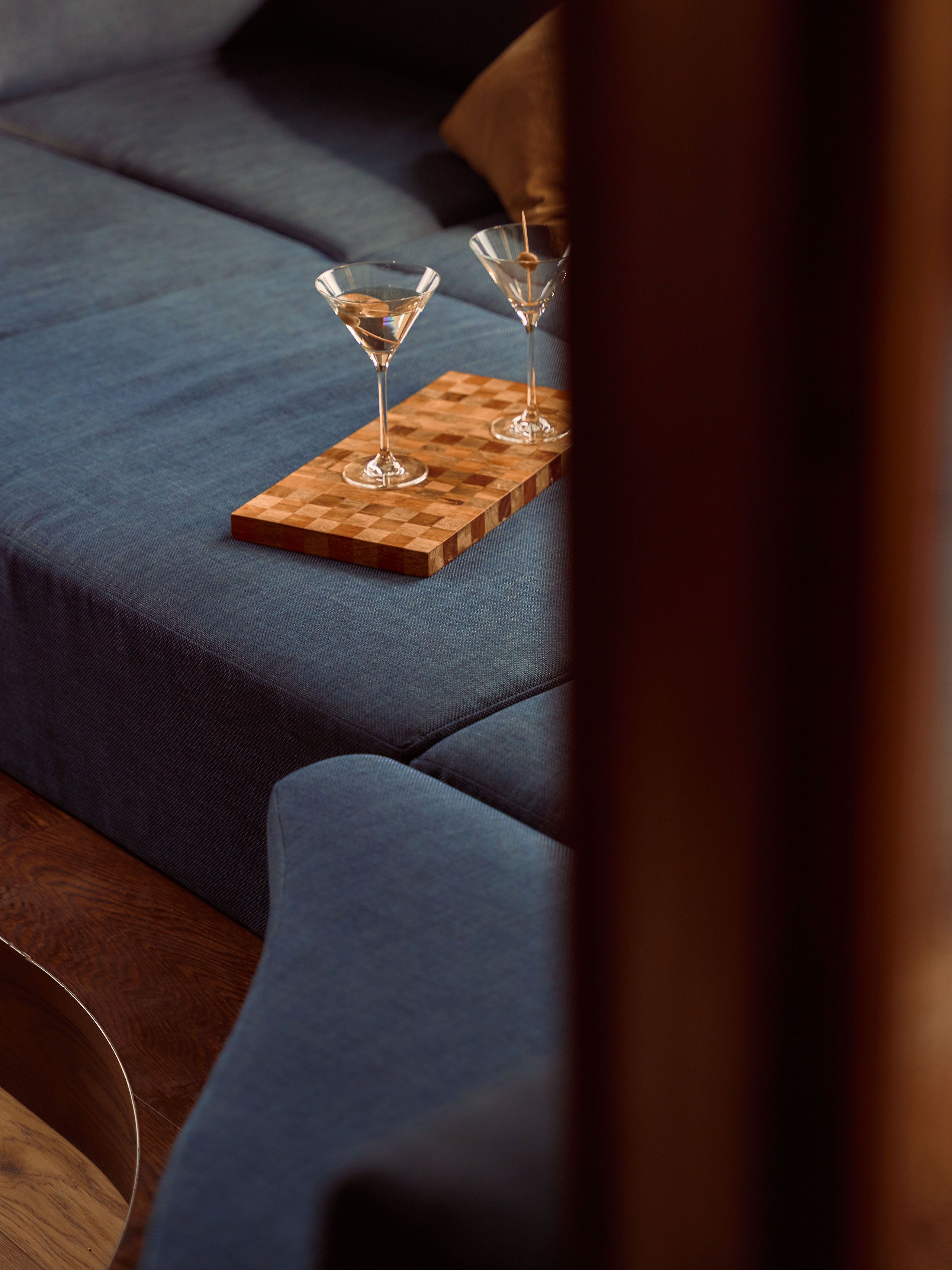
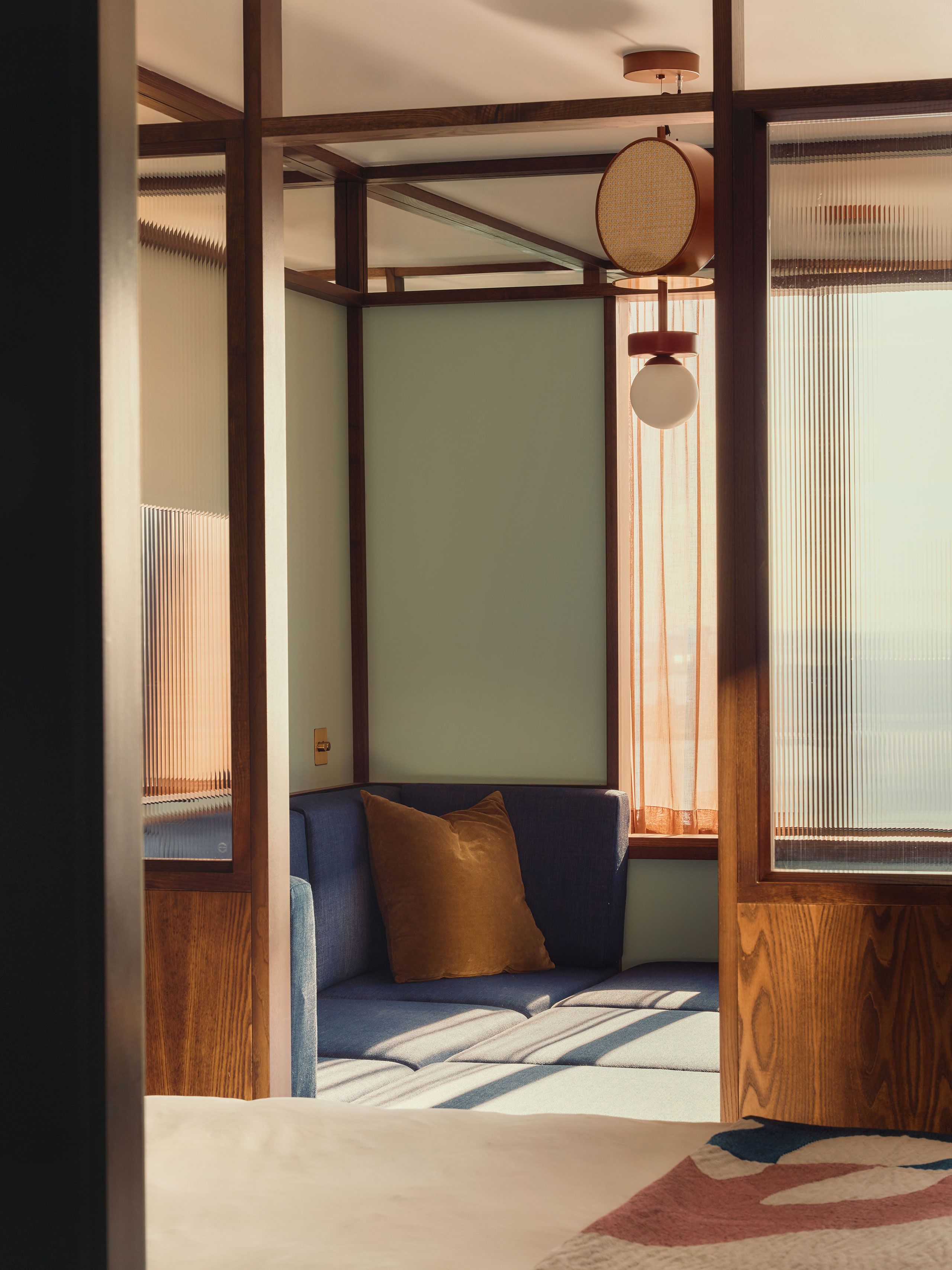
침대 곁 파란 소파 피트는 객실을 설명하는 가장 분명한 장치다. 몸을 깊숙이 감싸는 좌석이 누울 자리 옆에 놓여 있어, 동행자와 마주 앉아 시간을 보내는 장면을 떠올리게 한다. 설계자가 ‘매드맨’ 속 대화 공간과 1960년대 모듈형 좌석을 참조한 이유도 여기에 있다. 잠자리 곁에 모임의 자리가 생겼다.
영화적 풍경의 쓰임
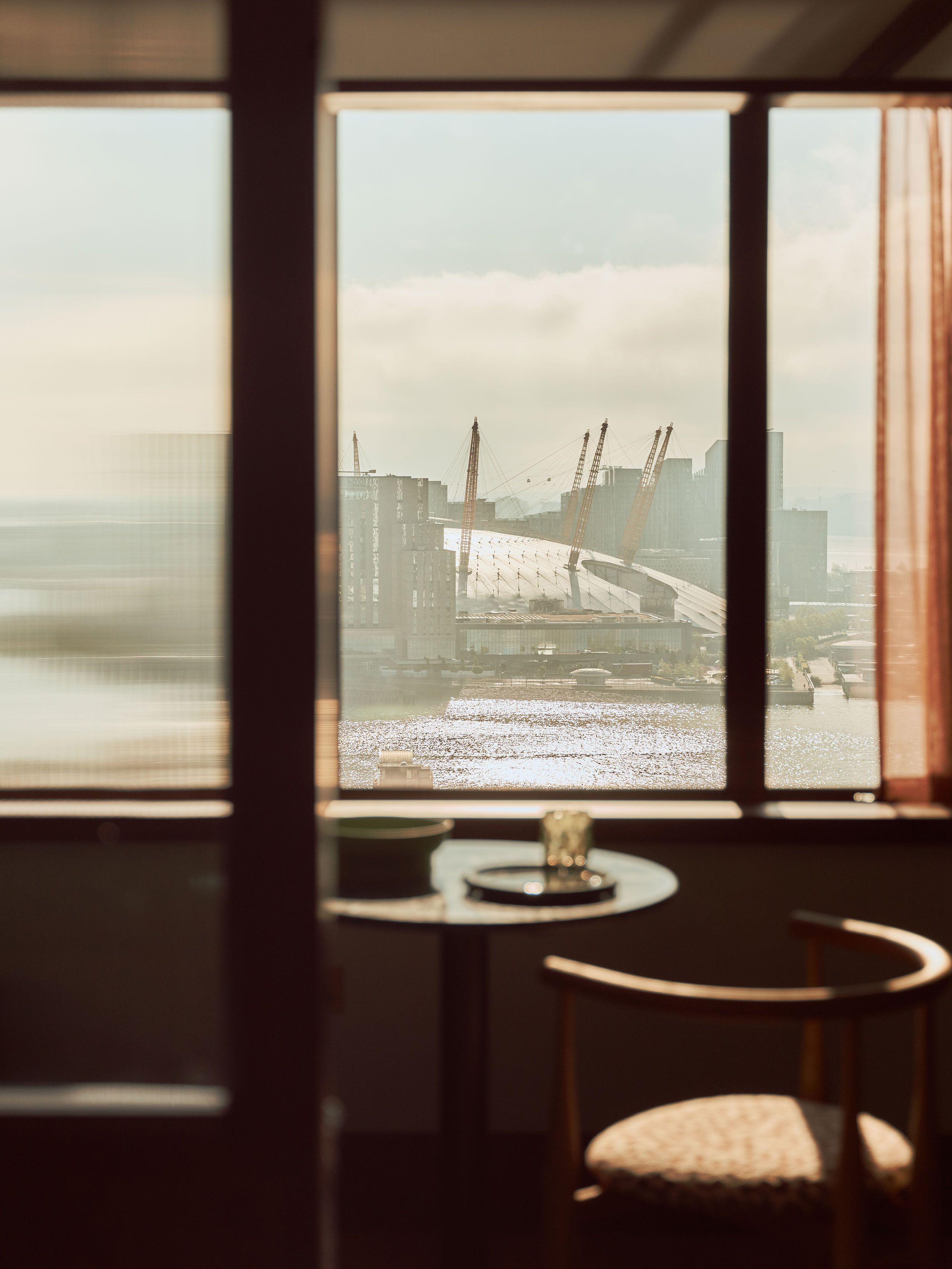
호텔은 업무지구에 쌓인 이미지를 새로운 쓰임으로 옮긴다. 공용층에서는 책장이 경계가 되고, 객실에서는 소파가 두 번째 생활 영역이 된다. 일부 객실에서는 수변 풍경이 호두나무 프레임과 골유리 너머로 들어와, 실내의 한 장면처럼 자리 잡는다.
이 장면들이 붐비는 시간과 긴 체류에도 얼마나 편안하게 작동하는지는 남는 질문이다. 사진과 기사만으로는 공용층의 소음, 객실의 프라이버시, 맞춤 가구의 유지관리를 판단할 수 없다. 옥상 바와 레스토랑 ALTO 역시 원문 발행 시점에는 추후 개장 예정이었다. 시대의 인용이 가구와 구획으로 구체화됐다. 홀러웨이 리는 업무지구의 호텔에 쉬고 만나며 머무는 하루의 여러 속도를 담았다.
프로젝트 크레딧
인테리어 설계: Holloway Li
위치: 1 Cartier Circle, London E14, United Kingdom
규모: 19개 층, 스튜디오·스위트 279실
준공연도: 제공 자료에 명시되지 않음(2026년 9월 기사 기준 운영 중)
면적: 제공 자료에 명시되지 않음
사진: Milo Hutchings
Write by Claude & Jean Browwn




-------------------------------------------------------------------------------
A1 — CORE AGENDA : WHAT IS THE PROJECT ARGUING?
-------------------------------------------------------------------------------
CORE PROPOSITION
Canary Wharf's corporate heritage is re-read through the nostalgic lens of the mid-century workplace, so that an office district becomes a stage for tailored glamour and after-hours social life.
WHY THE REFERENCE HOLDS
Mid-century modernism survives fashion cycles because its appeal is attitude as much as aesthetics.
It carries two usable registers at once — cool: clean lines, disciplined geometry; sensuous: walnut, lacquer, chrome.
'Mad Men' fused the 1960s office with glamour and hedonism, which is exactly the transfer the site requires.
GOVERNING METHOD
Holloway Li's "Cinematic Everyday": references from film and theatre choreograph atmosphere and movement through space. The result is designed as scenography, not as decoration.
-------------------------------------------------------------------------------
A2 — GIVEN CONDITIONS : SITE, BUILDING, PROGRAMME
-------------------------------------------------------------------------------
Address: 1 Cartier Circle, London E14, UK — Canary Wharf waterfront
Building: purpose-built tower
Capacity: 279 studios and suites / 19 floors
Outlook: many units face the Thames and the city skyline
Ground floor: lounge + co-working + café + bar, as one expansive sequence
Brand context: Locke, lifestyle apart-hotel brand; latest London address
Studio context: Holloway Li's third Locke project (Bermonds Locke and WunderLocke Munich preceding)
Next phase: ALTO rooftop bar and restaurant, opening later in the year, as a more theatrical counterpart to the ground floor
-------------------------------------------------------------------------------
A3 — PRIMARY SPATIAL STRATEGY : STRUCTURE vs. SOFTENING
-------------------------------------------------------------------------------
DECISION 1 — Do not read the open plan as one lobby.
The ground floor is broken into a succession of intimate "sets", and each set is loosely defined by a change of colour, pattern and furniture.
DECISION 2 — Let the structure keep the beat.
A procession of angular structural concrete columns supplies the underlying rhythm of the sequence.
DECISION 3 — Counter the rigid frame with fluid form.
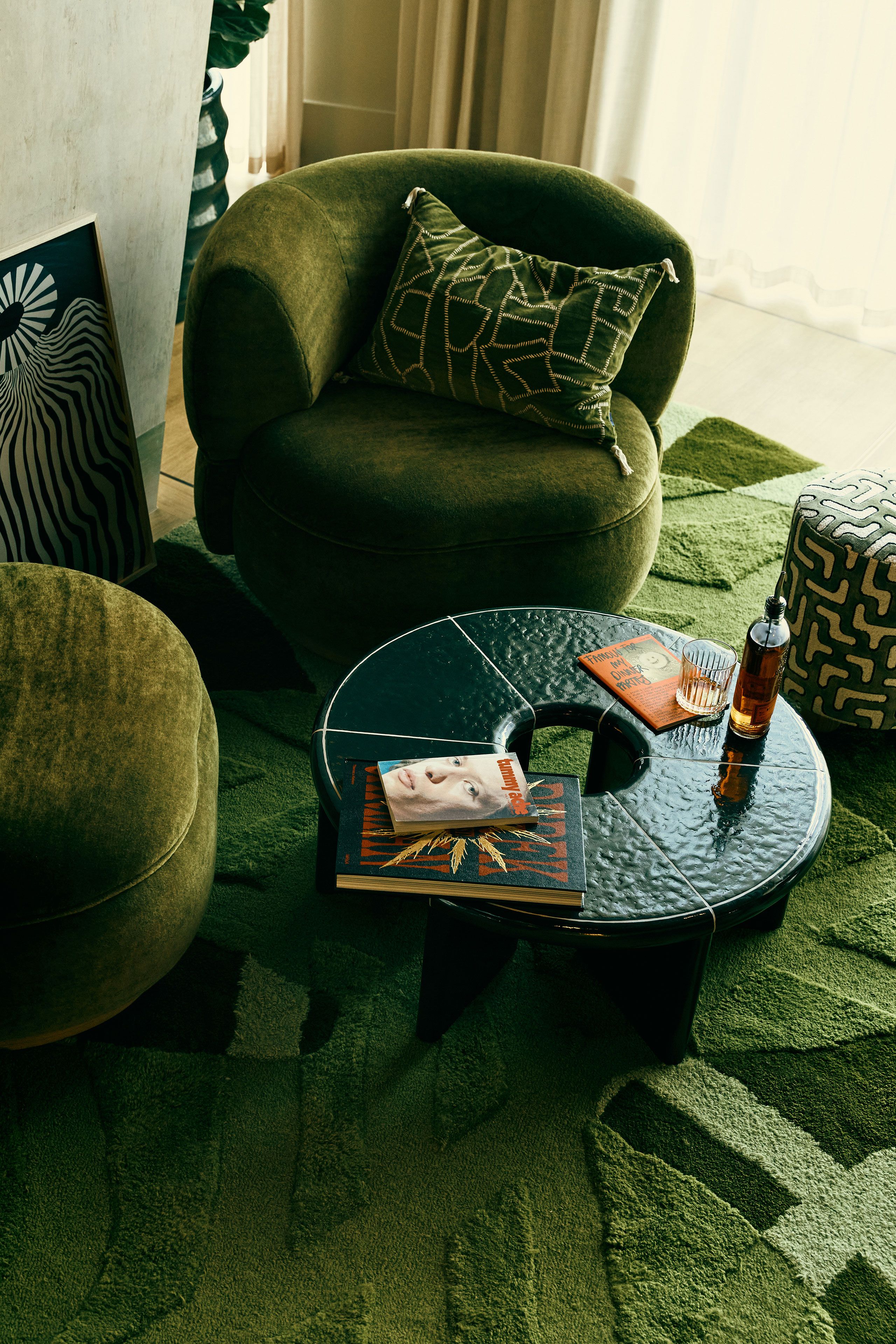
The tower's rigid geometry is played against fluid lines and rounded forms. Softening agents: curvaceous seating, oversized pendant lights, lush planting, bespoke rugs (Holloway Li x Modersia).
DECISION 4 — Grade the intensity by zone.
Communal floor: saturated and theatrical. Guest rooms: toned down, but still unmistakably mid-century.
-------------------------------------------------------------------------------
A4 — MATERIAL AND COLOUR SYSTEM
-------------------------------------------------------------------------------
BASE PAIRING: warm timber + chrome
ACCENT PAIRING: burgundy + forest / deep green
TIMBER: walnut (dark, room grid), oak (flooring), oak burr (bookshelf faces), fluted oak (bar cladding)
LACQUER: high-gloss burgundy (joinery), blue (DJ booth)
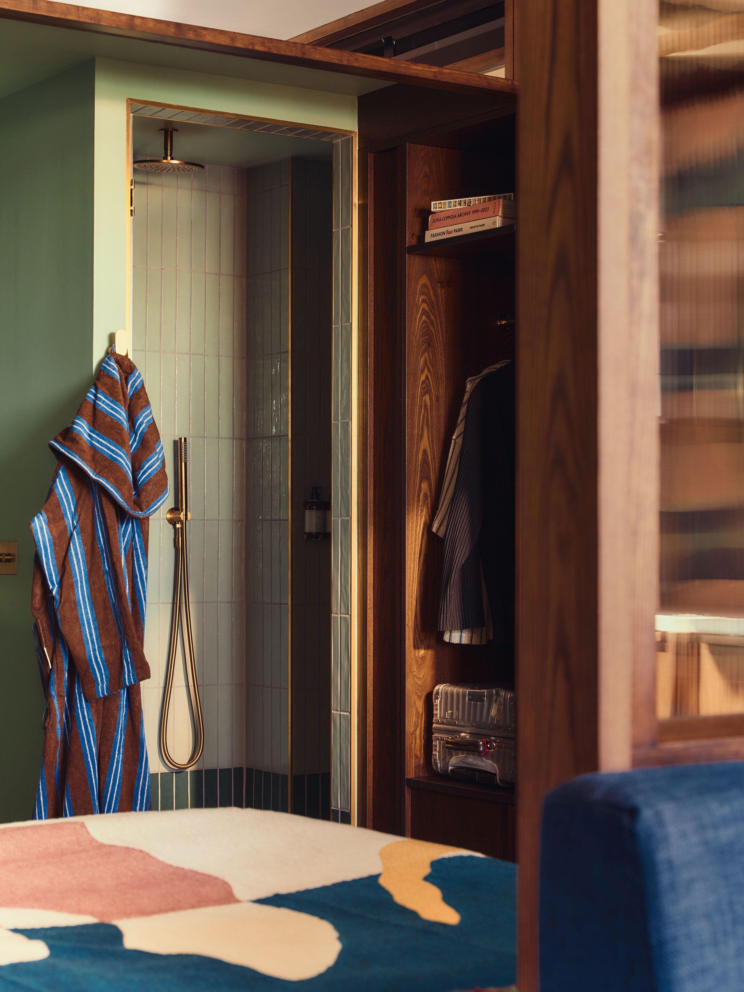
METAL: chrome (portal, period cue), stainless steel (DJ booth), brass (bathroom ironmongery)
STONE: green marble (bar counter), terrazzo (vanity, warm tone)
GLASS: fluted glass (room partitions)
TILE: striped green tile (WC / shower rooms)
COLOUR ACCENTS: ultramarine (café tabletops), vermilion (bar artwork), sage green (room walls), earthy brown (café base)
-------------------------------------------------------------------------------
A5 — SIGNATURE ELEMENTS, RANKED BY NARRATIVE LOAD
-------------------------------------------------------------------------------
1. SOFA PIT (guest rooms) — the defining feature
Oversized pit beside the bed. Double reference: the conversation pit in Don and Megan Draper's 'Mad Men' apartment, and the modular "adult playpens" of the 1960s. It turns a guest room into a proper social space, and encapsulates the hotel's message: close the laptop, pour the martini, invite people up.
2. DJ BOOTH (ground floor) — the most overtly theatrical piece
Stainless steel and blue lacquer, shaped with the retro-futuristic curves of 1960s automobile design; glowing "headlights" throw light towards the dancefloor.
3. BOOKSHELF DIVIDERS (ground floor)
Two large bookshelves, oak burr with high-gloss burgundy lacquer, working as room dividers and giving the sets much of their personality.
4. MAGAZINE SHELF (ground floor)
Matching piece; wave-like forms that subtly reference the Thames outside.
5. CHROME PORTAL + ULTRAMARINE TABLES (library café)
Entry through a shimmering chrome frame; ultramarine tabletops cut through an earthy brown palette as a sly nod to film-production blue screens.
6. LUQA BAR COUNTER
Green-marble top, fluted oak cladding, browns and greens lifted by vermilion artwork; the era of the three-martini lunch.
-------------------------------------------------------------------------------
A6 — GUEST ROOM DETAIL SPECIFICATION
-------------------------------------------------------------------------------
RANGE: compact studios through to spacious suites
ORDERING: formal grid of dark walnut framing across walls and ceiling
ZONING: the same grid extends into partitions separating sleeping, living and dining zones
LIGHT: some partitions in fluted glass — separation kept, light shared
SOFTENING: sage-green walls, oak flooring against the darker timber
PROPORTION: high-level mirrors visually lift the ceiling height
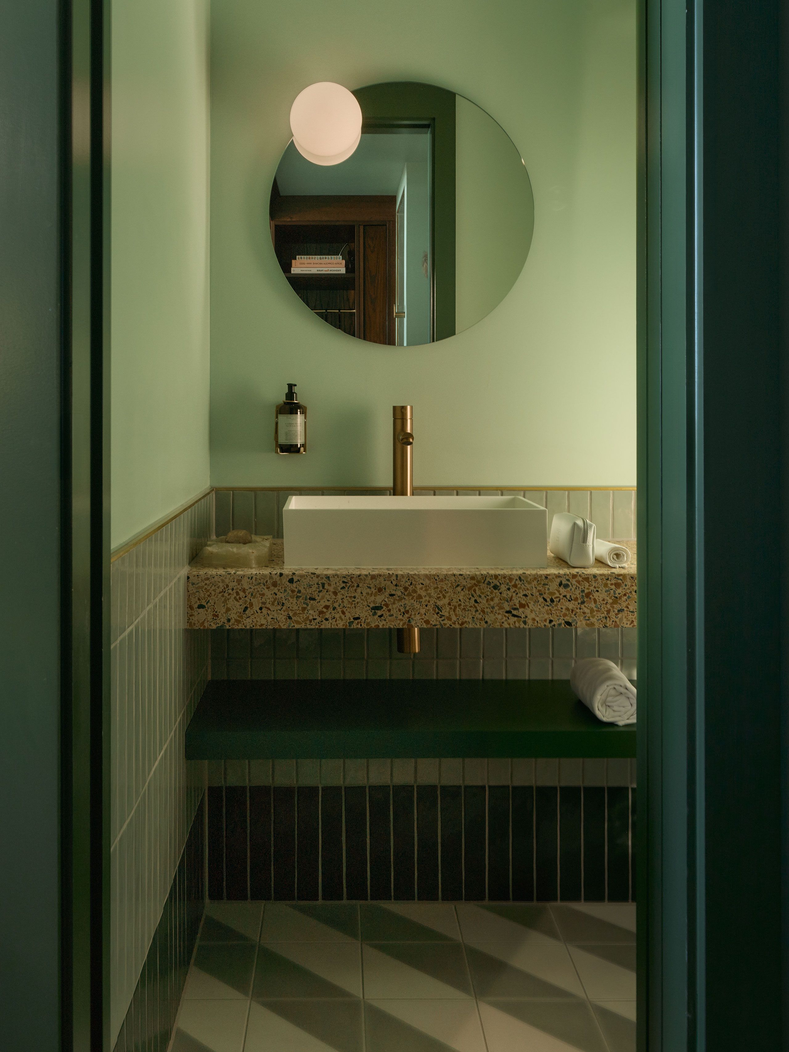
WET ROOMS: striped green tiles + warm terrazzo vanity + brass ironmongery as the tactile 1960s cue
-------------------------------------------------------------------------------
A7 — TRANSFERABLE LESSONS FOR REFERENCE FILING
-------------------------------------------------------------------------------
L1. A period reference is stronger when it is carried by a narrative (a series, a workplace myth) than by a style board alone.
L2. Large open plans can be zoned without walls: changes of colour, pattern and furniture are enough to read as separate "sets".
L3. Existing structure (concrete column rhythm) can be kept legible and used as the metre of the plan, with curves supplied by loose items.
L4. Bespoke joinery doubles as spatial infrastructure — a bookshelf is the partition, not an object placed against one.
L5. An intensity gradient from communal to private keeps a strong palette habitable over a long stay.
L6. One oversized "social" gesture inside a private room (the pit) can reposition an entire hotel typology.
from yatzer
'Hotel & Resort' 카테고리의 다른 글
| * 나무 한 그루가 지은 도시의 은신처, 아만 나이러트 방콕 [ Denniston ] Aman Nai Lert Bangkok (1) | 2026.07.07 |
|---|---|
| * 숲이 건축이 되는 곳 [ Michele Sicher Architetto ] Pineta Nature Resort (0) | 2026.06.17 |
| * 골목의 리듬 [ Brewin Design Office ] Capella Kyoto (0) | 2026.05.07 |
| * 사토야마의 순환 속으로 [Tatsuro Sasaki Architects ] Satoyama Terrace (0) | 2026.04.21 |
| * 대지 몰입형 공간 비평 [ Oppenheim Architecture ] Desert Rock Resort (0) | 2026.03.04 |