“사람을 가장 끌어당기는 것은, 아무래도 다른 사람이다.” — 윌리엄 H. 화이트(William H. Whyte)
 |
 |
 |
Breaking Up Height, Connecting the City
수변에서 시작하는 초고층
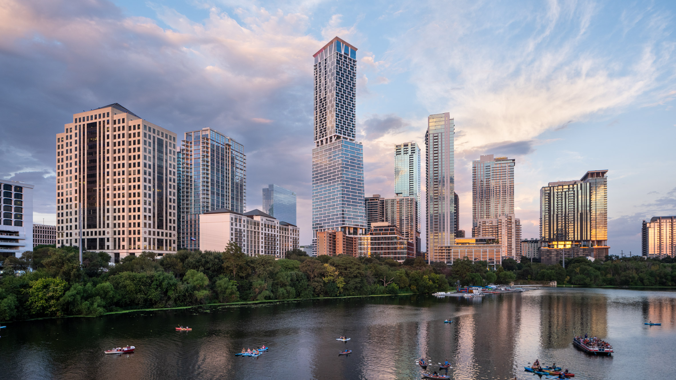
오스틴의 레이디 버드 호수(Lady Bird Lake) 건너편에 워터라인이 솟아 있다. 약 312m 높이로 텍사스주 최고층에 오른 이 건물은 수변 스카이라인에 긴 수직선을 긋는다. 상부와 하부의 폭이 달라지는 지점은 멀리서도 또렷하다. 시선을 그 경계에 두고 살펴보면, 높이 사이에 끼워 넣은 외부공간과 그 안을 받친 기둥이 차례로 눈에 들어온다.
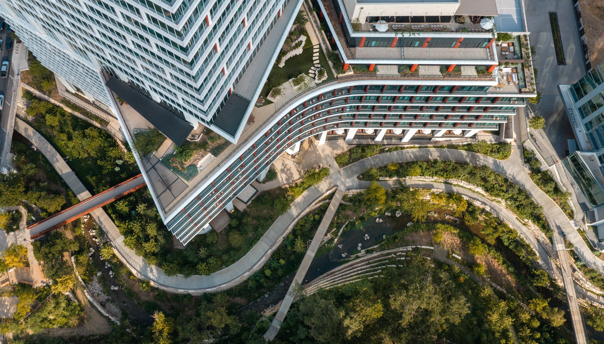
뉴욕의 건축사무소 KPF는 호텔과 업무시설, 고급 주거를 하나의 탑에 포갰다. 상점과 주차장을 품은 아래쪽 기단은 수변을 따라 넓게 펼쳐져 있어, 가늘고 높은 상부와 다른 비례를 이룬다. 기단은 월러 크리크(Waller Creek)를 따라 휘어지면서 주변 산책로와 맞물린다. 건물의 이야기는 이 낮은 층위에서 시작된다.
건물 아래로 들어오는 길
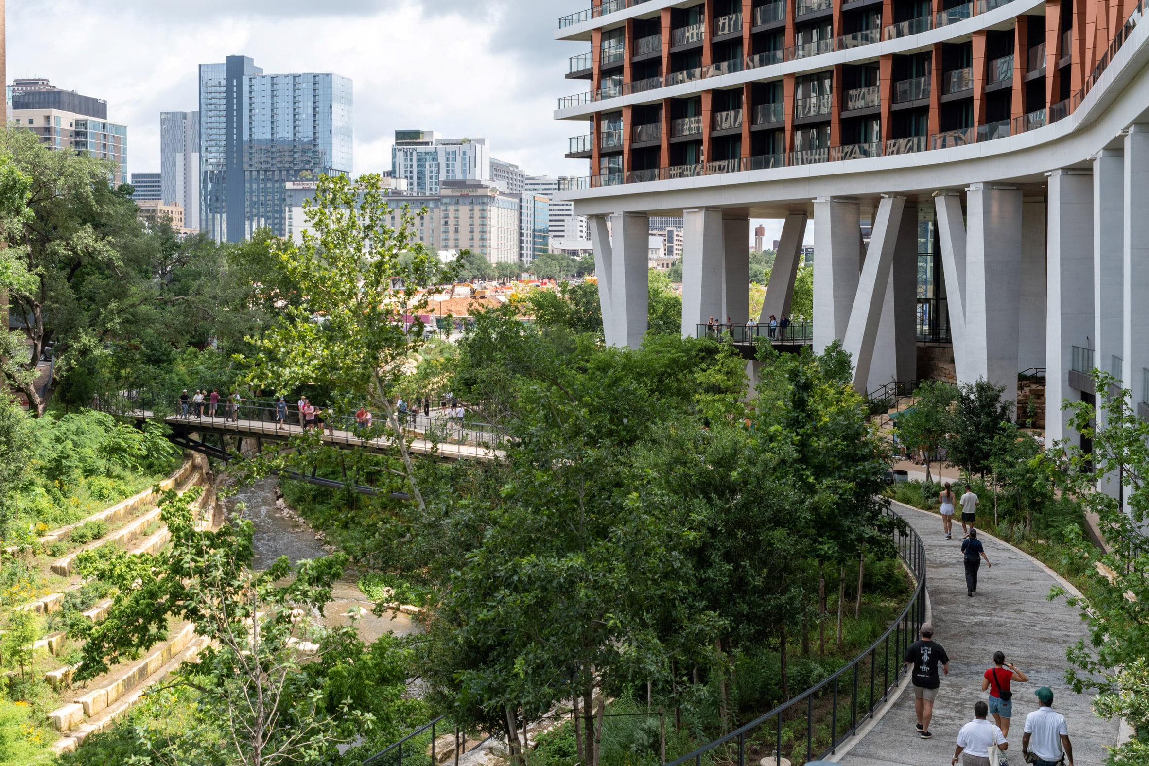
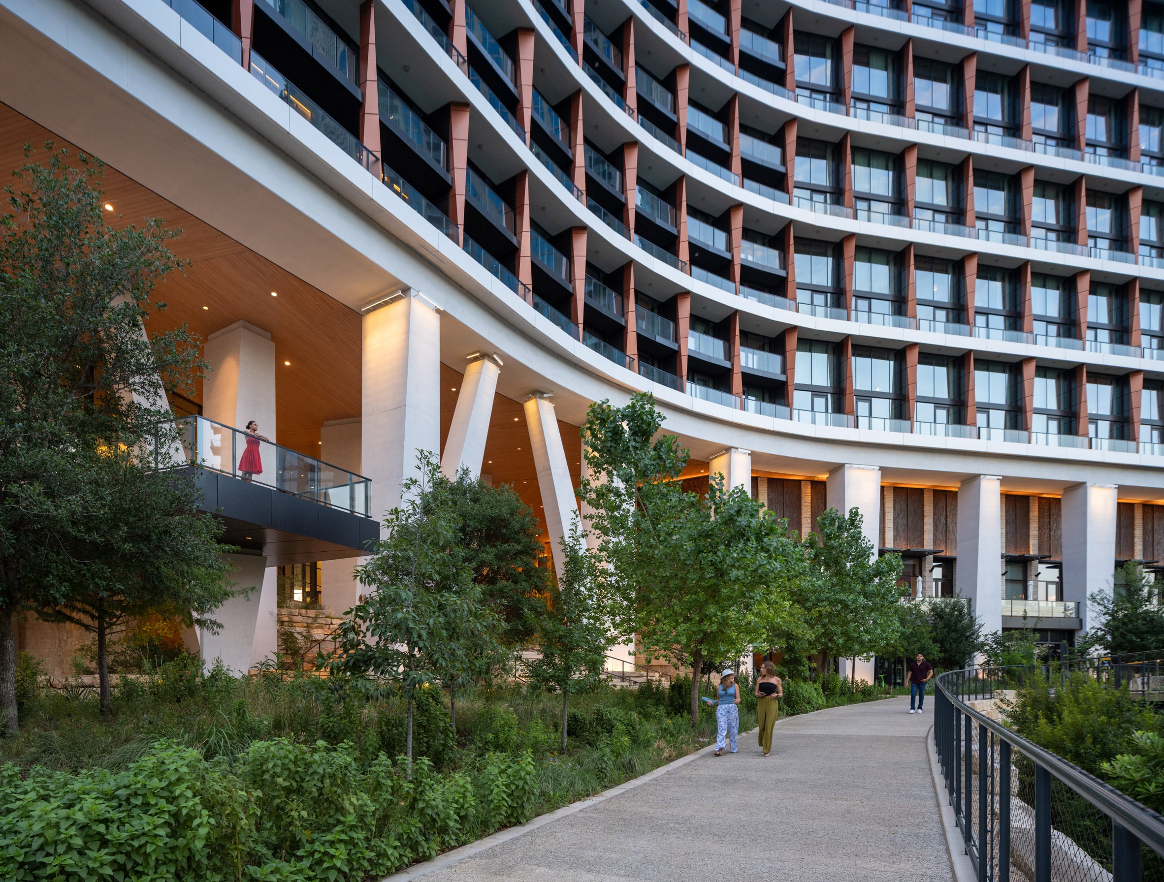
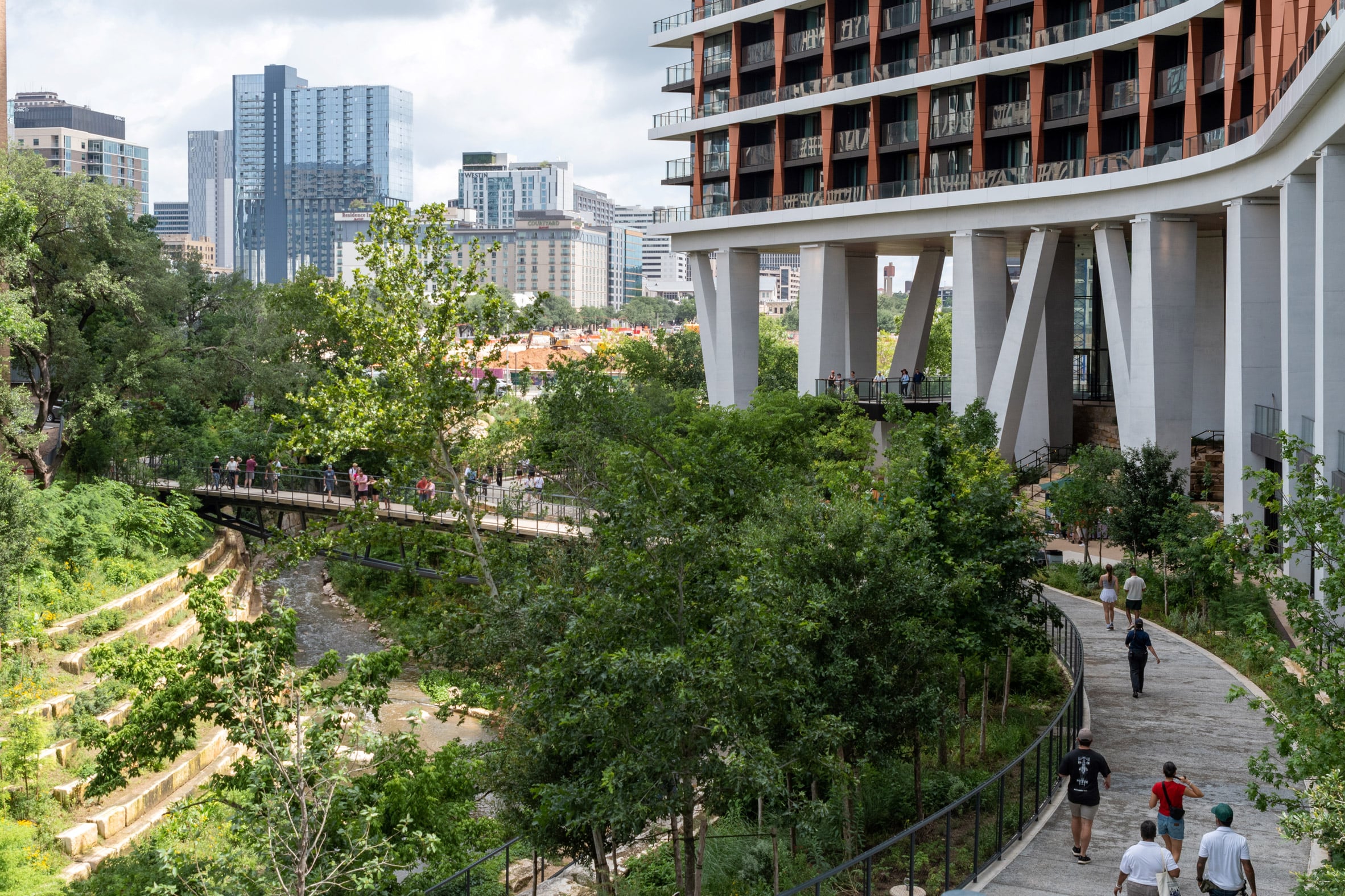
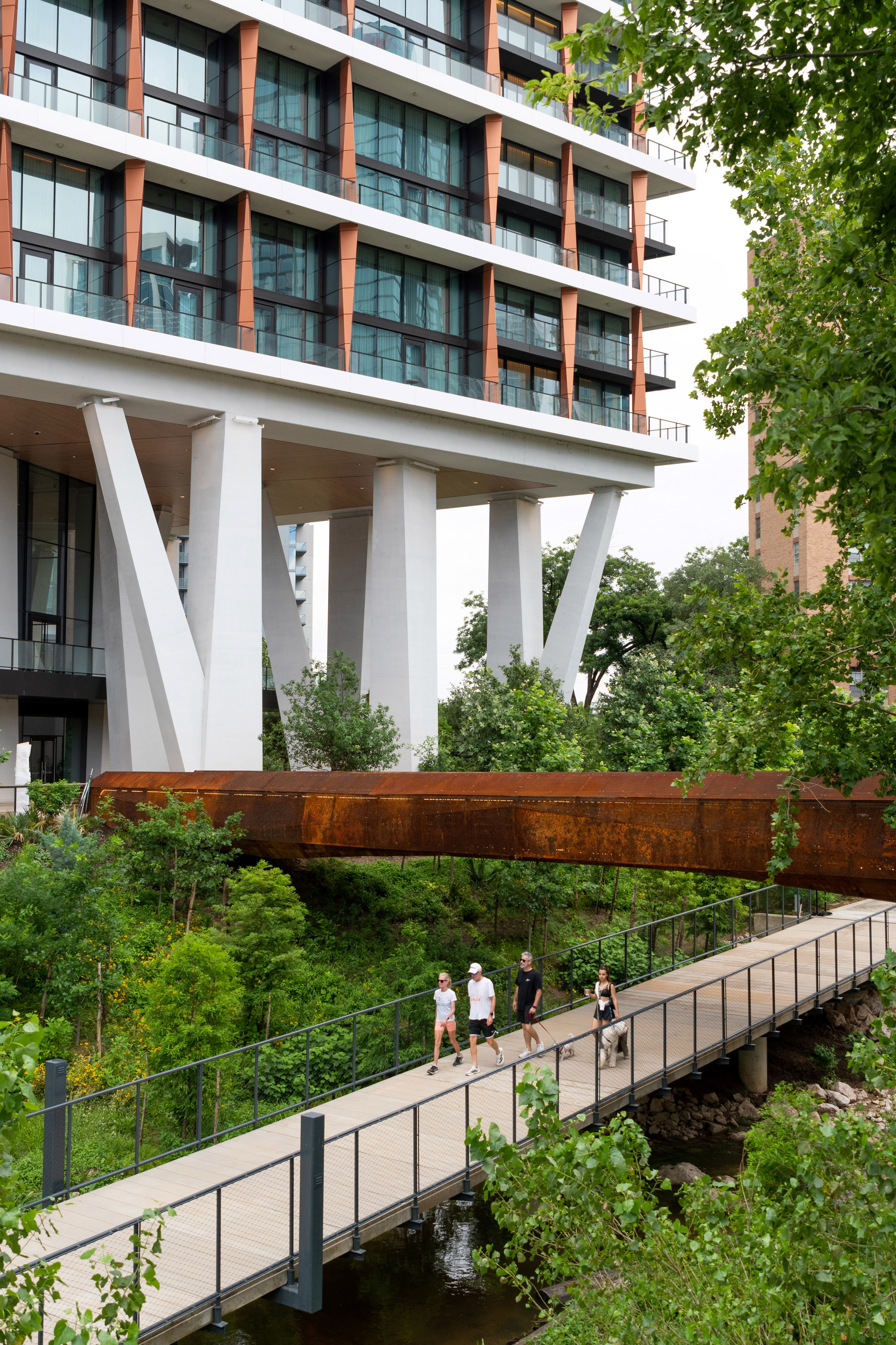
수변 산책로에서는 낮게 뻗은 기단과 굵은 기둥이 먼저 시야에 들어온다. 흰 기둥 사이로 그늘진 공간이 깊숙이 열려 있고, 식재를 두른 길은 건물 가장자리를 감아 돈다. 위쪽의 바닥판이 길게 내밀어 아래쪽 통로를 덮는다. 사람이 기둥 곁을 지나면서 거대한 부재의 크기가 한층 또렷해진다.
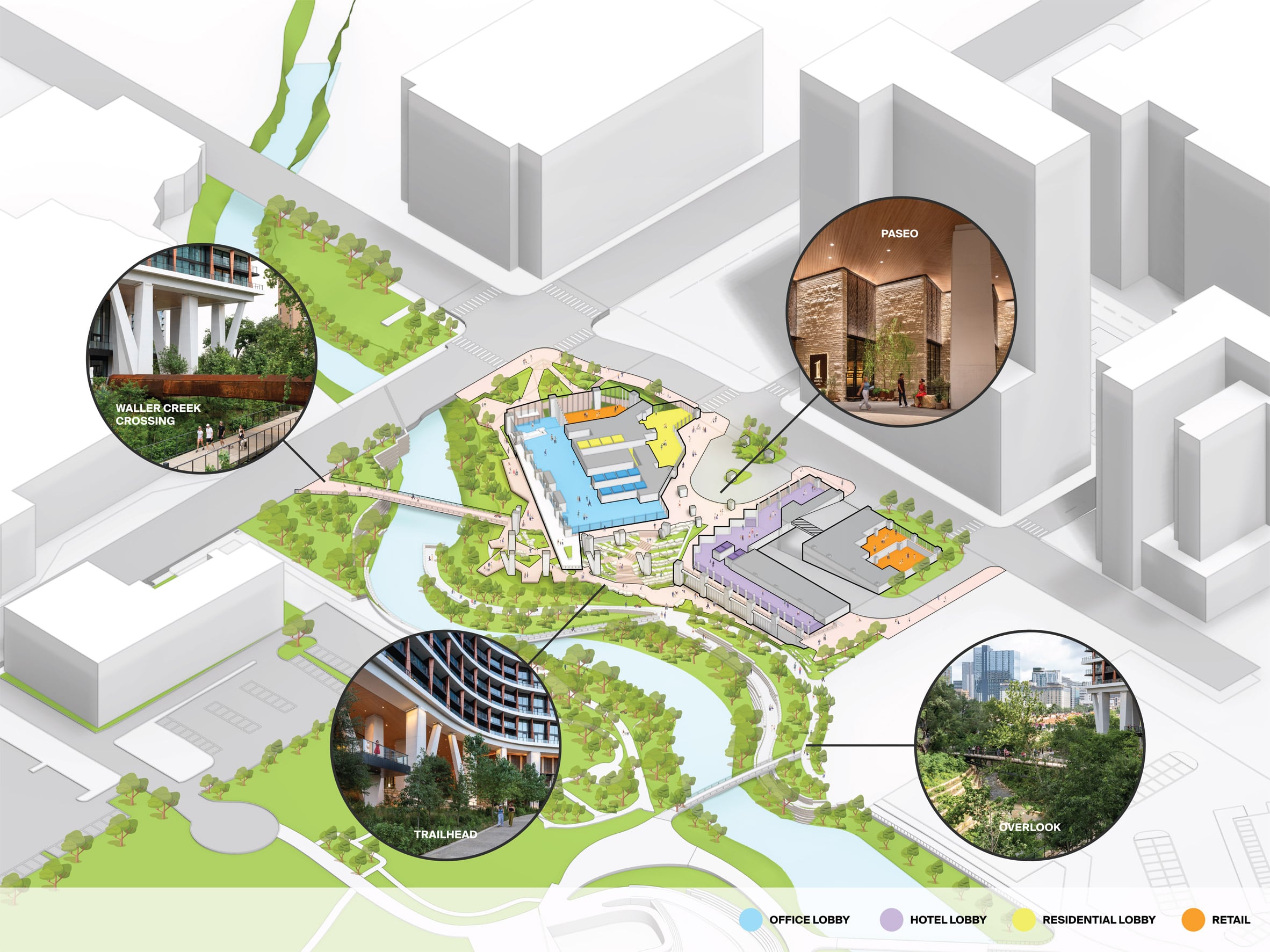
기단 중심에는 도시에서 물가로 이어지는 보행 통로, 파세오(paseo)가 나 있다. 돌로 마감한 벽과 식재가 길을 따라 이어지고, 큰 기둥 사이에는 바깥 풍경이 걸린다. KPF는 이 통로를 주변 공원의 보행망과 연결했다. 여러 높이에 걸친 지상부가 도시와 수변 사이의 통로를 이루는 셈이다.
배치 개념도를 보면 업무·호텔·주거의 로비를 서로 다른 색으로 표시해, 각 진입부가 어디에 놓였는지 구분할 수 있다. 보행로는 진입부 주변을 잇되, 각 로비의 문턱을 따로 남겨 둔다. 복합건물이 주변에 열리는 방식과 내부 이용자를 나누는 방식이 같은 지면에서 만난다. 기단에서 이동은 연결과 분리를 함께 따른다.
겹쳐 쓰려는 건물의 출발점
워터라인의 설계는 사업 주체가 바뀌는 과정을 거쳤다. 기사에 따르면 초기 개발사 위워크(WeWork)는 공모에서 비야르케 잉엘스 그룹(BIG)의 안을 골랐다. 이후 위워크의 2019년 기업공개 실패와 경영 논란을 거치면서 KPF가 설계를 맡았다. 새로운 개발팀 아래에서도 여러 기능을 겹쳐 쓰려는 구상은 이어졌다.
KPF는 코로나19 팬데믹으로 도심의 미래를 의심하던 시기에 용도 혼합의 의미를 더 강조했다. 일과 숙박, 주거를 모아 도심의 쓰임을 늘리려는 의도다. 여러 동으로 나누려던 밀도도 한 탑으로 모았다. 서로 다른 활동을 높이에 따라 배치하면서, 용도가 바뀌는 경계를 건축적으로 다루는 일이 중요해졌다.
용도가 바뀌는 높이에 남긴 틈
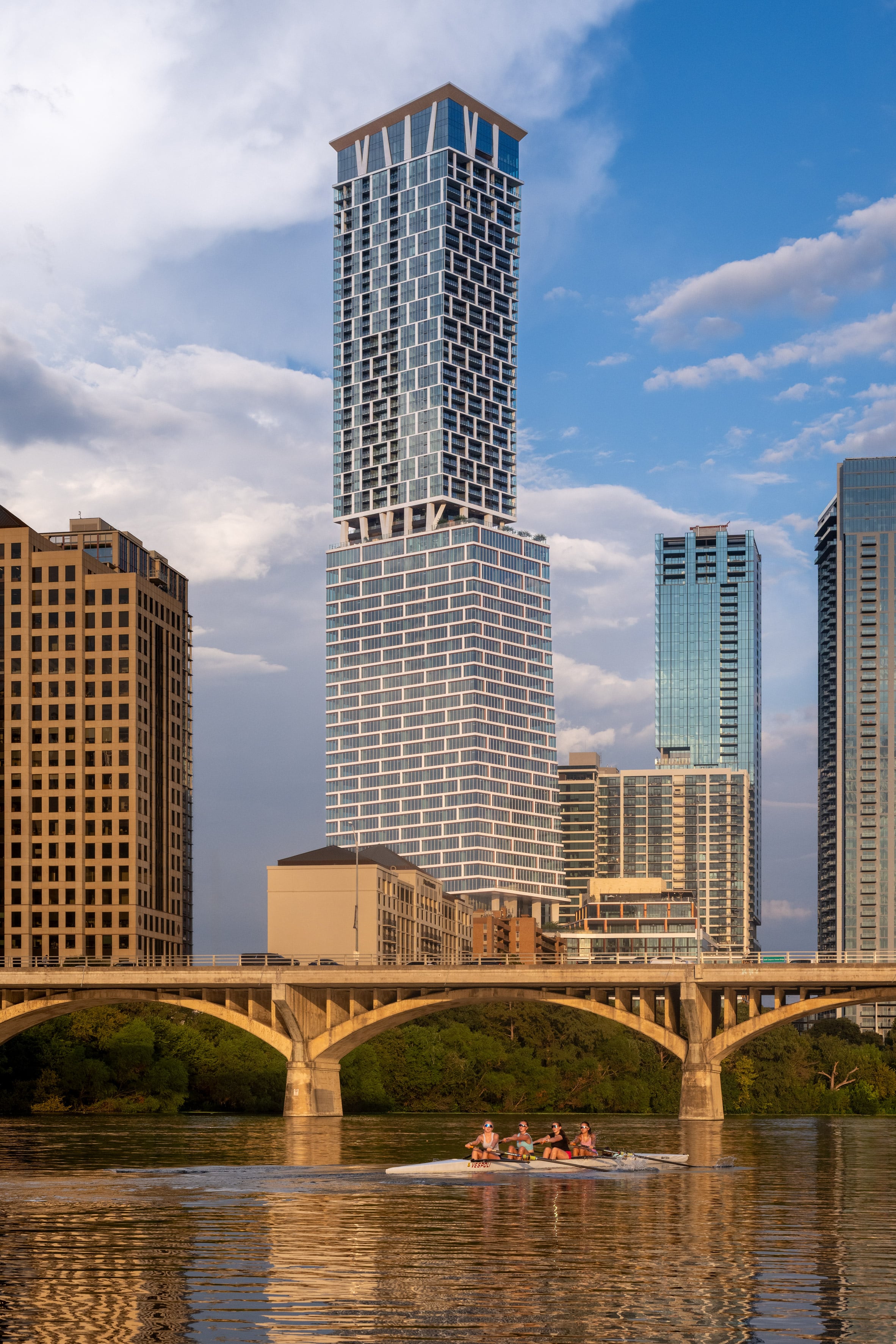
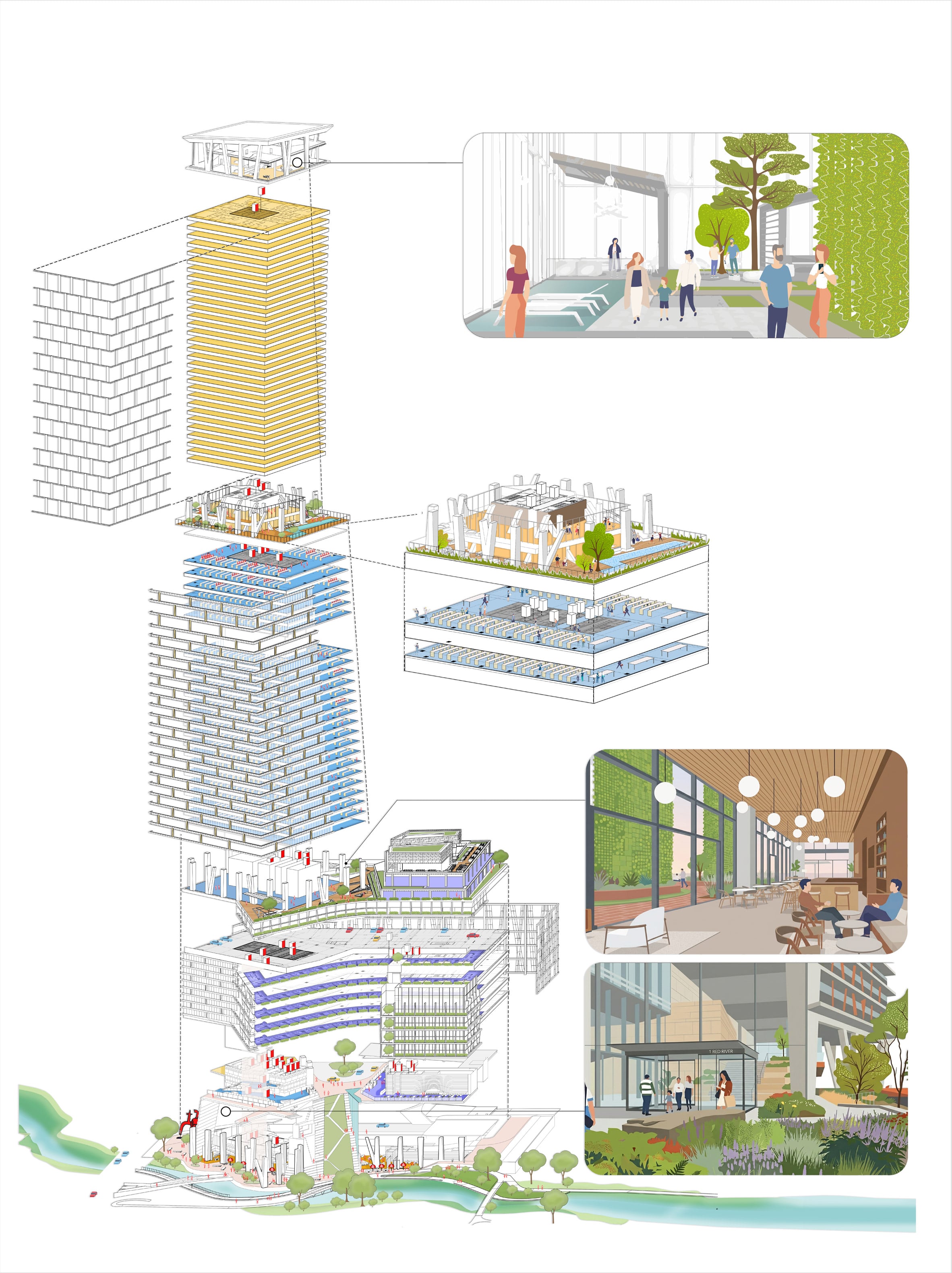
분해도에서는 용도 사이에 낀 외부공간이 선명하다. 호텔은 기단 쪽에 자리하고, 그 위로 업무시설과 주거가 차례로 올라앉아 있다. 용도가 바뀌는 지점에서는 실내가 안쪽으로 물러나 있어, 바깥에 남은 큰 기둥과 외부 바닥판이 윤곽을 드러낸다. 두 층 높이의 틈이 탑의 덩어리를 나눈다.
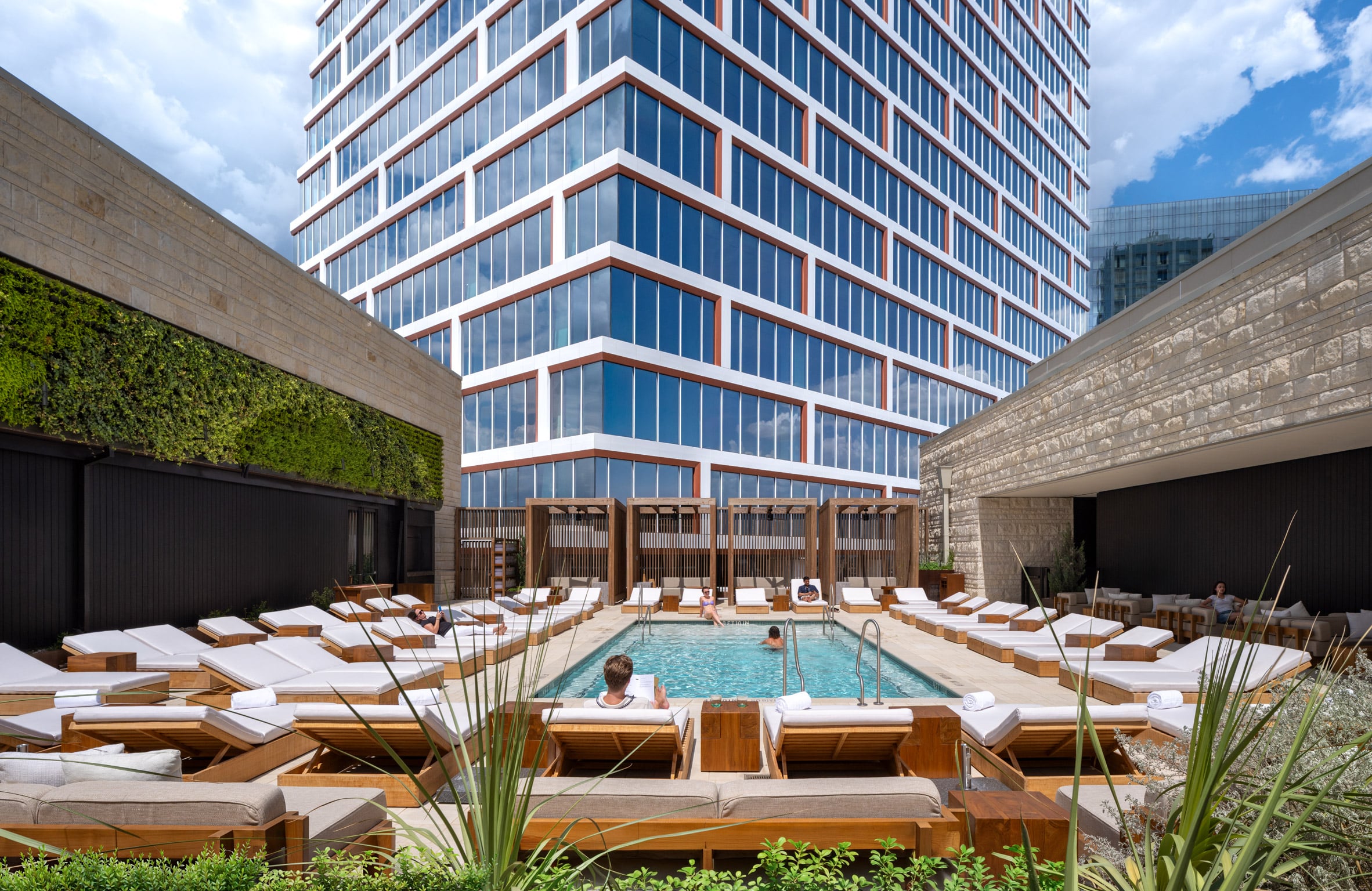
개념도 속 전환부에는 식재와 휴식 공간이 그려져 있다. 반복되는 층 사이에 식재를 두른 테라스와 머물 자리를 끼워 넣어, 실내에서 바깥으로 나설 수 있도록 짠 구성이다. 땅 가까이에 모였던 정원과 테라스의 경험을 위로 옮기려는 시도로 읽힌다. 다만 도식이 보여주는 활동 장면은 설계가 제안한 이용 방식이다.
이 열린 구간의 기둥은 용도별 구조 격자의 차이에도 대응한다. 설계진에 따르면 일부 V자 기둥은 업무층에서 주거층으로 바뀌는 기둥 위치를 조정한다. 나무를 닮은 형상에 구조적 이유도 겹친다. 기둥이 갈라지는 곳에서 용도와 구조 격자가 함께 바뀌므로, 보이는 형상과 건물의 쓰임을 연결해 읽을 단서가 생긴다.
수평선과 기둥으로 나눈 덩어리
수변에서 본 기단에는 흰 수평 띠와 녹슨 듯한 붉은빛 부재가 엇갈려 있다. 곡선을 따라 늘어선 수직 부재 사이로 유리와 발코니의 깊이가 보인다. 붉은빛 디테일은 텍사스의 지질을 참조한 색채다. 붉은빛 부재가 유리면 사이에 일정한 간격으로 반복돼 있어, 수평선을 따라 이어지는 곡면의 굴곡이 한층 도드라진다.
업무층과 주거층의 입면에서는 서로 다른 비례의 격자가 반복된다. 그 사이에 낀 열린 층이 경계를 강조하므로, 탑은 큰 덩어리 몇 개를 쌓은 모습으로 다가온다. 기단에서 시작한 수평선도 곡면을 따라 길게 이어진다. 촘촘한 창의 반복과 넓게 벌어진 틈이 건물의 크기를 서로 다른 간격으로 나눈다.
탑은 높아질수록 호수에서 뒤로 물러나는 윤곽을 그린다. 설계진은 이 윤곽을 카우보이 부츠에 빗댄다. 이를 지역을 상징하는 형태로만 읽으면 수변과 맞물린 낮은 부분을 놓치기 쉽다. 물가 쪽으로 기단을 길게 펼치고 그 위의 몸체를 좁혀 올린 구성이므로, 이 비유에는 수변을 향한 건축의 자세도 담겨 있다.
꼭대기의 작은 어긋남
꼭대기 스카이라운지 위의 구조물도 조금 기울어져 있다. 설계진은 이 작은 어긋남을 오스틴의 개성을 지키자는 구호와 연결해 설명한다. 아래쪽에서 반복되던 격자는 꼭대기에서 비스듬히 끝난다. 큰 형상을 여러 번 꺾기보다 마지막 윤곽에 변화를 남긴 선택이다.
열린 풍경을 도시의 일상으로
워터라인의 건축적 가치는 지상과 공중에 만든 외부공간을 함께 살필 때 드러난다. 지상에서는 수변의 길을 건물 가까이 끌어들이고, 위쪽에서는 용도 사이에 테라스를 둔다. 아래의 길과 위의 틈을 함께 짜 넣은 구성이 이 탑의 핵심에 가깝다. 서로 다른 높이에서 사람과 바깥 풍경이 만날 자리를 마련했기 때문이다.
그 가치의 범위는 공간을 누가 쓸 수 있는지에 달려 있다. 공원과 이어진 보행 통로와 호텔·주거의 편의공간은 이용 조건이 다를 수 있다. 열린 외관만으로 시민의 이용 범위를 가늠할 수는 없다. 문을 여는 시간과 접근 권한을 확인하고 실제 머무는 사람을 살펴야, 이 건물이 도시와 나누는 공간의 범위도 분명해진다.
수변 산책로를 걷는 사람에게는 건물 아래를 지나갈 수 있다는 사실부터 중요하다. 굵은 기둥 사이로 열린 길이 도심과 물가의 이동을 잇고 있다. 이 길에서 다양한 사람이 편히 머무는 일상이 쌓일 때, 설계가 마련한 연결의 가치도 더 분명해질 것이다. 워터라인을 평가할 눈높이는 그 길 위에도 놓여 있다.
프로젝트 크레딧
프로젝트: 워터라인(Waterline)
설계: KPF(Kohn Pedersen Fox)
현지 건축설계: HKS Architects
위치: 미국 텍사스주 오스틴, 98 Red River Street
발주·개발: Lincoln Property Company, Kairoi Residential
준공: 2026년, 제공된 Dezeen 기사 기준
규모: 74층, 약 312m. KPF 프로젝트 페이지에는 높이 311m로 기재
면적: KPF 기재 216,300㎡ ≈ 65,431평. 면적 산정 범위는 해당 페이지에 미표기
조경: TBG Partners, Nudge Design — 제공 기사 크레딧 기준
인테리어: Michael Hsu(업무), Studio Mai(호텔), Ink & Oro(주거) — 제공 기사 크레딧 기준
시공: DPR Construction
구조: Brockett Davis Drake
Write by GPT & Jean Browwn
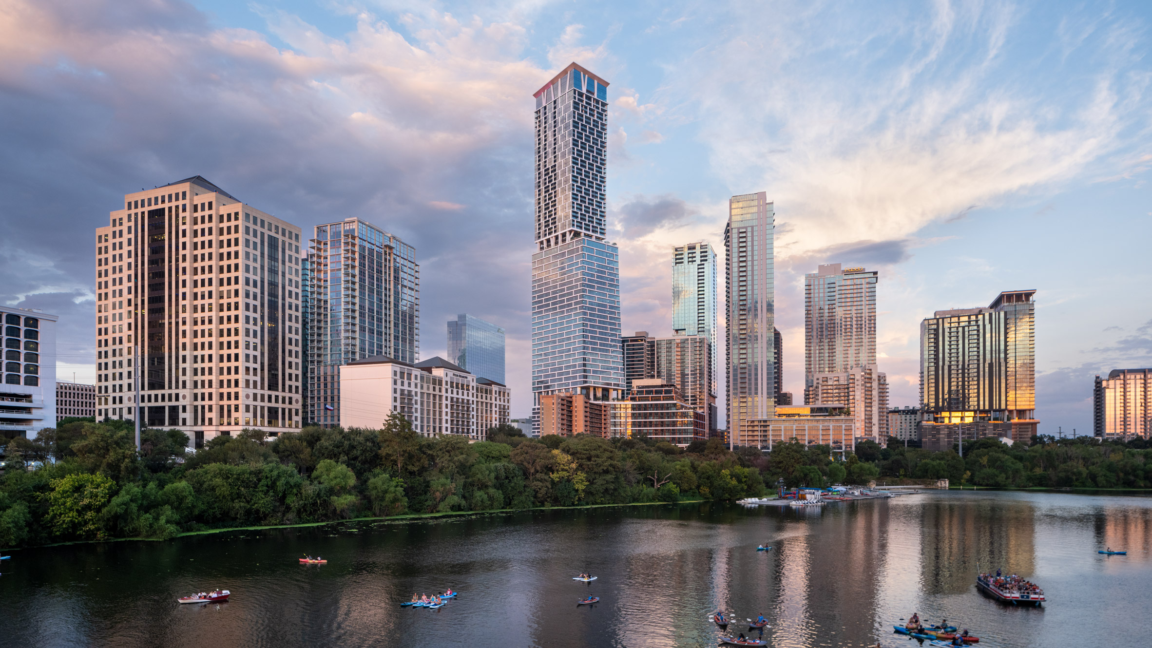
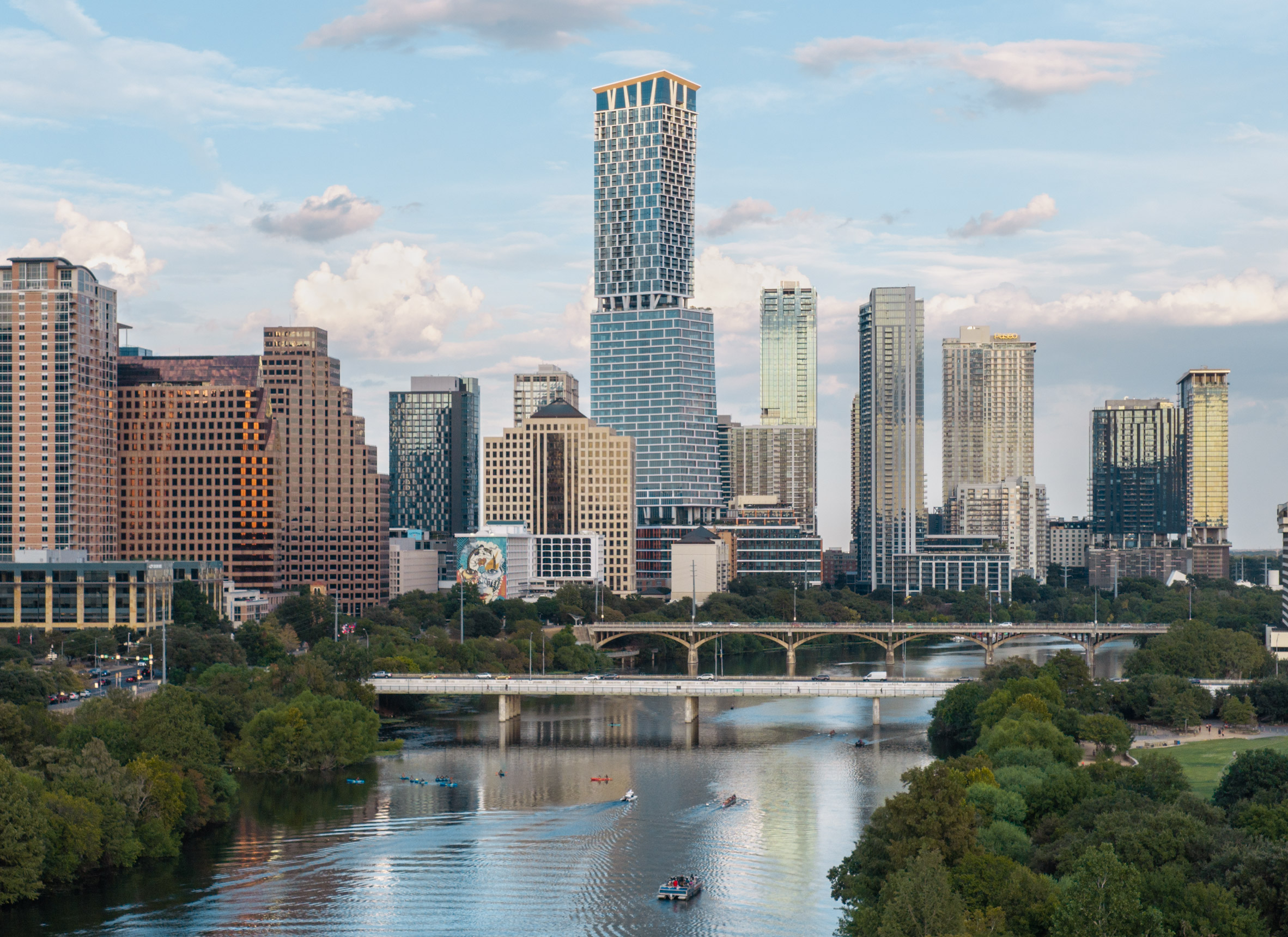
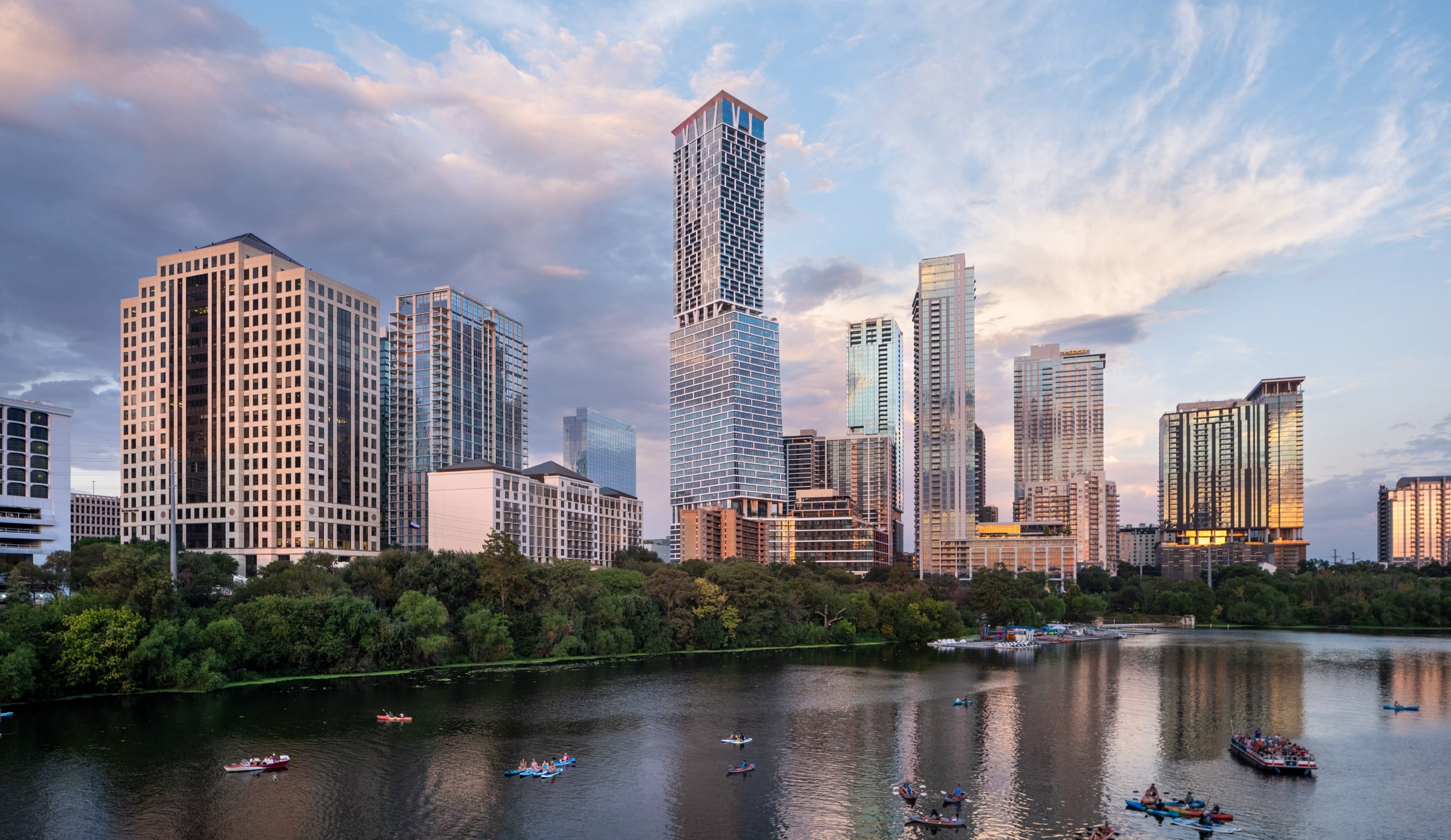

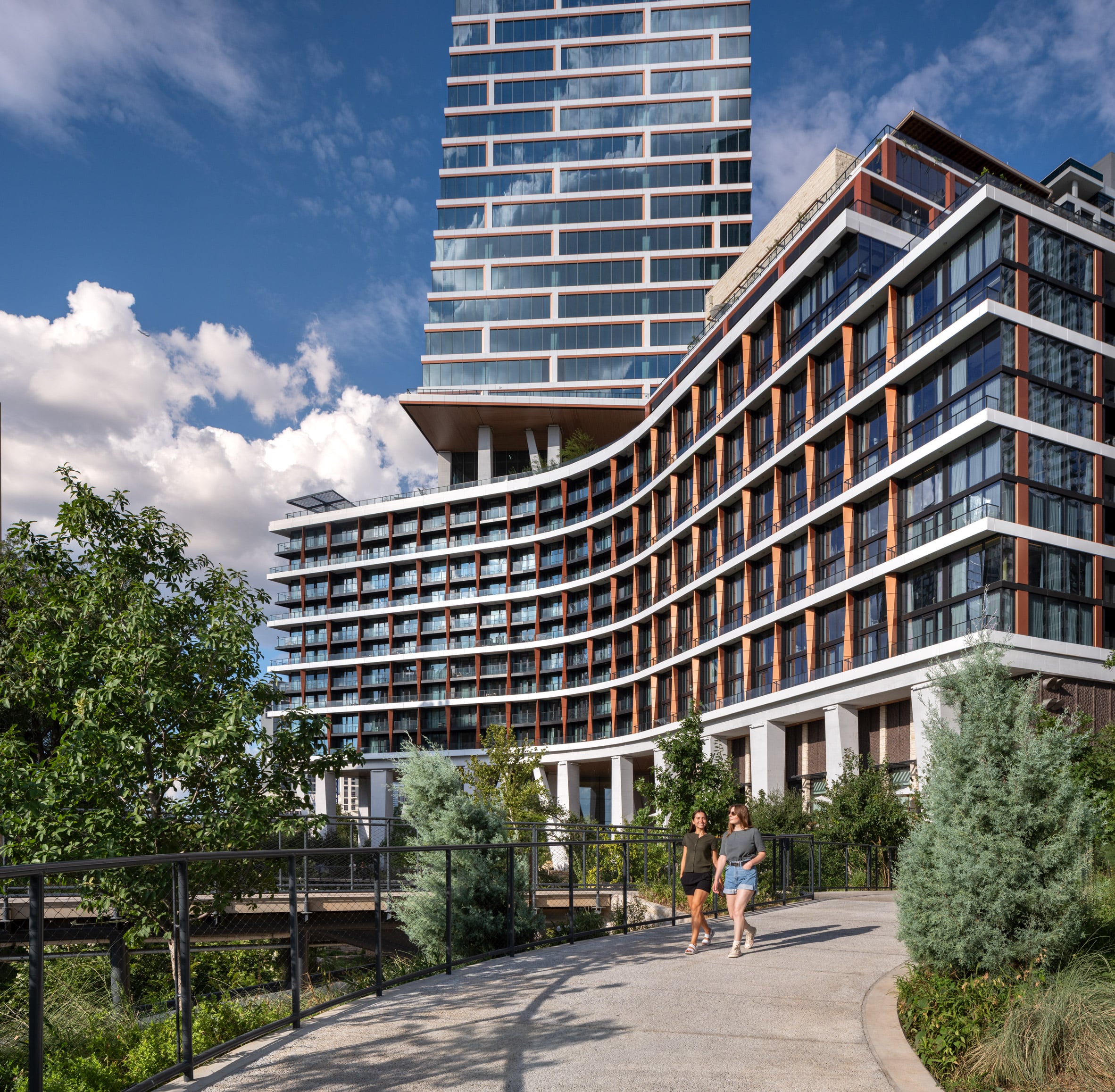
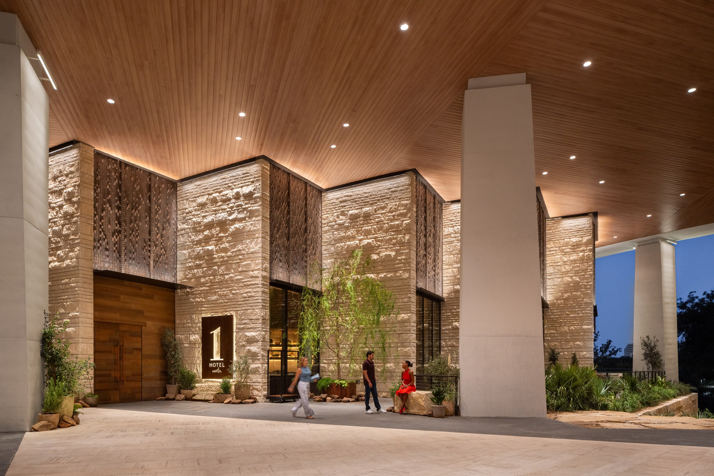
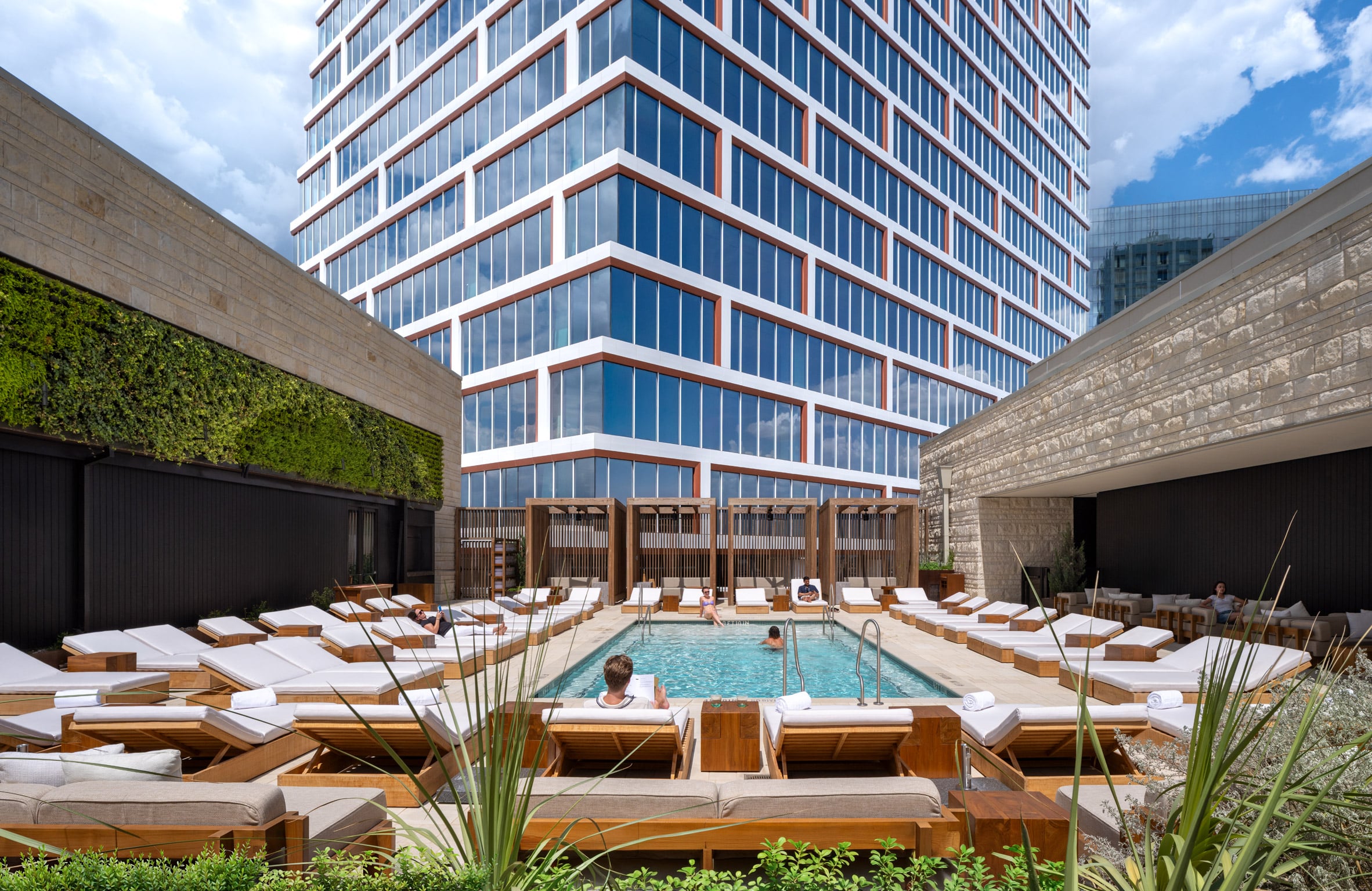
New York architecture studio KPF has completed Waterline in Austin, Texas, a supertall skyscraper with a mixed-use programme that slopes away from Lady Bird Lake as it rises. It has a form that resembles a “cowboy boot”, according to its designers.
KPF, which is known for its skyscrapers around the world, was not originally meant to design the structure.
The building’s original developer was the coworking real estate company WeWork, which selected a design by its collaborator, architecture studio BIG, through a competition.
However, after WeWork’s failed IPO in 2019 and governance scandals, KPF was brought back in to take up the mantle on the project, which had already begun its early construction.
KPF president James Von Klemmperer told Dezeen that the concept of a “we-building” or a mixed use building with overlapping functions remained part of the DNA of the building as the project was awarded to KPF by its new development team.
“Space isn’t as proprietary,” said Von Klemmperer of the project and concept. “No, it weaves together with other things, and with the spaces that are shared at the rooftop of the base of the building.”
The 1,025-foot-tall (312-metre tall) structure features hotel and office programmes at the bottom, with luxury residences at the top. Double-height exterior floorplates supported by massive columns mark changes in the programme from the exterior, and the whole building slopes up and away from Lady Bird Lake, a wide section of the Colorado River that flows through Austin.
Deference to the waterway was one of the main goals of the project, as were nods to the regional heritage, and a desire not to “strangle” the low-lying historic Rainey District to the southeast of the site.
It was originally supposed to be multiple towers, but the studio decided that shoring its density into a single tower allowed for these goals to be achieved.
“The project grew into the design, if you will, the way it inclines down like a cowboy boot at the base,” said Von Klemmperer.
“It inflects towards Lady Bird Lake, and I think that was a powerful profile in everybody’s estimation, because it says something about a vertical structure becoming a piece of landscape or geology.”
Von Klemmperer also contrasted the skyscraper, with its wide-grid facade and columns, with black glass skyscrapers with wide bodies that block urban view corridors, referencing recent skyscraper construction in New York.
[Pull quote] It’s not often or always that a tall building is also seen as a kind of supple building that is good for the community.
“It’s not often or always that a tall building is also seen as a kind of supple building that is good for the community,” he said, adding that Waterline’s facade, which features rust coloured details to reference Texas geology, is “lacy” and more full of moments where your eye can see through or see some depth or see pattern”.
“We hoped to make a beautiful little piece of waterway facade.”
Working closely with landscape architecture studio TPG Partners, the base of the structure steps up from the creek at the ground, with massive columns meeting the ground plane.
These columns work to form what Von Klemmperer compared to an amphitheatre of sorts that adds “urban drama”.
“Cities should have places that support urban drama, and I think already this has shown it really works,” he said.
At the centre of the structure’s stepped podium is a paseo from the city to the water that is lined with stone and makes the lower part of the structure, mostly retail and parking, more porous.
On top of the podium, amenity spaces serve the 1 Hotel, which is taking over the middle part of the programme.
The columns at the base and at the breaks were designed with oak trees in mind.
The studio included some V shaped columns to add to this character, but also to structurally aid the building as the floorplates changed to accommodate the programme shifts.
“From an office grid to the residential grid, those misalignments along the perimeter were actually beneficial for getting a better column placement in the residential above,” said KPF design director Andrew Klare.
At the top of the building is a sky lounge, and the bulkhead has a slight angle that echoes the slope of the skyscraper.
Von Klemmperer said both the shifts in the facade and the tilted top of the skyscraper were subtle nods to the city’s slogan – Keep Austin Weird.
“It’s not an exceedingly weird gesture that interrupts the skyline, but it’s a bit of whimsy, which is in character with the rest of the skyscraper’s geometries,” he said. “It destabilises the conventional grid of the world.”
The mixed-use programme also came to pass during the Covid 19 pandemic, which was a period of doubt in the feasibility of downtown cores.
This didn’t stop the project, but intensified the studio’s desire to create an open building with multiple uses and to “multiply” the uses of the podium.
“It restores your faith in the urban agenda of development – to make such a mixed use project with levels of shared use throughout,” said Von Klemmperer.
Other recent skyscrapers by KPF include a “beaux arts” supertall in New York that is nearing completion and a pair of skyscrapers in Istanbul.
from dezeen