 |
 |
 |
atelier tao+c-ZIIN Beijing Store
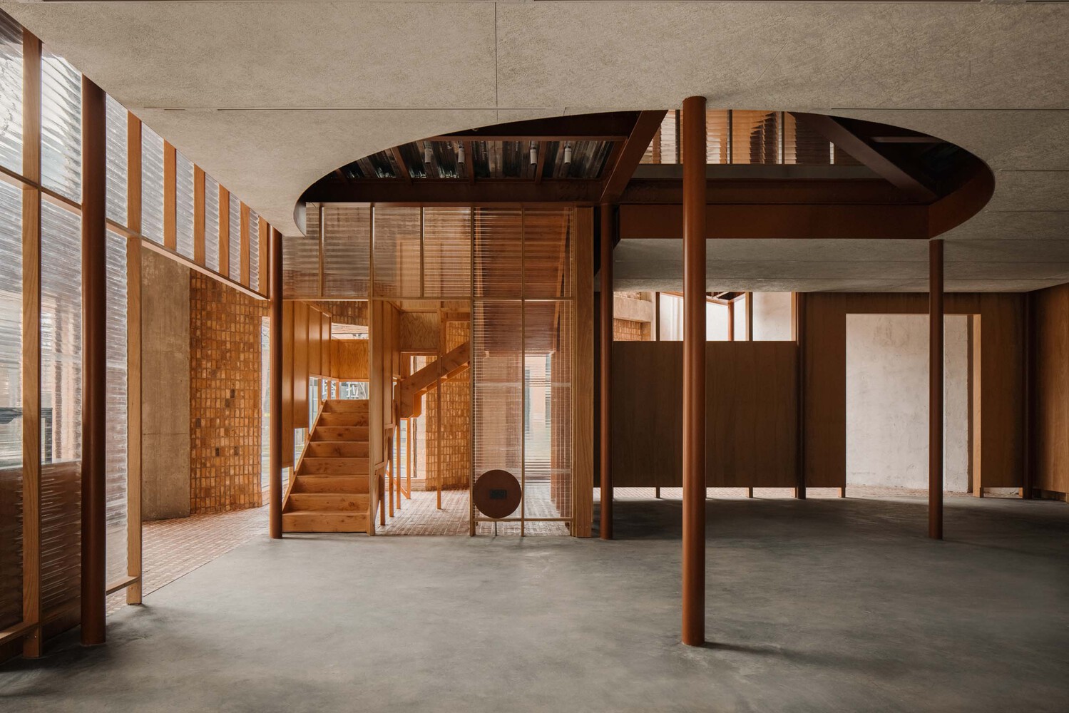
랑위안 역 주변에 위치한 오랜된 섬유창고는 이제 신생가구 브랜드 지인의 쇼룸으로 탈바꿈된다.60년대 지어진 뾰죽한 지붕과 벽돌 벽을 가진 창고에 Atelier tao+c의 디자인 감각이 더해져 레트로한 건축공간으로 완성된다. 집 속에 집을 컨셉으로 내부 공간에는 새로운 격자공간이 연출된다.
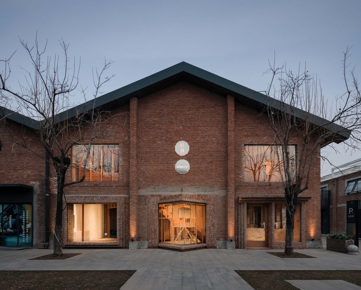
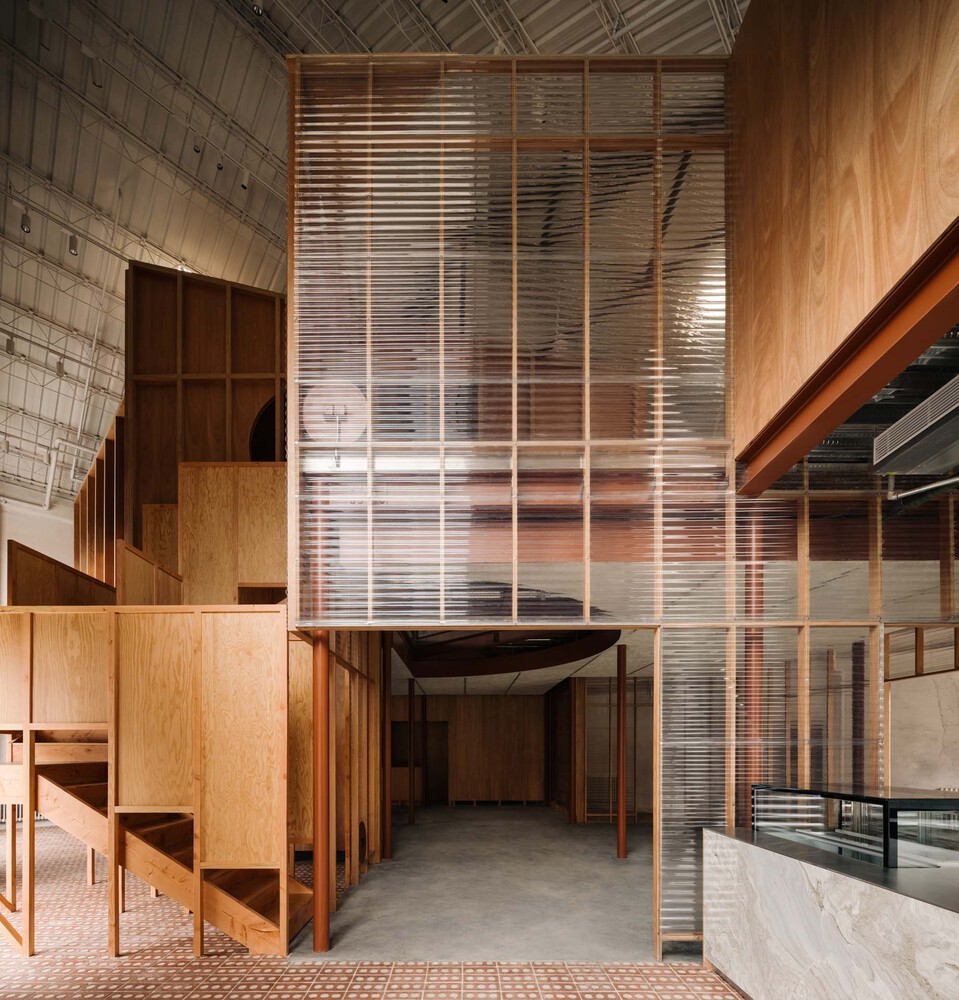




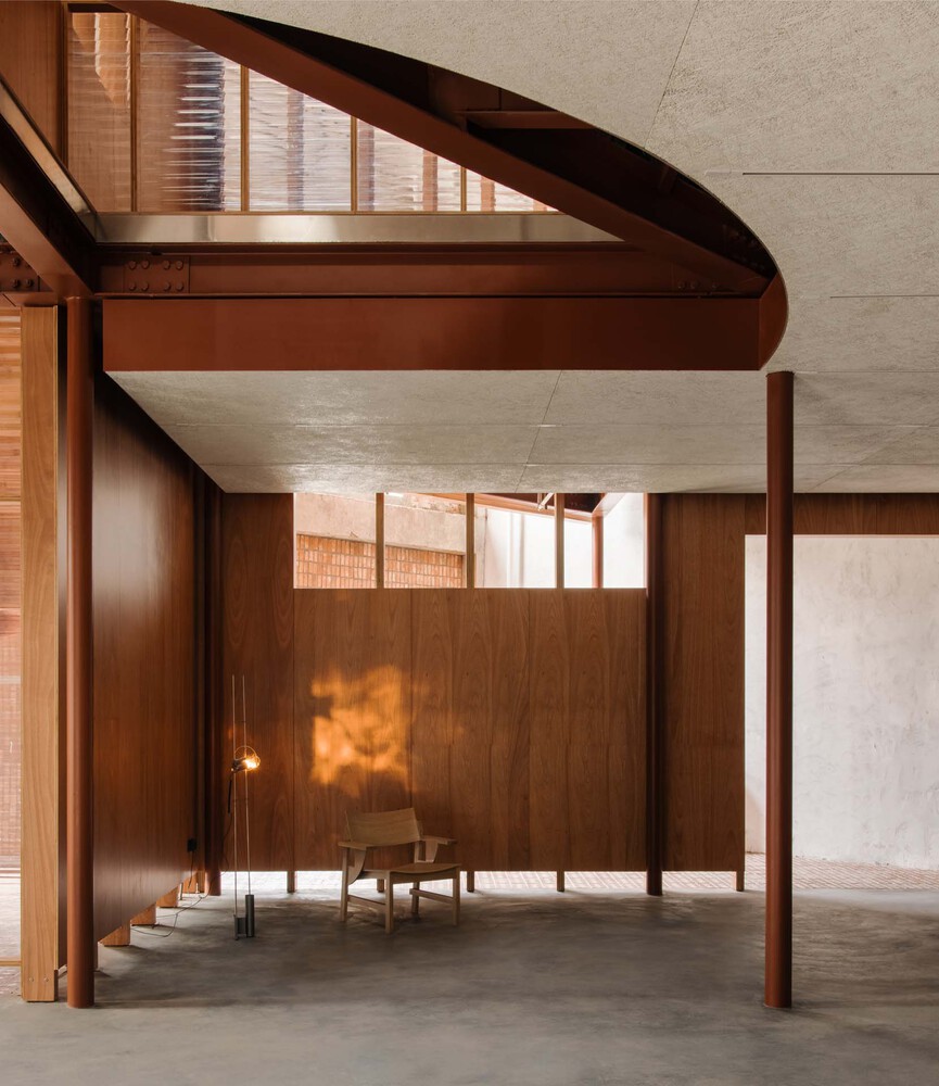
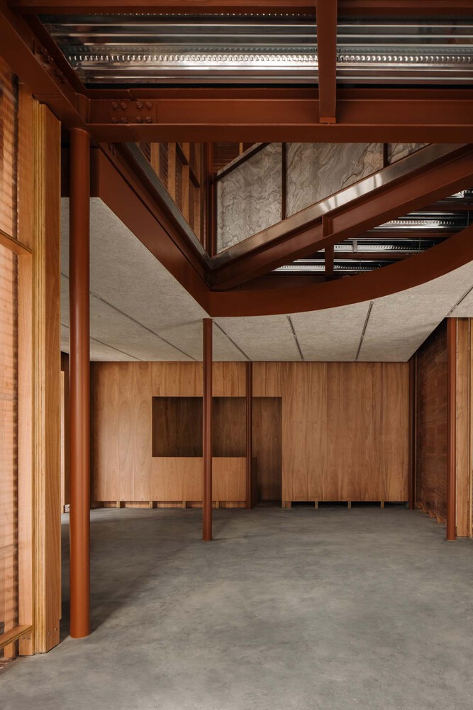


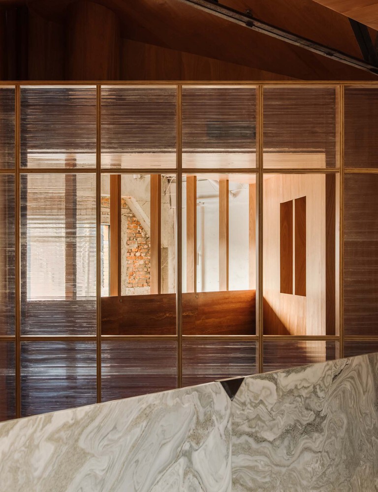
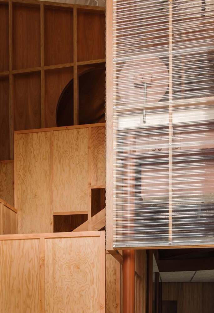


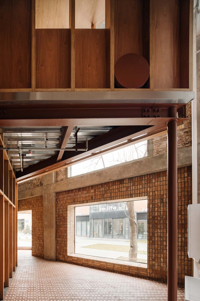


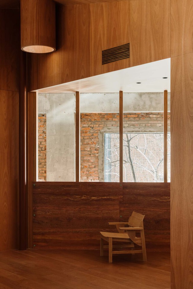
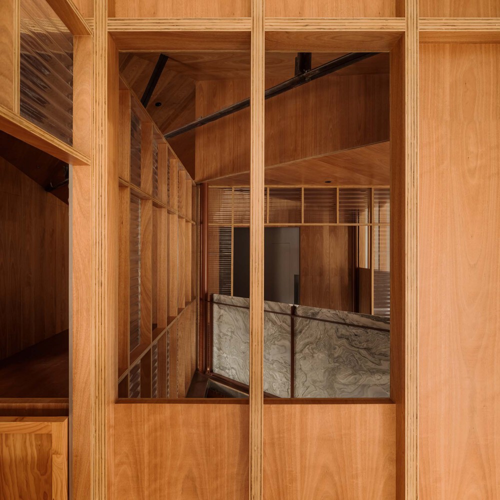
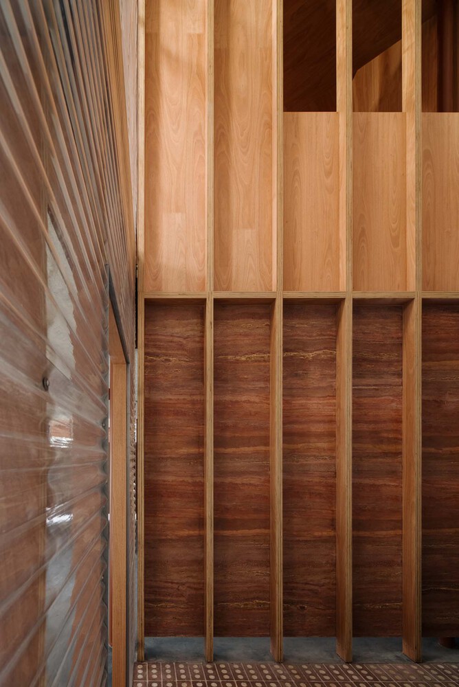


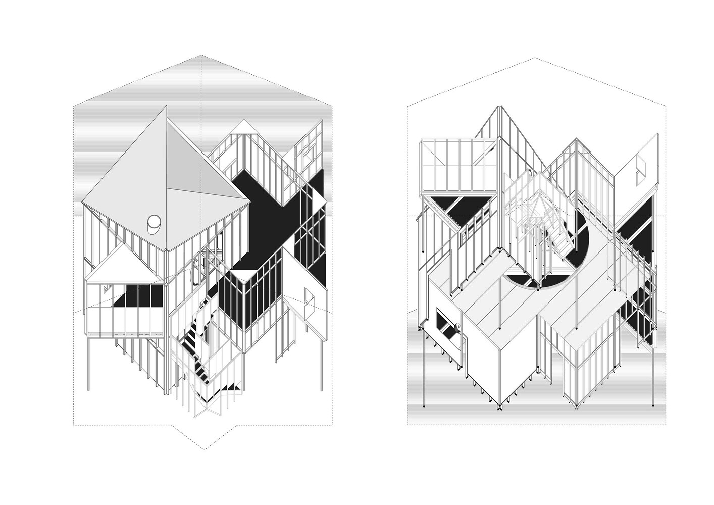
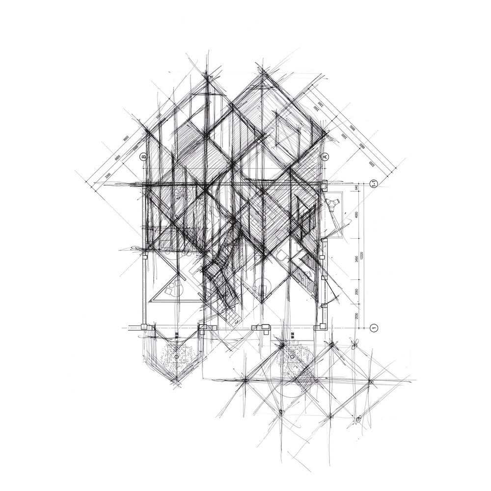
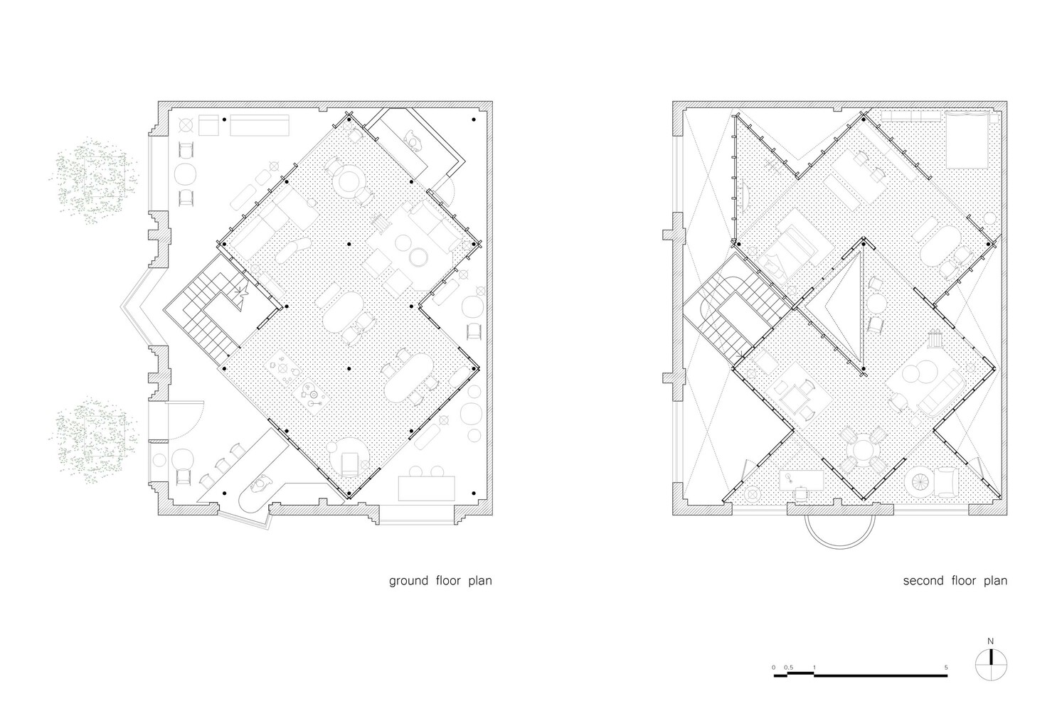
Atelier tao+c has transformed an old textile warehouse into a showroom for ZIIN, an emerging furniture brand. The project site is part of Langyuan Station, which features warehouse with pitched roof and brick walls built in the 60s from last century. Two intersected square frameworks were erected, meticulously rotated at 45 degree, staying sole as an individual structure while also connected to the original brick wall, which forms a separate “house within a house” journey. Atelier tao+c sought to balance the relation between the existing site with new functions, exhibition and sale, background and objects in the aged industrial space.
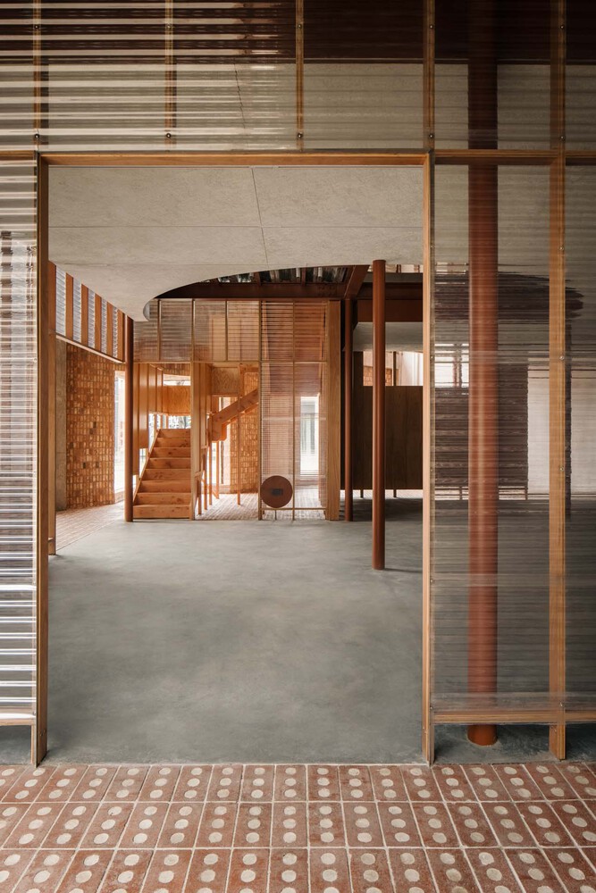
The two interlaced frameworks were treated divergently in transparent and solid, establishing a crystal like structure. The first hint of the interior space is suggested to the public by a transparent house, cladded with corrugated polycarbonate panels. Most days, the sunshine is welcomed from the south window through the front house to the back one wrapped in timber panels, proposing the overlapping relation of the two stacked frameworks. Comparatively being positioned at 45 degree, the diagonal direction marks a new spatial order and circulation, enriching the depth both visually and experientially.
The carefully curated structure also groups homogeneous rooms in a continuous sequence organized in two sets of identical columns, wherein one designated room leads into another. This route brings, both for different events and spontaneous gathering, flexible places with different possibilities.
The negative space, in between the existing brick walls and the new frameworks, that flows along the perimeter, introducing the notion of “semi-interior and semi exterior”. On the mezzanine floor, unexpected space of triangle balcony, pergolas and staircase were adaptively molded into the new inserted dwelling according to the circulation, becoming interesting elements embedded in the project. The staircase has been placed in a rather constricted area, ‘seeping out’ purposefully and generating a glass box on the fade in triangle shape, thus the tension between architectural boundaries and interior components could be revealed. These scattered structural elements were employed as an integration while detached from one another, presenting its independence and similarities.
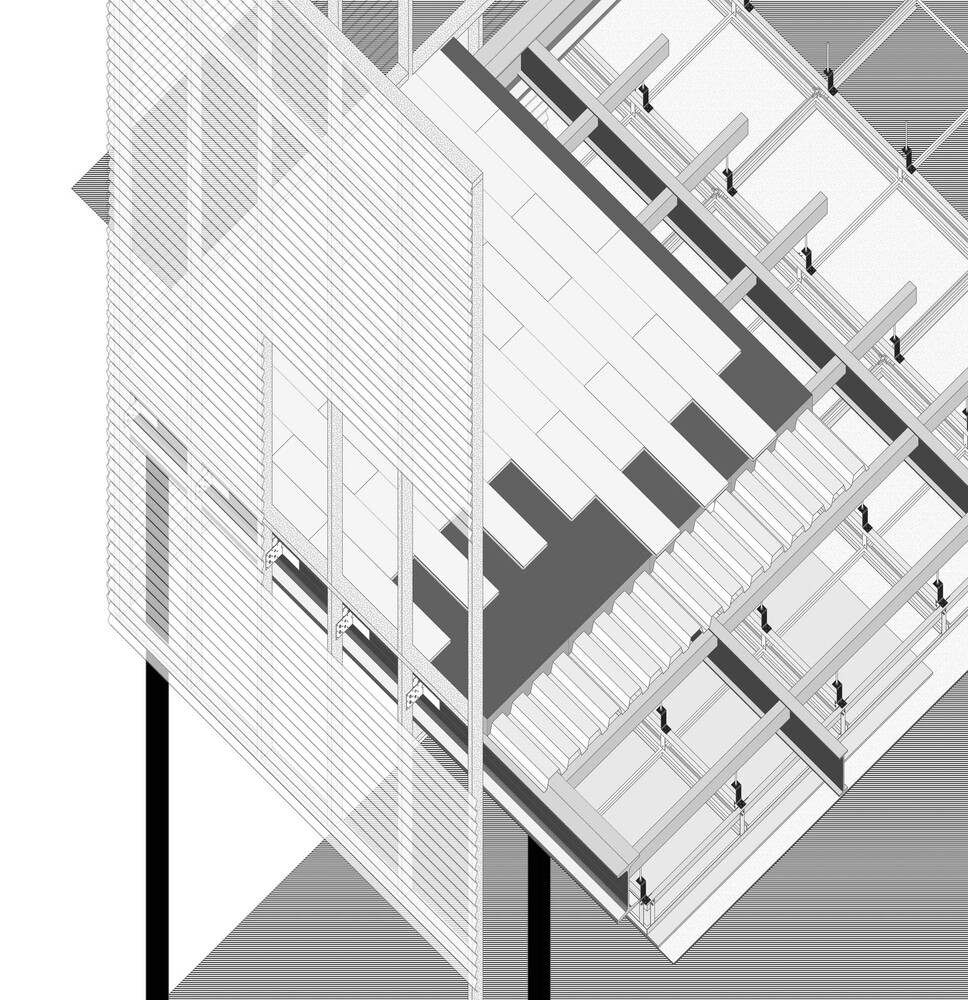
Atelier tao+c aspires to capture the authentic craft of construction and express the narrative of structure itself. From the steel structure, timber frame, the substructure of walls to the assembled finish panels, every component is visible and traceable. Each layer of the structure was superimposed during construction, amplified from the steel floor decks to the I beam, the ducts, piping layer and the dropped ceiling, simulating layers of the earth, clear and identifiable to the viewer. They are both the structure and the finish, recording both the design process and the construction process, vividly telling the story of how the frameworks were built.
from archdaily
'Commerce' 카테고리의 다른 글
| *비앤에이 워터프런트 [ StudioMAS ] The Ridge_V&A Waterfront (0) | 2023.07.06 |
|---|---|
| *바람길 태양길 [ Behet Bondzio Lin Architekten ] Watermoon Tea House (0) | 2023.04.18 |
| *레드블럭+실린더 [ G+ Architects ] NAM Coffee (12) | 2023.03.15 |
| *스시레스토랑 Child Studio Subtly Blends Modernist and Japanese Elements in a London Sushi Restaurant (0) | 2023.02.24 |
| *피셔리 터미널 [ Estudio Acta ] Fishery Terminal Lonja De Pescado (12) | 2023.02.16 |